On product pages, product images are tremendously important in users’ product-evaluation experience, providing critical visual information about key product details.
Yet in order to be most valuable, users have to know how to find additional images and what important product attributes they depict.
During Baymard’s large-scale usability testing across both desktop and mobile, we observed that using only dot indicators or text to represent the existence of additional product images within the main image gallery caused some users to miss the very product images they were looking for, while others had difficulty interacting with the indicator dots.
While 100% of desktop benchmark sites use thumbnails for optimal visibility, only 24% of mobile sites do so.
Interestingly, our desktop and mobile UX benchmarks show widely divergent strategies for displaying additional gallery images — while 100% of desktop benchmark sites use thumbnails for optimal visibility, only 24% of mobile sites do so.
In fact, on many sites, the desktop version will use thumbnails to indicate additional gallery images but switch to dot indicators or text on their mobile site, presumably under the impression that this decrease in visibility is worth the usability trade-off in order to conserve screen real estate.
However, our mobile usability testing shows that subtle dot indicators or text indications cause other usability issues, making thumbnails the universal solution across platforms for providing both clarity and easier gallery navigation.
In this article we’ll discuss the test findings from our large-scale UX research related to image gallery thumbnails. In particular, we’ll discuss:
- How desktop users overlook additional images when presented as indicators or text instead of thumbnails
- How mobile users struggle to use gallery indicators as a fallback for navigating product images
- The importance of information scent when it comes to product images
- How thumbnails resolve many issues observed with other gallery implementations
1) On Desktop, Users Risk Overlooking Additional Images
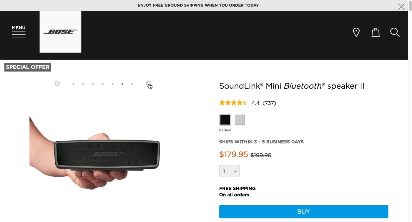
“I wonder how big these things [the speaker] are?” This user never found the additional product images in the gallery, including an “In Scale” image that would have helped her answer her question regarding the size of the speaker.
When additional images are not immediately evident, desktop users are prone to mistakenly think that the only product image available is the one that is displayed on the product page by default.
On desktop, the default image typically takes up a smaller proportion of the overall screen real estate, so more additional product information like product variations and the product description is usually visible within the viewport.
With more visible product information, during testing desktop users were less likely to explore the additional gallery images compared to mobile users, where the default image often takes up the majority of the viewport and other product information requires additional scrolling and interaction.
In fact, when indicators were used to indicate additional images, 50% of desktop users had trouble finding these additional product images — with a handful missing the fact that there were additional images entirely.
Therefore, inconspicuous gallery indicators risk that desktop users will overlook the quantity and quality of product images available.
2) On Mobile, Indicator Dots Are Hard to Target
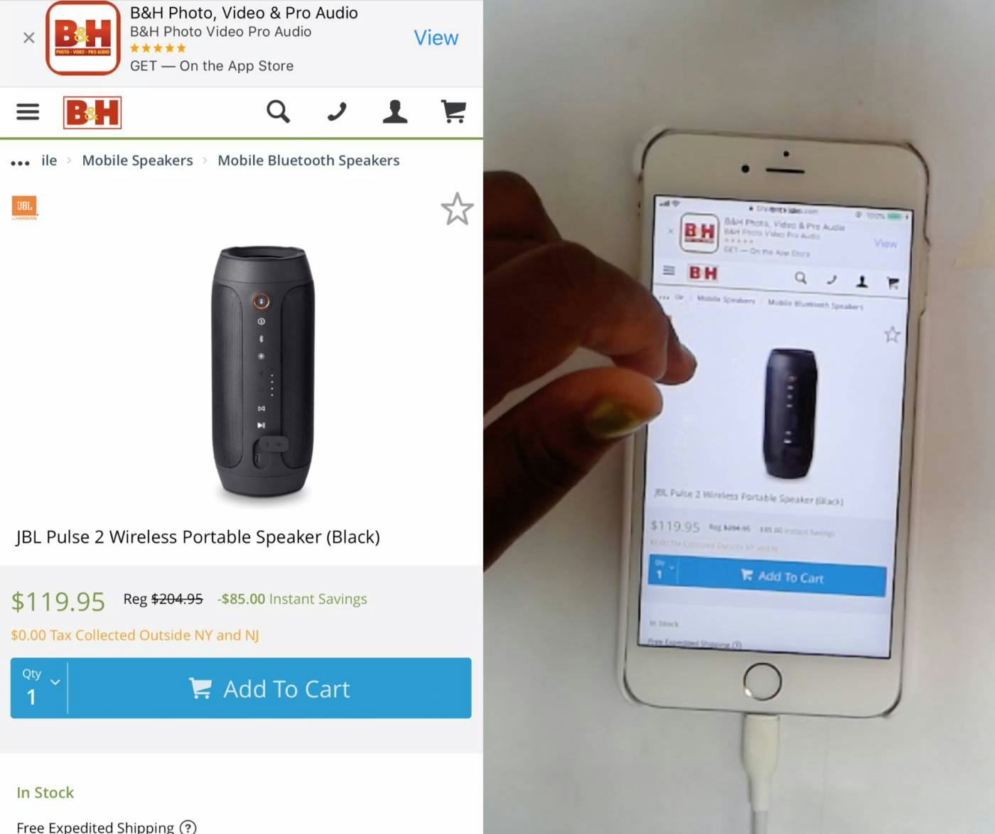
Even without any indicators of additional images, this user on B&H Photo immediately attempted to swipe through gallery images, a behavior observed across our mobile test users. On mobile, the default assumption that additional images exist and are able to be viewed by swiping is prevalent.
Unlike with desktop testing, during mobile testing we observed that users assumed the existence of additional images regardless of whether additional images were indicated.
Even with no obvious indication of additional gallery images, users routinely begin swiping the default image to navigate the gallery, and text or dot indicators are routinely ignored.
Being more likely overall to engage with the image gallery, mobile users are therefore far less likely to overlook additional images compared with desktop users, so the availability of thumbnails versus indicators is, in this regard, not a factor on mobile.
Yet that doesn’t mean that indicator dots perform well for mobile users.
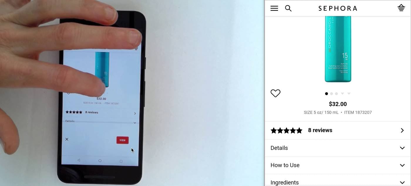
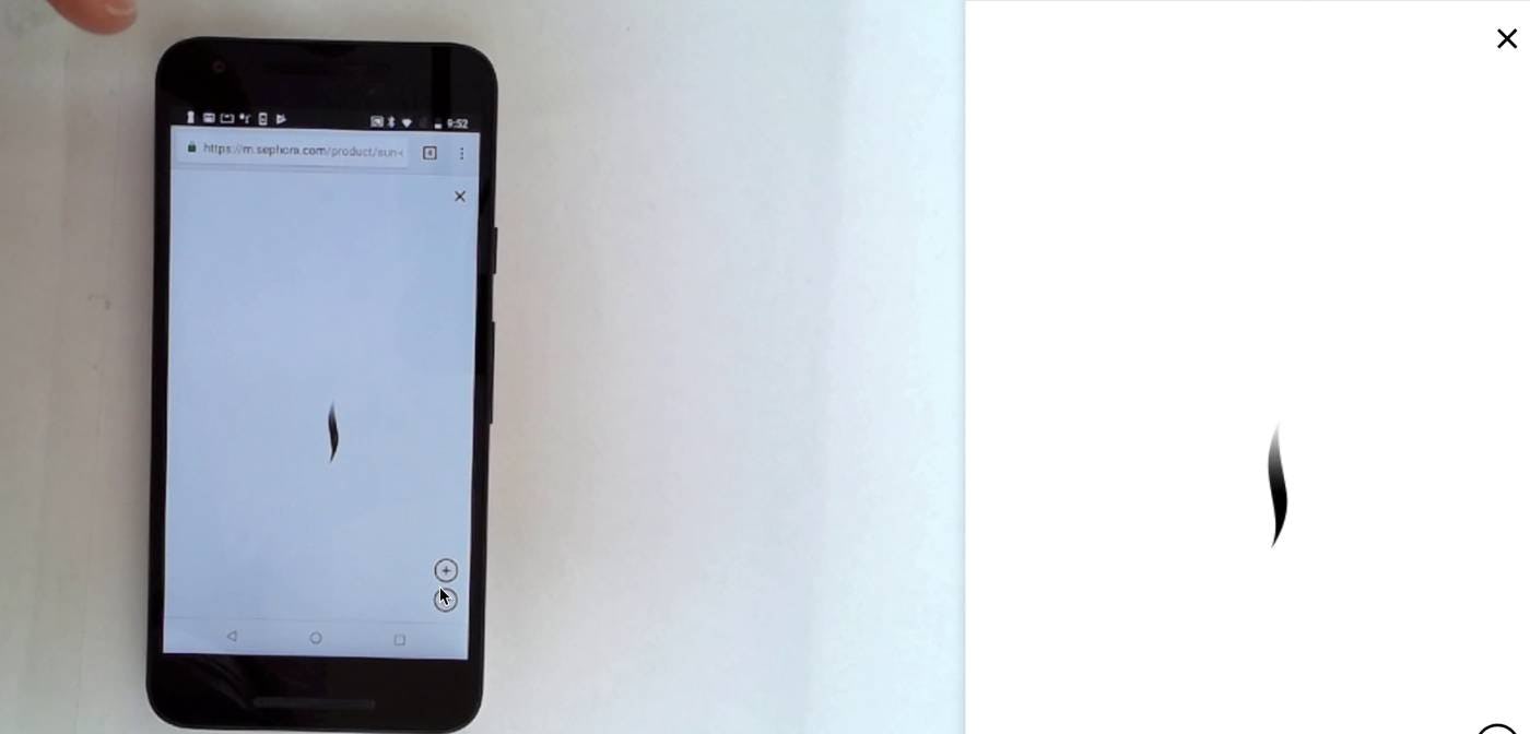
“What just happened? Oh, I don’t need to see the bigger image.” This user on Sephora was unable to swipe through the gallery images and attempted to use the gallery indicator dots to do so instead (first image). However, she accidentally tapped the main image, resulting in the enlarged view overlay loading (second image). On mobile, gallery indicator dots are so small that hit area issues nearly always arise.
When attempting to navigate the image gallery, mobile users almost universally use the swipe gesture, typically using dot indicators only as a fallback when they experienced issues with unresponsive swiping.
However, when this fallback was necessary, the tiny and closely spaced hit areas of these indicators often resulted in accidental taps during testing.
This resulted in users often tapping the wrong gallery indicator and accessing an unexpected product image, or accidentally tapping the main image, opening a disorienting enlarged view overlay.
Consequently, for users relying on gallery indicators as a means to navigate product images, these hit area issues make this experience highly frustrating and inefficient.
Even worse, some mobile sites fail to include any indication of additional images. With this complete lack of information scent, mobile users often attempt to swipe past the final image, either “bouncing” against a dead end or circling endlessly through the same few images over and over again.
3) On Both Desktop and Mobile, Indicators or Text Lack Information Scent
“The fact that these represent images I think is kind of unnecessary. I would rather just show a little mini image…if I’m looking at features and I want to go back and look at this image I have to click through all of these to find out which one it was…if it’s a little thumbnail then I know exactly which image I need to click on.” Using indicators to represent product images makes it unnecessarily difficult for users to click on or find the images they are interested in.
While gallery indicators may lend a visually “cleaner” look to product pages, this aesthetic benefit comes at significant cost when it comes to usability.
Across both desktop and mobile platforms, indicators or text indications of the number of images in the image gallery provide no visual information for users, leading to further important drawbacks.
Namely, users are unable to use gallery indicators to preview the different image types that may be available for the product, such as “In Scale” and “Included Accessories” images.
Likewise, if videos or 360-views are included in the image gallery, users may overlook or unwittingly skip them.
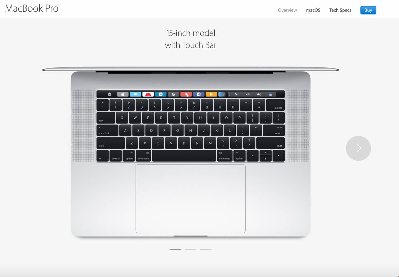
Using indicators rather than thumbnails makes it more likely that users will miss the additional images entirely. Here, in a previous product page design, Apple made it slightly easier to know that there are additional images to explore by including a large arrow indicator next to the image. However, it’s not clear what the next images will be. Without this crucial information scent, users may not bother to click to see the other images if they think they will be just different views of the same product model (in fact, they were images of the Macbook with and without a touch bar).
Furthermore, without adequate information scent, users have a more difficult time finding the particular image they need to answer their questions or complete their understanding of the product.
For both desktop and mobile users, fatigue can set in before all product images have been explored — again, resulting in a wasted opportunity.
4) Thumbnails Solve the Issues Caused by Indicators or Text
“Here you’ve got your thumbnails, which are nice.” Using thumbnails allows users to quickly decide which images they’d like to see, and then jump to those specifically.

“When it opens, this is nice…I can easily scroll through them.” Thumbnails are important to include in image gallery overlays as well as on product pages.
For desktop sites, representing additional images with thumbnails is a common convention: all desktop benchmark sites use thumbnails to indicate to users that additional product images are available.
Because this implementation is so common, deviations from it will come at high risk, as users looking for additional images have become highly accustomed to looking specifically for thumbnails.
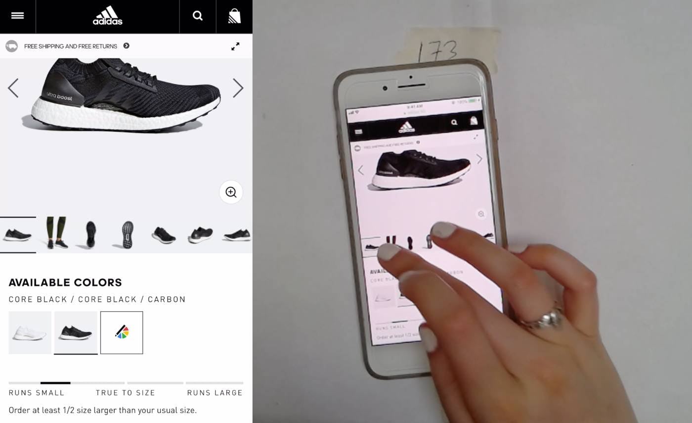
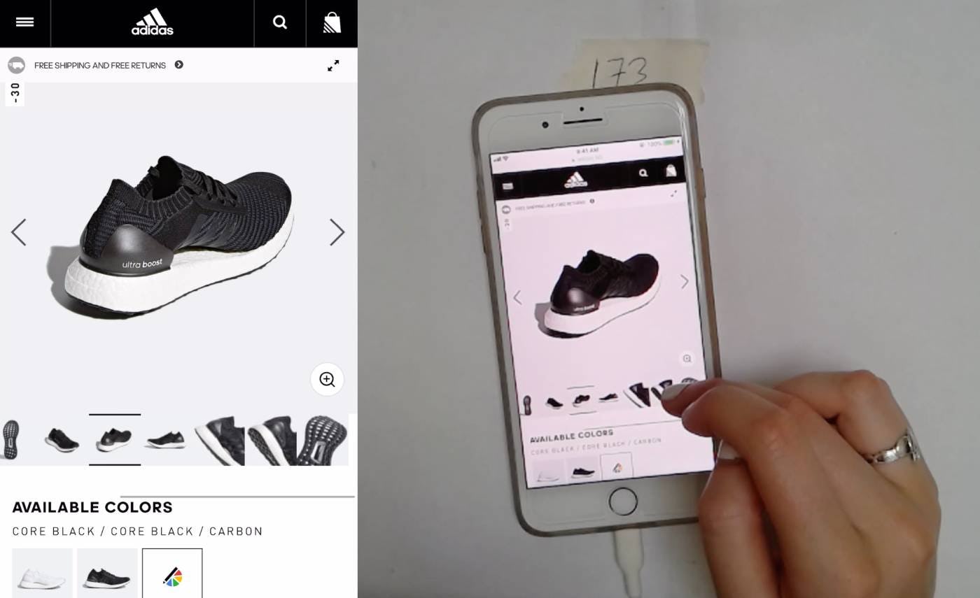
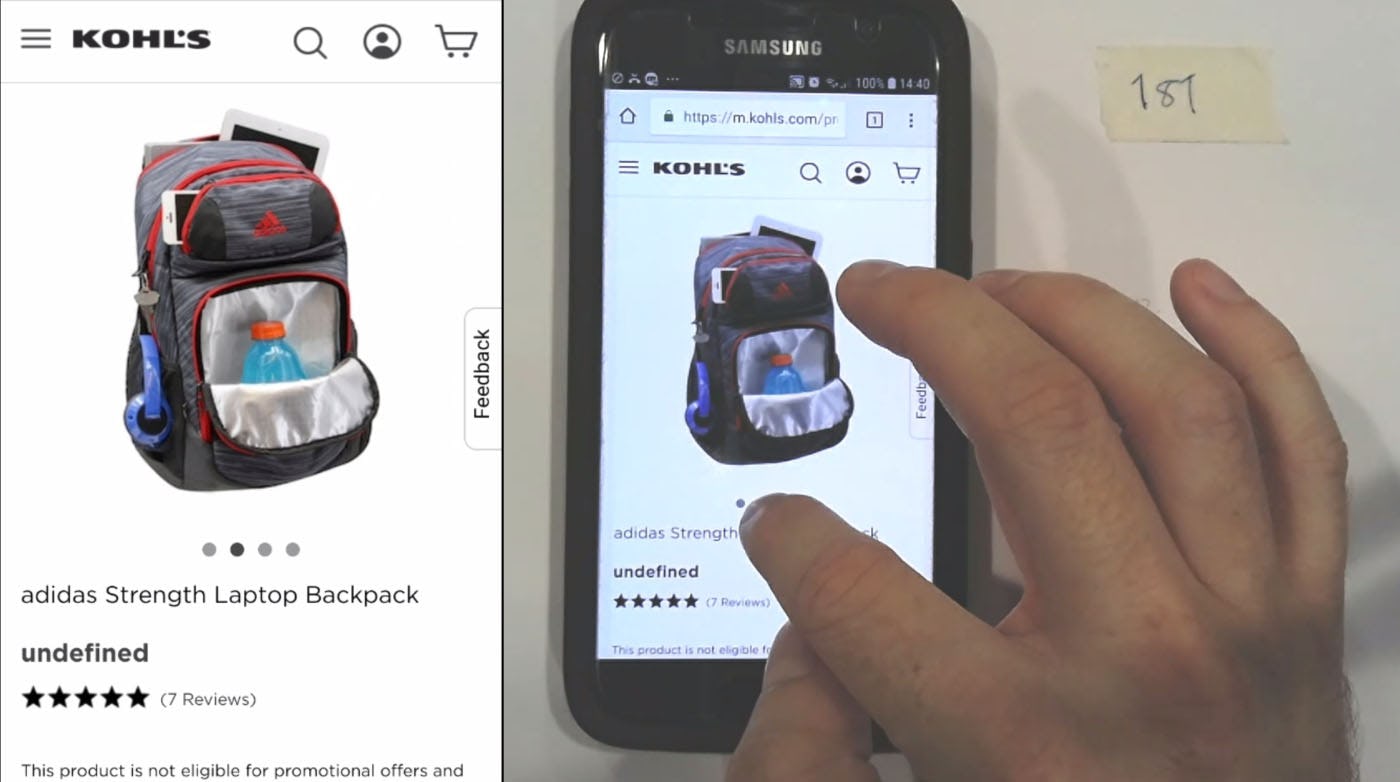
This user easily swiped the thumbnail slider on Adidas to navigate precisely to images that piqued her interest. Of the different gallery image indicators used by mobile test sites, this thumbnail presentation resulted in far fewer hit area and disorientation issues compared to more conventional dots or text indications. In this example, the current image is clearly indicated by the distinct black bars on the top and bottom of the thumbnail, and thumbnails themselves are large enough that users can clearly see what each one depicts.
Given the rate of adoption on desktop sites, it’s surprising that thumbnails for mobile image galleries are somewhat rare: only 24% of mobile benchmark sites use thumbnails to represent product images.
Using gallery indicators such as dots to represent additional product images is often used as a way to conserve valuable screen real estate on mobile, where its narrow viewport means relatively little content can be visible at once.
However, using gallery indicators or text sacrifices too much when it comes to users’ ability to conduct a thorough visual inspection of a product.
On the other hand, during mobile testing we observed using thumbnails to represent additional product images resulted in the lowest incidence of unintentional taps and errors compared with other gallery indicators.
The increased hit area provided by thumbnails makes thumbnail images much easier for users to accurately target, overcoming a major issue of indicators observed during mobile testing.

The right-most thumbnail on Williams Sonoma’s product page is visually cut off by the side of the viewport, providing a visual indication of further content.
Of course, due to the narrow mobile viewport, only a modest number of thumbnails will be visible by default, causing any additional images to be hidden offscreen.
However, the natural predisposition of mobile users to swipe through the gallery means that, despite truncation, users are actually unlikely to overlook images that are hidden by default.
That said, users should still be provided with an indication that there are additional gallery images beyond the visible thumbnails.
For example, showing only half of the final, visible thumbnail, or fading and horizontally cutting off a second line of thumbnails, provides the necessary visual cue that allows users to quickly ascertain that there are more thumbnails available.
Gallery Thumbnails Are Worth the Screen Real Estate on Mobile
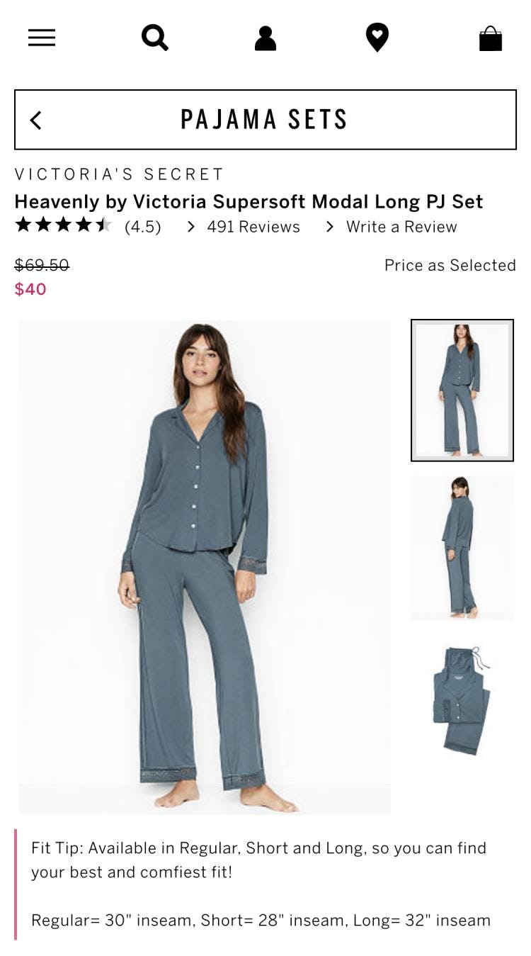
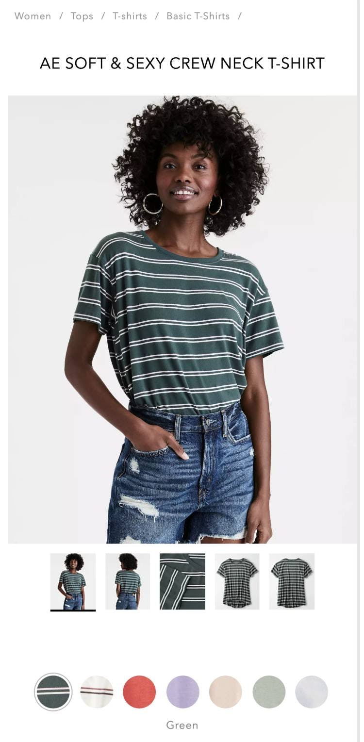
On Victoria’s Secret (first image) and American Eagle (second image), immediate access to thumbnails allows users to preview the array of images available and navigate directly to those they want to view.
As confirmed by our large-scale UX testing, using thumbnails to represent product images results in enhanced visibility and ease of navigation across all platforms:
- On desktop, gallery thumbnails alert users to the existence of additional images, which they would likely otherwise overlook.
- Meanwhile, on mobile, thumbnails prevent common hit area issues observed as users attempt to navigate within the image gallery.
- Across both platforms, thumbnails provide valuable information scent that allows users to preview the full range of images available and home in on those that are most important in their own product exploration.
Given the outsized value of product imagery to most users’ purchase decision-making, product thumbnails are a worthy inclusion to any product details page — even when screen real estate is scarce.