
Do you link to categories or products from your home page?
On e-commerce stores with thousands of products the home page quickly gets cluttered. We’ve looked at this in the past: e-commerce home page focus (Walmart vs. Apple).
Today, let’s take a deeper look at the two different paths large e-commerce retailers often choose for their home page, using OfficeDepot.com and Staples.com as examples of a Category vs. Product approach. (Note: this tendency is by no means limited to the “office supply” market.)
The Category Approach: OfficeDepot
The “category approach” generally treats the home page as a gateway to help users find the right product category. Let’s have a look at an example of this:

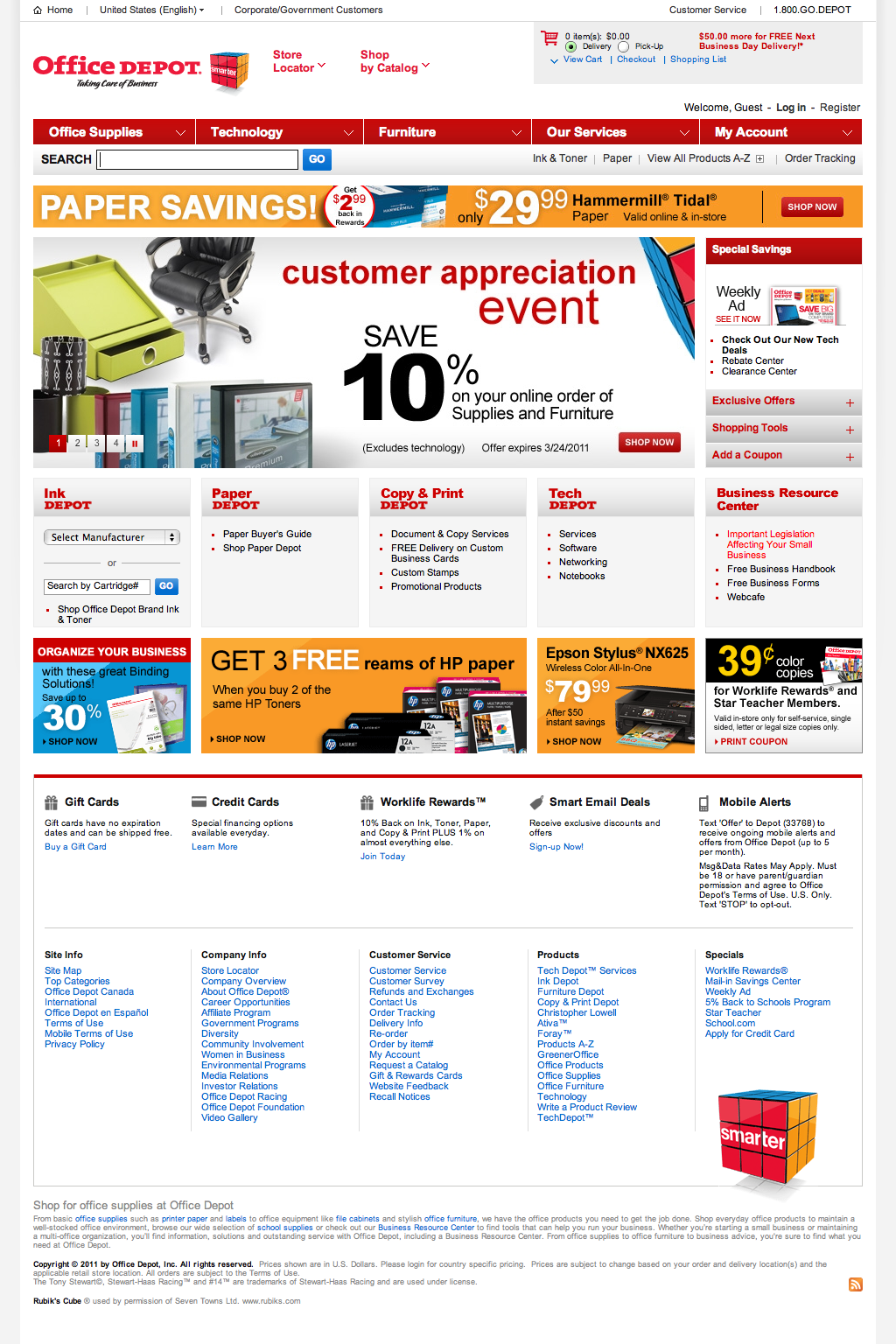
The purpose of this home page is clear: point you towards a category page. (Full-size screenshot.)
On OfficeDepot.com’s home page there isn’t a single link that will take you directly to a product page – all links go to category or promotional pages from where you’ll find specific product pages. Not even the “Epson Stylus(R) NX625” ad take you to a product page.
The reasoning behind this type of home page often go like this: people search for specific products in Google, and consequently, people looking for a specific product model will land on the relevant product page directly from Google anyways. Whereas those users going to the home page aren’t quite as sure which product model they want and instead need an overview of their options (which the category pages can provide).
The Product Approach: Staples
In the “product approach”, the home page generally points you directly to specific product pages. Let’s take a look at an example:

You’ll notice that the actual search field is much larger and of higher visual importance than on OfficeDepot. (Full-size screenshot.)
Except for the main navigation, there’s almost no links to ‘category pages’. Most of the dominant elements take you to a specific product page. This force users who aren’t looking for a specific product to use either a) the search feature, or b) use the main navigation.
The product approach is especially powerful when combined with product suggestions based on the user’s interests. Amazon is a prime example of this, suggesting relevant products based on the user’s browsing behavior and the purchasing history of other users with similar interests.
Category vs. Product
The clear strength of the category approach is that if a user is in doubt of which product he wants, a category page is a great place to explore his options. The downside is, however, that most users won’t reach the category page using the main navigation, so they are less likely to get a clear understanding of how the site’s navigation work. This might not be a problem in the short run, but may prove problematic if the site is looking for returning customers.
The strength of the product approach is that the user is presented with real product offers immediately. Additionally, it forces the user to take advantage of the site navigation or search if she isn’t sure exactly which product model she is looking for. The obvious weakness of this approach is that people may not bother searching for generic terms and it puts more strain on delivering good search results for such generic search terms.

