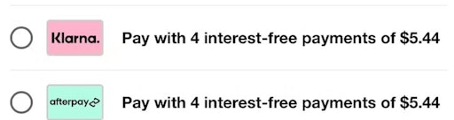
Implementing a custom designed drop-down selector is often a visually attractive alternative to using the browser’s native drop-down design. In a few select cases it can even lead to a more user friendly interface. However, it’s also a dangerous strategy. Our large-scale checkout usability testing and benchmarking reveal that while 82% of e-commerce sites use custom designed drop-downs in the checkout flow, 31% of all custom designed drop-downs have significant usability issues.
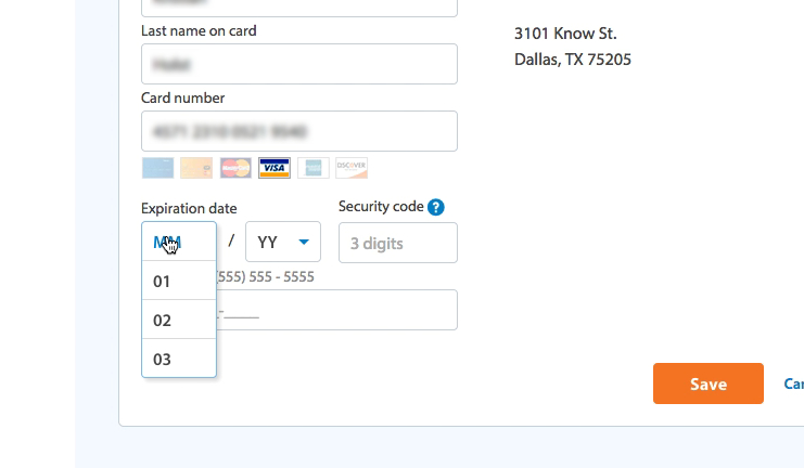
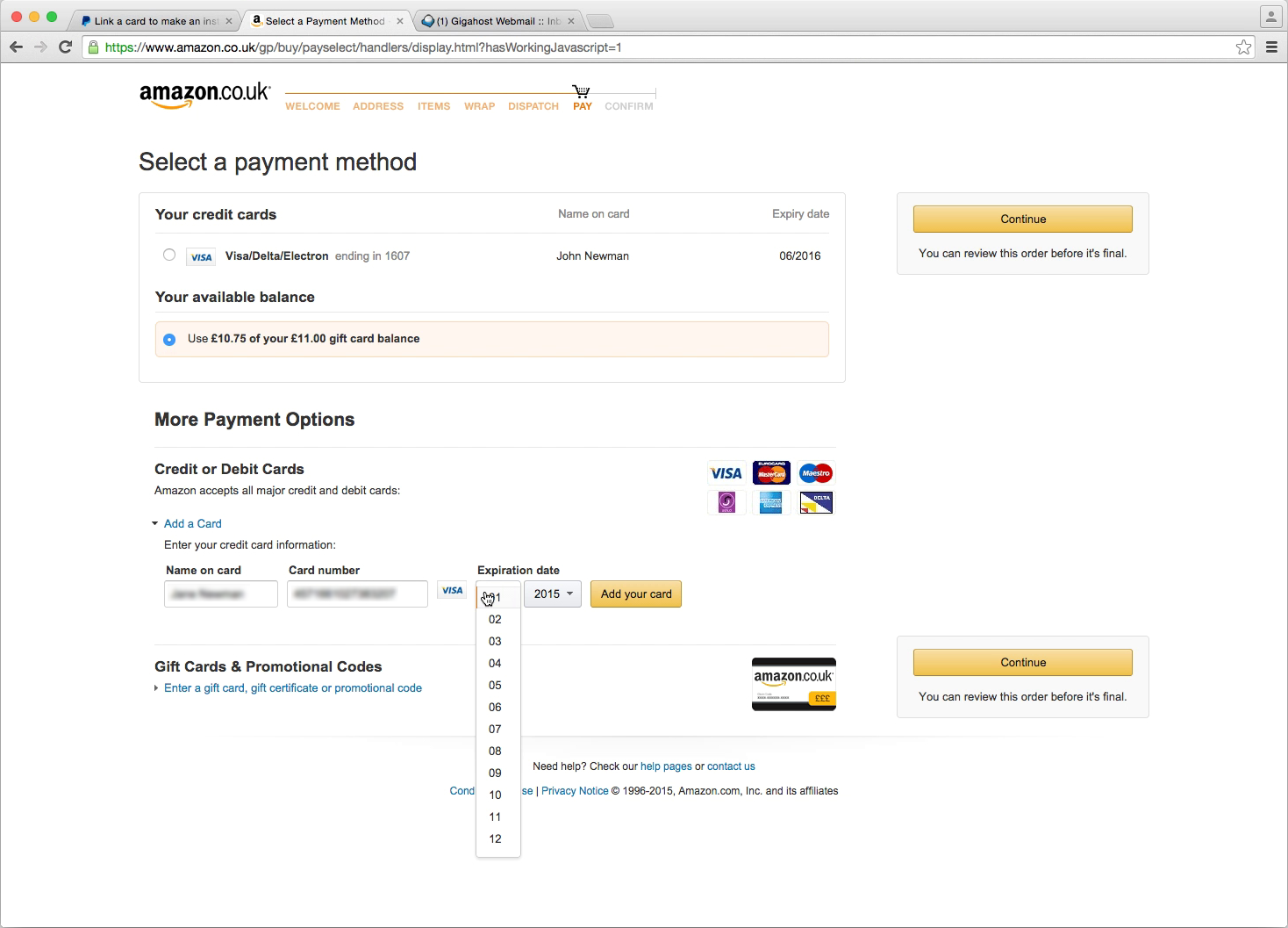
In practice, custom designed drop-downs often have usability issues. Here is Walmart’s custom drop-down for the card expiration date. Note how the pre-defined height cause only 3 month options to be viewable. There’s no indication to users that the 9 additional month values even exist (!).
When developing custom designed drop-down interface, it’s very important that the many subtle features and capabilities from a native interface are built into the custom interface as well, as users have deeply rooted expectations about how fields and selection interfaces function. However, re-coding the native drop-down features in a robust way is challenging, even for the world’s very largest e-commerce sites — as you’ll see in the examples in this article.
In this article we’ll share our test findings from our checkout usability study that relates to custom designed drop-downs, such as:
- 5 common pitfalls to avoid when using custom drop-downs.
- A few cases where custom drop-downs may be better than native.
- A ‘Shell Approach’ will often be a better solution, as it provides most of the aesthetic advantages, but still rely on the native drop-down beneath.
5 Pitfalls with Custom Designed Drop-Downs
In practice the many interaction nuances of a native drop-down aren’t supported in custom designed drop-downs.
Our benchmarking reveals that 31% of the custom designed drop-downs found in the checkout flows of the world’s 60 largest e-commerce sites, are suffering from at least one of the below 5 keyboard and interface issues. Note how all the examples of issues are from sites beyond $100+ million in online sales.
1) Users Are Unable to Use the Keyboard to Tab into the Custom Drop-Down Selector

This breaks users’ tabbing flow in a longer form.
For example, at Foot Locker’s checkout flow (seen above), once users have progressed to paying, those 62% of users we find to regularly tab through a long form will not be able to do so, because the custom drop-down for selecting the payment method is not reachable by keyboard tabbing.
2) There’s No Styling for Keyboard Focus in the Custom Drop-Down
This makes it invisible to users that the drop-down actually has keyboard focus.
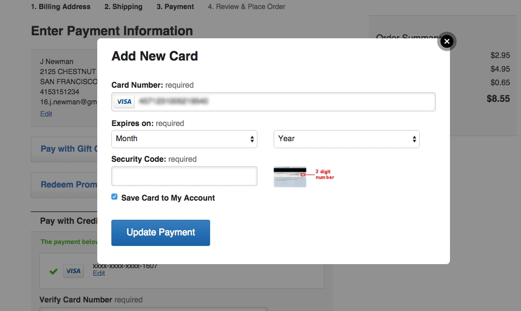
Or as one test subject explained during testing at Crate & Barrel (seen above) “Oh the tab didn’t work for ‘month’ and ‘year’”, when reaching the expiration date drop-downs during testing. The test subject had actually successfully tabbed into the expiration month, but couldn’t see that it had keyboard focus. She, therefore, tabbed multiple times before (wrongly but understandably) concluding that tabbing didn’t work.
Note that our benchmarking reveals the majority of custom designed drop-down implementations fail in this aspect.
3) Keyboard Characters Are Not Allowed for Selecting Values in the Custom Drop-Down
This means that users cannot use the keyboard to “jump” to specific sections in the drop-down, makes it needlessly difficult to navigate long drop-downs and impossible to do quick keyboard selections.
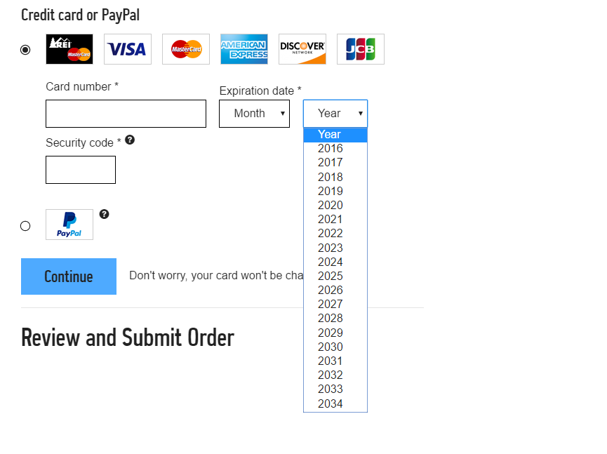
For example, in REI’s custom drop-down for the expiration date, seen above, values cannot be selected using keyboard input. This makes it impossible for users to tab into the custom drop-down and then select the card expiration date using only the keyboard. Support for this is important because in our large-scale checkout usability study we’ve found that it’s 24% of all desktop users who consistently try to input the expiration date using only their keyboard.
4) The Opened Drop-Down Isn’t Tall Enough to Display All Values
This makes users prone to overlook the non-visible select values, and those that do notice them will have to use troublesome inline-scrollable areas.
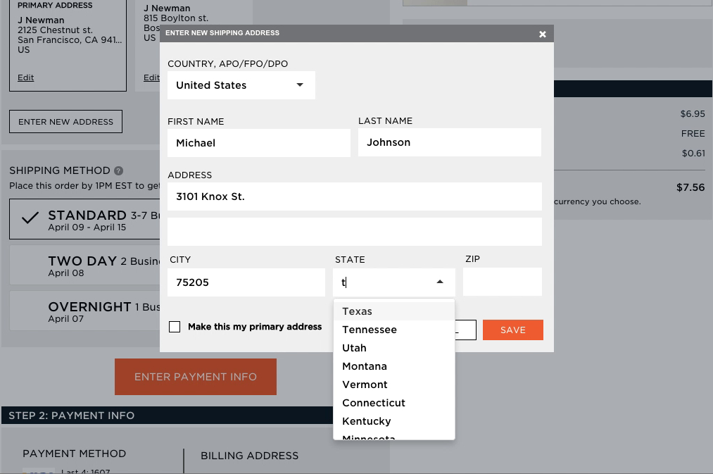
For example, American Eagle Outfitters (above left) offers a custom state drop-down, where several test subjects successfully tabbed to the state field, and typed “t” to jump to that part in the list. While AEO got the keyboard interaction right, note how length of the drop-down interface is suboptimal as it’s too short compared to the available space. Walmart (above right), suffers from the same issue with their custom drop-down, it’s just in an even worse context.
5) The Custom Drop-Down Always Has the Same Open Direction Regardless of the User’s Position on the Page
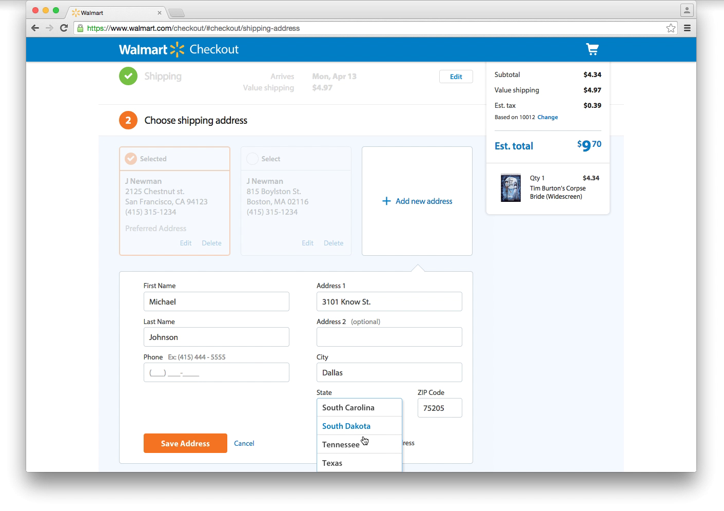
This causes the selection list to be cut-off by the browser viewport.
For example, note in Walmart’s custom drop-down for selecting states (seen above), how this user could only see four state values. The drop-down is actually taller than this, but because the drop-down always expands downwards, it will often expand outside the user’s viewport.
These are all nuances that are important to the drop-down’s overall usability, and all of these 5 drop-down usability issues were resolved around a decade ago in the browser’s native drop-down implementation. Today nearly all native drop-downs will have a dynamic open direction and size based on the drop-down’s position in the user’s viewport.
It’s important to underscore that it’s not that these native drop-down features cannot be re-created using JavaScript. But it is often expensive to do so, and even then it will be vulnerable to browser and OS updates.
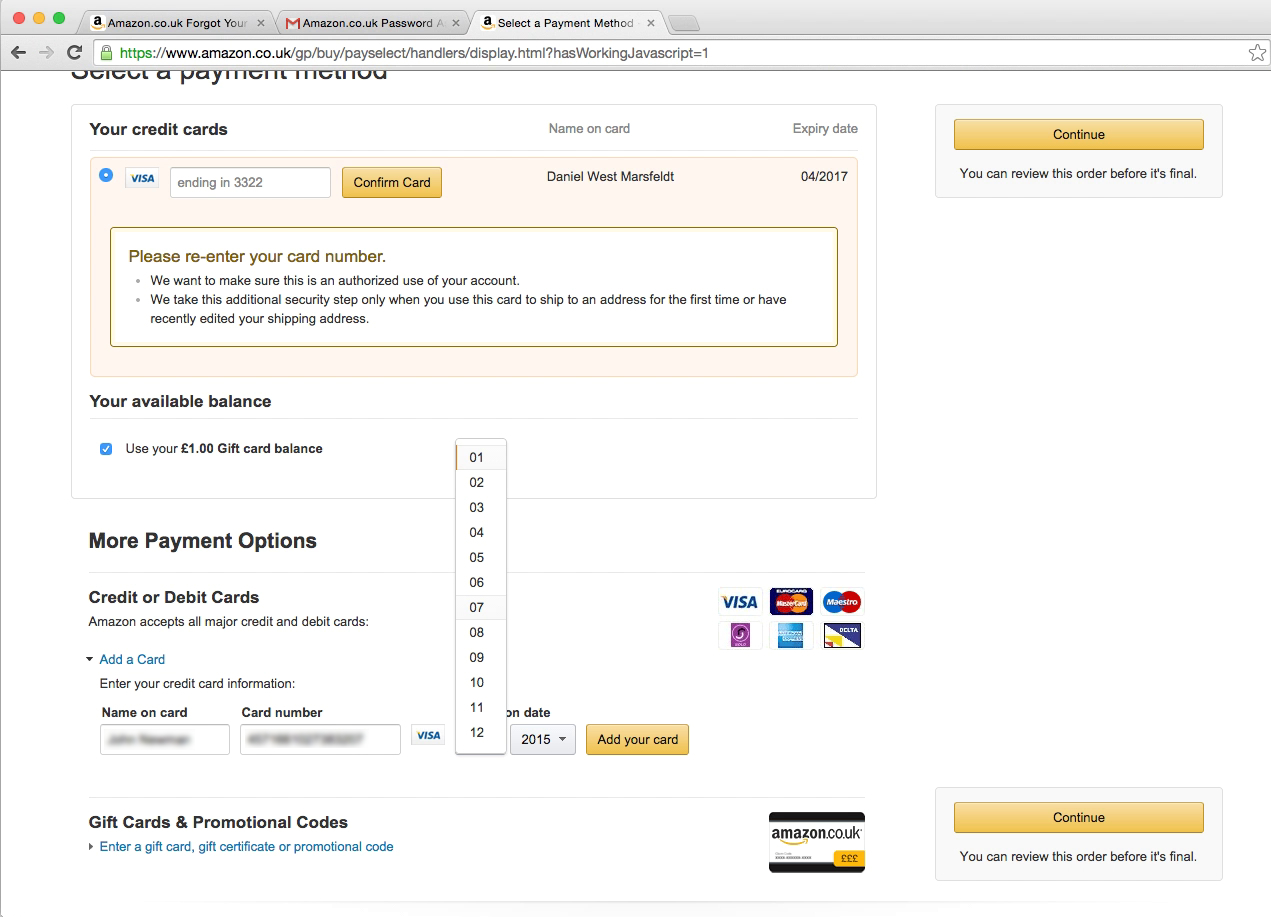
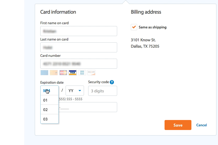
While it is possible to develop a fully custom drop-down that alleviate nearly all of the pitfalls, it will require extensive technical resources, as all the native features will have to be re-developed. Note here how Amazon has a custom drop-down that uses the dynamic open direction (down vs up) based on how much space there is in the user’s viewport.
Cases Where Custom Drop-Downs May Be Better Than Native
In our usability testing we do observe that in some instances, a custom drop-down can be superior to a native drop-down. Sometimes custom drop-down designs can be used to provide a better data presentation or a better interaction for the user.
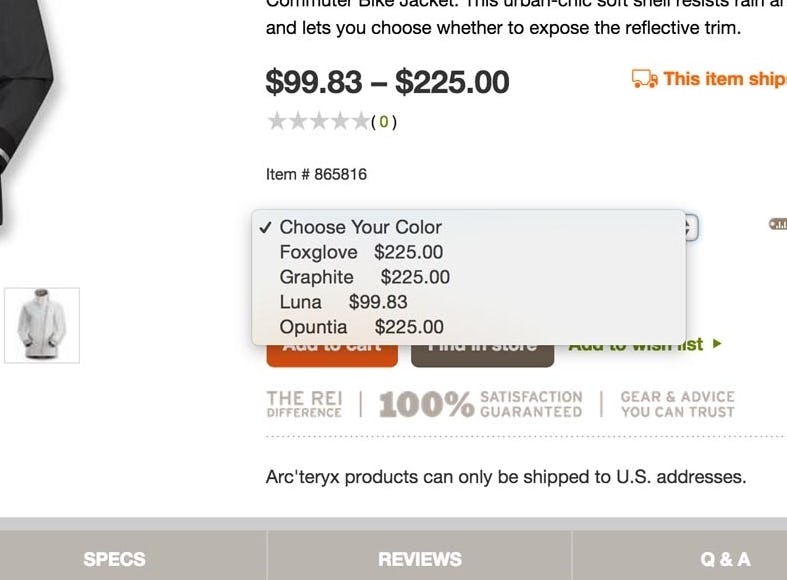
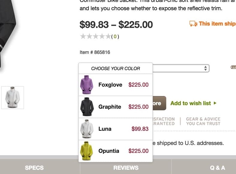
A native drop-down versus a custom drop-down for selecting color variations. Notice how color names such as “Foxglove” and “Opuntia” are a lot easier to decipher with thumbnails next to them. The price points are also easier to scan due to the controlled right-hand alignment.
In terms of data presentation a native drop-down is very limited as it, more or less, only allows unstyled text. In a drop-down for selecting credit card expiration dates, quantity, countries, states, etc. this lack of text styling is quite okay, and we observe no issues during large-scale testing for such selection values (due to drop-downs lack styling, at least). However, the native drop-down’s lack of styling makes it a very poor interface for visual selections. Such options are much better communicated using visual aids, like color swatches or color variation thumbnails.
Other inputs where drop-downs with a custom visual styling is needed are on sites that use horizontal filtering interfaces and for the mobile site’s main navigation.
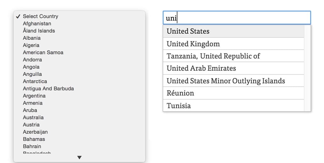
Other times the user’s interaction experience can be improved by using a custom drop-down implementation. This is particularly the case for drop-downs with a large number of values, like “Country” and “State” drop-downs – where we consistently observe usability issues. Here a superior design is to (progressively) turn the drop-down into an auto-complete field. In the case of a country drop-down, instead of having to scroll 200+ country options in a tiny drop-down pop-over window, the user can then simply type the first couple of letters of their country and it shows up.
(For more on country auto-complete see our article on at Smashing Magazine. We’ve even developed a free plugin that progressively enhance drop-downs into autocomplete fields)
The ‘Shell Approach’ Is Often a Better Alternative
While some site do use custom drop-downs to provide better a data presentation or selection interaction, most e-commerce sites use them simply for aesthetic reasons as a lot of sites want to control their entire “brand feeling”. If aesthetics is the objective there’s a much simpler and better solution than a fully custom drop-down; the ‘Shell Approach’.
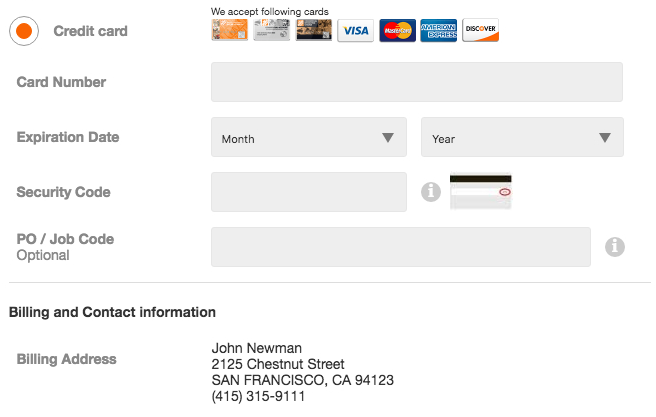
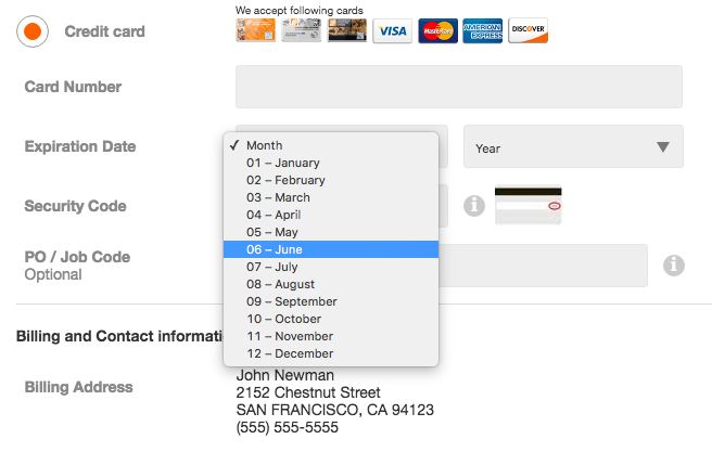
An example of the “Shell Approach” as seen in Home Depot’s checkout. Note how the drop-down in it’s default closed state uses a custom design for improved aesthetics (first image), but when the drop-down is opened it falls back to use a native drop-down (second image).
In a ‘Shell Approach’, a custom designed UI is shown in the default collapsed state of the drop-down, but when users interact with it, the native drop-down is instead served. This way, the drop-down can easily match the site’s visual styling and brand guidelines in its collapsed state, yet there’s no need to spend resources re-developing native browser capabilities using advanced JavaScript.
If the desire for a custom drop-down is purely rooted in aesthetics, we’d strongly encourage this ‘Shell Approach’ over developing a fully custom drop-down. The ‘Shell Approach’ is significantly cheaper to implement initially, requires far less maintenance, offers better compatibility with older devices and browsers, and is more flexible in supporting future web evolvements (i.e. accessibility, voice control, interface-less sites, etc.) since all of the selection logic relies on native HTML elements.
However, if relying on the ‘Shell Approach’, make sure to design a very clear styling for when the semi-custom drop-down has keyboard focus, as the majority of implementations using the ‘Shell Approach’ forget this important element – effectively disrupting users’ tabbing flow.
Custom or Native Drop-Downs
While fully custom drop-downs are somewhat popular, they are also very expensive to develop properly. Consequently 31% of all the custom drop-down implementations suffer from a series of low-level interaction and usability issues – all leading to selection friction that native drop-downs do not suffer from.
While there are exceptions where fully custom drop-downs are warranted – like country selectors, mobile main navigation, and horizontal filtering drop-downs – most sites use them purely for aesthetic reasons. This is a user experience trade-off that is seldom justifiable considering how many sites are unable to get the implementation details right, and considering that the ‘Shell Approach’, roughly speaking, give sites 80% of the effect for 20% of the cost.
If you still deem you need a fully custom drop-down implementation be sure to make it on-par with native drop-downs on these 5 important implementation details:
- Ensure the custom drop-down is part of the keyboard tabbing sequence, so users can tab into the drop-down.
- Ensure the custom drop-down in its closed state has a clear “selected” styling to indicate when it has keyboard focus through tabbing.
- Allow users to make input selections and “jump” to drop-down values by typing the corresponding characters on their keyboard.
- Ensure the custom drop-down has a dynamic height depending on the number of values it contains and the available space in the user’s viewport.
- Use a dynamic open direction for the custom drop-down, so a large drop-down opens upwards if the user opens it and has more space available upwards in their browser viewport (and vice-versa).
This article presents the research findings from just 1 of the 650+ UX guidelines in Baymard Premium – get full access to learn how to create a “State of the Art” e-commerce user experience.