Drop-downs are an example of a native UI component that may in certain circumstances benefit from a custom implementation (when it provides the user with significant presentational or interactive enhancements).
In a few rare instances, we find that it is acceptable to override the standard UI components provided natively by browsers and instead implement custom UI components.
During our usability tests, we generally find the default native UI components to be very user-friendly. Meanwhile, custom designed UI components tend to be a lot more hit and miss. In fact, our testing often finds custom UI components to be poor for usability. In the worst cases, we have found them to be outright harmful to the user experience and be the direct cause for site abandonments. Luckily, there is a brighter side to the world of custom UI components too.

In the above example, is the test subject going to be subscribed to the newsletter? In an early version of Android this was actually the “unticked” state of native checkboxes. Platforms still in rapid development may suffer from poorly designed native UI components. Since a checkmark in checkboxes on all other platforms means the option is selected, the test subjects naturally assumed this to be true here as well – alas, it wasn’t.
In a few instances, our usability tests have shown custom UI components to actually provide the test subjects with an experience superior to that of the equivalent native UI component. This is achieved when the custom UI component affords the user with a superior presentational and interactive experience.
In this article it’s these darker and brighter sides of custom UI components that we’ll explore, looking at when to rely on the standard native UI components (answer: most of the time) and under what circumstances custom UI can improve UX.
The Benefits and Limitations of Standard UI Components
We’re generally very big proponents of relying on the default native UI components. They tend to be virtually bug-free and users intuitively know how to use them because they can recognize the component from the thousands of other websites and applications where they (also) appear.
However, native UI components do come with certain limitations – their data presentation and interactive behavior is often highly restrictive with little room for customization. This can be particularly problematic if a set of options would benefit from a richer data presentation, such as basic text formatting and assistive visuals, or when certain interactions could be optimized to improve form completion times and create a smoother form entry flow.

Left: Firefox. Right: Safari. Different browsers offer different implementations of the drop-down component.
The exact implementation of the native UI components can differ across operating systems and browsers. For the most part these differences tend to be aesthetic but there are a few UI components where there are tangible deviations in regards to data presentation or interactive behavior.
For example, drop-downs have both design and interaction differences across different operating systems. A drop-down in Firefox will confine a long list of options to an overlay box with an inline scrollbar, while in Safari that same drop-down will be displayed as a long list which extends all the way to the bottom of the screen and has arrows that the user can hover to move the options up/down.
Such differences aren’t necessarily crucial or problematic. Indeed, our testing finds that users are capable of using both, although they naturally have an easier time using the implementation of their preferred OS-browser combination.
Hence despite minor implementation differences across platforms, the reason for pursuing a custom UI component is almost never because it has a poor default design. So when should you implement a custom UI component?
When to Implement a Custom UI Component
Throughout our usability tests, custom UI components worked better than their native counterparts when they provided a superior presentational or interactive experience. In other words, when significant interaction or data presentation benefits can be realized, a custom UI component may be considered.
The drop-down component is an interesting case because both its presentational and its interactive features may be improved upon for certain types of tasks.
Improved Presentation
Let’s take a look at data presentation first. The native drop-down component allows close to zero customization of the select options – it’s basically a list of text labels. For many types of data this is perfectly fine. For instance a ‘Quantity’ or ‘Size’ drop-down can convey its options just fine within these limitations, as the options can easily be understood from a simple text label.

A native drop-down used for selecting color variations on a product page.

A mock-up of what a custom drop-down implementation might look like on the same page. Notice how colors such as ‘Foxglove and ‘Opuntia’ are a lot easier to decipher with thumbnails next to them. The price points – which happen to differ quite significantly for the ‘Luna’ product variation – are also easier to scan due to the controlled right-hand alignment.
However, there are certain types of data where a “richer” presentation of the available options will make it easier for the user to understand, compare and select between those options. The two most common types are:
- Visual options such as color and texture variations. These options tend to be easier to communicate with graphical aids instead of only text.
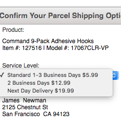
- Matrix options with multiple attributes for the user to consider such as shipping options (price + speed) or pricing schemes. Such options are typically easier for the user to scan when they are presented in a structured layout.
A custom UI component allows for inclusion of visual aids and more complex layouts. Hence if significant presentational improvements can be made, and it’s important for the user to understand and compare the available options, a custom UI component may be warranted.
Improved Interaction
Other times what can be improved upon is an even more fundamental aspect of the UI component: its interactive features.
A good example of this is the “country selector”, which on most sites is implemented as a drop-down. However, during testing we consistently observe usability issues with these massive country selector drop-downs (also confirming Jakob Nielsen’s findings dating back to 2000 and 2007).

Most users find it a lot easier to type the first few letters of their country than having to find it in a drop-down list of 200+ options.
One solution to this is turning the drop-down into an autocomplete field (on capable devices and platforms), which provide the user with a superior interactive experience. Instead of having to scroll 200+ country options in a tiny drop-down pop-over window, the user simply types the first couple of letters of their country and it shows up. In fact, we wrote an entire article on this topic at Smashing Magazine a few years ago and even developed a plugin that progressively enhance drop-downs into autocomplete fields.
For the purposes of this article, the key takeaway is that there are cases where a custom UI component can provide an enhanced interactive experience for the user. If those interaction improvements are sufficiently tangible, a custom UI component may be warranted.
A Case-by-Case Judgement
Unfortunately, there isn’t a single clear-cut answer to what constitutes “significant” presentational or interaction improvements. Most of the time a native drop-down is absolutely the right way to go.
Yet sometimes, a well-tested custom UI component will be a better solution because it enables interactive or presentational enhancements that are so significant that they outweigh the benefits of a native UI component (recognizability to users + bug-free implementation + no development or maintenance costs).
It’s ultimately a judgement call. Designers must use their discretion to evaluate whether to stick with the native component or “go custom”.
How to Implement Custom UI Components
The two main benefits of native UI components are recognizability and reliability (virtually bug-free implementations that are kind to screen readers). When implementing a custom UI component these two aspects often require a concerted effort to even be approximated. But they can be approximated, and consequently they should.
Reliability: Test, Test, Test
It is absolutely possible to implement a close to bug-free UI component – it just requires adoption of “best practice” development techniques and serious investments in thorough testing up-front as well as budgeting for ongoing maintenance.
We cannot tell the number of times we’ve seen custom UI components break during testing – even on e-commerce sites in the billion dollar range. Testing is crucial. (And we haven’t even touched on the topic of accessibility.)

Even key elements (like navigation menus) on major sites (such as J.Crew) suffer from technical bugs.
The recommended approach for custom UI implementations is to actually rely on native UI components and then progressively enhance them with custom design and behavior as this promotes both accessibility and reliability. When the underlying component is native, it will still be accessible to screen readers et al, and if for some reason something breaks on the page (e.g. a script fails) the site will still be perfectly usable – it just won’t provide that particular user with the custom enhanced experience.
(For more on how widespread e-commerce bugs are, and three principles to minimize their occurrence, see our article Fixing Bugs – the Next ‘Big Thing’ in E-Commerce?.)
Recognizability: Emulate the Native Component
From a usability perspective the main benefit of native UI components is that the user can recognize them from the thousands of other sites and applications they’ve used throughout their digital lifetime. This means users intuitively know how the component works and how to approach it.

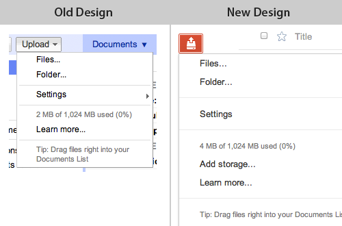
Google Docs has implemented a custom drop-down which features visual aids and secondary descriptions – yet a wise use of spatial indicators help emulate the native drop-down component, enabling most users to recognize and intuitively interact with the custom implementation without any trouble.
It’s therefore recommended to emulate the standard UI components to achieve some level of recognizability. When a site imitates a standard UI component, we find that most users will (tentatively) assume the behavior of the original component to also apply for the custom UI component – unless those expectations are broken, of course.
Emulating native UI components can therefore be a great way to tap into user expectations while still achieving the potential presentational or interaction benefits of a custom UI component.
Conclusion
The litmus test goes: Will the interaction or presentational benefits of a custom UI component offset its implementation and maintenance costs and outweigh the reduction in recognizability?
If the answer is yes, then implementing a custom UI component is appropriate – under the premise that it is implemented flawlessly, fails gracefully and lives up to accessibility standards. We do advise pessimism when making this judgement call.
If in doubt, go with the native UI component. It’s only when the benefits of a custom UI component are overtly obvious that it should win out.