Key Takeaways
- Hover-based drop-down menus are great for exposing site categories and subcategories
- But 60% of sites implement them poorly
- As a result some users will be reluctant to interact with the main navigation when searching for products
Hover-based drop-down menus allow users to get started with quickly browsing categories.
Indeed, they offer an important navigation UX benefit of allowing users to read through the main categories, then hover one which might be appropriate, and then based on the revealed subcategories infer if it is in fact the appropriate category.
In fact, during our Product Finding study we found that many of the test participants deduced the correct parent scope and category taxonomy solely with the help of hover-based drop-down menus — which allowed them to probe into a parent category without a click commitment.
As a result, users are able to find a suitable product more efficiently — which is likely why 74% of desktop sites in our e-commerce UX benchmark have hover-based drop-down menus.
Yet our large-scale testing also finds that hover-based drop-down menus can cause serious usability issues — which often negate the benefits provided by the menus in the first place.
In particular, during testing, drop-down menus appearing and disappearing unexpectedly caused considerable annoyance and interrupted product finding needlessly.
In this article we’ll share our insights from our Premium research findings on hover-based drop-downs:
- How “flickering” or “flimsy-feeling” drop-down menus cause users serious navigational issues
- Why implementing a hover delay can resolve the issue for most sites
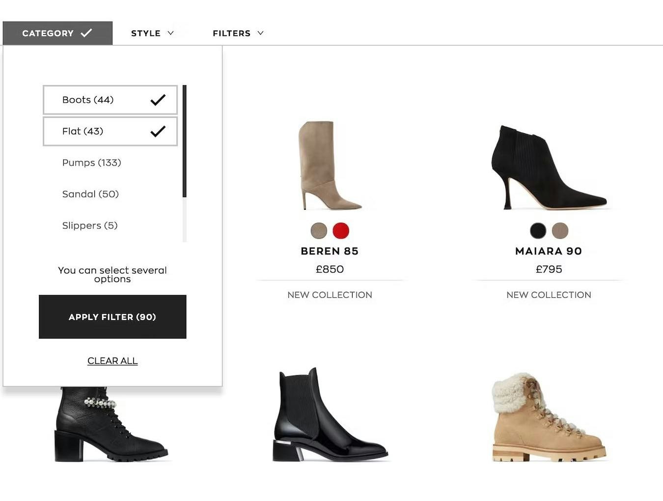
“Flickering” and Hover-Based Drop-Down Menus
Since we first tested hover-based drop-downs in 2013 we’ve identified that they can perform very well in helping users find a suitable product list — but are often implemented with a serious flaw.
In particular, participants during testing struggled to use the main navigation when it opened immediately when their cursor hovered over it — which participants described as the drop-down “flickering” or feeling “flimsy”.
Such quick opening and closing of the main navigation can be disorienting and make it difficult for users to stay on track with finding the product list they’re looking for.
Indeed, during testing many participants came to a halt when confronted with such “flimsy” drop-down menus — their attention was diverted away from product finding toward the UX issue caused by the drop-down menu.
Now most users will learn to cope with a “flimsy” drop-down — while they access it repeatedly when they hadn’t intended to, they push through to continue on with product finding.
A subgroup, however, will be so distracted that they give up on using the main navigation in favor of search — or leave the site entirely due to its perceived navigational difficulties.
Testing further revealed that nearly all users will experience interruptions when drop-downs “flicker” too much — a series of minor UX speedbumps that compound the more they interact with the menu.
In short, at best users are delayed in finding a suitable product list — at worst, they abandon using the main navigation (or even the site) to turn to a less-preferred product-finding strategy such as search.
Moreover, it’s not just the unintentional opening and closing of the main drop-down navigation but also the unintentional opening of categories and subcategories within the drop-down.
Thus, it’s not only a problem when first accessing the main drop-down — the issue can occur as long as users are interacting with the main navigation, which can be for extended periods of time, as users consider the categories and decide which ones are most likely to lead to sought-for product lists.
Finally, the issue isn’t limited to the main navigation but can also occur with courtesy navigation options — for example, account sign in — if a similar “flimsy” drop-down is implemented.
A Hover Delay of 300–500 MS Alleviates the Worst of the “Flickering” Issue
To avoid inadvertent triggering of hover-based drop-down menus, there should be a minimum amount of time the user has to hover the trigger area before the drop-down content appears.
Typically, a delay of 300–500 milliseconds will eliminate the majority of accidental triggering.
With this delay, users who need to access the drop-down menu will be able to do so without a significant lag, while there’s much less chance of other users getting annoyed by the menus appearing and disappearing in a distracting way.
Additionally, another solution that can be considered — more complex to implement than just the hover delay — is to implement a mouse path algorithm that takes into account the user’s intent when the cursor is moving.
These algorithms add extra delay to the hover time if the cursor path is in a direct line from the cursor’s current position to the subcategories.
If you code your own solution, you may consider making it even more intelligent by accounting for mouse path acceleration, direction, and origin — basically a vector-based mouse path analysis for determining the hover activation.

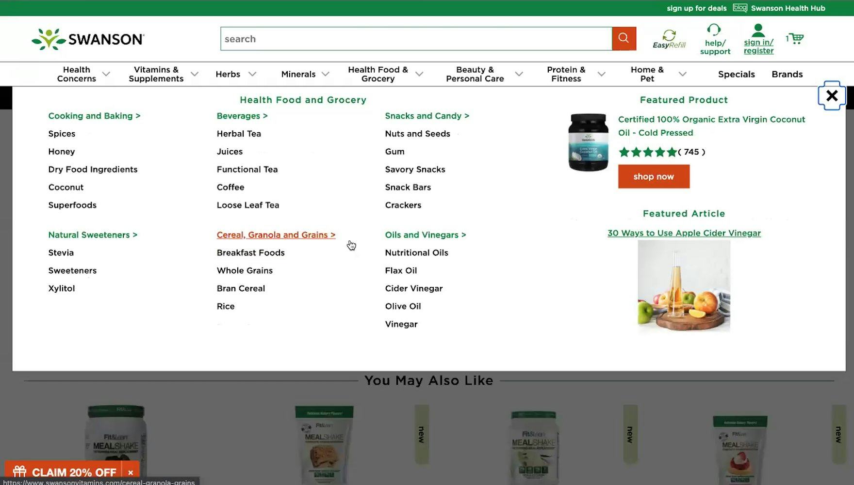
At Newegg, menus aren’t triggered when they’re briefly hovered, allowing users to navigate to their desired category without unwanted menus opening.
In particular, vertical menus are prone to the issue as the user’s direct mouse path toward the subcategories is very likely to cross and activate one of the sibling categories if users aren’t moving quickly enough. (For vertical hover menus, there is even a free jQuery script for such a solution.)
Provide Users with a More Stable Navigation Experience

At John Lewis, the lack of a hover delay means that it’s easy to trigger unwanted categories by accident, leading to a frustrating navigation experience.
Being able to efficiently use the main navigation is a prerequisite for many users navigating an e-commerce site.
If such a basic interaction proves difficult — because the drop-down suffers from “flickering” — users will quickly lose patience and often choose to avoid the main navigation altogether.
Therefore, it’s critical to provide a hover delay of 300–500 ms for hover-based drop-downs — yet our e-commerce UX benchmark reveals that 60% of sites don’t.
As a result, users will have a harder time using the main drop-down navigation — and a harder time finding a suitable product to purchase.
This article presents the research findings from just 1 of the 650+ UX guidelines in Baymard Premium – get full access to learn how to create a “State of the Art” e-commerce user experience.
If you want to know how your website performs and compares, then learn more about getting Baymard to conduct a UX Audit of your site.