Imagine investing resources into expensive video production and implementing video players on your e-commerce site, and then your users don’t watch the videos! Now imagine that the reason they don’t watch your videos is not because they don’t want to, but because they can’t find them on the product page… well, that’s precisely the risk 35% of major e-commerce sites are running due to where and how they embed videos on their product pages.
During our large-scale product page usability testing, 41% of users watched product videos. Now some users simply dislike the video format and will very rarely (if ever) watch product videos, hence the significant chunk of 59% of users who didn’t watch videos. But for the 41% of users who did seek out video, the content made a big difference in their product page experience, helping them to imagine how the product might fit into their own life.
Video content can therefore be a great addition to your product pages, but it is obviously worthless if the users who are looking for the videos can’t find them. Our usability research showed that the placement and design of videos greatly impacted their discoverability.
In this short article we’ll go over our research observations on where and how to embed videos on product pages so users can easily find them.
Where to Place Videos on the Product Page
Discovery plays a major role in video utilization. After all, users must be able to find videos in order to watch them.
When videos were placed far away from the image gallery on the product page, some users had trouble finding the video content during our testing. As a user remarked when stumbling upon a video far down a product page: “So there it is. Lots of scrolling down. That’s not what I would have expected at all… I would think the video would be right in the overview.”
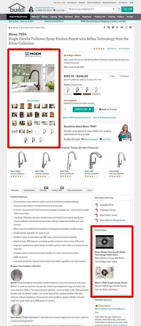
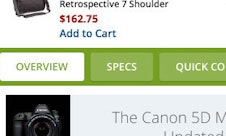
When videos weren’t placed alongside (or as part of) the image gallery, such as seen here at Build, some users had difficulties finding them. As one user said during testing, after not finding a video in the image gallery: “They could have…brought this [video] up so that I could have found this quicker.”
Our usability tests showed that users generally expect images, videos, 360° views, and similar visual content, to be placed together at the product page, because they see videos and 360° views as supplements to the product images. Hence users expect to find videos located next to the main product images on the Product Page.
Testing also confirmed the web convention of placing image galleries at the top of the product page to be a de facto user expectation. During testing, users virtually always looked at the
image gallery (even if they didn’t interact with it) when they landed on the product page. Having videos located here therefore greatly increases their discoverability.
Thus videos and 360° views should be placed at the top of the product page, mixed with or next to the product image gallery. (Note that all videos should be placed here — not just some of them. Some of the tested sites only included one video in the main image gallery despite having multiple videos available for the product — alas, some users would only ever discover the single video included in the image gallery.)
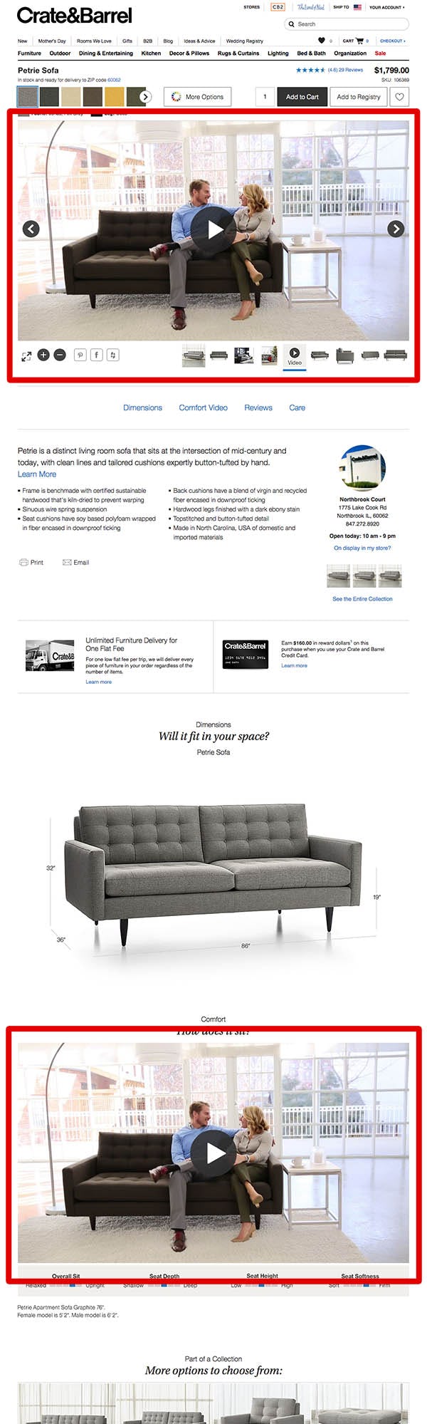
Notice how Crate & Barrel embeds the same video both in the image gallery and then again later on the product page. This is a great implementation strategy.
It’s important to note that repeating the videos elsewhere on the product page is perfectly fine. So long as the videos are also available in the image gallery, it is great to have them embedded in content sections throughout the product page as well.
How to Integrate and Design the Video Thumbnails
The short version: just mix videos into the normal image gallery thumbnails and overlay them with a “play” icon and you’re golden.

“Oh, there’s a video. This one does have a video but it wasn’t as easy…to find,” said a test user at Crutchfield who had trouble finding the two videos despite spending 15 minutes on the product page.
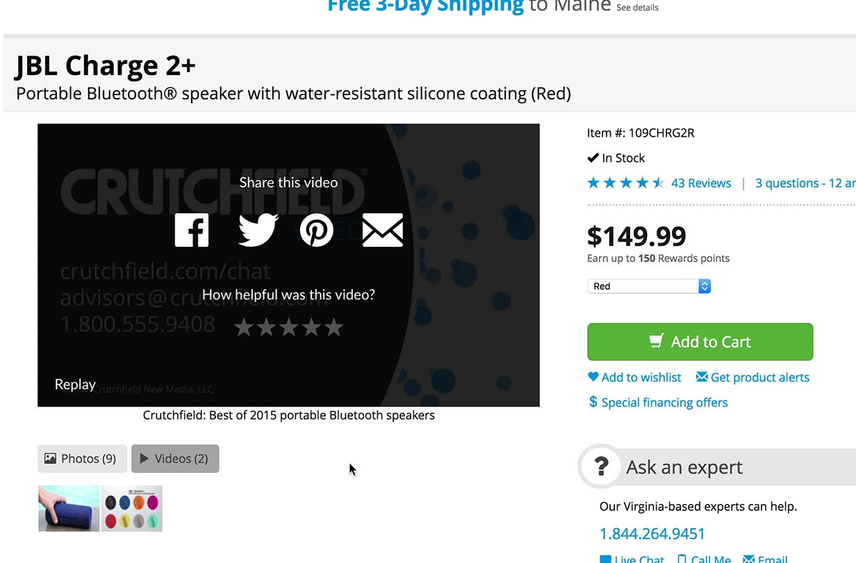
Another subject who watched one video couldn’t re-find the second, which was a thumbnail right next to the first video he watched: “I still don’t know where that first video I saw [is]. I guess it’s unimportant….” Note the lack of a “play” icon on the video thumbnails, making them difficult to distinguish from normal image thumbnails.
Don’t use tabs to separate the video and image thumbnails in the image gallery. A third of the tested users had trouble with this design. (Generally we observe that tabs often cause severe discoverability issues.)
Testing showed that there was no need to separate video and image thumbnails — users were perfectly capable of discovering and distinguishing product videos from images, as long as they had some sort of “play” icon, and were displayed next to or as part of the image gallery thumbnails.
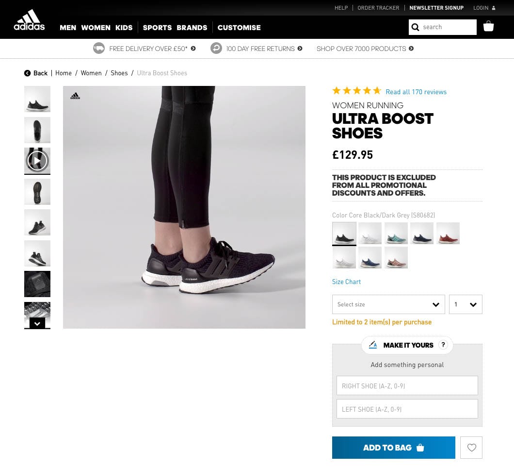
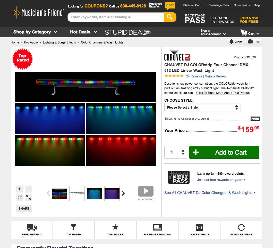
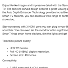
A frame from the video with a “play” icon overlaid, mixed in with the image gallery thumbnails, as seen on Adidas (left), is a perfectly good design. Also, Musician’s Friend’s approach (right) of displaying a standalone “play” icon with the text “Play Video”, worked equally well during testing.
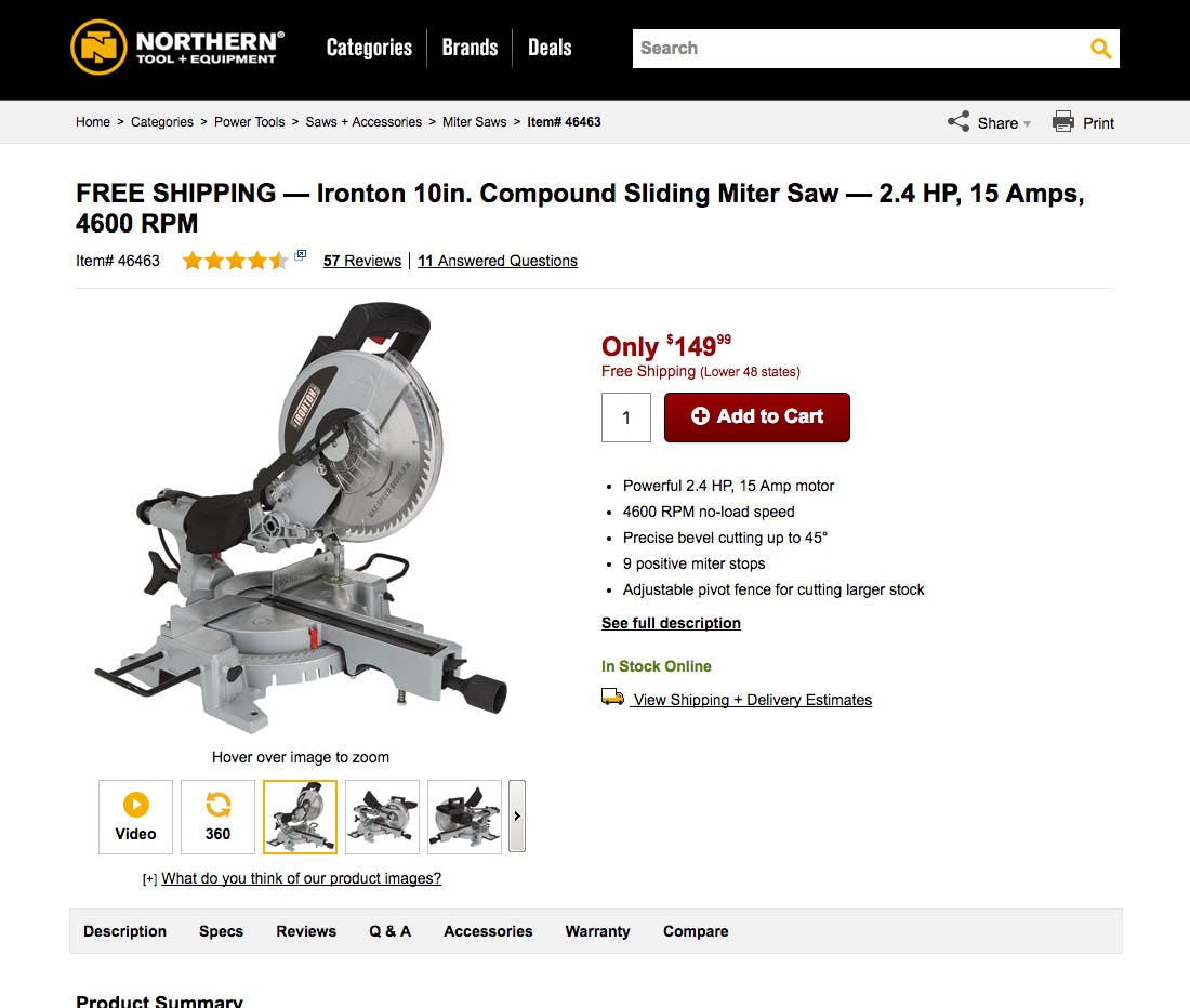
Notice how Northern Tool also includes a thumbnail for their 360° view in the image gallery. Just like for video, our usability testing revealed that users also expect to find 360° views in (or alongside) the image gallery.
As for the thumbnail design itself, testing showed that all that mattered was that videos had some sort of “play” icon. It was fine if the thumbnail also included a still frame from the video with the “play” icon overlaid, but this wasn’t necessary — a standalone “play” icon worked equally well.
So in summary, to make sure the users looking for your product videos can actually find them:
- Place videos in or alongside the product image thumbnails
- Ensure the video thumbnails have a “play” icon
- Feel free to repeat the videos in other content sections elsewhere on the product page
Not overly complicated, but better double-check your site’s implementation — our benchmarking showed that 35% of major e-commerce sites fail to get these details right.
This article presents the research findings from just 1 of the 650+ UX guidelines in Baymard Premium – get full access to learn how to create a “State of the Art” e-commerce user experience.