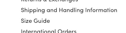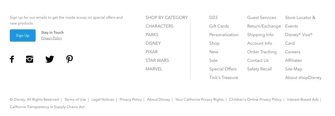
Not semantically grouping the footer links, like seen here at Disney Store, means that users has to read every link until they find what is relevant to them, rather than being able to just pinpoint the correct group of links, by reading only section headers.
Website footers aren’t exactly the most glamorous or exciting aspect of a webpage. For some sites, it’s a repository for auxiliary links that a user may need at some point. For others, it’s just a place to put things that don’t really have a home anywhere else, like ”Terms and Conditions”. Although the footer may not be considered the most important aspect of website design, the footer can actually offer a lot of help to those users that rely on it to find certain information.
Many users in our large-scale usability testing were observed to expect the footer to contain particular information or links, like the return policy or live chat. For others, the footer was used as a last resort when trying to find information that they simply couldn’t find anywhere else.
However, there are several footer designs that we in testing consistently observe to perform poorly with users. Furthermore, we observe that the nature of the issue differs from mobile to desktop. Our benchmarking also reveals that 13% of the largest e-commerce sites suffer from usability issues with their site-wide footer.
This article takes a look at the impacts of a poorly designed footer that we’ve observed during our large-scale usability testing and what can be done to avoid these issues, including;
- Users will abandon a purchase if they can’t find the information that they need.
- How dividing footer looks into distinct semantic sections helps users find information.
- Why mobile footers depend more on clear semantic headings than desktop sites.
Users Will Abandon a Purchase if they Can’t Find the Information they Need
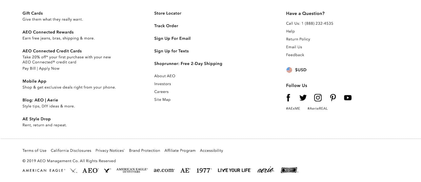
A lack of headings for footer links at American Eagle creates a disorganized appearance: it’s difficult to see when scanning the footer how links in proximity to each other are related semantically.
There are many different factors that affect a user’s buying decision — is the product the right size, is it compatible with their other products, will the site deliver in time for when they need it, how easy is the product to return, and more. Some of this information (like size or style) is readily available on the product details page, but other information is not always, and some users will have to go looking for answers before they are happy to buy anything from the site. As importantly, users that have particular concerns (like shipping speed) will often investigate this before they even start browsing for products.
Any such moment is typically crucial for the users’ buying decision: if users can’t find information that they are looking for (like a phone number for support) then they are much more likely to leave.
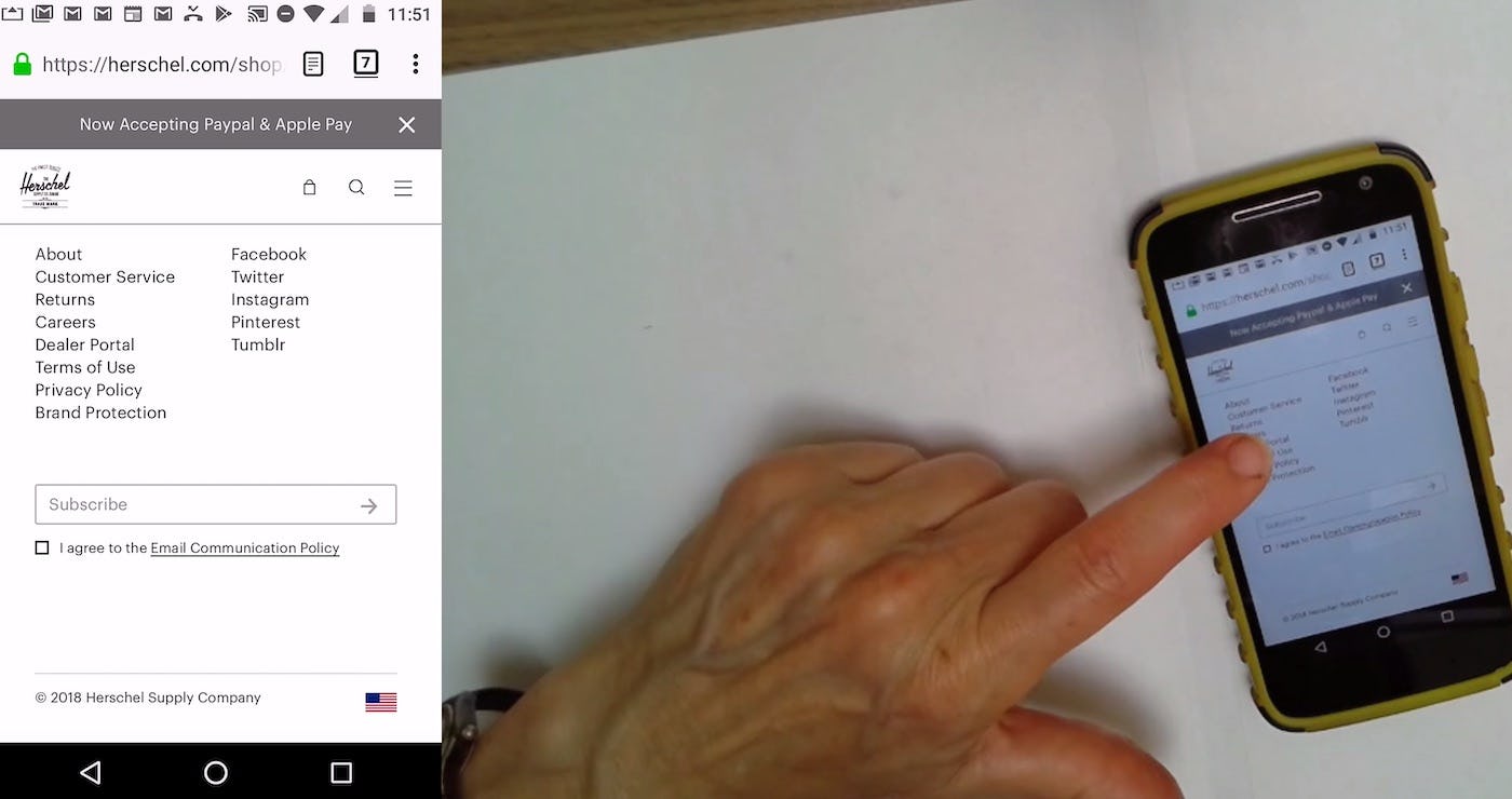
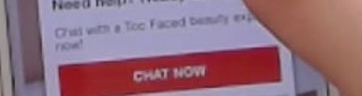
“If there were a phone number, or if there were a chat feature, I might take advantage of that…But there’s no chat, and there’s no phone number”. At Herschel, this user failed to tap the “Customer Service” link, which would have provided information she was looking for (chat and a phone number for support), and she abandoned the site. It doesn’t help scannability that customer-facing paths (e.g., “Returns”) are mixed in with paths such as “Dealer Portal” and “Brand Protection”.
Users expect to find information in certain places. For example, our large-scale usability testing has shown that when users look for things like shipping information and return policies) or live chat they often turn to the footer. They may want to have peace of mind in the event that they need to return an item or they have a question that they can’t find the answer to anywhere else. It’s therefore important that the site footer provides easy access to any information that is significant to the user’s buying decision (in particular, shipping methods and the return policy).
How Dividing Footer Links Into Distinct Semantic Sections Helps Users Find Information
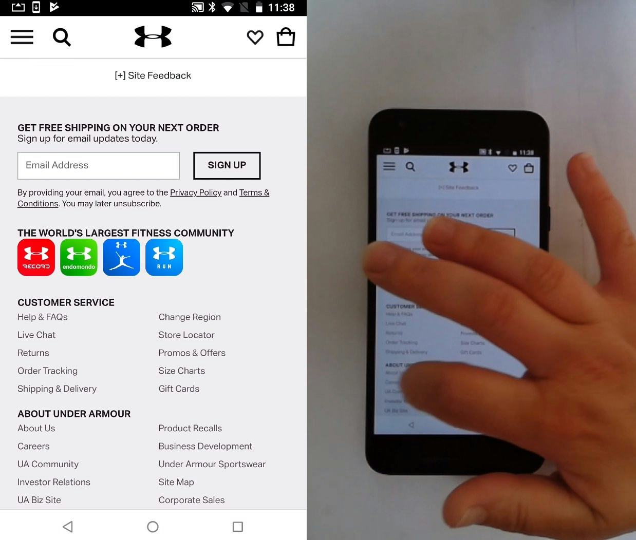
A user interested in ethics and sustainability at Under Armour goes to the footer and quickly spots the appropriate path (“About Us”). Headers help users quickly scanning the footer find the appropriate section to focus on.
Providing “easy access” via footer links boils down to making it easy for users to locate what they are looking for in the often vast sea of footer links. In practice, we consistently observe that this is best done by grouping the footer links into sections that are both 1) clearly separated visually, and 2) semantically grouped.
1) Visual Separation of Footer Links
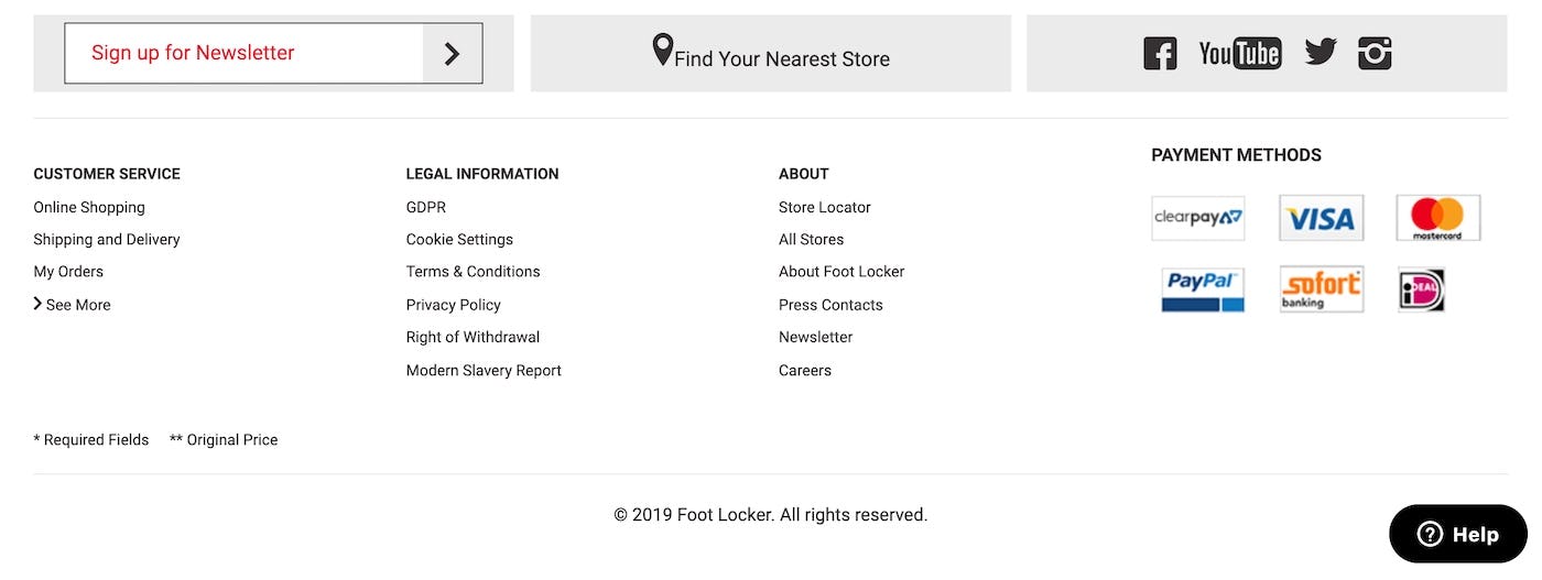
The footer links at Foot Locker are clearly visually separated. The user can now see how the information is grouped and which items are separate from each other.
Dividing footer links into sections helps break the flood of links into manageable groups that are easy for the user to scan. Visual separation is important for the user to be able to tell the sections apart. Ensuring that there is sufficient space between the groups and different styling for the headings of the group lets the user see how the information is divided.
But visual separation is worthless if the sections are poorly separated semantically — it doesn’t matter that there are four neatly divided groups if apples and oranges are still mixed.
2) Semantic Grouping of Footer Links
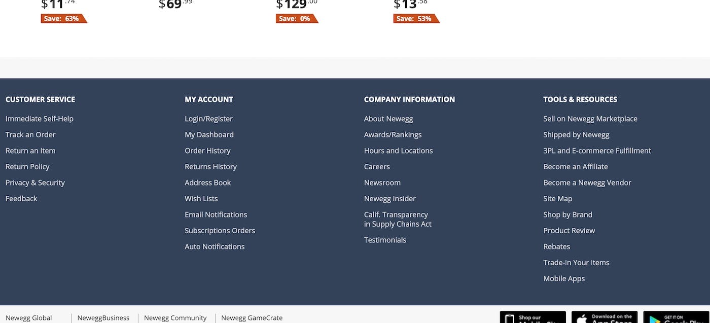
Newegg does a great job of dividing their footer links into four unique functional areas: “Customer Service”, “My Account”, “Company Information”, and “Tools & Resources”. Clear semantic differentiation between footer sections is as important as visual separation.
Semantic separation is simply grouping the footer links that relate to one another together and giving that grouping a clear heading.
Semantic division is rarely an easy task as it essentially requires you to turn a vast collection of disparate themes into a few distinguished groups. During our usability testing, users generally responded well to footers that were divided into functional areas as they often aligned well with a task-oriented mindset. For example, in the Newegg example, the functional areas mapped well to a multitude of user quests: Need help? I’ll look in “Customer Service”. Want to check my orders? I’ll head for “My Account”. Want a job at the company? Go look under “Company Information”.
That said, other types of semantic division may be a better fit for other sites with a different taxonomy and type of customers. The important thing is that the semantic divisioning aligns with user expectations — it must be logical to the typical user as to which section to look in when searching for, say, the site’s return policy. A key component of this is to avoid fuzzy boundaries where one section begins to semantically overlap with another, as this makes it unclear to the user which section to look in. Card sorting can be helpful to figure out the best semantic division for your site.
(It’s also important to remember that the user must, of course, be able to access the footer in the first place. For sites utilizing infinite/endless scrolling on search or product listing pages, this might be an immediate issue, as we discuss in our external article Testing ‘Pagination’ Against ‘Infinite Scrolling’ and ‘Load More’ Buttons.)
Optimal Mobile Footer Design Depends on Clear Semantic Headings
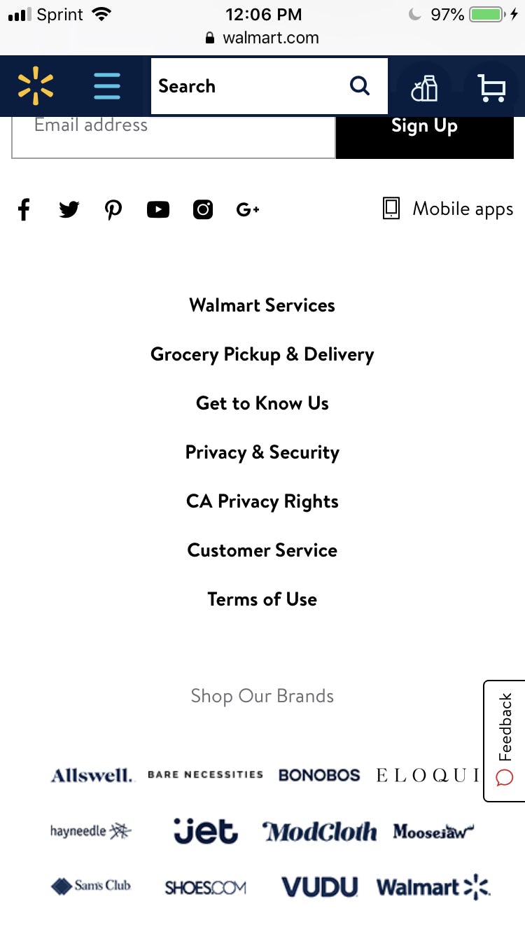
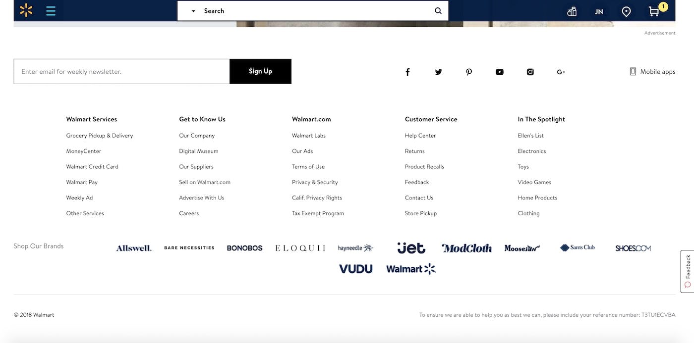
With only 7 links in the mobile site footer, Walmart has opted to forego using semantic sections — a reasonable choice given the few links available (first image). On its desktop site, however, Walmart has 30 links, and has very rightly divided them into semantic sections, with headers, making it easier for users to quickly scan the paths available (second image).
On mobile, the issue is often less severe than on desktop, as the smaller interface means that, in practice, many sites opt for having fewer links in the footer on their mobile sites, relying instead on broader categories, like in the Walmart example, above. The challenge for many mobile sites, therefore, is even less visual and even more semantic — ensuring that the link names are clear and closely match users’ expectations of where to find certain types of content and features (see Have Direct Links to “Return Policy” and “Shipping Info” in the Footer — 20% Don’t). That said, footer links should still be grouped semantically as doing so will aid scannability.
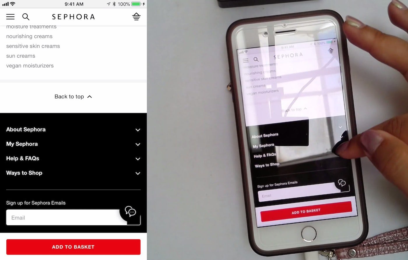
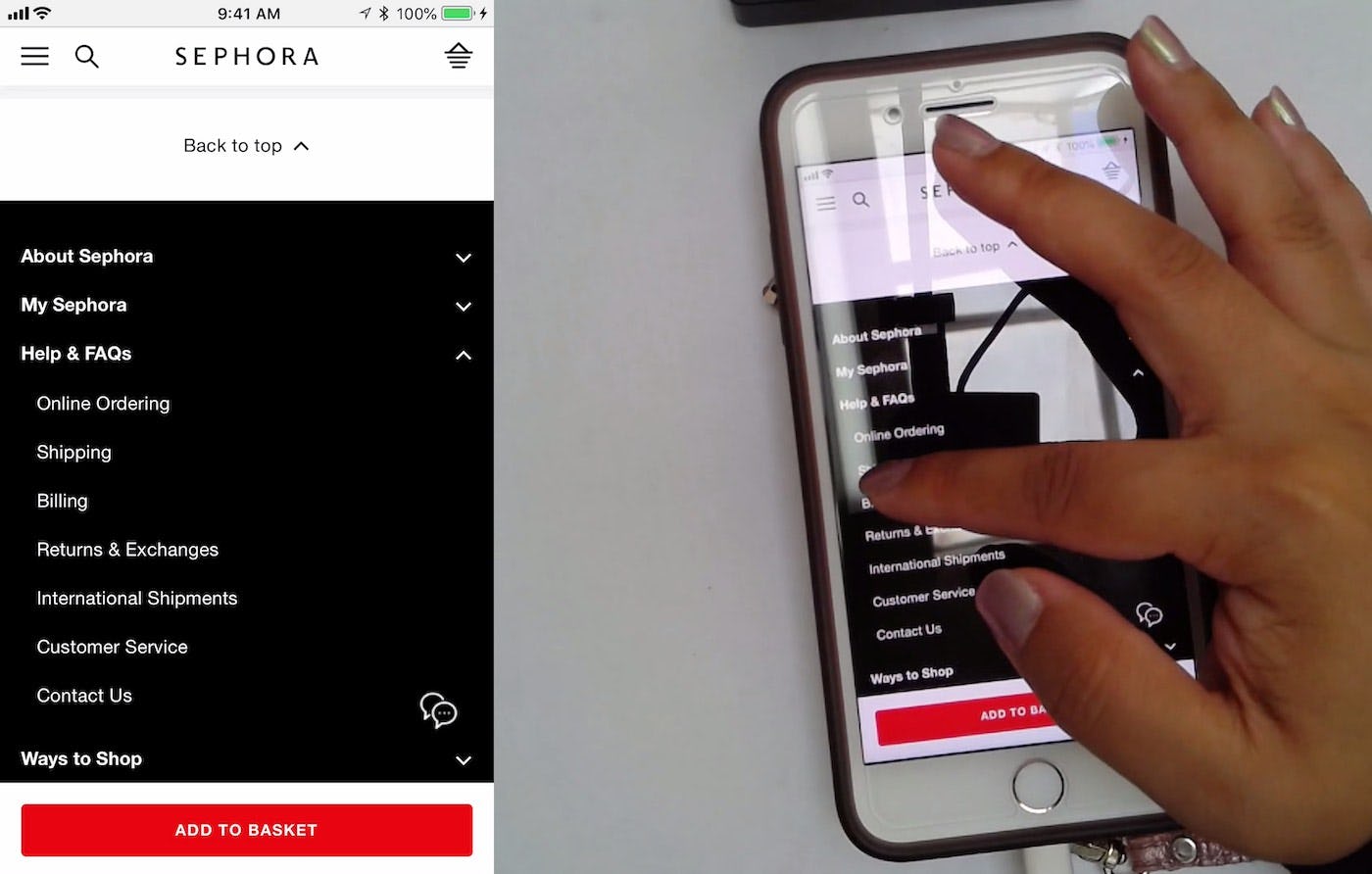
An alternative approach to displaying all footer paths by default is to nest footer paths in collapsed sections. This saves real estate and can be a good choice for mobile sites with lots of footer content. Here a user at Sephora is finding information on shipping costs by tapping the “Help & FAQs” and “Shipping” options.
Mobile sites may also consider nesting footer links and paths into collapsed sections, as Sephora do. This saves space, like seen with the Walmart example, without sacrificing access to those links from the footer, albeit nested. Again, it’s still important that the footer links are grouped semantically as the user still needs those key words and phrases to establish whether the information that they’re looking for can be found in the grouping or not.
Semantically Dividing Footer Links Improves Scannability
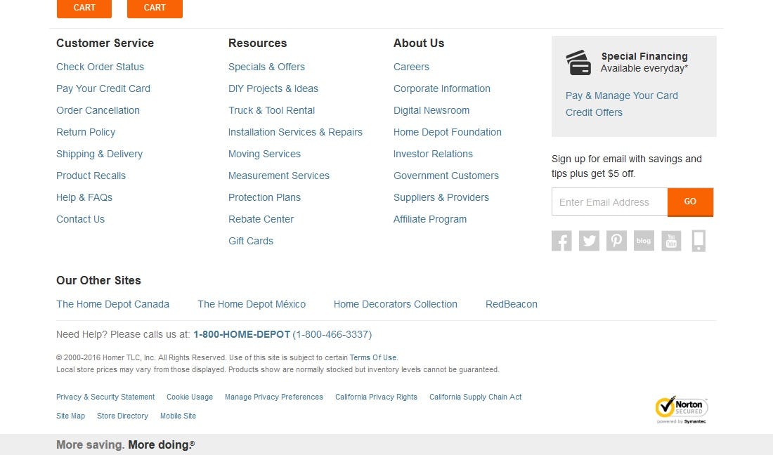
Home Depot groups semantically related links under their appropriate headers, including grouping links with “fuzzy” boundaries into a separate “Resources” header.
While not a sexy web design topic, the styling and content of a footer can actually go a long way in helping the user access pertinent information. As seen, when users are unable to find the information that is important to them, they may be forced to abandon their product search and purchase. By dividing the footer links into distinct visual and semantic sections, users are more easily able to find the information that they’re looking for — extremely important when that information has a direct impact on the buying decision.
When designing website footers, it’s important that:
- Users are easily able to access the footer and find the information that is most important to them, as not being able to do so may lead to abandonments.
- Not only visually but semantically separate your links to improve scannability.
- When it comes to mobile sites, semantic headers are especially important due to the lack of overall space.
This article presents the research findings from just 1 of the 650+ UX guidelines in Baymard Premium – get full access to learn how to create a “State of the Art” e-commerce user experience.