Updated with new data in 2024.
Many users are highly concerned about a site’s shipping costs and return policies before buying online – our quantitative study of reasons for checkout abandonments shows that return policy and shipping info are a direct cause for massive abandonments. This strong user concern was also confirmed in our more than 1,000 qualitative moderated in-lab usability test sessions.
While both shipping and return information should be available through multiple paths on e-commerce sites — for example, via the site header, on the product details page (yet, 43% of sites don’t), or sitewide search results (yet, 14% don’t) — our large-scale qualitative usability testing revealed that a subgroup of users will consistently look in the footer when seeking shipping and return information. We observe this both for mobile and desktop users, although more frequently with desktop users.
Despite the importance of direct links to ‘Shipping Info’ and ‘Return Policy’, our benchmark reveals that 20% of e-commerce sites neglect to provide a simple text link to this in their footer.
In this article we’ll therefore dive into our findings from our Homepage & Category study , Accounts & Self-Service study , and our Mobile E-Commerce study – specifically looking at our findings on:
- How Users Seek Shipping and Return Info in the Footer
- Why It’s Not Enough to Have Shipping and Return Info on the Product Details Page
- Why It’s Not Enough to Have a ‘FAQ/Help’ Link in the Footer
- What Keywords to Use in the Footer Link
Why Users Seek Shipping & Return Info
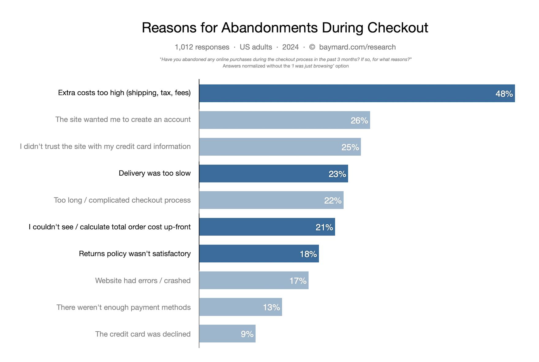
For some users, a site’s return policy is crucial to their decision on whether to purchase a product from a particular site. We’ve found that 18% of users have abandoned one or more shopping carts in the past quarter solely due to an unsatisfactory return policy (see all reasons for checkout abandonment). As one user said in testing, “Nordstrom’s return policy, I’ve never seen it matched. That is the reason I will always shop at Nordstrom. I think that seriously draws me to them.”
During testing, many users voiced their questions regarding return policies and procedures when buying online — for example, Can the item be returned? Do I have to pay for return shipping myself? How long do I have to return an item? Does that deadline include the shipping time? Answers to these questions are often central to a user’s buying decision as they need to feel confident that they can indeed return the items if there’s something wrong with them and be reassured that the return procedure will be simple and straightforward.
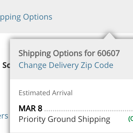
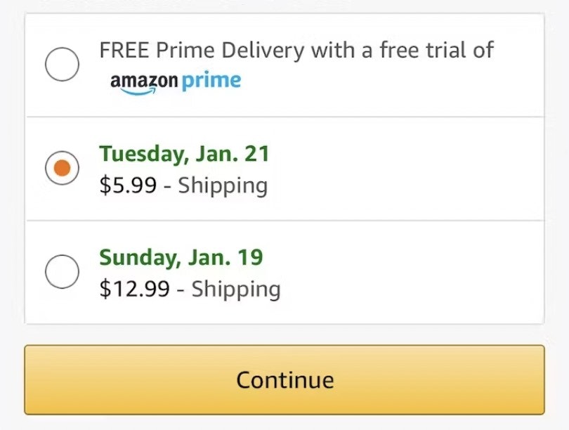
Similarly, shipping information can also be crucial for users; in particular the cost and expected delivery date. Shipping information also ties directly into users’ desire to learn about the return policy — if they have to return a product, how much will they lose on any nonrefundable shipping costs? In fact, shipping information is so important to some users that they want to know the shipping options available to them before they will even commit to adding a product to their cart, let alone entering the checkout process.
When there is no immediate path or paths to shipping information or the return policy, users must go “information hunting”, which, depending on how easy it is to find the information elsewhere on the site, results in an often substantial delay in product browsing.
It’s Not Enough to Have Shipping and Return Info on the Product Page
57% of e-commerce sites do have information on or a link to returns and shipping within the product page content itself (see Product Pages Need to Show ‘Estimated Shipping Costs’). This is helpful as we do observe that many users find and use this information here while browsing the product page itself.
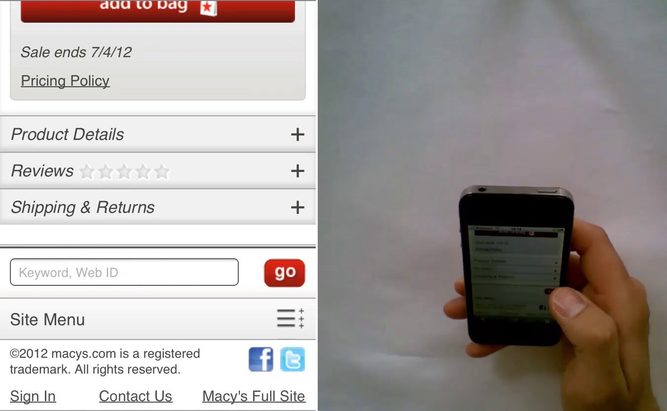
A user from our very first round of mobile test sessions immediately went to the footer when looking for the return policy. Note how he bypassed the “Shipping & Returns” section (which actually contained the information he was looking for). However the footer only had paths to sign in, contact, and a link to the full site. The footer is a strong draw for some users seeking shipping information and can be the first place they look.
However, in all of our usability testing, dating back to our first round of mobile testing in 2012 up to our most recent 2019 mobile testing, our testing revealed a subgroup of users who consistently try to find this information in the footer, even scrolling past the relevant section on the product details page that would have provided the information. For this subgroup of users the footer is mentally “the place to go” when it comes to finding information on a site’s return policy or shipping options.
Additionally for shipping, many sites advertise “Free Shipping” using sitewide banners, or in the sitewide header, but, despite the visual dominance, our testing reveals that these highlights are prone to be missed altogether by users, and thus aren’t substitutes for a direct link to standard shipping information on the product page and in the footer (see ‘Free Shipping’ Should Not Only Be in a Site-Wide Banner - 32% Get It Wrong).
It’s Not Enough to Have a ‘FAQ/Help’ Link in the Footer
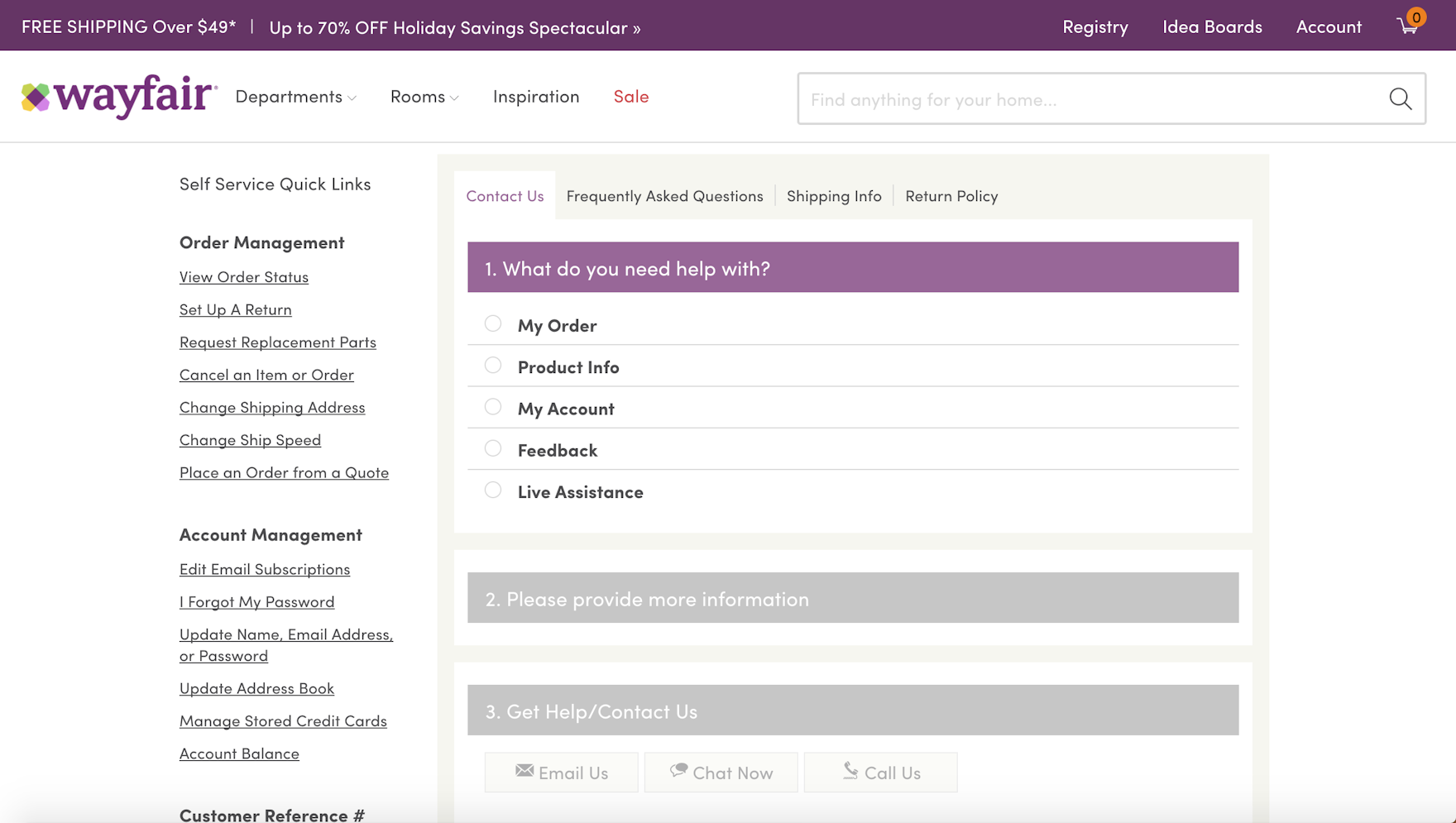
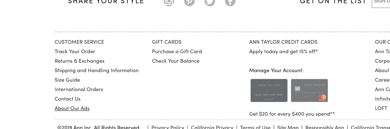
Wayfair doesn’t include a direct link to the return policy in the footer. While scanning the footer for “returns” users must instead first click the “Help” link, and then locate the return policy link.
“I go to the bottom because that’s where it usually has all those things [like return policies]”, a user explained while he — like most of the other users in our Homepage & Category and Account & Self-Service testing — scrolled to the footer when looking for the site’s return policy.
Despite the importance of return and shipping information, and despite a subgroup of users exhibiting the clear behavior of going straight to the sitewide footer, 20% of e-commerce sites don’t support this user behavior. Many sites make it unnecessarily difficult to find their shipping and return information in the sitewide footer by tucking their “Return Policy” away behind generic footer links to “FAQ” and “Help” sections, failing to have direct stand-alone links to “Shipping Info” and “Return Policy” from the footer.
(Of course, the return policy should still be featured in any “FAQ” and “Help” sections.)
What Keywords to Use in the Footer Link
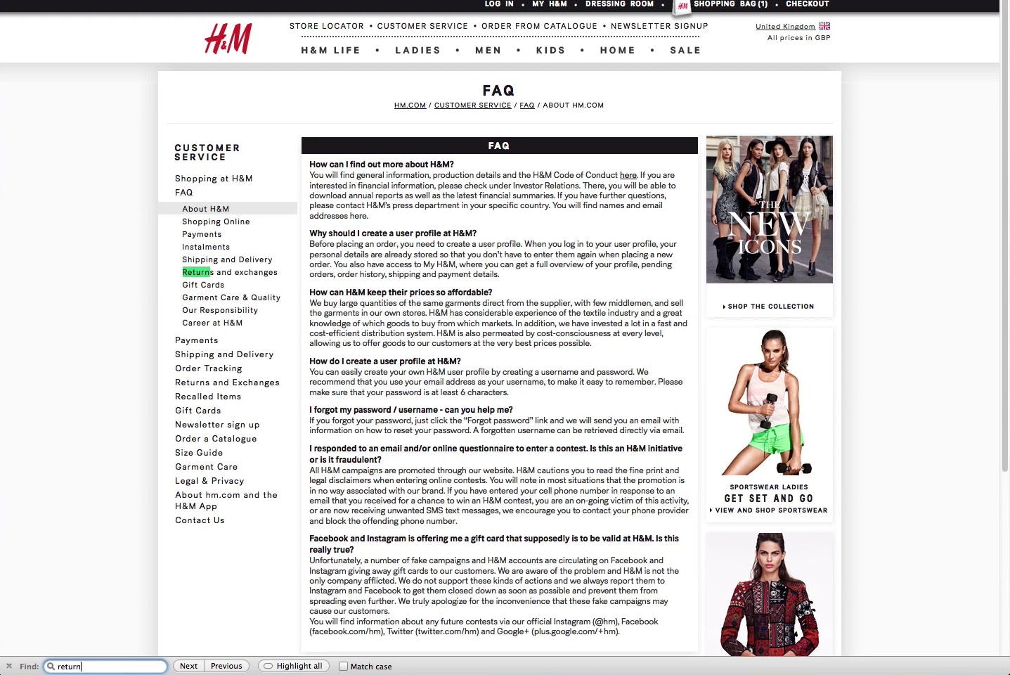
A user searched for “return” within the page using the browser’s built-in “find on page” feature — underscoring the importance of using the right keywords when linking to the return policy.
It’s also important to keep in mind the keywords that users are scanning for in the footer (e.g. “return” or “shipping”). Highly unconventional phrases such as “Don’t like it? Send it back” (instead of “Returns”) should therefore be avoided, as they won’t match the specific keywords users are looking for. If unconventional words or phrases are used users have to actually read all the footer links instead of simply scanning them until they spot the keyword that they’re looking for (or, for the more tech savvy users, use their browser’s “find on page” feature to find the keyword for them). This is also part of the reason why only having a generic “Help/FAQ” link in the footer is an issue – it impedes scannability.
With regards to finding the return policy, one issue users ran into multiple times during testing was the somewhat subtle distinction between “Return” and “Return Policy”. The former would often send the user to a page with a tool for initiating the return of an item, whereas the latter would describe the terms and conditions for returning items to the store. Keywords and clear copywriting obviously play a major role in reducing ambiguity. Labeling the two paths, for example, “Return an Item” and “Return Policy” helps, but even sites that label the links accordingly and place them in close proximity had users going to the wrong page. It’s therefore important to either cross-link the pages so users landing on the “wrong” one can easily switch, or alternatively merge the two pages so the return policy and the return tool are on the same page.
Have Direct Links to ‘Return Policy’ and ‘Shipping Info’ in the Footer (20% don’t)
Despite return policies, shipping cost, and shipping speed being among the top reasons for abandonment, and despite that a subgroup of users exhibit the clear behavior of going straight to the sitewide footer, 20% of e-commerce sites don’t support this user behavior.
It’s important to keep in mind that regardless of whether the user is on desktop or mobile, the footer is still associated by a subgroup of users as “the place to go” to find information on the site’s return policy or shipping information. While this information also needs to be directly within the product page content, shipping and return policy information should always also be accessible from the footer. Within the footer it’s not enough to just have a generic link, e.g. to “Help”. To aid scannability and findability the site would still need separate stand-alone links for “Return Policy” and “Shipping Info”.
This article presents the research findings from just 1 of the 650+ UX guidelines in Baymard Premium – get full access to learn how to create a “State of the Art” e-commerce user experience.