Links are how people navigate your site.
Which is why it’s crucial that you follow 3 basic link usability guidelines: 1) underlining links, 2) coloring links, and 3) keeping link styling consistent throughout your site.
If you break any of these 3 guidelines, you will leave your visitors guessing about how to navigate your site.
1. Underlining Links

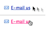
Underlined words are instantly recognized as links.
If you see an underlined word or sentence in a text online, you immediately conclude that it’s a link. This is how links have looked from day one on the Internet and everyone (subconsciously) grasp this fundamental principle.
So why would you divert from this principle? Because “it’s ugly”. Which is true, it’s not always visually appealing to have a link stand out in the middle of your beautifully crafted page. On the other hand, that’s also the very reason you underline links: to make them stand out and not look like the rest of your text so it’s clear that “this word” and “this sentence” can be clicked.
If you actually want people to click on your links, then you have to make it obvious that they can and should be clicked. Underlining text is the most universal way to indicate.
Links in menus are the exception. When you have a list of links where every single item in the list is a link, it’s OK to remove the underline. Convention has taught people to realize this and people will quickly decode the text as links. However, this requires that you at least color the links consistently.
2. Coloring Links

Blue words will typically be recognized as links.
The default link color is blue. While you should feel free to play around with different shades of blue, you should keep your links blue if you want to make it easy for your visitors to spot and recognize them as links. Especially if you don’t underline them.
When a visitor comes to your site, one of the first things he’ll do is to scan the page – especially if it’s a site where the user is to perform an action. Many users even scroll down the page and then up again to quickly get an overview. If you have ever done web usability studies sitting next to the test subject you might have noticed this tendency to scan pages.
When users are scanning your page, they will immediately be able to spot your links if they are blue, even if they don’t actually read the link text or even stare directly at the link. If you use another non-standard color for the links on your website, users won’t necessarily connect this color with “links” for the first few pages of surfing (which is often all you get from a first-time visitor).
Your users will have to learn to recognize your non-standard color as the link color on your site. You can shortcut this by using blue for your links because people mentally map this color to links.
If you do decide to break this guideline just be sure to have good reasons for doing so, like color coded menus or if you have a set of links on your page but you don’t want to call attention to such as footer links. And finally, if you do break this guideline, it will become increasingly important to follow the other link guidelines (underlining and consistent formatting).
3. Consistent Styling of Links
If you do decide to break any of the two above guidelines, then make sure that you’re at least breaking them consistently. Use the same non-standard styling on all pages.
This way your visitors will be able to learn what to perceive as links on your website and what they can regard as normal content after they’ve surfed around on a couple of pages on your site.

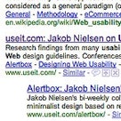
Green and washed-out gray text is links. The strong black text is not.
A great example of how wrong it can go when you’re styling links inconsistently, without underline or the standard blue link color, is AudioJungle.net (see picture to the right).
Here, when you first see the list you have no clue as to which words can be clicked and which are just normal text. In fact, you may believe all of them can be clicked, although subconsciously, following normal design principles online most users would probably expect the washed-out text not to be links – to be “disabled”.
Turns out this is not the case. On mouse hover you find that both the green and washed-out grey text represent links, whereas the strongest text in black can’t be clicked.
No Learning Curve
While all this might seem as small details they are all link conventions that have a great impact on how quickly and easily visitors can start interacting with all the great content and features on your site. And they are all guidelines that you see broken repeatedly throughout the web.
By following these 3 simple guidelines you’ll dramatically improve the usability of your site and your visitors will never have any doubts about how to navigate your site (at least not due to design decisions, bad information architecture UX will of course leave visitors confused).
Share your thoughts in a comment.