We all know and love the highlighter – but how do we highlight content online? In this post we show you 3 different approaches.
Highlights can effectively be used in web design to guide the readers attention towards specific sentences or words. It comes from the realization that all content is not equally important and that many web-users scan content instead of reading it. In essence highlights can provide a better user experience, guiding the users through the content.
However, incorrect use of highlights can dilute your message or even distort it – working directly against the idea behind driving the reader’s attention towards what’s important in the first place. So use this power carefully.
Let’s take a look at 3 different methods for highlighting text, and when to use each method and when not to.
1) Bold, Italic, Underline

Highlight styles: bold, italic, underline.
These three methods of emphasis are used wide and far.
The use of bold immediately catches the eye. The reason for this is that the larger amount of black leads to a higher contrast, which works like a magnet for eyegaze. The amount of noise it creates is relatively low compared to the effect of the highlight.
Using italic creates a very subtle effect. While it adds almost no noise to the design it also attracts almost no attention, except when focused on directly. Therefore italic is good for highlighting keywords that are important only for the specific sentence, and not as a highlight technique to draw attention when scanning. In smaller sizes, italic is often less legible as there’s too little weight to provide proper contrast.
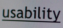
Using underline can give as much attention as using bold, however, it also adds a significant amount of noise to the text and overall design. Therefore you should think hard about how much noise you want to add to your design before deciding to use underline as your highlight method. Furthermore in web design the use of underlining should be reserved for links as web-users in general have a mental model of underline = link.
2) Changing fonttype

Highlight styles: uppercase, font family.
Another option for highlighting is using a different typeface.
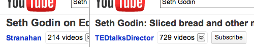
One method is by using UPPERCASE - which works well, especially when highlighting a single word (preferably short). When uppercasing multiple consecutive words the sentence immediately gets very difficult to read. You should be aware that uppercase is also often interpreted as being yelled hence it can come off as aggressive.
Another method is to change font family entirely. This approach can work well if you change the font of an entire headline. For highlighting words or sentences inside a text this method is difficult to use, as the right balance between detectability and not hurting the overall aesthetics is hard to achieve.
3) Color

Highlight styles: text color, background color.
The third method is to use colors. Once again, there’s multiple ways to do this.
One way is by changing the font color itself. This increases the detectability, especially on text-centric sites, where there are few colors or other graphical elements in close proximity to the text. The downside of changing font color is the same as with italic: it reduces the contrast (compared to black text on a white background), and therefore makes it harder to read. The darker the color is the less notable the effect is, as it no longer stands out from the general text. When using this method then only have a few different colors, and generally use desaturated colors.
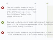
Another approach is to use a text background color as a highlight. This has the same benefits as changing font color, since a color within an otherwise black/white interface instantly demands attention. The trick here is to generally choose very light, desaturated color, so it won’t hurt the contrast. This technique is also the one that works best when large parts of a text needs to be highlighted, as it turns into more of a graphical background element than a change to the text, and therefore introduce less text-noise (although the overall design noise can of course still be considerable).
Rule #1 for Highlights
Highlight sparsely. Otherwise it’s no longer a highlight, but merely a noisy text style.
As a rule of thumb max 10% of your content should be highlighted. The less you highlight, the more attention your highlights will receive.