I previously wrote about links and the visited state. This post is about links and the hover state – what it is, why it’s important, and how to use it.
What is the “Hover State”?

Highlight the link content and change cursor to indicate a clickable link by utilizing the “hover” state.
A link’s hover state is activated whenever your mouse is located over the link, “hovering” it. This is also known as the “rollover state”.
When your cursor changes from the normal arrow to a hand, it’s typically because the “hover state” is activated.
Why is it Important?
Links are your navigation. Whenever you make a change to your site’s links, you’re effectively changing the way people navigate your site.
There are many reasons to pay attention to the hover state of your link – here’s the 3 best reasons:
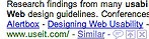
- The hit area (the area where the hover state is de/activated) change from link to link – using the hover state you can inform your users whether their mouse is over the link’s hit area or not.
- It can help underscore the “clickability” of a link. If you for whatever reason have decided to remove the underline from your links (btw, we do not recommend this), you can use the hover state to let your users know that this content can indeed be clicked.
- If you use a stacked navigation (vertical menu), the hover state will let your users know which menu item they are about to click. If there’s no highlight of the actual content, it can be near impossible for a user to determine which item she is about to click when the mouse is located in between two options.
Conclusion: Highlight Link Content
You should always highlight the actual content of the link. A cursor-change from arrow to hand is not enough (this won’t help the user identify which link she is actually hovering).
We recommended a strong and clear highlight. A color change is good, but you’ll want to change the contrast too (preferably to something brighter) so color-blind people can easily notice the change too.
If your links are bold by default, keep them bold. If your links are normal weight by default, keep them that way. Changing the weight of your font can cause the entire layout to shift which is obviously not desirable.
Do you have any tips on how to format these most fundamental aspects of a site’s navigation?