Key Takeaways
- Mobile users rely on the main navigation to understand the product catalog and zero in on products
- But 33% of mobile sites in our e-commerce UX benchmark make it overly difficult to use the main navigation for product finding
- Exposing product categories as top-level main navigation items alleviates the issue for most users
Mobile users can generally access main product categories using navigation menus in two ways:
- Directly from the main navigation menu, where each category is exposed by default
- From the main navigation menu, but nested under a single navigation item like “Products” or “Departments”
During testing on mobile sites with the second implementation, some participants found it challenging to simply start browsing products.
Indeed, while seemingly only a minor increase in friction, testing revealed that nesting the main product categories in the mobile main nav can lead to users abandoning navigating the site via the main navigation (e.g., in favor of search).
This can have severe consequences — for example, if users’ search queries are suboptimal, or if the site’s search engine itself is low-performing, there’s an increased likelihood that users will fail to find a suitable product.
Despite the consequences, our e-commerce UX benchmark reveals that 33% of mobile sites fail to make the product categories the top-level items in the mobile main navigation.
In this article, we’ll discuss the results from our large-scale testing and Premium research findings regarding the organization of the mobile main navigation menu items:
- Why nesting product categories under a “Shop” or similar link leads to increased difficulty when users try to use the mobile main nav to access product lists
- How listing product categories as top-level items in the mobile main navigation alleviates this issue
Why Nesting Product Categories under a “Shop” Link Hurts Navigation Performance on Mobile Sites

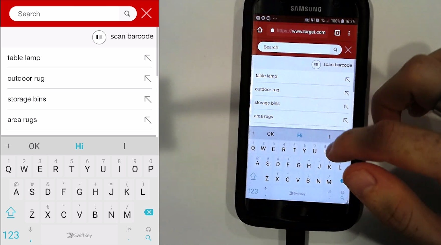
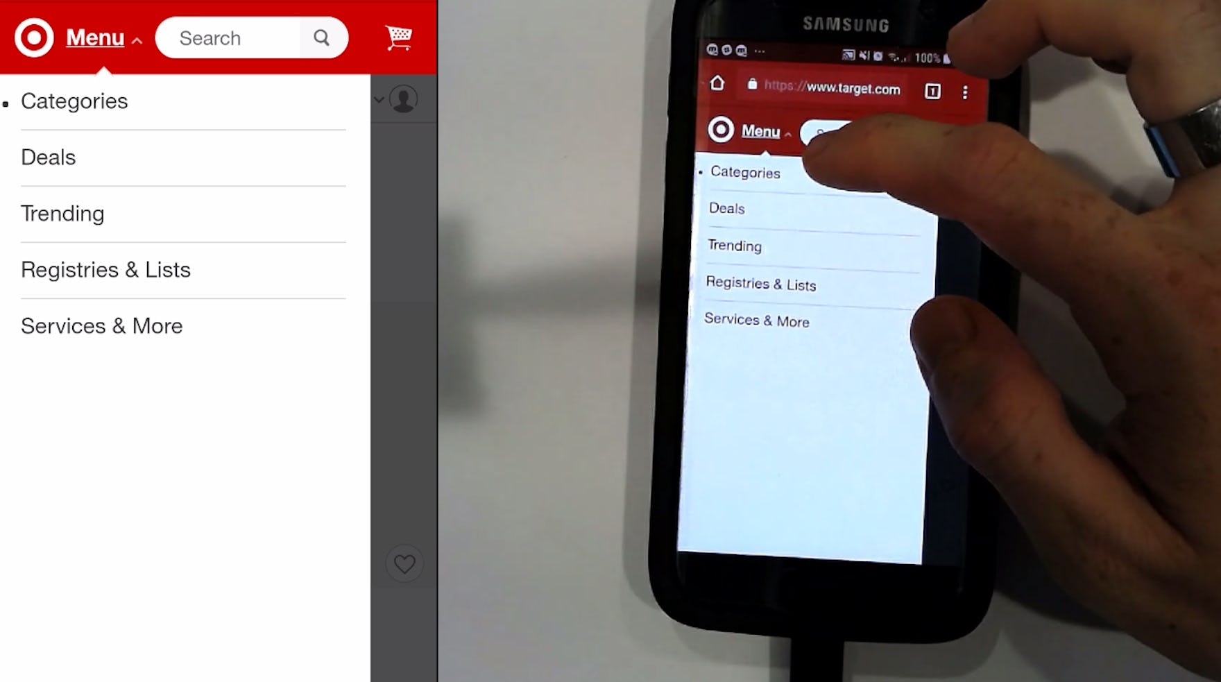
“This is very confusing.” A participant at Target opened the main navigation (first image), scanned the options, and decided to search instead (second image). There was no immediate entry point for users looking to browse products, as all product categories were collapsed into “Categories”. Furthermore, note the white space — product categories could easily have been provided to help users get started browsing products.
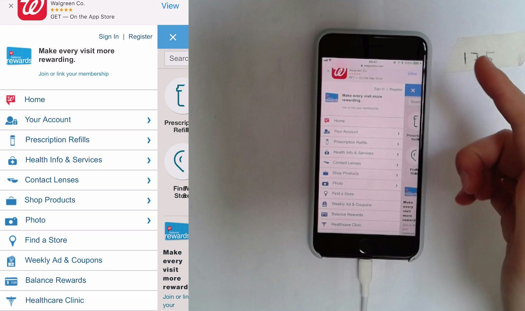
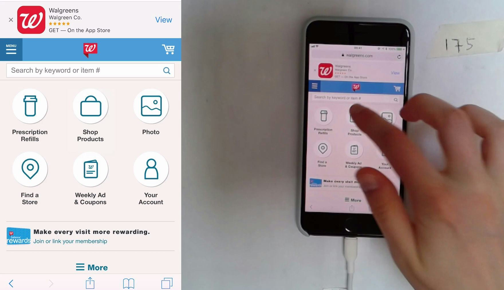
“I was looking to see if there was a skincare section again. Like there was at Macy’s.” A participant at Walgreens opened the main navigation (first image), scanned the options, then closed the main navigation and selected “Shop Products” on the homepage (second image). Note the same path existed in the main navigation, but she didn’t select it there. When the main navigation is crowded with many other secondary paths, mobile users find it difficult to begin browsing products.
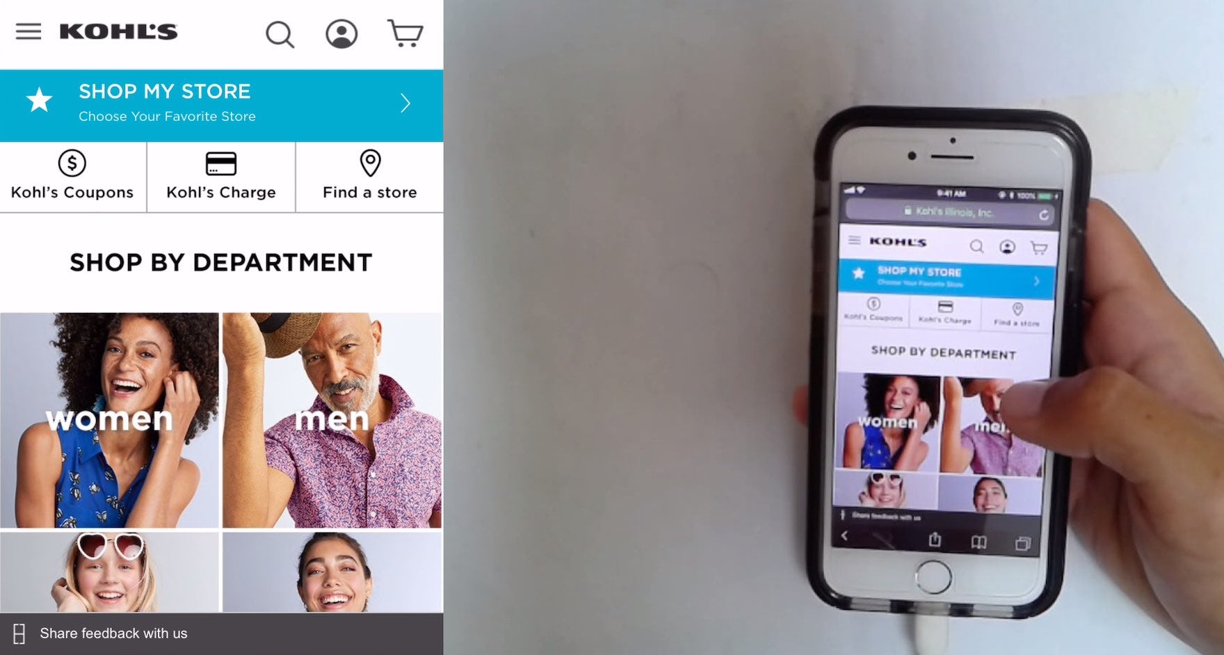
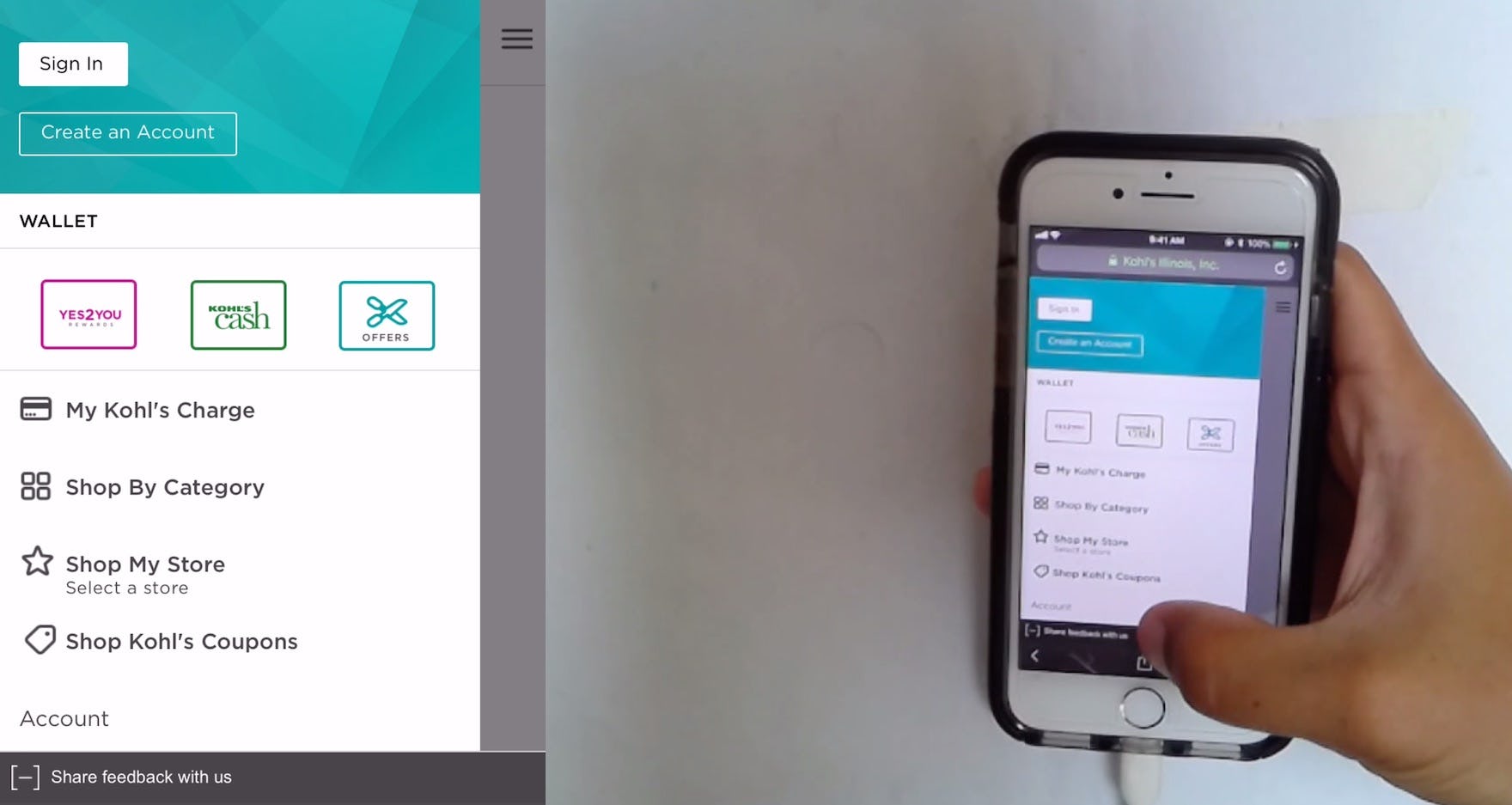
“Whatever this is here [the homepage categories] should be where that is [in the menu].” A participant at Kohl’s expressed his desire to have the product categories, which were available on the homepage (first image), immediately accessible in the main navigation (second image).
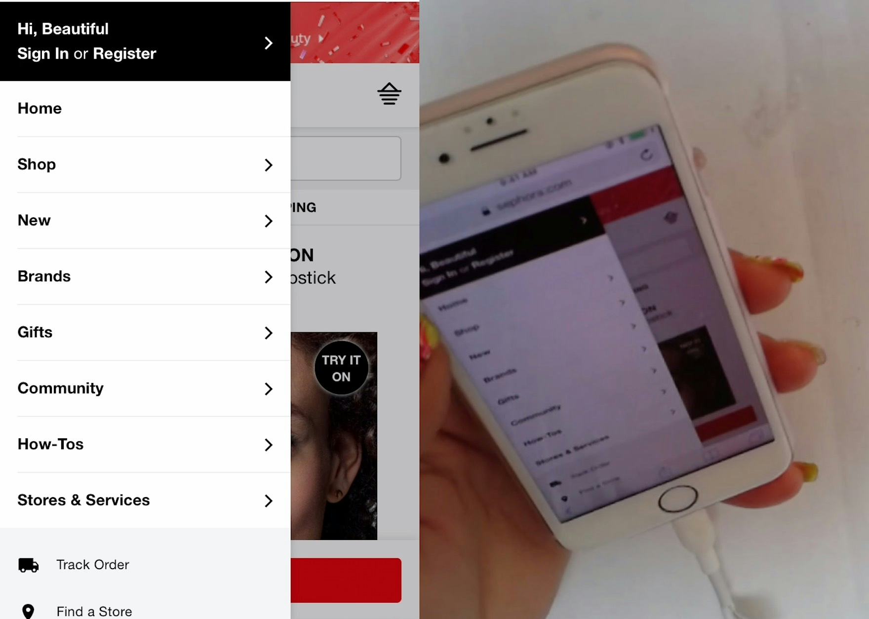
“How do I use this website?…I don’t even know how to use their website. You saw how quick I could use Walmart. I can’t use this website.” A participant at Sephora puzzled over the top level of the main navigation before eventually selecting “Shop”. For many users, there’s no obvious path to begin browsing products when the product categories are collapsed behind a single link like “Shop”.
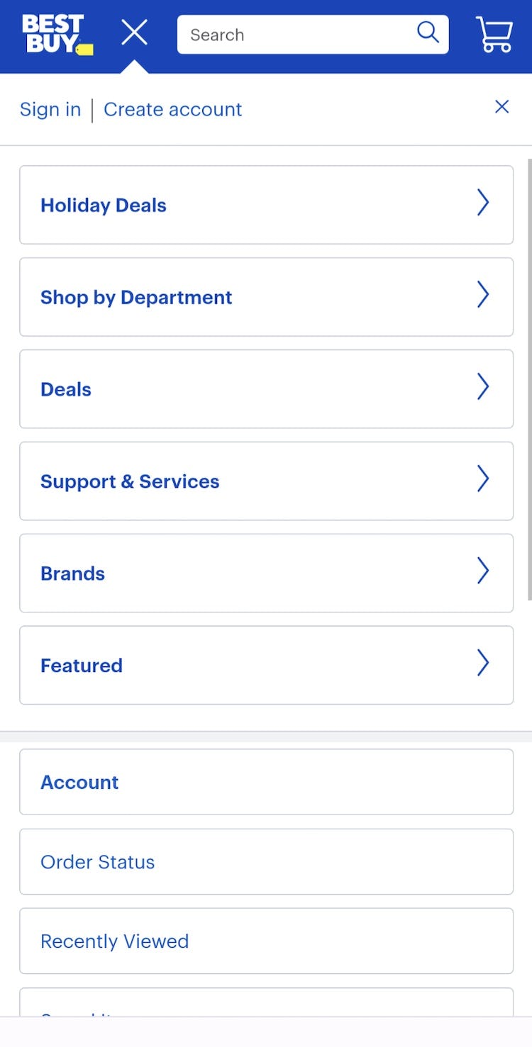
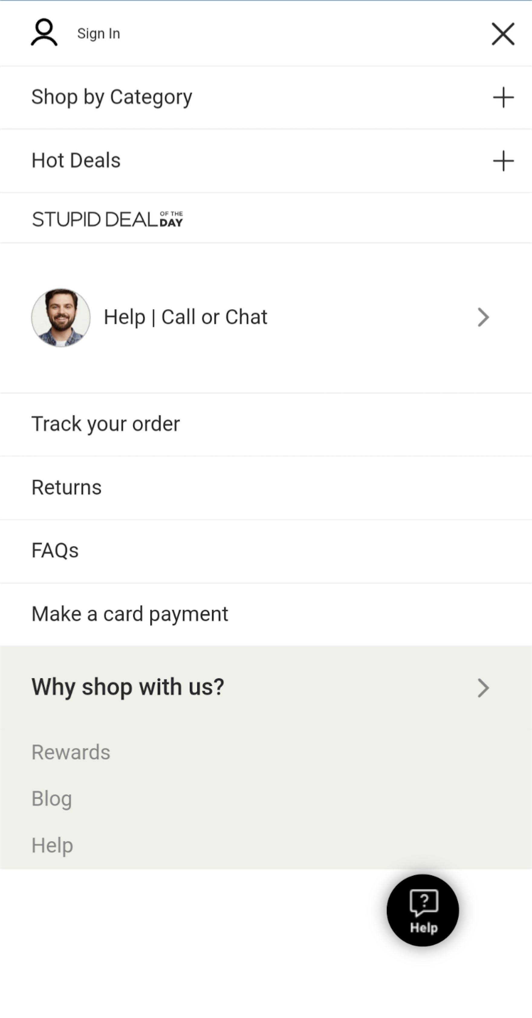
Many users will be delayed when starting browsing on Best Buy (first image) and Musician’s Friend (second image) because the main menus don’t show top-level product categories by default.
When it comes to site navigation, mobile users are typically at a disadvantage compared to desktop users, as they lack the overview provided by, for example, a hover-based drop-down navigation available to desktop users.
Indeed, rather than being able to quickly hover main navigation menu items and see product categories and subcategories expand, mobile users must make a decision and take a more laborious action — tapping a menu item — when browsing the main navigation.
If it’s not immediately obvious where to begin viewing product categories, a subgroup of users will decide to abandon the main navigation in favor of using search or trying to navigate to desired categories using the homepage.
Indeed, testing revealed that many mobile users are impatient and will close the main navigation if confronted with secondary navigation options such as account sign in, help, product guides, etc. that are displayed on the same level as product categories.
As a consequence, these users are forced into a secondary navigation strategy that may be less suitable for them — with the end result being they’re unable to find a product of interest.
List Product Categories as Top-Level Items in the Mobile Main Navigation
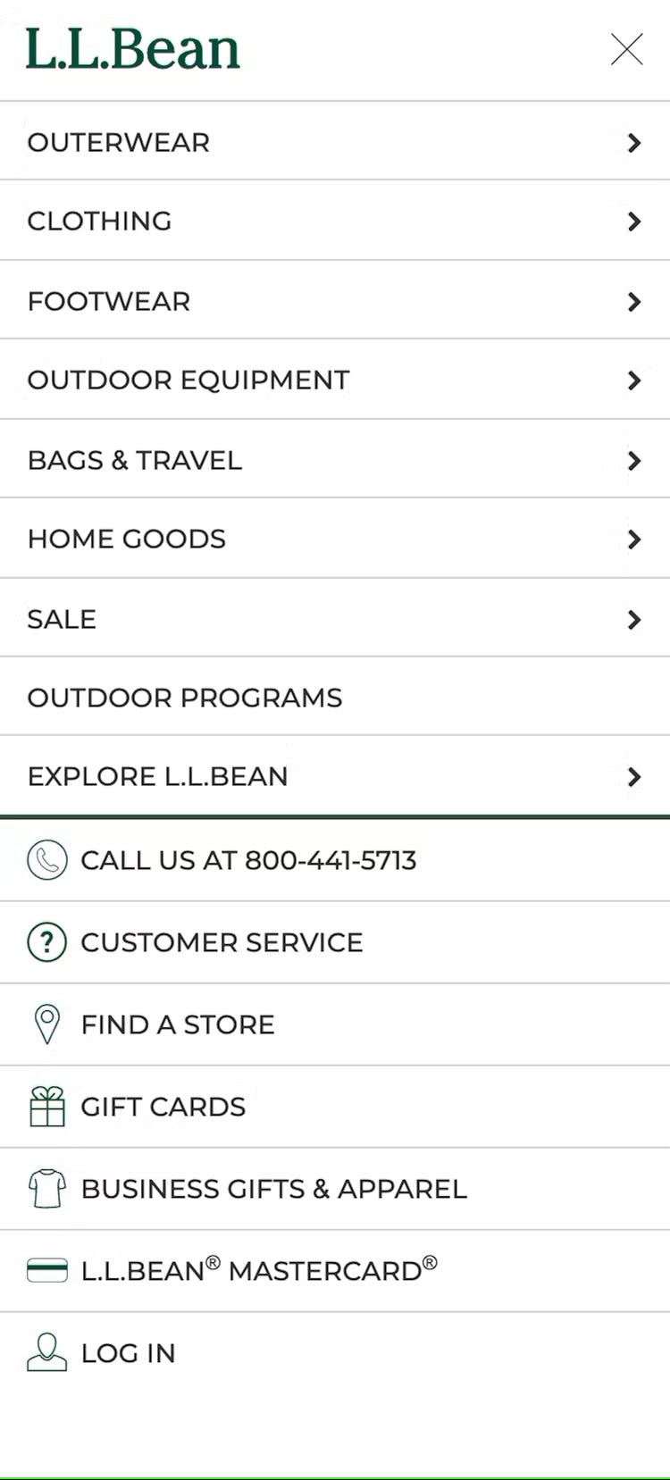
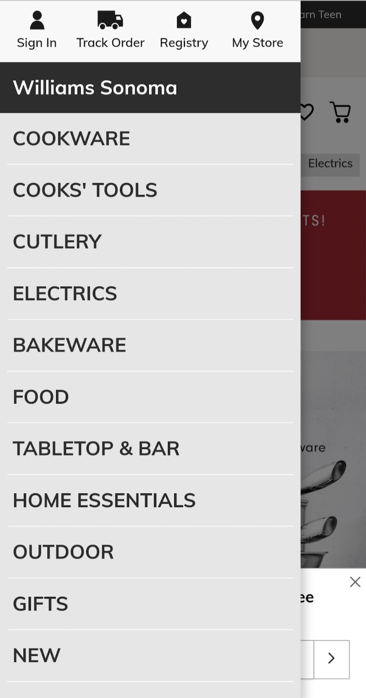
At L.L. Bean (first image) and Williams Sonoma (second image), product categories are immediately visible when the main navigation is opened. Users can thus begin immediately searching for suitable products.
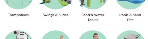
The solution to the issue described above is straightforward: listing product categories — for example, “Men’s”, “Women’s”, “Kid’s” or “Laptops”, “Headphones”, “PCs”, etc. — as top-level items in the mobile main navigation.
Listing product categories as top-level items allows users to begin browsing for products as soon as they open the main navigation.
Moreover, users unfamiliar with a site can quickly infer the types of products offered on the site — and thus quickly get a good overview of the product catalog.
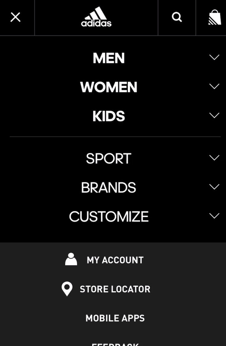
At Adidas, “Men”, “Women”, and “Kids” are immediately available as top-level main navigation items, while thematic and account navigation options are listed below.
Note that this isn’t to say that product categories should be the only items in the main navigation.
On the contrary, many sites will find it important to include other navigation options as well — for example, “Store Locator”, “Contact”, “Sign In”, “Track Order”, etc.
Testing revealed that it’s fine (and often beneficial) to include these items in the main navigation — as long as they’re styled distinctly from product categories, and the visual hierarchy makes it clear that these are, for most sites, secondary options for users to consider.
For example, this could mean placing secondary options below the main product categories, in a reduced font size, and preceded by a separator.
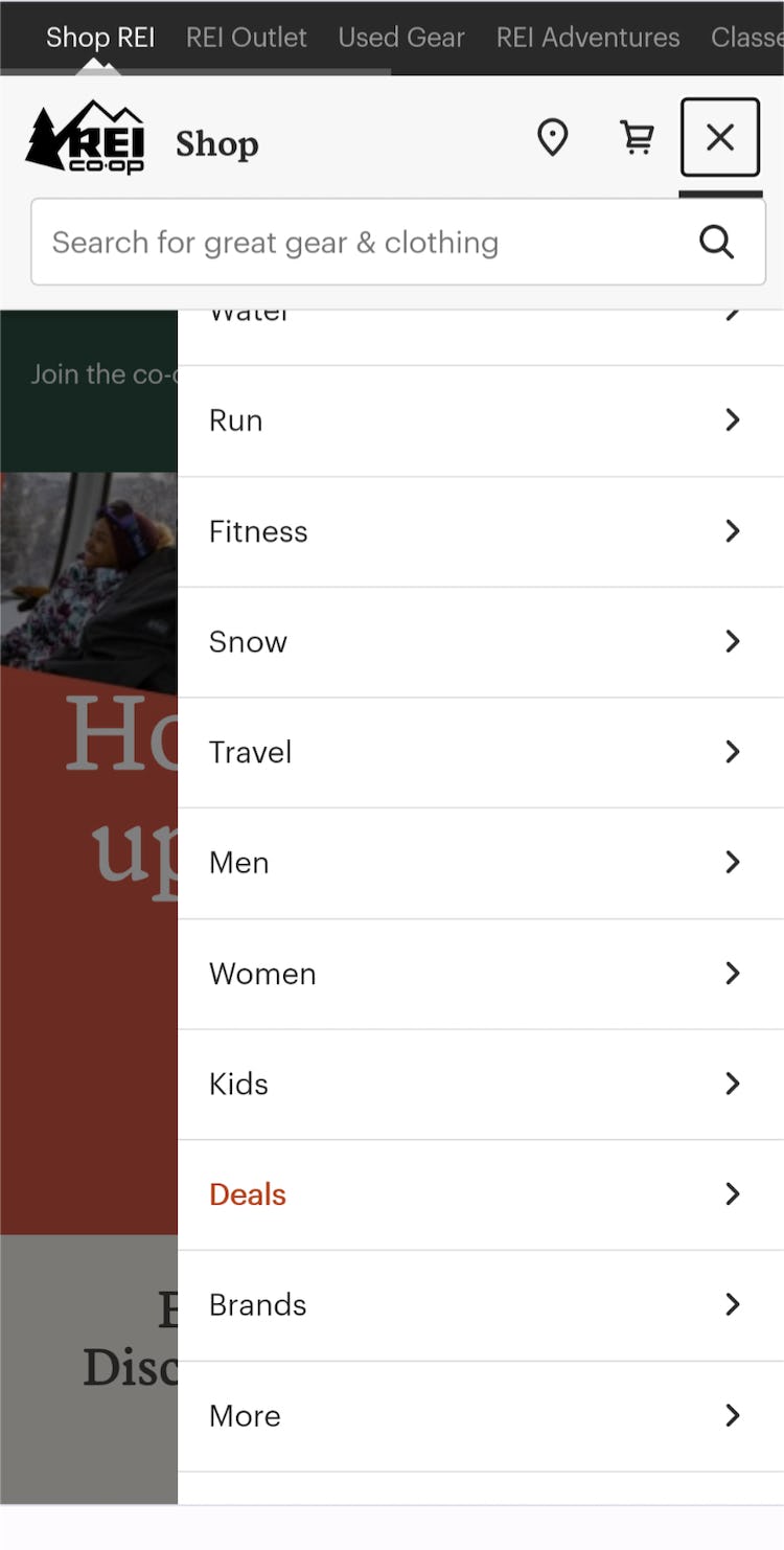
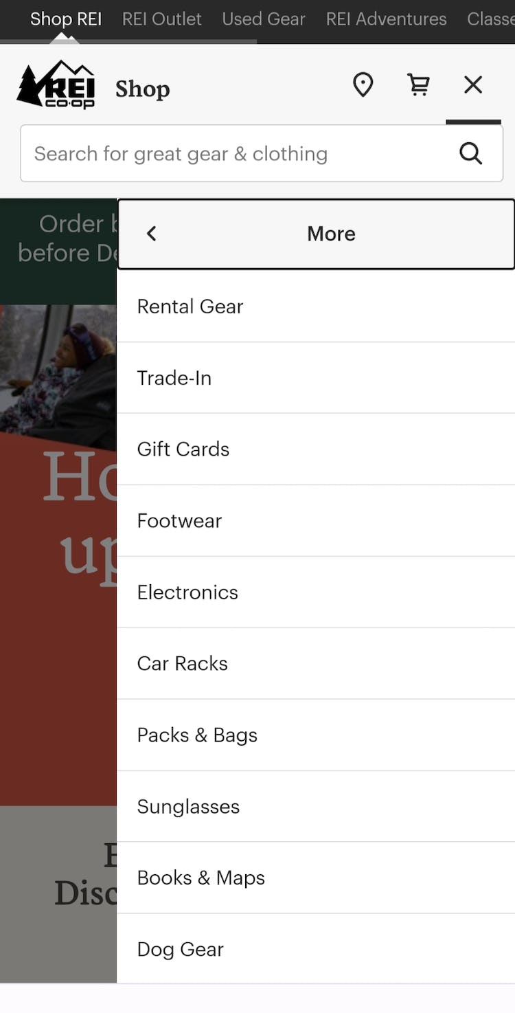
Sites with many categories, like REI, may struggle to fit all of them in the main navigation menu. One solution to this issue is to display the most popular categories by default in the menu — while providing a “More” link (first image) that enables users to access the others (second image).
Additionally, sites with a large number of top-level categories can display the most important ones by default in the menu, with others available behind a “More” link.
That way, most users will get to where they need to go with just a single tap from the menu, while others can get to less-important categories with just one extra tap.
With this implementation, there is little chance of users not knowing how to start browsing, regardless of the amount of product categories a site offers.
Consider Also Listing Product Categories as Top-Level Items in the Desktop Main Navigation
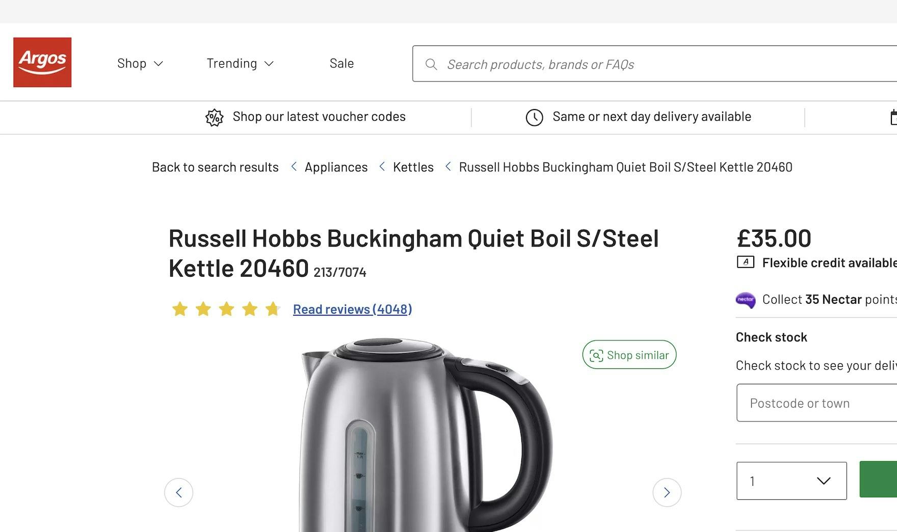
Users landing on this product page would have to hover the “Shop” menu to get an idea of the broad range of items they could buy at Argos (UK). Therefore, if this product is unsuitable, they may not be inspired to purchase something else from a different category or subcategory.
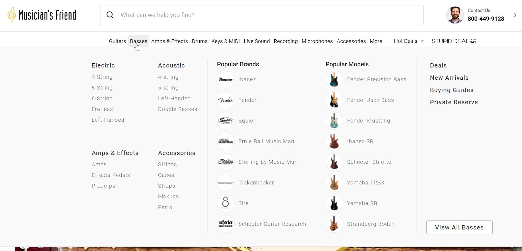
On the other hand, the top-level categories on Musician’s Friend, like “Guitars”, “Basses” and “Amps & Effects”, are exposed in the first level of the main navigation, allowing users to immediately click on each category to show the relevant subcategories.
Note that, while exposing the product categories in the main navigation provides the most benefit to mobile users, desktop users can also benefit from seeing the categories by default.
While testing made it clear that desktop users will find it much easier to navigate the increased friction of a “Shop” or similar top-level menu option, providing the product categories will help a subset of desktop users quickly infer the site catalog and use the navigation more efficiently.
Additionally, having the product categories as top-level items on desktop sites matches the ideal mobile implementation — providing a more seamless mobile-to-desktop experience (e.g., for users who shop on mobile and then decide to complete a purchase on a desktop computer).

“I think I would start with a face wash or face scrub.” A participant on Maya Chia used the “Shop” menu to easily navigate to her desired subcategory. Well-organized “Shop” menus can be a viable design pattern for sites with a very small and homogeneous product selection.
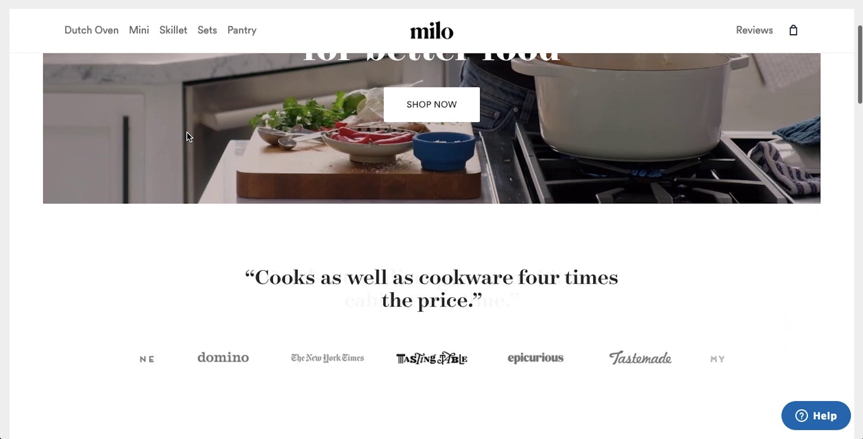
“So we’ve got ‘Dutch Oven’, ‘Mini’, ‘Skillet’, ‘Sets’, ‘Pantry’”. Of course, surfacing product categories — or even individual products — as the main navigation categories on DTC sites provides similar benefits as on larger retailers, as shown by this participant on Milo.
Finally, note that on small catalog sites desktop testing showed that a “Shop” top-level main navigation option wasn’t any hindrance to participants, likely due to the vastly less complicated category taxonomy required for such sites, and thus it’s even less important that product categories be visible in the main navigation.
Help Mobile Users Quickly Find Where They Need to Go
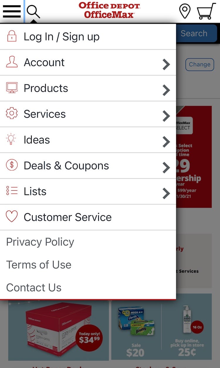
The cluttered main navigation at Office Depot — where “Products” are at the same level as “Ideas” and other much more secondary content — will hinder users who are simply looking to find suitable products.
To avoid having some users stall immediately as they get started looking for products, it’s key to reduce navigation friction by providing product categories as top-level mobile main navigation options on mobile sites.
Otherwise, as observed during testing, some users will open the main navigation only to quickly close it, overwhelmed and confused by the options provided to them.
Desktop sites should consider also exposing the product categories in the desktop main navigation — though testing revealed that, as opposed to mobile users, desktop users were likely to only experience a small hiccup, rather than a serious disruption, in their navigation.
Avoiding this pitfall — which 33% of sites in our e-commerce UX benchmark stumble into — will help mobile users quickly understand the product catalog and get started looking for the right product.
This article presents the research findings from just 1 of the 650+ UX guidelines in Baymard Premium – get full access to learn how to create a “State of the Art” e-commerce user experience.
If you want to know how your website performs and compares, then learn more about getting Baymard to conduct a UX Audit of your site.