This is the 6th in a series of 8 articles on mobile usability that draw on findings from our mobile e-commerce usability report.
When displaying search results and category lists on mobile sites & apps, users often simply have no idea where to tap in order to select a given item / product.
Can the entire “element” be tapped? Or is it only the product title? And what about the thumbnail? During the mobile commerce test sessions multiple issues arose as subjects were unsure of where to tap in order to select a given option in a list, what was even “tappable”, and where a link would take them when they tapped an area. Some even got completely stuck and, without knowing how to proceed, were unable to complete their purchase.
Lack of Hover State on Touch Devices

On touch devices users lack the subtle but crucial mouse hover states which provide instant indication if something is clickable or not. Often by changing the cursor from a pointer to a hand, changing link color, showing the destination url path (depending on browser), showing a link title, or by changing the visual appearance of entire elements by using a change in background color, borders, or even images.
But with touch devices’ lack of hover state these indications aren’t available to the user and interfaces must instead either be learned by trial-and-error (a sometimes acceptable trade-off for frequently used games and productivity apps) or the interface must at all times make it clear what is and isn’t clickable (clearly designed links and buttons). This proved a major problem during user testing of the mobile sites; especially on complex, navigation heavy sites such as mobile commerce sites.
A good example is inconsistent link styling. This is certainly a problem on Desktop sites too, but it is much worse on touch devices as users don’t have the hover state to assist them in clearing up hit area confusion (as previously mentioned, the problem was so severe in some cases that it lead to purchase abandonments). On Desktop, if the user is in doubt, they can hover the area with the mouse and get instant feedback on whether the area is clickable or not; on touch devices, users don’t have this affordance.

Note the very inconsistent link styles. Sometimes orange was used as a header, other times as a list item. Sometimes the separators were used to indicate a list item, while other times again it was used to separate elements of text. Some text was one shade of blue which sometimes meant it was a link but at other times didn’t, with some links styled in a different, darker blue and underlined. Confused yet? The test subjects were too.
Multiple Hit Areas Within the Same Visual Element
One particular issue that was observed at many of the test sites was when list items (e.g., a list of products within a category, a list of movies at a specific theater, or a list of different departure flights to choose from, etc) had multiple hit areas invoking different functions. The subjects were simply unable to determine which of the multiple elements they should click, and in most cases did not realize they lead to different places or invoked distinct features.

At Fandango, after having selected a specific movie to watch, users were shown the above list of theaters with specific show times. Here’s how the subjects interacted with the list:
- 40% first tapped the showtime they wanted (notice where the subject is tapping), but the showtimes are not clickable. (Also note how the blue “Share” link is clickable, whereas the blue “Digital” label is not.)
- The spatial indicator (the arrow pointing to the left) is also problematic. Although it is often used to indicate an entire element is clickable, here the arrow is vertically aligned with the theater header. If a user clicks the arrow or the header, they are taken to a generic list of all movies at that specific venue - despite being within a specific movie scope. Another 40% did that and were taken to a page that did not make sense to them.
- Only 20% hit the “Buy” button on the first attempt.
That’s an 80% failure rate! Quite simply, it’s very confusing to users when a single visual element has this many different (interactive and non-interactive) hit areas. Two other approaches would have been to either make the entire list item one large hit area, all leading to the next step in the process (the “Time Selection”, where the “Buy” button currently takes you), or have users select the wanted play time directly at this page (allocating much large hit areas for the time options).

Multiple hit areas were also a problem at Walmart when users had to select departments to narrow their results by. Here all the test subjects clicked one of the options, e.g. “Electronics”, but found the categories much too broad. None of them noticed that there in fact is multiple different hit areas in this view. Clicking the category title will select that category, but clicking the orange ‘+’ icon expands the category and shows sub-categories within the category (e.g. TV, Audio, Computers).
Generally speaking, one should avoid having multiple hit areas (for different paths or features) within the same list item and instead make the entire list item one hit area pointing to a single path.
Making Hit Areas Sufficiently Distinct
The above examples are only two of the many instances where it was unclear to the subjects either what elements were clickable, what the differences were between the different hit areas, and most importantly, where to click in order to select a given option in a list.
The sites with the far fewest issues regarding hit areas embraced multiple of the following recommendations:
- Make the entire element area clickable, using an anchor content approach. In particular, make sure that the product thumbnail, product header and price are clickable and lead to the product page.
- Style the title as a link (using your primary text link style).
- Have an arrow or similar visual cue indicate the virtual space; showing that the entire list item can “move you to the next step of the process”.
- Be very careful when implementing multiple different hit areas within the same visual element, in particular, links or buttons within a list item leading to different pages or invoking different functions.
You do not need to adhere to every single of these recommendations, but the more you adhere to the clearer the hit area will be to the user. Also, in some cases bundling different hit areas in the same visual element may be preferable for the sake of functionality but you must be very mindful when doing such implementations.
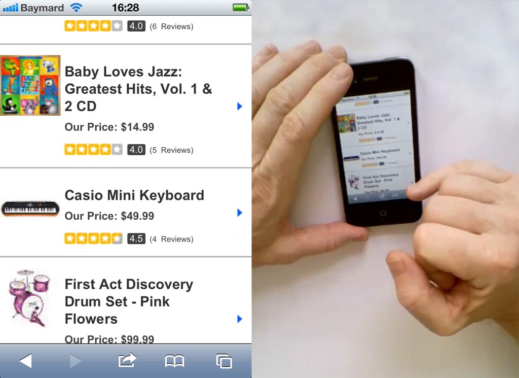
A simple test we’ve found helpful in determining whether hit areas in a list are sufficiently distinct goes as follows:
- Grab your phone and scroll to a random place in a product list on your site
- Hand the phone to someone (colleague, spouse, etc) who isn’t part of the dev or design team
- Ask them to identify all the distinct hit areas of the page and predict the function / destination of each
If they immediately can identify the all the hit areas and can accurately predict the pages they lead to or functions they invoke, then odds are that the items are sufficiently distinct. If they have trouble identifying the hit areas you may want to revisit the design and see if you can make the distinction clearer.
This article presents the research findings from just 1 of the 650+ UX guidelines in Baymard Premium – get full access to learn how to create a “State of the Art” e-commerce user experience.