Deciding on the number of products to load at once in product lists is a balancing act between optimizing page load performance and making users’ process of scanning, comparing, and choosing products as convenient as possible. A product list with too many or too few products can be troublesome for users in different ways.
During our large-scale usability testing we’ve found that when too many products are loaded into the default product list, some users will feel overwhelmed by the number of items to consider. When too few products are loaded, some users will instead often fail to grasp the full range of products available, and during testing this even lead some users to abandon sites (with relevant products) because they underestimated the site’s product selection.
In addition, our testing reveals that the ideal number of products to load by default varies by more than a factor 10 depending on the industry and products displayed in the list, and whether it’s the desktop or mobile website.
To make things even more complicated, the number of products loaded by default can also affect the page load performance, which carries its own issues for the user. Maybe unsurprisingly, our UX benchmarking reveals that 52% of desktop sites show either too few or too many products by default in their product listings. So how many products should a site load at once to appease the user and avoid issues with page load performance?
In this article, we’ll explore our large-scale usability test findings that relates to how many products to load in the product list, by default. In particular, we’ll cover:
- Determining how many products to load for desktop sites
- Determining how many products to load for mobile sites
- Showing fewer items for search results than for category lists
- Dealing with page load performance
- Finding the balance between too many and too few
Note: The term “at once” is used throughout this article to describe each set of products loaded when a product list is accessed, regardless of whether they are loaded into a separate page (e.g., using “Pagination”) or loaded into the same page (e.g., using a “Load More” button). That said the best-performing method of loading products is generally “Load More” as discussed in our external article Testing Pagination Against Infinite Scrolling and “Load More” Buttons and our more recent findings in guideline #501.
Determining How Many Products to Load For Desktop Sites
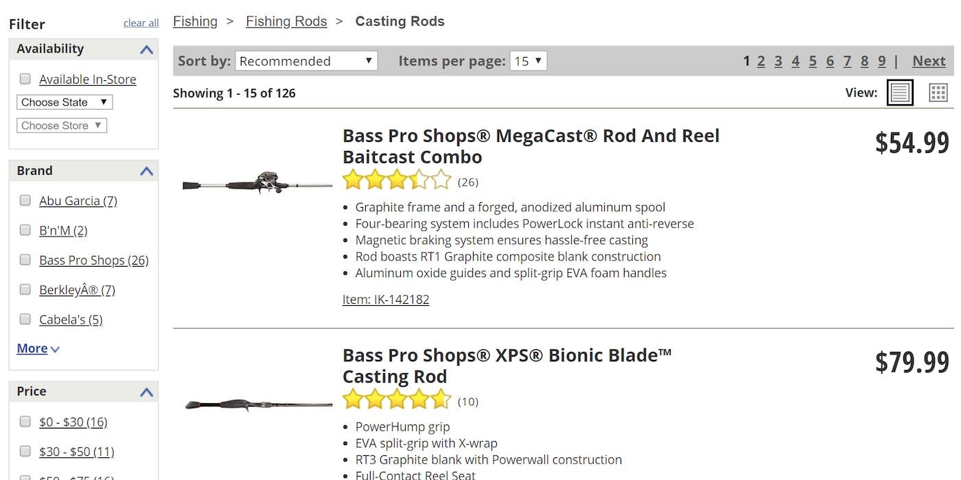
When only 15 items are loaded at once, such as here on Cabela’s, getting an overview of a reasonable number of products necessitates loading 4 or 5 pages. In testing this was observed to consistently slow down users’ product scanning process.
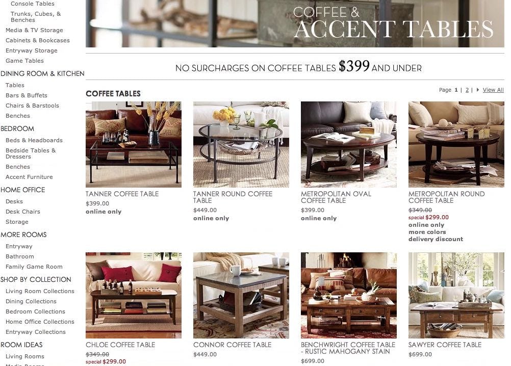
On many visually driven sites, like Pottery Barn, users were comfortable viewing as many as 150 products per “page” (as long as they were periodically interrupted by “Load More” buttons).
On desktop sites, our testing reveals that the best balance can be found by loading between 50 and 150 products into the product list at once.
At first glance, that seems like a large span, and it is. However, that’s because the amount of products to load at once also depends on the industry.
In testing we observe that for visually driven products, sites perform the best with users when 100–150 items are loaded at once; while for spec-driven products only 50–100 should be loaded. It’s currently 52% of desktop sites’ product listing pages that aren’t within these ranges.
The reason why more visually driven products (like apparel) can be loaded at once, is because users scanning a list of products can decode visuals faster than textual information. This means that users are able to scan and consider more visually driven list items before they begin aimlessly glancing over products rather than actually exploring them.
This behavior is not confined to online shopping — for example, in a physical store most consumers would have no trouble picking out suitable shirts quickly from a large selection, but many would have to spend more time assessing the suitability of a range of laptops by examining their specs. This is why fewer spec-driven products (like electronics) should be loaded at once by default.
Loading between 50–150 products at once for desktop sites ensures that users are exposed to a sufficiently wide array of products and that they aren’t needlessly interrupted in the process of scanning and evaluating products by having to load another page.
Determining How Many Products to Load For Mobile Sites
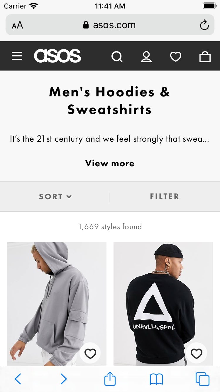

The 72 items in this product list on ASOS take up 18 viewports on a mobile device, but only 8 to 10 on a typical desktop monitor. Getting a full idea of the scope of all items on a page necessitates a lot more scrolling effort from users on mobile.
Unsurprisingly, the recommended number of products to load at once differs when it comes to mobile sites. Our mobile testing reveals that users were fatigued by long product lists much sooner than on desktop and, hence, on mobile sites, fewer products should be loaded at once.
Because the viewport on mobile is relatively small, list items take up a relatively large portion of the screen, with typically only 2 - 4 items visible within the mobile viewport. Therefore, 50 list items will take up many more viewports on a mobile device than on desktop. In other words, users have to scroll a lot more on mobile devices than on a comparable product list on desktop.
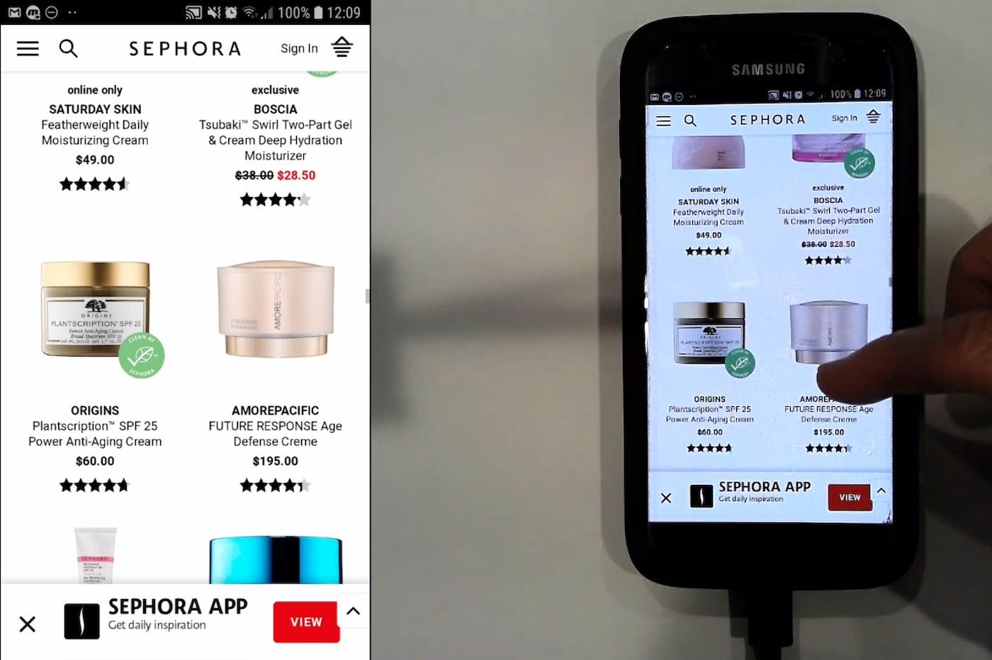
“This might be a bit too long. There’s too much”, a user said on Sephora when products kept loading (the site uses infinite scrolling) and there were over 527 products in this list. When too many products are loaded at once, users can get overwhelmed.
When it comes to effort expenditure, this can be off-putting for the user. If there is a high number of products loaded at once on the mobile site, the user has to put in much more effort to go through the list than they would have to do on desktop.
But that isn’t the only issue. During our testing, some users ended up scrolling very slowly in long product lists. Mobile sites generally react more slowly than desktop sites, so scrolling through long lists on mobile is often observed to take substantially more time than it does on desktop. As a result there is a risk that users on mobile devices will find scrolling a long default list of 100 items tedious and will pay less attention to items towards the end of the list (if they even get that far).
In summary, due to the physical constraints imposed by the smaller viewport and the way users scroll on mobile, it’s recommended to load only 15–30 products on mobile devices and to load them all at once.
Showing Fewer Items for Search Results than Category Lists
For search results the relevancy of the items will drop the further users continue in the list of results. Typically this warrants the threshold for search results are lowered, but ideally the threshold is dynamic based on the relevancy of each unique set of search results.
Our test observations on the ideal amount of products to load in the default list also change based on the type of product list; a set of search results versus a category-based product list.
There are two special circumstances observed to apply to search results lists:
- Due to the open nature of search, it tends to have far more results than browsing categories. Hundreds of search results are not an uncommon sight, and at mass merchant sites, users’ queries often return thousands of results.
- As search results are by default sorted by their relevance to the search query, there is less of a need for scrolling before getting relevant results (compared to category navigation) — indeed, the more the user scrolls, the less relevant the items in the list will typically be.
It’s therefore unwise to encourage users to scroll large quantities of search results, as the item relevance will drop the further users scroll. Users will therefore typically benefit from a lowered threshold of products displayed by default for search results than the threshold used in category based product lists (as described in the prior sections). How much lower this search threshold should be, will depend on the exact type of products carried and how good the search engine is.
If you’re looking to perfect the user experience for search, then ideally search results should use a dynamic threshold of products loaded by default, that depends on the individual search query and the relevancy of the returned results.
For example, with a dynamic threshold for search, if a user searches and the first 90 items have roughly the same (high) relevancy score, the dynamic threshold for items loaded by default could increase, potentially all the way up to 90 items. But, if the results for another search query have a drastic drop in relevancy score after the 62nd item, the default load threshold could be dynamically lowered to 62. This would ensure that all highly relevant items are displayed on the first page to encourage more focus on the relevant items.
Dealing with Page Load Performance
Concerns over poor load performance is one reason sites load too few products at once.
Loading fewer products means less data needs to be downloaded, and fewer graphics need to be rendered by users’ devices. So reducing the number of products loaded at once means that the impact on load performance of the average page visit is significantly lowered. Yet, we’ve seen that loading too few products will cause issues for users, as described above.
Conversely, loading a large number of products can take a significant toll on users’ devices, and can take significant time on slower internet connections.
Luckily there are several solutions to dealing with the page performance issues caused by loading a lot of products by default. By using a combination of a “Load More” button and lazy-loading products can be lazy loaded as users scroll downwards towards them. Once the needed product threshold is reached, the “Load More” button is provided.
By combining the lazy-loading technique with a “Load More” button, the number of products per page can be increased because most of the performance hit is removed, meaning the default number of products shown per page can be based purely on when it’s ideal to interrupt users in their scrolling and scanning (as addressed earlier). (While the recommended implementation is using a “Load More” button, the method of automatically lazy-loading sets of products will work just as well for pagination.)
An alternative implementation is to load all the list items at once and then simply load the product thumbnails asynchronously. This tends to be easier to implement.
Find out more about “Load More” as a method of loading products in our external article Testing Pagination Against Infinite Scrolling and ‘Load More’ Buttons and in our more recent test findings in guideline #501.
Finding the Balance Between Too Many and Too Few
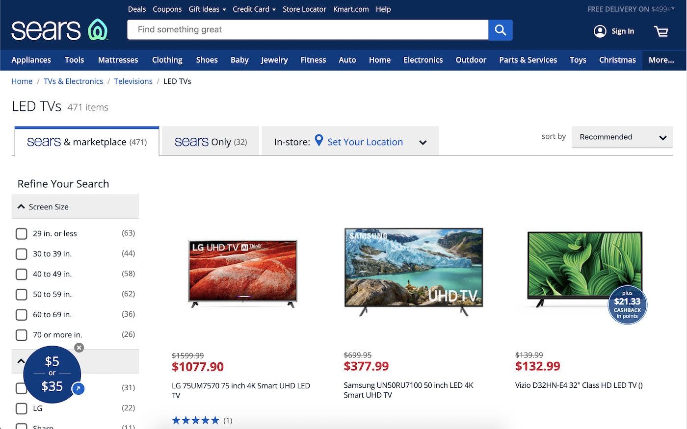
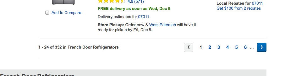
Sears presents the user with 50 spec-driven items (televisions) at a time.
Our testing showed that users had no trouble browsing over 100 products at once on desktop, on sites with visually driven products, like apparel. The question of how many products to show by default is therefore a matter of balancing page load performance with the point at which users should be deliberately interrupted to load more products.
Page performance can be optimized with a smart-loading implementation, while the question of when to nudge users to load more products depends on the type of products in the list, whether users are on a desktop or mobile device, and whether the list is search or category based.
Whether on desktop or mobile, figuring out how many products to load per page is a matter of determining which is more desirable for users — to be able to scan many products or to be encouraged to examine fewer items but in greater detail.
Ultimately, the goal is to try to hit the sweet spot between exposing users to a sufficient number of products to allow them to comfortably scan a reasonably representative set of products without overwhelming them with too many. It’s important to remember:
- For desktop sites, it’s generally safe to load between 100–150 products at once for visually driven sites and between 50–100 products at once for spec-driven sites.
- For mobile sites, fewer products should be loaded, typically between 15 and 30 products.
- For search results, a lowered threshold is typically warranted, but ideally, the threshold is instead dynamic for search and based on any sudden drop in relevancy score within the search results.
- To avoid issues with page load performance, use a combination of a “Load More” button and lazy-loading to load products onto the page.
This article presents the research findings from just 1 of the 650+ UX guidelines in Baymard Premium – get full access to learn how to create a “State of the Art” e-commerce user experience.