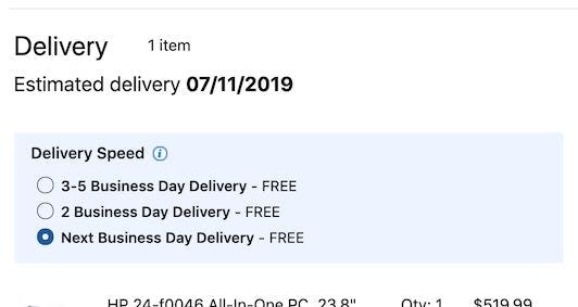
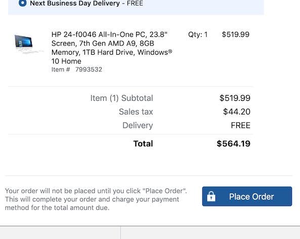
When considering Checkout Optimization, the “Order Review” step shouldn’t be overlooked, as we consistently observe in our large-scale checkout usability testing that issues encountered here can easily cause users to abandon — even this late in the checkout flow.
Furthermore, the abandonments observed at this point in the flow are very often solely due to the checkout design and flow — as in, they are entirely preventable.
However, after benchmarking 60 major e-commerce sites on Checkout UX performance, and analyzing the 300 manually reviewed UX parameters specifically for “Order Review” steps, we find that 65% of e-commerce sites have an “Order Review” user experience that ranges from poor to just acceptable.
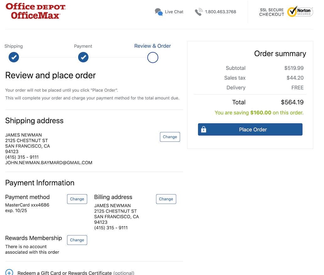
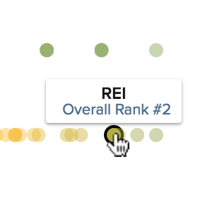
Yet it’s possible to excel at this critical checkout step: the top-ranked site in our benchmark is the office supply store Office Depot, which has a best-in-class “Order Review” UX performance.
In this article we’ll explore the 5 Order Review UX implementations that Office Depot excels at, but which many e-commerce sites fail at. Specifically, we’ll show you some of the Baymard Premium checkout UX research findings that relate directly to the ‘”Order Review”’ step, and how you can ensure your “Order Review” step aligns perfectly with common user behavior:
- Allow users to edit data directly at the “Order Review” step (38% get it wrong)
- Have a “Place Order” button above the fold at the “Order Review” step (23% get it wrong)
- Optimize the “Order Review” step for skimming (11% get it wrong)
- What information to display at the “Order Review” step (12% get it wrong)
- Have edit links in close proximity to each semantic group at the “Order Review” step (38% get it wrong)
Note: If you have Baymard Premium access see the full guidelines for each implementation discussed below by going to the “Order Review” topic.
1) Allow Users to Edit Data Directly at the ‘Order Review’ Step (38% Get It Wrong)
During our large-scale checkout usability testing, users at the “Order Review” step were often observed to find errors in their order information, which they naturally wanted to edit before finalizing the order. This is in itself a positive thing, as it justifies the presence of the review step.
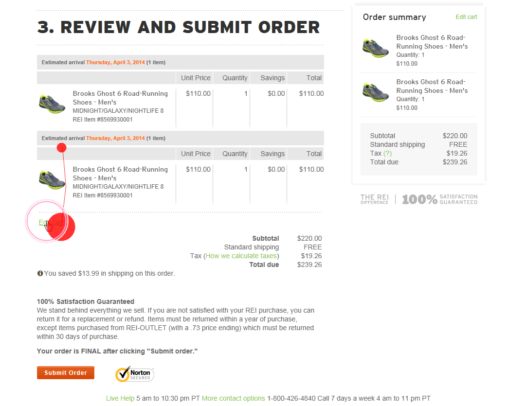
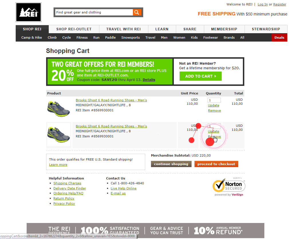
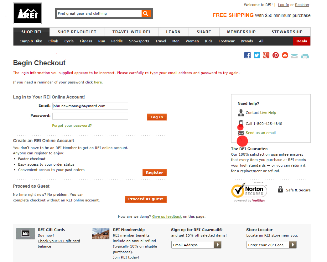
A user during testing at REI had accidentally placed two identical products in his cart. Only wanting one pair, he clicked the “Edit” link (first image), which sent him to the cart step (second image). As he deleted a pair and clicked the “proceed to checkout” button, he was sent to the first step in the checkout flow (third image) — a page he was already at six minutes earlier. “I think this is stupid, it starts all over again? Ha ha”, he laughed in despair, as he realized he would have to go through all of the checkout steps once more.
Yet, during testing, the task of editing data at the “Order Review” step was often observed to be a cumbersome process, as “Edit” links would send users backwards in the checkout flow, causing a great deal of confusion and frustration both when moving backwards in the checkout flow and when moving forward again after corrections had been made.
Users who are sent back in the checkout flow are prone to make additional errors as they are yet again presented with a set of choices and options, which they had already completed the first time around.
Additionally, after being sent backward in the flow and editing the information, the user now will have to move forward again. This is not only confusing, and may introduce new validation errors, but was also experienced by users during testing as highly discouraging, as they had to go through the same checkout steps they’d completed several minutes earlier.
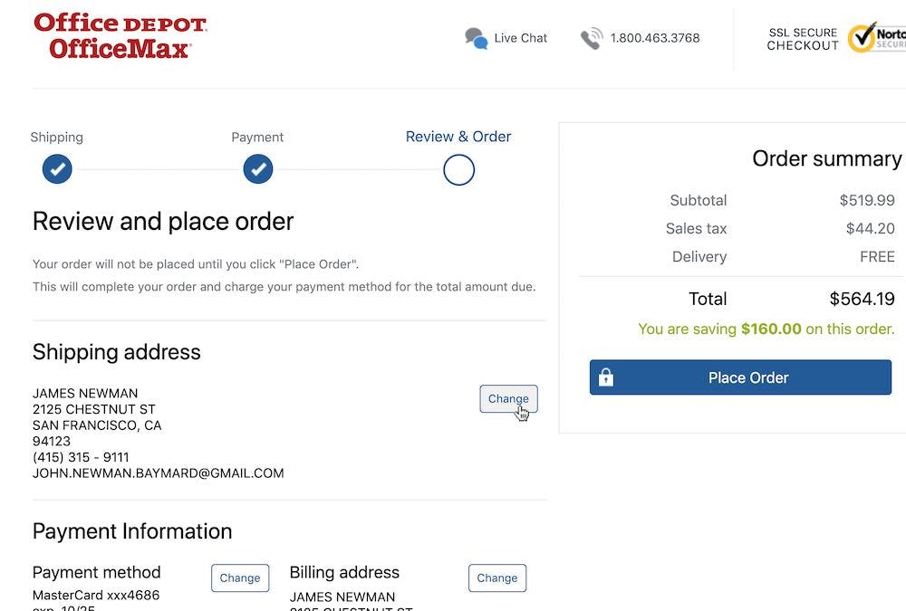
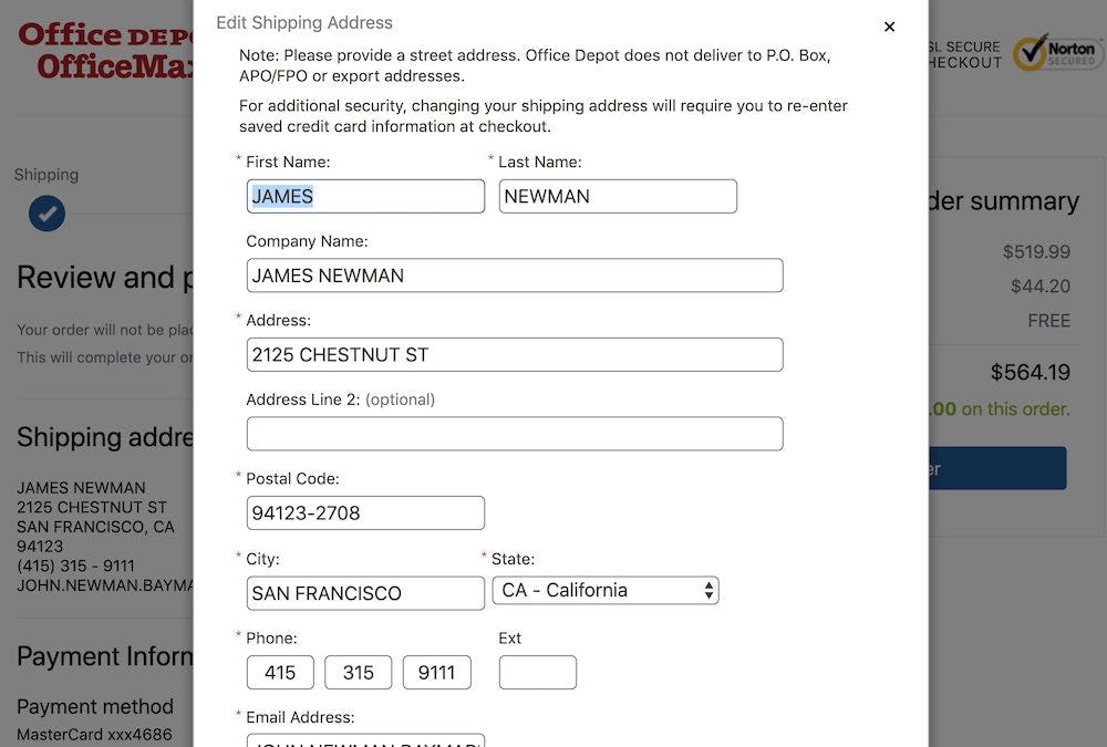
At Office Depot, users can edit their data directly at the “Order Review” step by clicking the “Change” button (first image), which opens an overlay (second image).
The solution lies in allowing users to edit data at the “Order Review” step, either inline (for simple information like quantity and contact numbers) or via a page overlay (for more complex information like address and payment data).
If, however, users must be forced to go backwards in the checkout flow to edit data (e.g., for legal or security purposes), then at least ensure that users then can return directly to the “Order Review” step (e.g., by adding a “Return to Order Review” button and functionality).
Finally, we’ve identified that failing at this particular implementation represents a “Missed Opportunity” within e-commerce in general — many sites (38%) fail to address this UX issue, despite it having a significant UX impact for the end user.
2) Have a ‘Place Order’ Button Above the Fold at the ‘Order Review’ Step (23% Get It Wrong)
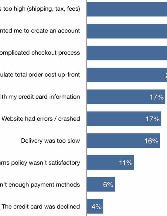
During testing, 11.6% of users misinterpreted an “Order Review” step for a “Confirmation” step.
This isn’t surprising, given that the “Order Review” and “Confirmation” steps are often more or less identical. They typically both contain product information, an order cost summary, and a summary of the user’s just-typed address details and selected shipping method.
Furthermore, they are often (though not always) both presented after the user has typed in all data (e.g., payment data) and performed all selections necessary to technically place the order.
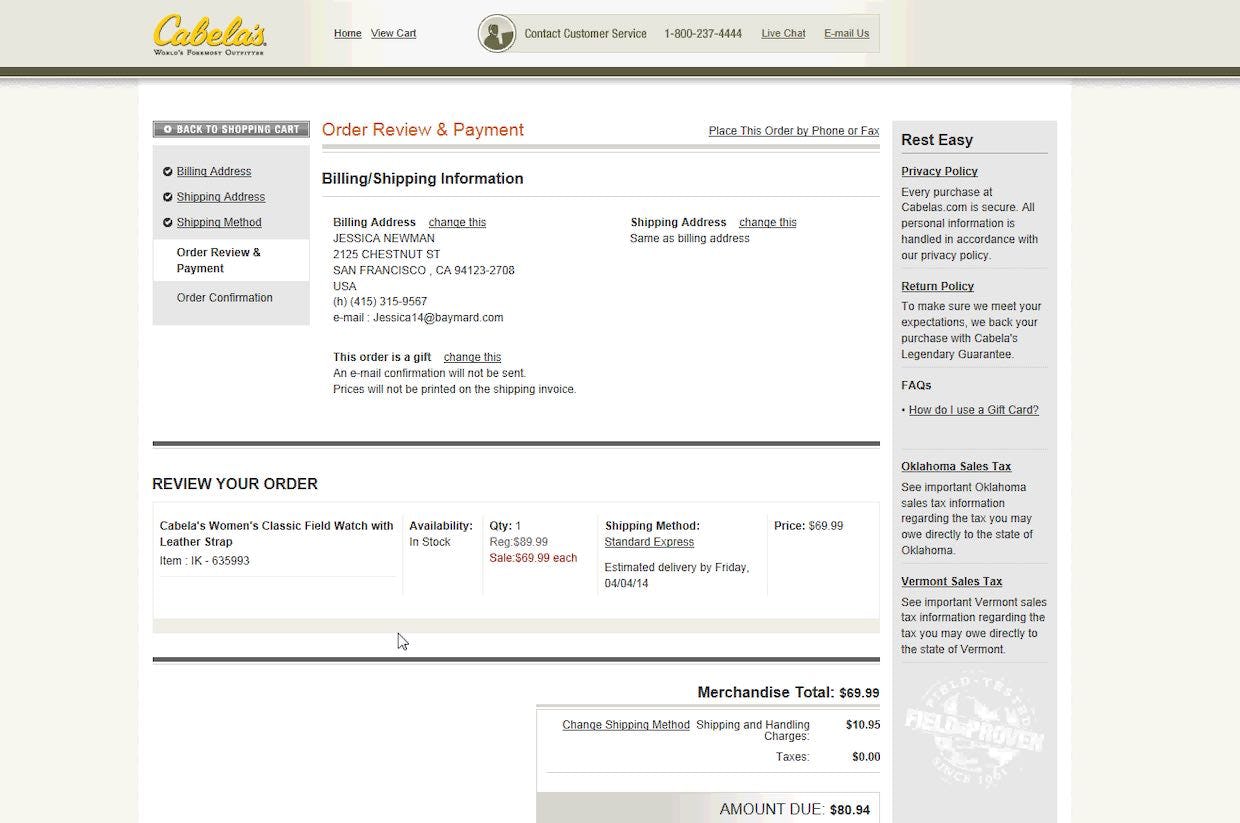
“There, now it’s purchased”, one user said during testing at Cabela’s, concluding that the purchase was done. The user consequently left the checkout, believing the order was placed, despite this in fact being just an “Order Review” step.
Users during testing who misinterpreted an “Order Review” step for a “Confirmation” step consequently left the checkout without having placed their order. Adding to the tragedy, these users did so in good faith believing that their order was successfully placed.
In other words, failing to have a “Place Order” button at the top of the “Order Review” step can be the sole cause for up to an 11% abandonment rate.
These users are furthermore likely to require extensive customer support later on when they’re angered about why their order hasn’t arrived, yet customer support will have a hard time helping these frustrated customers, as there’s no placed order to look up — a scenario likely to lead to permanent brand damage as users are left with two poor experiences in a row.
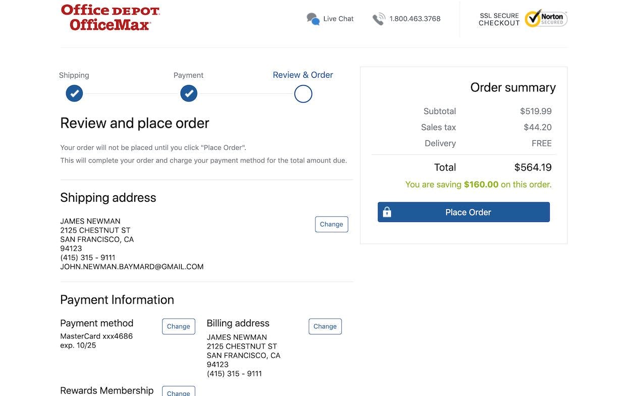
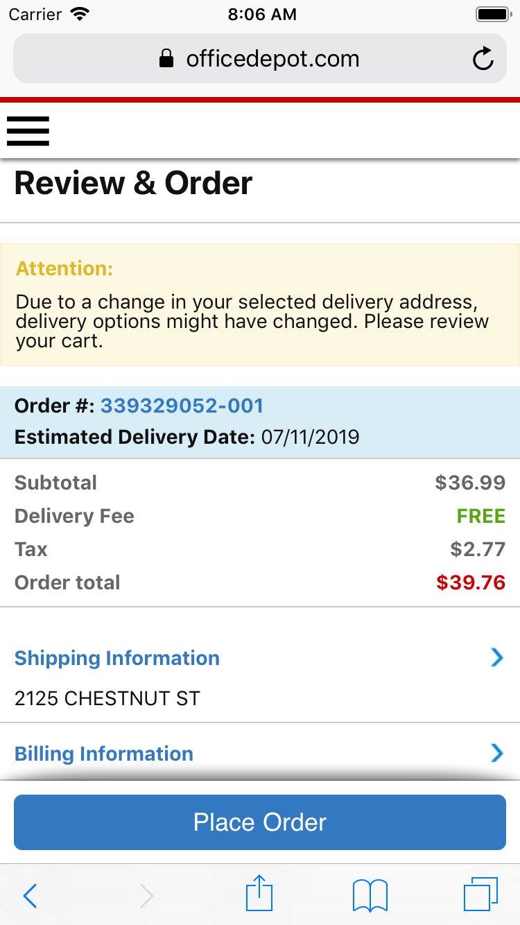
On the desktop site, Office Depot has the “Place Order” button above the fold at the “Order Review” step, making it clear to users that they haven’t yet completed their order. To perfect this implementation a “Confirmation” process step should be included as well to offer users additional information scent (first image). On the mobile site, the “Place Order” button is sticky, meaning it’s always visible in the viewport as users scroll (second image).
The solution we observed in testing to resolve this issue is to place a second “Place Order” button above the fold, or to make it “sticky”. One of the main differences between an “Order Review” step and the “Confirmation” step is the presence of a “Place Order” button. Being able to spot the primary button is therefore a great help to the users who use the site content, not the headline, to deduce which step they are on.
In addition to prominent placement of the “Place Order” button, the primary button throughout the checkout flow (e.g., “Continue to Payment”) must also be consistently placed so that users can easily find it.
Furthermore, a “Confirmation” Process step should be included as well, to offer users further information scent and reinforce the fact that they’re only at the “Order Review” step, not the “Confirmation” step.
Finally, resolving this issue will be “Low Cost” for most sites, when compared to fixing other checkout issues.
3) Optimize the ‘Order Review’ Step for Skimming (11% Get It Wrong)
During our checkout testing, just over half of users tested skimmed, rather than thoroughly read, the information and options presented at the different “Order Review” steps.
This observed behavior in and of itself is a fine way to approach the “Order Review” step. Yet testing revealed it leads to issues when (1) new information is included at the “Order Review” step or (2) data and options not directly related to the actual order dominate the content of the step.
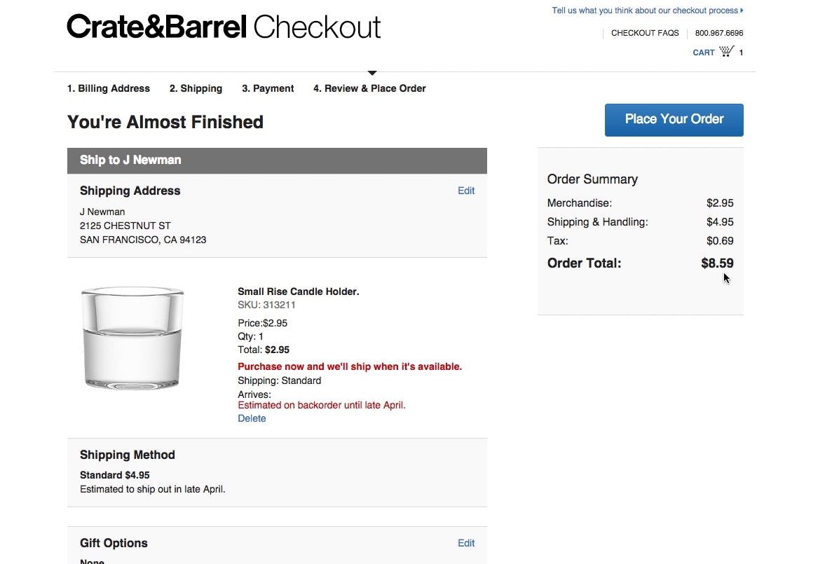
“Whoa! Now it increased again. Now additional fees have been included. So the price has gone from $3 to $8.59, and that has happened across three steps. That makes me feel a little duped.” This user at Crate & Barrel clearly thought he knew the price already before the “Order Review” step, and when presented with a new price at the “Order Review” step was surprised and disappointed.
First, if users quickly skim the “Order Review” step and find that there’s a mismatch between the displayed information and the memorized data, this will draw their attention away from other, often more important, pieces of information.
For example, if users have seen one order total throughout the checkout process and then at the “Order Review” step get presented with a price that contains an added tax, users will no longer be able to “recognize” the order total — thus the elements will draw attention, and can result in users feeling “duped” (e.g., “Why did they hide this until the very end?”).
This unnecessary distraction draws attention away from what the actual point of the “Order Review” step is — to allow users to check for errors in their typed data. If users aren’t checking for errors because they’re focused on new information, there’s an increased chance they’ll submit incorrect data, which could lead to abandoning the order. (Some may also abandon because they feel “tricked”, depending on the new information that’s added at the “Order Review” step.)
Second, testing revealed that users’ attention was time and again observed to be drawn towards elements such as graphically highlighted text or elements that required interactions (such as buttons and empty form fields).
If the highlighted elements represent actual order information to be reviewed (e.g., an “Estimated Arrival Date”) or critical page elements (e.g., the “Place Order” button), this is generally a good thing, as it helps users review the order.
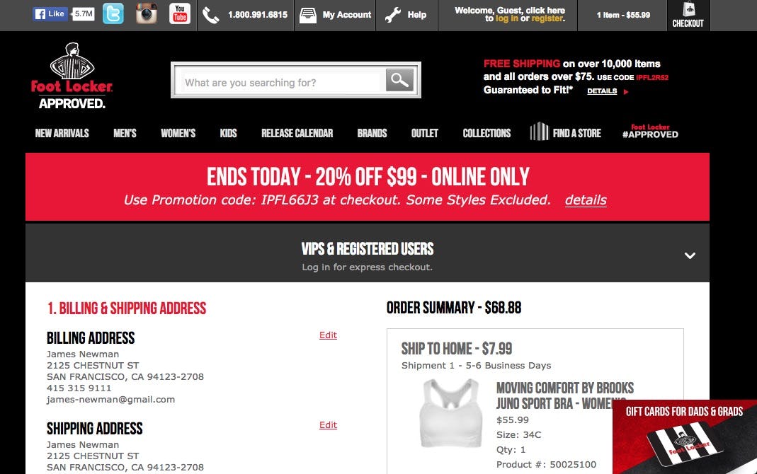
This is what users will be met with when landing at the “Order Review” step at Foot Locker. Note how around the first half of the available screen real estate consists entirely of non-order related content, such as menus and offers.
It’s however problematic if the user’s few seconds of brief skimming is spent on ads, deals, and “Exclusive Sign Up” offers, elements that don’t help the user evaluate the purchase and actually lessens the chance of the user detecting possible errors in the order data.
The “Order Review” step should therefore not waste the eye gaze and attention of users who skim the step on non-order information or new order information that could have been displayed earlier.
While it to some extent is true that errors in the order are the user’s own fault if they only spent a few seconds scanning the “Order Review” step, it’s still the harsh reality that it will add up to an overall negative shopping experience, and the issues caused may require extensive customer support resources to resolve.
Finally, we’ve identified that this implementation is a “Web Convention”: nearly all (89%) sites adhere to this implementation. Consequently, users have come to expect that the “Order Review” step on all sites is optimized for skimming. When it isn’t, it has a more severe impact on the end user, as it breaks their expectation of how an “Order Review” step should perform.
4) What Information to Display at the ‘Order Review’ Step (12% Get It Wrong)
During testing, some users proved that the “Order Review” step wasn’t superfluous by actually using it to edit their data and correct errors in their order.
Of course, users can only make such corrections at the “Order Review” step if they’re presented with the relevant prior-typed data and selections, and both are formatted to be easy to see.
Therefore, all prior-typed data and selections should be presented at the “Order Review” step. Moreover, there are details to consider when it comes to displaying the various pieces of information and selections. These are discussed below.
Shipping and Contact Info
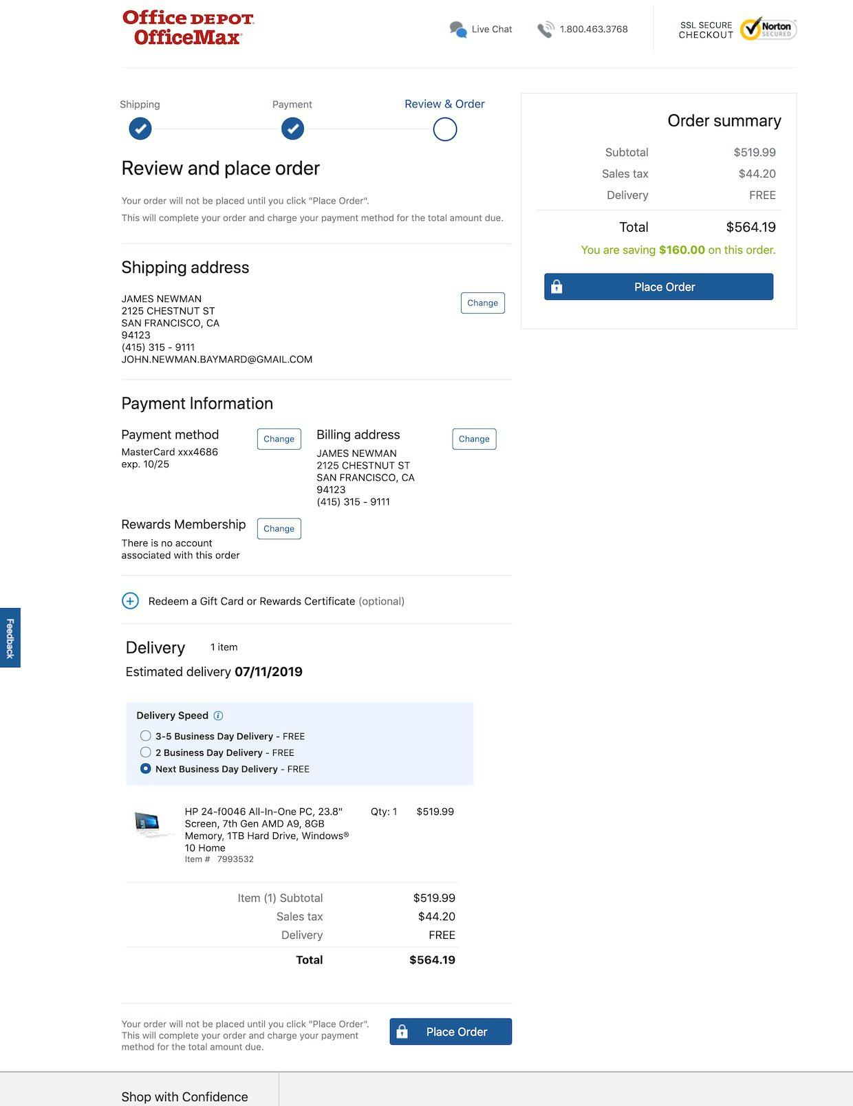
At Office Depot, the shipping information is easy to scan, the phone number is formatted to be easy to read, and the user’s email address is provided.
1) Address scannability. Addresses should be presented in a standard format and broken into multiple lines, as it’s easier to scan and parse a multiline-formatted address than a single-line address.
2) The user’s email address. Users may have multiple email addresses, and the email address is prone to being mistyped (especially on mobile). Testing showed that users rely on the confirmation email to serve as their “receipt” and therefore an incorrect email address that’s not corrected at the “Order Review” step will cause severe issues at the “Confirmation” step.
3) Autoformat the user’s phone number. To heighten scannability, consider autoformatting the number — for example, (123) 456-7890 instead of 1234567890, or however the user inputted it.
Additionally, for shipping information consider also indicating if “Billing = Shipping”, to allow the subgroup of users who want to use different addresses to double-check that the correct one is being used.
Finally, consider avoiding abbreviations and using the full forms of words instead (e.g., “Maine” rather than “ME”), as abbreviations are more likely to be overlooked by users scanning the information compared to the full forms of words.
Payment Details
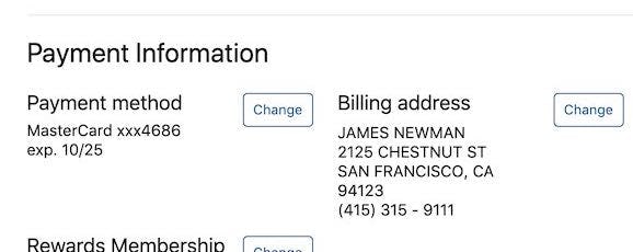
At Office Depot, the last four digits of the credit card are displayed, along with the expiration date.
4) Display the last four digits of the credit card number. To help users recognize the credit card used, display the last four digits of the applied card. For security reasons, the last four digits are typically the only ones possible to display.
5) The card expiration date. Some users might have multiple stored cards of the same type (e.g., two VISA cards). To help users as much as possible it is therefore advisable to also display the expiration date for the applied card. The expiration date will resonate well with some, as the card that expires the latest will usually also be the newest card — for example, a user with two VISA cards will from the expiration date on the “Order Review” step often be able to tell if they are about to use “the old VISA card”.
Additionally, consider displaying the card logo, which provides a way for users to instantly recognize the card type.
Shipping Method and Estimated Arrival
Office Depot provides an estimated arrival date, the shipping speed, and the cost of the different shipping methods.
6) Provide an estimated arrival date instead of shipping speed. Figuring out the finer details of the postal services can be extremely cumbersome for users — for example, “Do they ship today or tomorrow and do they deliver Saturday?”. By contrast, the site is much better equipped at calculating when the product will arrive. Therefore, provide the estimated arrival date (e.g., “Thursday, April 8”) rather than shipping speed (e.g., “3–5 Business Days”).
Additionally, consider including the shipping method and speed. If a user has chosen a different shipping method than the site’s default, it can help to specify the shipping speed and costs to help users understand how the estimated arrival date was determined — for example, “Estimated Arrival Date: 6–7 July (expedited 3-days shipping, $12)”.
Price and Products
Office Depot makes the total order price more prominent than other prices, provides a cost breakdown, has thumbnails for products, and displays the quantity being ordered.
7) Make the order total the most prominent price. The “Order Review” step often does (and should) display several monetary amounts. This is in itself not necessarily a problem and informing users of “how much they save”, for example, is quite fine. However, it is important that the total price — the price users will actually pay — is the most prominent.
8) Provide a cost breakdown. Users strongly dislike not knowing what they are paying for, and are generally hostile towards “surprises” at the “Order Review” step — for example, a new, higher price. Therefore, display a total cost breakdown (e.g., including sales tax and delivery and other fees), which allows users to deduce how the total price was calculated.
9) Have thumbnails for all products. Thumbnails make products quickly recognizable, while providing users with an easy, visual way to verify that they are indeed buying the right products.
10) Display product quantities. To ensure users are aware of how much of a product they are buying, quantity should be visible at the “Order Review” step. Consider also allowing users to alter quantities at the “Order Review” step, in particular if the checkout flow allows users to bypass the cart (as the “Order Review” step is then a user’s first encounter with their cart contents).
Additionally, consider providing tooltips for taxes, fees, and other information (e.g., as Office Depot does for “Delivery Speed”).
5) Have Edit Links in Close Proximity to Each Semantic Group at the “Order Review” Step (38% Get It Wrong)
As described in item #1, users should be allowed to edit their data at the “Order Review” step.
Furthermore, however, it must be obvious which “Edit” link belongs to which block of information (e.g., shipping address, payment details, etc.).
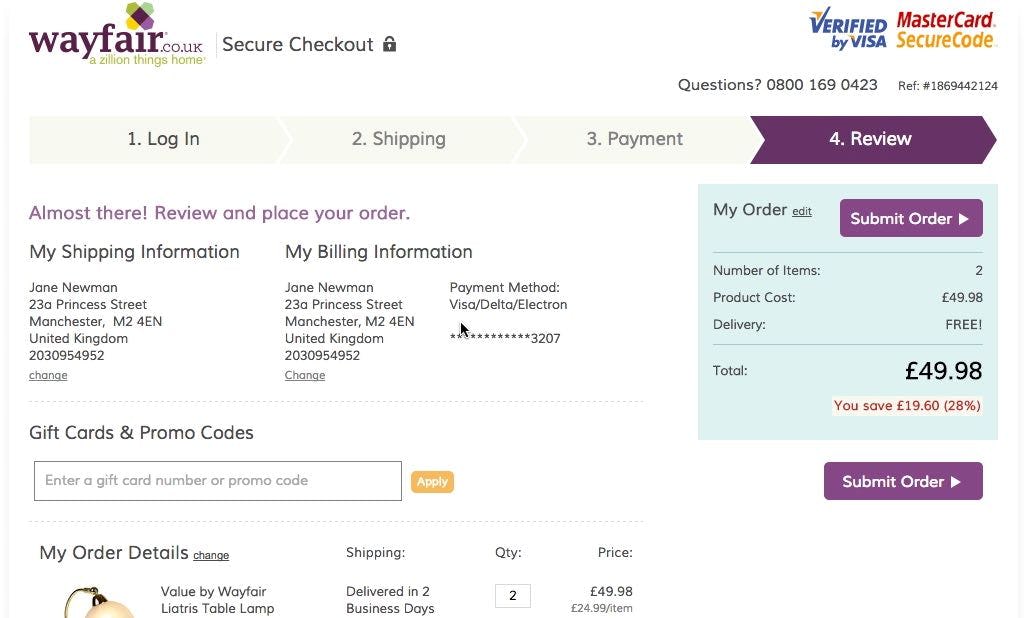
“I’m trying to see if there’s some way that I can go back…hmm. I think I will have to go back to the main page and start over”, a user during testing at Wayfair explained, wanting to use a different credit card but unable to find a link for it. Notice how a “Change” link is available beneath “Billing Information” but the user did not associate it with the credit card text summary in the right-hand column. As a result, she clicked the company logo and started the checkout process all over again.
Otherwise, testing revealed that many users will have trouble associating an “Edit” link with its corresponding information group — and consequently won’t use it, which can result in a slowed-down checkout or even an abandonment.
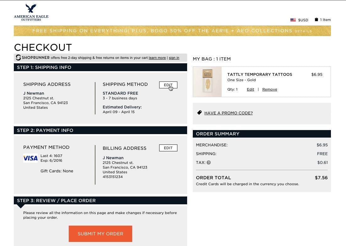
“It’s divided into ‘Address’ and ‘Method’, but I’m in doubt, if I click here, do I then edit the address or the method?” a user said during testing at AEO. The user wanted to edit the shipping address, but was confused by the two-column layout with only one “Edit” button — it wasn’t obvious to her that clicking “Edit” would have allowed her to alter both.
The issue is typically caused by “Edit” links not being proximate to their relevant information group or a discrepancy between what information sites consider to be semantically related and what information users consider to be semantically related (e.g., “Shipping Address” and “Shipping Methods” as one or two groups of information).
Office Depot has 4 “Change” links, each of which belongs to a different information group (e.g., a “Change” link for “Payment method” and one for “Billing address”). To perfect this implementation the “Change” link for the “Shipping address” group could be placed closer to this information block.
The solution is straightforward: have an “Edit” link for each semantic group, and place the “Edit” links next to their information groups at the “Order Review” step, so that it’s clear from a quick visual scan which “Edit” link belongs to which information group.
It may help to think of the “Edit” links as directly connected to a specific information group (e.g., a set of form fields or selections) rather than a shortcut to a specific checkout step.
For example, even if “Billing Address” and “Payment Methods” are handled at the same checkout step, they will require individual “Edit” links to align with user expectations.
Perfecting the ‘Order Review’ User Experience
As noted in the introduction to this article, 65% of sites fail to reach a “good” level of performance for the “Order Review” user experience. While it may be tempting to settle for an “acceptable” performance, consider that “Order Review” is a critical step in checkout — problems here have been observed during testing to be the direct cause of checkout abandonments, which is a shame when users are one click or tap away from completing their order.
Office Depot exemplifies however how it’s possible to have an excellent “Order Review” performance. In particular, the site excels at
- allowing users to edit data directly at the “Order Review” step (38% get it wrong),
- having a “Place Order” button above the fold at the “Order Review” step (23% get it wrong),
- optimizing the “Order Review” step for skimming (11% get it wrong),
- presenting the necessary information and selections at the “Order Review” step (12% get it wrong), and
- having edit links in close proximity to each semantic group at the “Order Review” step (38% get it wrong).
Office Depot, along with some of the other top-performing sites (e.g., Microsoft, Foot Locker, and Crutchfield), can be considered as sources of inspiration when trying to improve the “Order Review” experience.
To see Office Depot’s “Order Review” experience and UX performance in detail head to Office Depot’s site review or consider viewing some of the 160 Order Review examples available in our Page Design tool.
This article presents the research findings from just 1 of the 650+ UX guidelines in Baymard Premium – get full access to learn how to create a “State of the Art” e-commerce user experience.

