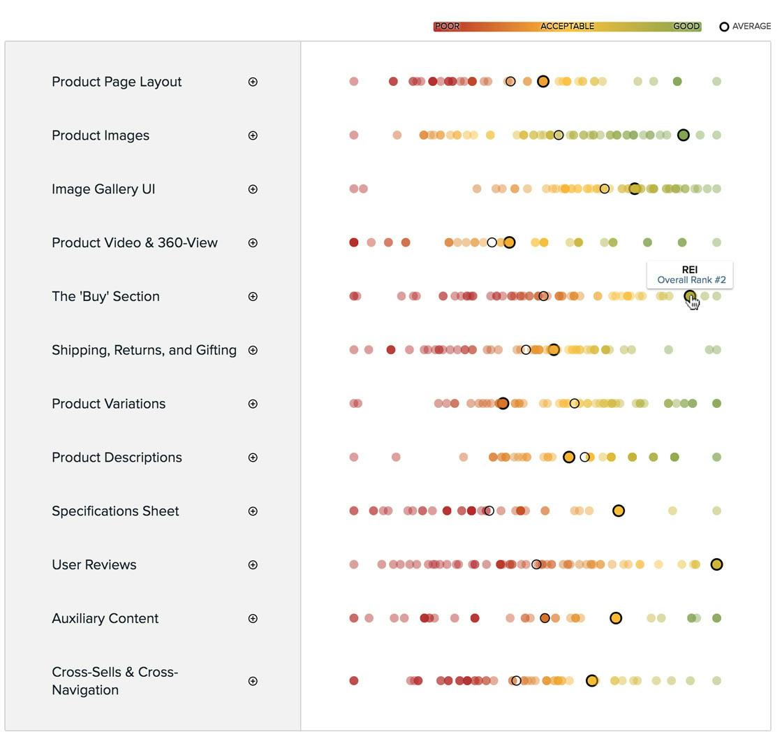
Within Product Page UX the e-commerce site REI performs well. Here’s their PDP UX performance plotted against 59 other top-grossing e-commerce sites. The dots represent the summarized score of 5,880 usability scores manually audited by Baymard. (Tip: you can also browse a free interactive version of this scatterplot.)
After benchmarking 60 major e-commerce sites on Product Page UX performance, and analyzing the 5,880 manually reviewed UX parameters, we find that:
- 82% of e-commerce has an overall poor-to-mediocre Product Page user experience, and
- sites struggle across nearly all sub-areas of Product Page UX, and perform particularly poorly in key areas such as User Reviews, Cross-Sells & Cross-Navigation, and the ‘Buy’ Section, where the interfaces often directly misalign with user behavior.
One site that performs better than most within User Reviews, Cross-Sells & Cross-Navigation, and the ‘Buy’ Section is the outdoor retailer REI, which ranks #2 in our Product Page UX benchmark.
In this article we’ll therefore explore 7 Product Page implementations that REI excels at, but most large e-commerce sites fail at. Specifically, we’ll discuss how REI does well in the following Product Page implementations crucial to the Product Page user experience:
- All Products Need At Least One ‘In Scale’ Image (28% Get It Wrong)
- Allow Users to Purchase Temporarily ‘Out of Stock’ Products (68% Don’t)
- Avoid Sneaky Displays of ‘Free Shipping’ Promotions (8% Don’t)
- 5 Requirements for the ‘Ratings Distribution Summary’ (65% Get It Wrong)
- Provide Both Site-Authored FAQs and Community-Driven Q&As (70% Get It Wrong)
- Provide a Cross-Sell Section that Only Contains ‘Alternative Products’ (28% Don’t)
- Provide a Cross-Sell Section that Only Contains ‘Supplementary Products’ (47% Don’t)
These product page implementations not only make REI perform better than the majority of e-commerce sites, but were also verified in our large-scale usability testing to be high-performing product page design implementations that can be applied to most e-commerce sites — and should therefore be a highly relevant case study for most.
1) All Products Need At Least One ‘In Scale’ Image (28% Get It Wrong)
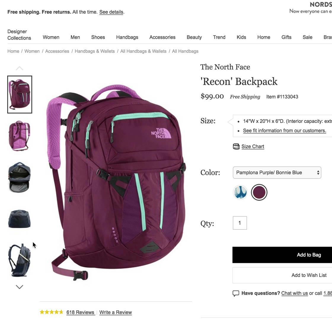
“Let’s see a picture here, if anyone is wearing it…There’s no photo of anyone wearing it.” The test subjects had trouble judging the size of the North Face backpack at Nordstrom because there were no images showing it on a model.
The “Product Images” sub-element is one of the few areas of Product Page UX where the average site performs very well, from acceptable to good (80% of sites). However, there still exist some common “missed opportunities,” including 28% of sites that fail to provide at least one “In Scale” product image.
When users shop at physical stores, it’s easy for them to judge the scale of products they’re interested in. For example, if they’re interested in buying a refrigerator, they will immediately be able to gauge its approximate size just by looking at it, and can also compare its size relative to other products in the store. For smaller items — for example, shoes or beauty products — users can furthermore pick up the product and hold it in their hands to see if it would fit in their everyday bag.
This crucial and immediate grasp of a product’s size is much more difficult to get when viewing images of products on the web. When only traditional “Cut Out” images — just showing the product on a white background — are offered, users have a very difficult time getting an accurate impression of the product’s overall size.
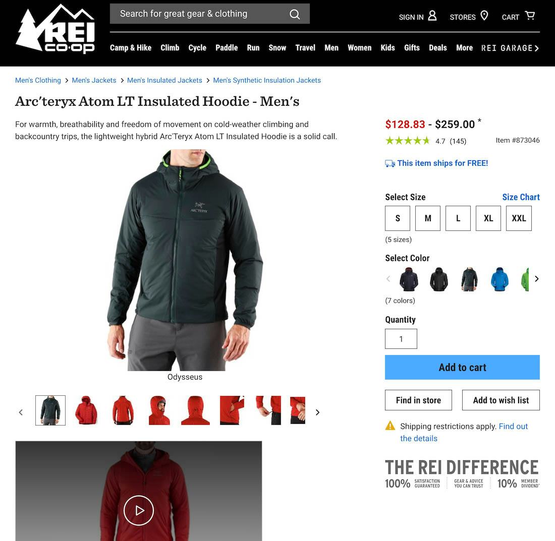
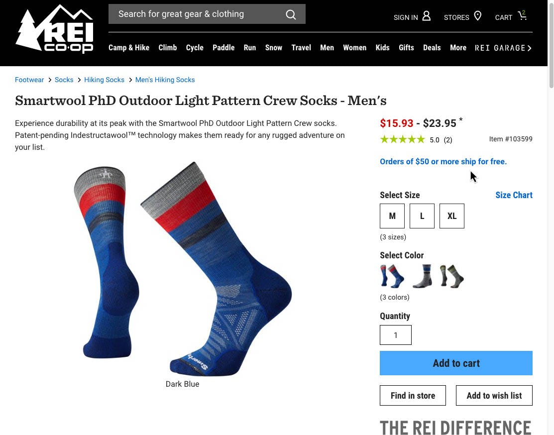
At REI, “In Scale” images provide users with a sense of the product’s size. The visual information conveyed is crucial to users exploring the product: imagine how much more difficult, for example, it would be to determine the relative size of the jacket if users were only provided with dimension information (e.g., sleeve length, hood width, etc.).
The solution is to provide at least one “In Scale” product image — an image that shows the product relative to the surrounding environment, humans, or other objects of a size known by the site audience. REI provides many “In Scale” images of, for example, the Arc’teryx jacket that show the jacket worn by a model, with an image of the entire jacket, an image of a model’s head with the jacket hood pulled up, and images of the model’s hands coming out of the jacket. Combined, all the images help to give users an idea of the scale of the jacket and helps to answer size questions they may have — for example, “How far down does the jacket fall past the waist?”.
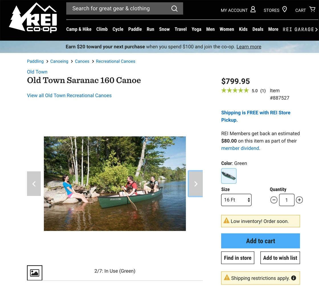
“In Scale” images can also do double duty: here, the size of the canoe is effectively conveyed to users (it fits two adult men comfortably) while users are also presented with a “Lifestyle” image — an image illustrating how the product can be used, which is designed to generate excitement and interest in the product.
When deciding how to illustrate scale it’s important to consider how the product will be used. For products that will be worn directly by users, the item should be shown on a human model. For other types of products it makes sense to consider different types of “In Scale” images — for example, showing a canoe in the water, as in the above example at REI.
(For more on “In Scale” Images, see our article “All Products Need at Least One ‘In Scale’ Image (28% Get It Wrong)”.)
2) Allow Users to Purchase Temporarily ‘Out of Stock’ Products (68% Don’t)
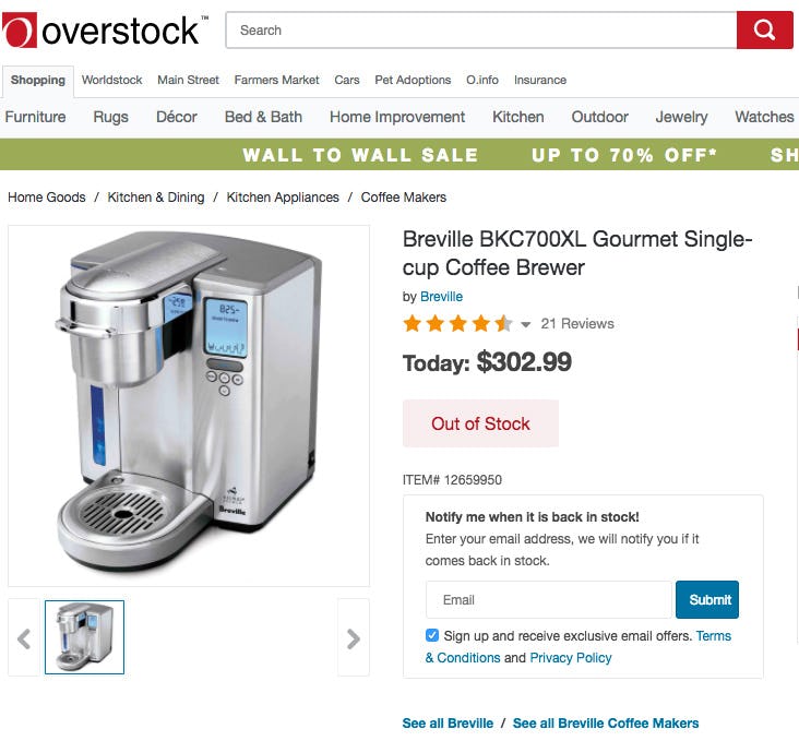
Telling users a product is out of stock and removing the “Add to Cart” button, as is the case here at Overstock, brings them to a complete halt and prevents the user from purchasing the item.
During our usability testing of product pages users would sometimes stumble on products that were listed as “out of stock.” What’s clear from testing is that if users are simply told a product or product variation is out of stock some will look for alternative products on the site but 30% are likely to simply abandon to look for the product elsewhere.
Presenting users with text that simply states a product is “out of stock” is a UX dead end: users can’t go any further on a site if they are truly set on purchasing that particular product. Yet, amazingly, our benchmark of product pages reveals that 68% of sites don’t allow users to purchase temporarily out of stock products, which greatly increases the likelihood that a user intent on purchasing a particular product listed as “out of stock” will abandon and look for the item at a competing site.
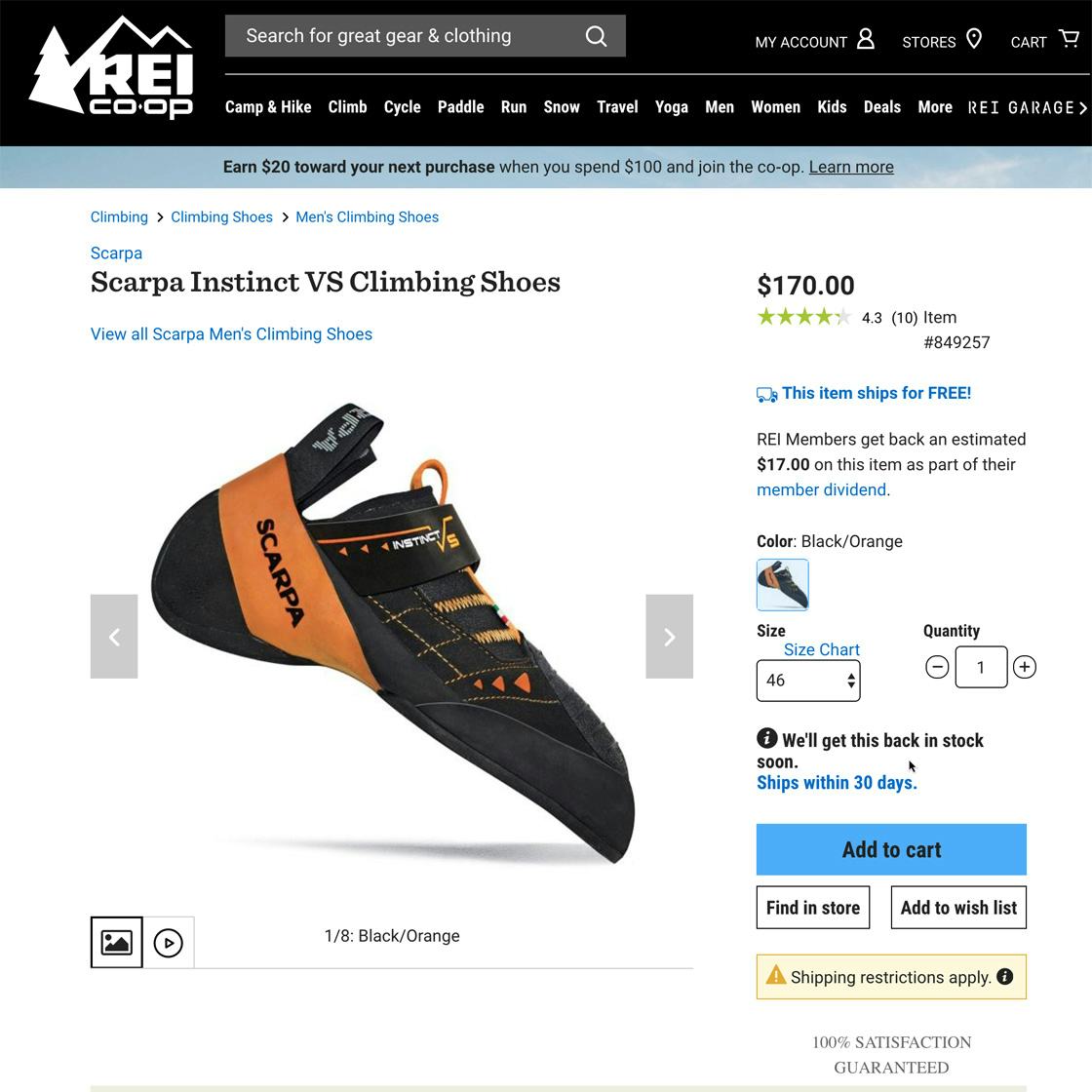
At REI, users are allowed to purchase shoes that are temporarily out of stock. By allowing users to purchase the shoes in this temporarily out of stock size, REI makes it much less likely that users will leave the site to seek the shoes elsewhere, which our Product Page testing shows 30% of users are likely to do. Note the message, “Ships within 30 days,” alerting users to the longer delivery time for this item.
It’s perhaps easy to forget that users assume they’ll have to wait for a product when shopping online. From the user’s perspective, there is always a period of downtime while they wait to receive their order. Depending on the shipping method selected, it could be as soon as a couple of hours to several weeks until they expect to receive their order.
This gap of time, from when users first place the order to when they expect to actually receive it, can be be taken advantage of by allowing users to purchase items that are only temporarily out of stock.
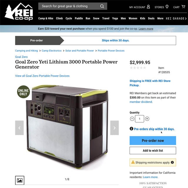
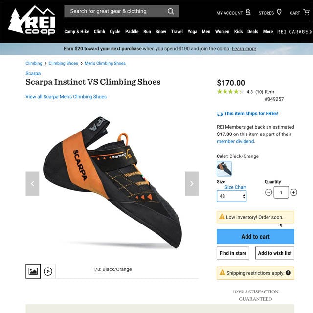
REI allows users to pre-order products that aren’t available yet, again making it more likely that users already on the site will at the very least consider ordering the product from REI, rather than trying to hunt the product down elsewhere (first image). Users are also told when products are low inventory, helping them avoid the out of stock problem altogether by nudging them to place an order soon (second image).
Allowing users to purchase temporarily out of stock products is similar to allowing them to pre-order products that aren’t available yet — effectively accepting orders for products that aren’t currently in stock but will be sometime in the future. This ensures that users are able to purchase the product at your site, and aren’t forced to go to a competitor.
At REI, users are allowed to purchase temporarily out of stock products, pre-order products, and are even alerted when a product is low inventory (helping users avoid the out of stock issue in the first place by spurring them to make the purchase sooner rather than later).
(For more on handling temporarily out of stock products, see our article “Allow Users to Purchase Temporarily ‘Out of Stock’ Products by Increasing the Delivery Time”.)
3) Avoid Sneaky Displays of ‘Free Shipping’ Promotions (8% Don’t)
“I can see it’s ‘Free Shipping on any Order.’” This test subject noticed the “Free Shipping” banner and assumed that the order she placed would qualify for free shipping. Only later in checkout was it revealed that there’s a threshold of $49 to qualify for free shipping. Note the very small asterisk at the end of the free shipping text banner.
Many sites that promote “Free Shipping” add an asterisk or “see details” after the text to alert users to the condition or conditions that apply to qualify for free shipping. However, in practice the majority of users will miss this explanatory text — subjects during testing often missed the conditions for free shipping, which were frequently hidden behind a link.
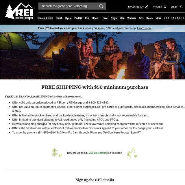
The purchase threshold required to qualify for free shipping is clearly stated on the product page, helping users to avoid getting “tricked” by sneaky “Free Shipping” notices.
When the condition to qualify for free shipping is simply a spending threshold — for example, “Spend $75 to qualify for free shipping” or “Orders over $75 ship for free” — that information can easily be communicated to users wherever the “Free Shipping” notification is placed on the product page.

Once users add a product to the cart, they can find free shipping information in the “Add to Cart” drop-down (first image) and on a “Free Shipping” information page if they click the link in the drop-down (second image).
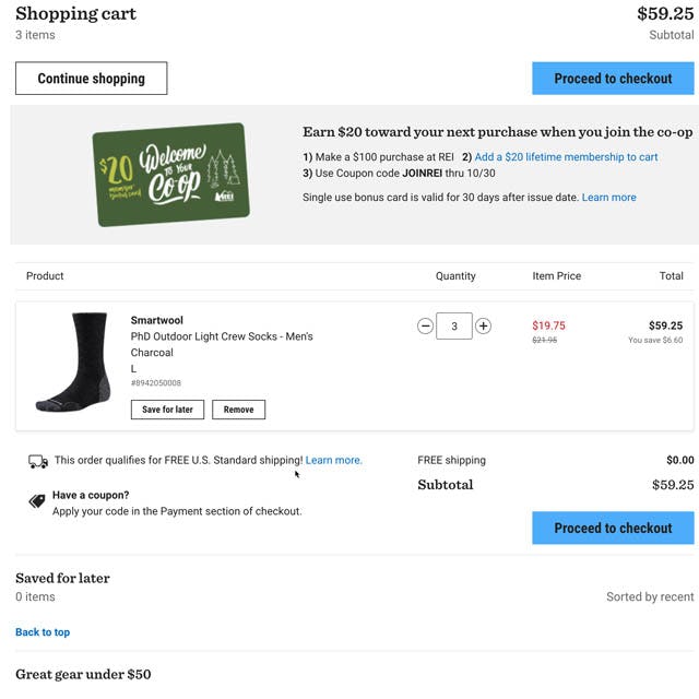
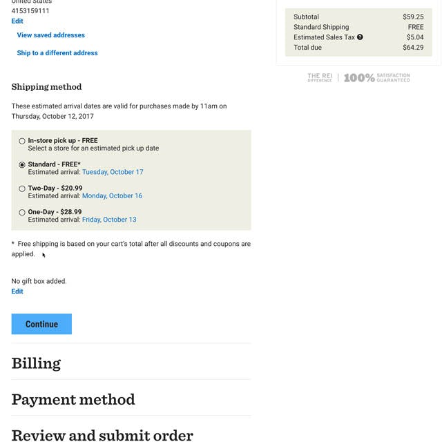
Continuing to the checkout, in the cart users are again alerted to the fact that their order qualifies for free shipping (first image) and again during the shipping address step (second image). The unambiguous “Free Shipping” message is communicated and reinforced at multiple places on the site, from the product page all the way through checkout, reducing the likelihood users will abandon due to unexpected total order costs.
When users see “Free Shipping” advertised — and then have that contradicted by shipping fees, or by additional shipping fees for oversized items — many will feel unsure of what the actual, final shipping cost will be. This can lead some to abandon due to too-high extra costs, while others may decide to call or chat with customer service, putting needless strain on support.
At REI, however, the clear statement of the shipping threshold makes it less likely users will be angered or surprised by the cost of the shipping during checkout (if they haven’t qualified for free shipping).
(For more on “Free Shipping” information, see our article “‘Free Shipping’ Should Not Only Be in a Site-Wide Banner (32% Get It Wrong)”.)
4) 5 Requirements for the ‘Ratings Distribution Summary’ (65% Get It Wrong)
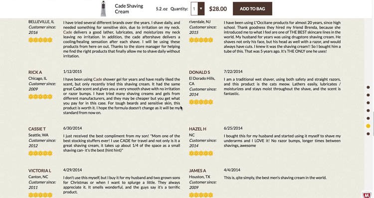
“I do wonder if it’s rigged a little, to leave out the bad reviews.” A test subject viewed a list of positive reviews, with no reviews summary, with skepticism because he was unable to see anything other than 5-star reviews.
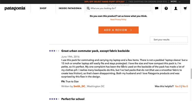
“The fact that it’s their best-selling and yet it has several reviews up at the top that are less than five stars makes me a little bit concerned. Makes me wonder why it’s their best-selling one,” a subject said at Patagonia, misinterpreting the product to be somewhat mediocrely rated based on the first couple of reviews, while in fact the product had a 4.2-star ratings average.
Our latest large-scale usability testing of product pages made it clear how important product reviews are to users: 95% of users relied on reviews to learn more about products.
In particular, a ratings distribution summary at the top of the reviews section allowed users during testing to get a feel for how the product has been rated overall. In fact, the ratings distribution summary was the most utilized feature of the reviews section, and was relied on by users even more than the actual review content.
Our testing showed that when ratings distribution summaries aren’t provided, users are more likely to conclude that the reviews are fake if they see mostly positive reviews listed first in the section, or misinterpret how a product has been rated if they see mostly negative reviews.
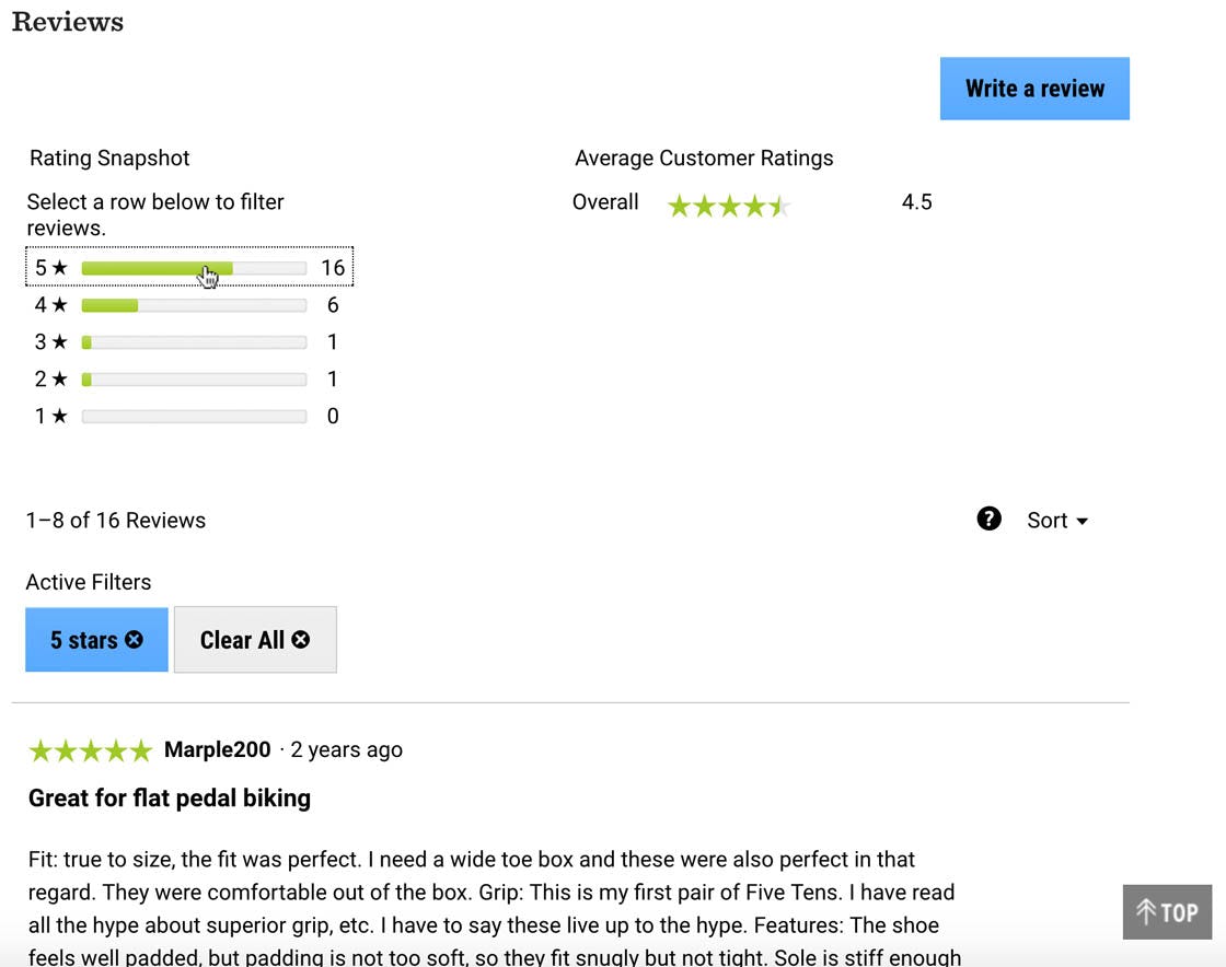
Beyond simply having a ratings distribution summary, REI gets nearly every implementation detail right, helping users make the most use of the summary.
Once the decision to include a ratings distribution summary has been made, testing revealed that there are, in particular, 5 implementation details that are important to get right for the overall UX performance of the summary:
- The ratings distribution should be graphical illustration (e.g., a bar chart)
- The ratings distribution summary must act as ‘star’ filters (users can click to view, e.g., only 5-star or only 1-star reviews)
- The ratings distribution summary should be exposed or expanded by default
- Each ratings filter should be mutually exclusive (i.e., users should not be allowed to select multiple star ratings at once)
- The ratings distribution summary should be dynamically hidden for products with few reviews
At REI, the ratings distribution summaries meet four of the five above criteria: the summaries are graphical illustrations, act as star filters, are exposed by default, and ratings filters are mutually exclusive. The only criterion not met is that the ratings distribution summary should be dynamically hidden for products with few reviews, which, to be fair, was only met by one of the 60 benchmarked sites (Grainger).
(For more on ratings distribution summaries on product pages, see our article “5 Requirements for the ‘Ratings Distribution Summary’ on the Product Page (65% Get It Wrong)”.)
5) Provide Both Site-Authored FAQs and Community-Driven Q&As (70% Get It Wrong)
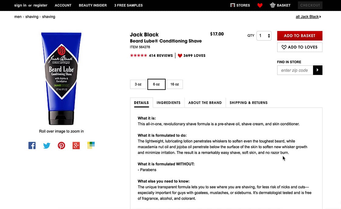
“So it’s all in one, pre-shave oil, shave cream, skin conditioner,” a subject at Sephora explained, “So that takes care of… [scans the text] no razor burn, right off the bat. It doesn’t say what it smells like though.” It’s of course impossible for us to know whether Sephora’s copywriter (or Jack Black’s writer) deliberately left out information on the scent of this “Beard Lube,” but it certainly requires a great and highly empathetic mind to anticipate every single user question or concern about all items in a site’s product catalog.
Site-authored Q&As (i.e., where site representatives respond to user questions) and community-driven Q&As (i.e., where users answer each other’s questions) play integral roles in the quest for a well-balanced and fully featured product page. These sections obviously cannot replace the product description, nor should they try to — rather, these sections should be seen as extensions of the product description.
It is the interplay between all of this content that makes it work. A standalone product description would either get too long or leave important user concerns unaddressed. Yet a standalone site-authored Q&A or FAQ section is similarly deficient: it won’t be nearly as credible as a community-driven Q&A, and may overlook more esoteric user concerns. But then again, a standalone community-driven Q&A wouldn’t work either: it would start out empty and, once it does receive content, it won’t be nearly as scannable or high quality as properly curated site-authored content.
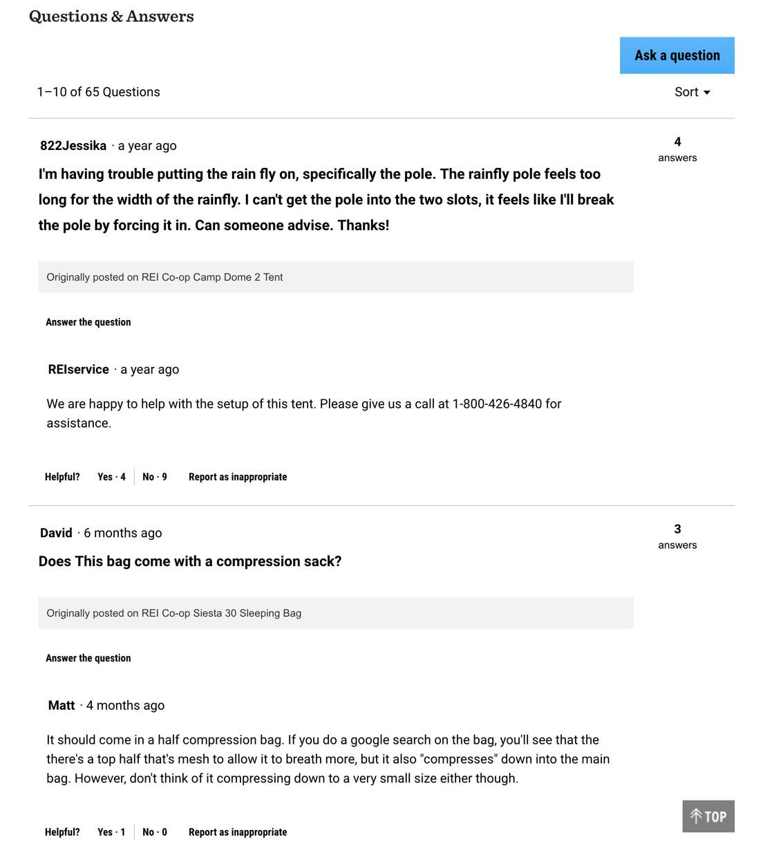
At REI, the Q&A section includes responses from REI representatives (“REIservice”) as well as other users (e.g., “Matt”), ensuring users get both authoritative and credible responses, and helping to make the product page a wealth of in-depth product information for users.
It’s obviously not easy to get all these elements right — otherwise 70% of sites wouldn’t fail at it. Yet it is worth it, because the true rewards come from the interplay among these different content sections, which is what enables the “Hybrid FAQ and Q&A” solution to overcome the three issues we’ve observed in testing:
- Product description length — By relegating the more unique (or even obscure) user questions and concerns to FAQ and Q&A sections, the product description can stay concise and on point
- Credibility of product claims — Most users are highly skeptical of any product “claims” made in product descriptions and other site-authored content due to the inherent bias, an issue that community-driven Q&As (along with customer reviews) tend to overcome
- Unanticipated questions — Community-driven Q&As are able to illuminate user concerns and questions that weren’t thought of when writing the product description
REI mixes both site-authored responses to questions with community responses in the Q&A section, giving users the “best of both worlds” — authoritative content from REI specialists and credible content from other users of the products.
(For more on Q&As on product pages, see our article “Provide Both Site-Authored FAQs and Community-Driven Q&As (70% Get It Wrong)”.)
6) Provide a Cross-Sell Section that Only Contains ‘Alternative Products’ (28% Don’t)
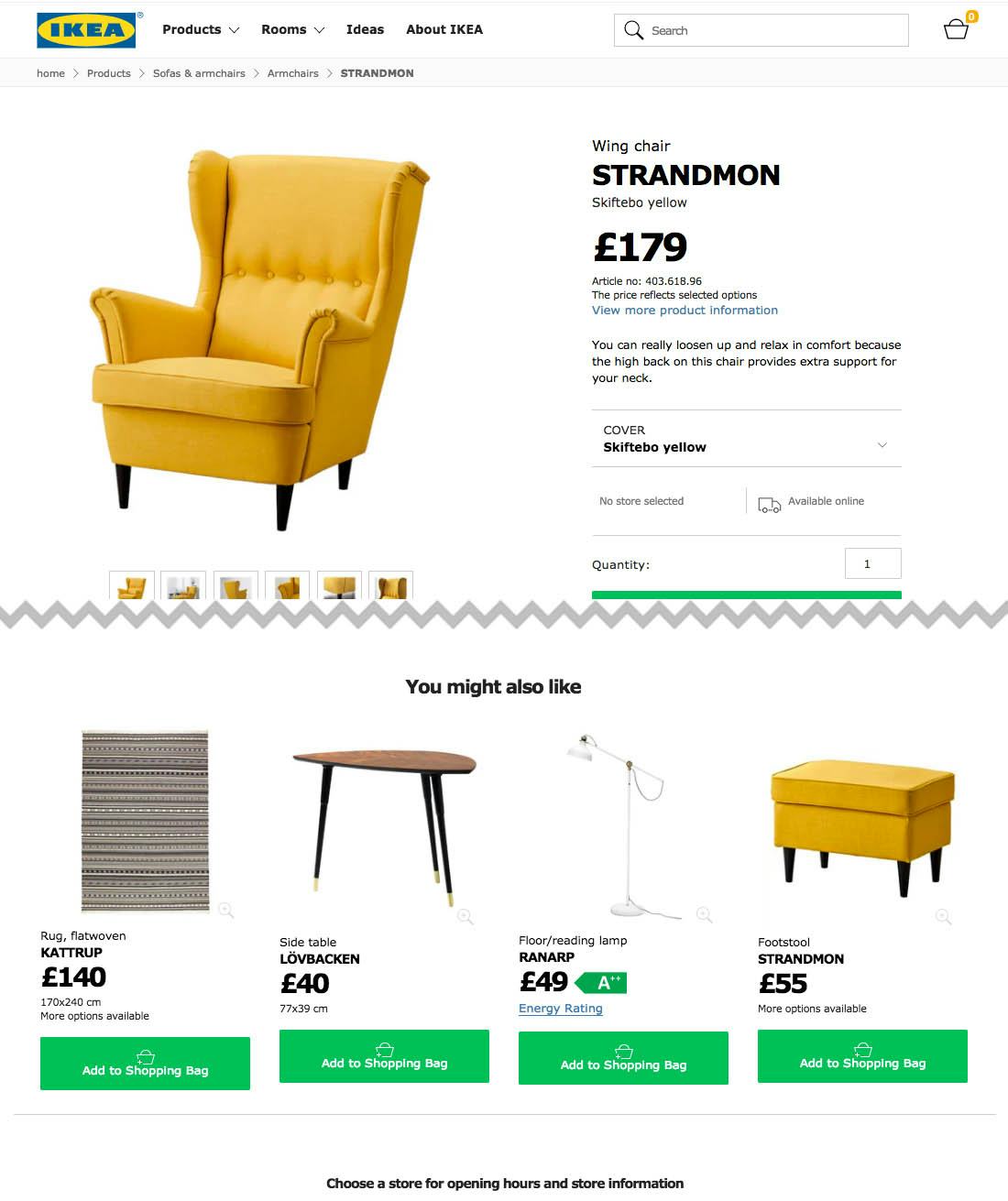
IKEA, like 28% of benchmarked sites, fails to provide a cross-sell section for alternative products. Users who may like the style of this chair, but perhaps feel it’s not quite the right fit, must continue their product search using category navigation or search, or choose to abandon the site altogether. Note that the “You might also like” section contains only supplementary products (discussed as the 7th implementation below).
When users land on a product page and learn that the specific item doesn’t match their criteria perfectly, they essentially have two options: 1) abandon the site or product search or 2) go look for alternatives until they find an item that fits their criteria. Initially, most users will luckily opt for the latter option, continuing their product search, but after a while more and more users will drop-off as they fatigue.
Users come to product pages from a wide variety of paths — sometimes from an intermediary category page, other times from on-site search, and, perhaps even more often, from off-site search or social media links (not to mention “regular” referrals and ads). Yet what all these paths have in common is that the user chooses to open this particular product page (e.g., by clicking on the link that’s been shared with them), so the user is typically looking for something fairly similar to the product they end up viewing, if the product they’re viewing isn’t quite what they’re looking for. Enter: suggestions for alternative products.
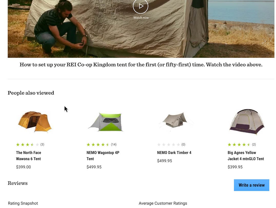
REI provides a cross-sell section that only contains alternative products — in this case, other tents. This eases the product-finding process for users, as they are able to stay on track with finding a product that meets their needs.
At REI, a section containing only product alternatives lets the user jump from one product page to the next until they find a suitable item. It’s an effective way to keep users on-site, taking them from one related product to the next (e.g., “This tent wasn’t quite what I was looking for, but this one looks promising…”).
(For more on alternative product cross-sells, see our article “Recommend Both Alternative & Supplementary Products (Only 42% Get It Right)”.)
7) Provide a Cross-Sell Section that Only Contains ‘Supplementary Products’ (47% Don’t)
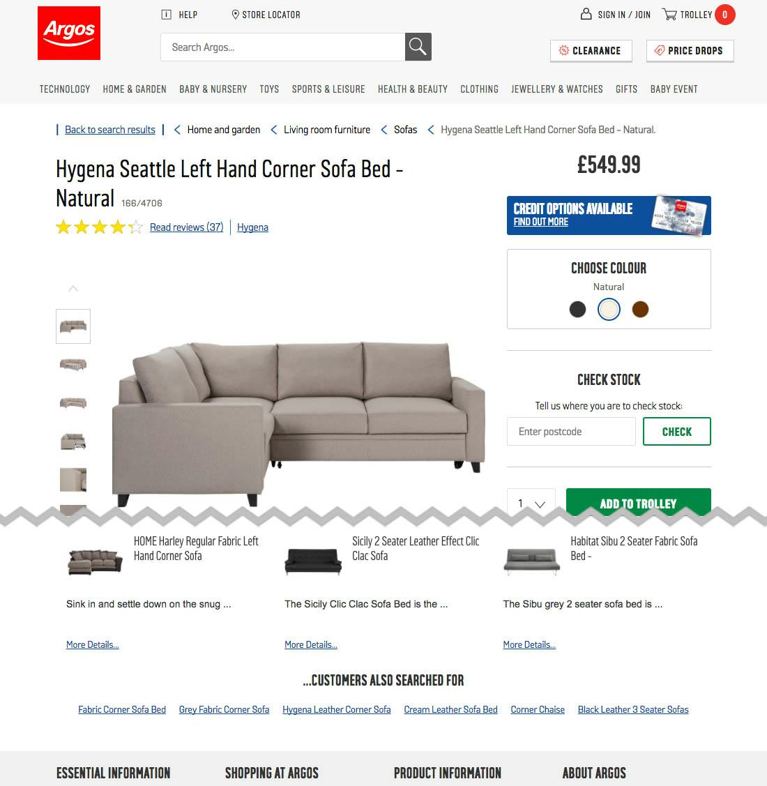
Argos doesn’t provide a cross-sell section for supplementary products, missing an opportunity to entice users viewing a sofa with sofa covers, rugs, lamps, etc. Note that the cross-sell section at the bottom of the page contains only alternative products (discussed in implementation 6 above).
When users find the product they want, they often need or want various add-ons or accessories to go along with it. Yet finding such supplementary products can be an incredibly cumbersome task unless they are listed as product suggestions directly on the product page (and below the cart contents on the cart page). However, 47% of sites don’t have a supplementary products section on the product page.
During our usability test sessions we often observe subjects hunt around product pages in search of suggestions for supplementary products after adding the product to their cart — often looking to “complete the package” by, for example, getting a case and memory card to go along with that compact camera they just added, or “finish the look” by adding a pair of pants and shoes to the shirt they just found. In other words, users find recommendations for supplementary products to be available on the product page incredibly helpful and often expect them to be there. When they’re not, sites are missing an opportunity to offer users products they’re likely to be interested in.
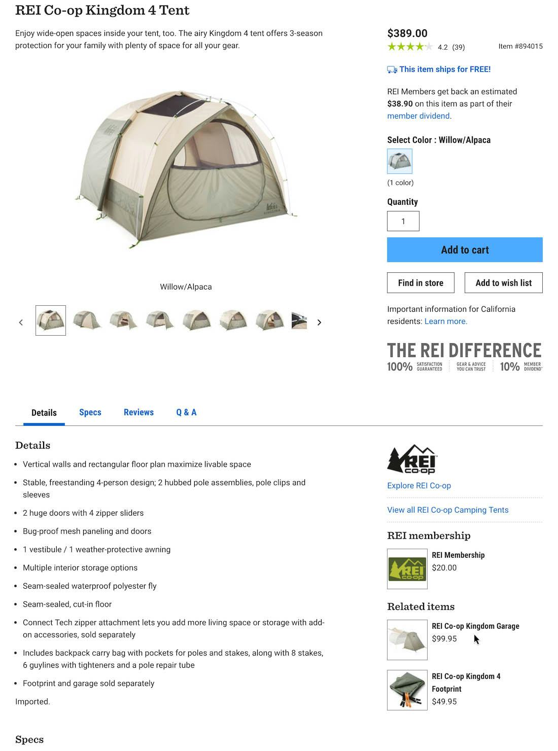
REI offers “Related items” (i.e., supplementary products) in a sidebar. Here, users looking at a tent see a garage and a footprint for the specific tent they’re viewing, which are reasonable items to offer and will likely encourage some users who decide to purchase the tent to add one of the supplementary products as well.
Having supplementary products available on the product page, in a section separate from alternative product suggestions, is an excellent way to increase total order value. It’s a “win-win” for users and sites: users can find items they are legitimately likely to be interested in (based on the product they’re currently viewing), and sites can offer users these products, in the hope that they’ll decide they do want, for example, the high-performance socks to complement the bike shoes they’re currently looking at.
(For more on supplementary product cross-sells, see our article “Recommend Both Alternative & Supplementary Products (Only 42% Get It Right)”.)
Perfecting the Product Page User Experience
As noted in the introduction to this article, 82% of sites struggle to reach even an “acceptable” level for the Product Page user experience. In that respect, the Product Page has much in common with the Product Lists & Filtering, Cart & Checkout, and Mobile E-Commerce areas of user experience, in that several top-grossing e-commerce sites also struggle to provide “acceptable” overall performances in those areas as well.
REI is a good UX design example as they do many things well in terms of the Product Page user experience, which most other sites fail at, including
- having “In Scale” images (28% get it wrong),
- allowing users to purchase temporarily out of stock products (68% don’t),
- avoiding misleading “Free Shipping” information(8% don’t),
- having a clickable ratings distribution summary and getting almost all the implementation details right (65% get it wrong),
- having both site- and community-authored Q&As (70% get it wrong),
- providing a section that only contains alternative products on the product page (28% don’t), and
- providing a section that only contains supplementary products on the product page (47% don’t).
REI, along with some of the other top-performing sites (e.g., Northern Tool, L.L. Bean) can be considered as a source of inspiration when trying to improve the Product Page experience.
To see REI’s Product Page experience and UX performance in detail head to REI’s site review or consider checking out one of the 59 other site reviews in our Product Page UX benchmark.
This article presents just parts of the benchmark analysis of our Product Page study — get full access to get it all, and the 98 Product Page UX guidelines identified in our large-scale testing.