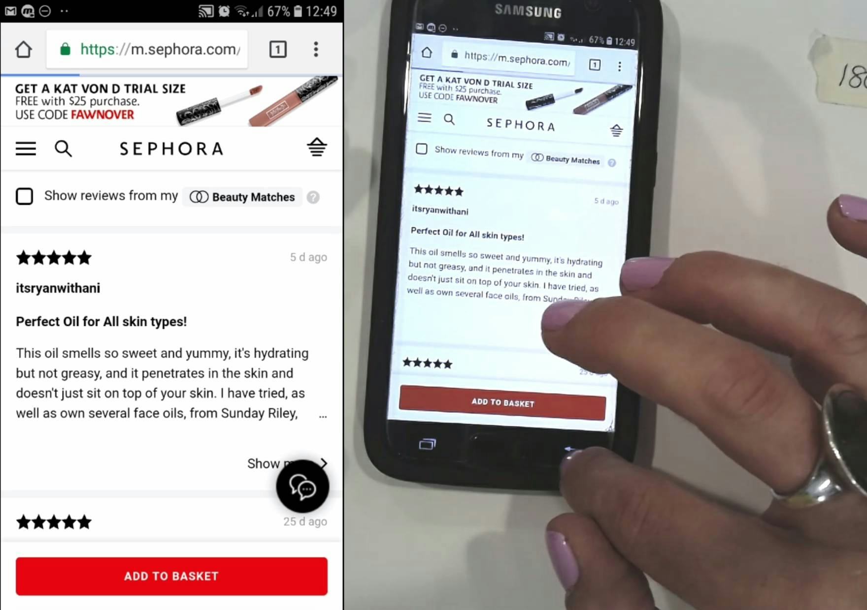
“It keeps coming back up to the very start. I would prefer if it went back to where I last left it.”
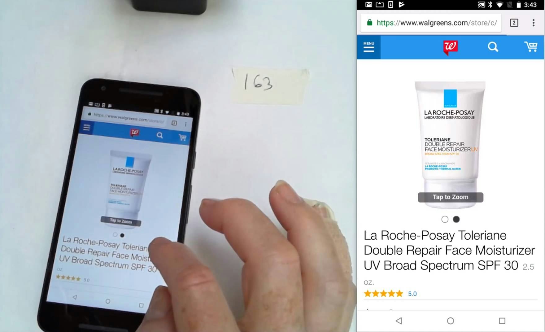
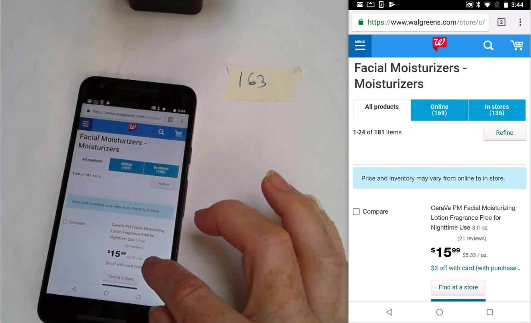
When users are evaluating products, they often move back and forth between the product list, where they can see a few key elements of product information, and multiple product details pages.
If users click into a product page having found the item interesting on a product list, then backtrack to the product list when they are done, they’ll be taken to one of two places in the product list:
- On most sites users are returned to the same place in the product list as they were originally — that is, the position of the list item they clicked on.
- However, on 13% of sites in our desktop and mobile benchmarks (amongst the world’s largest sites) users are returned to the top of the product list rather than to the place they were at before clicking into the product page.
If users are returned to the top of the product list, they will have to scroll to find the product they just investigated and then restart scanning items from that point.
This extra step of refinding the correct place in the product list is observed to be a direct cause of site abandonments during Baymard’s large-scale usability testing.
This article outlines
- why the issue causes problems for users,
- why problems are more severe on mobile devices,
- and describes how to make it easy for users to refind the last product viewed in product lists.
Why the Issue Causes Problems for Users
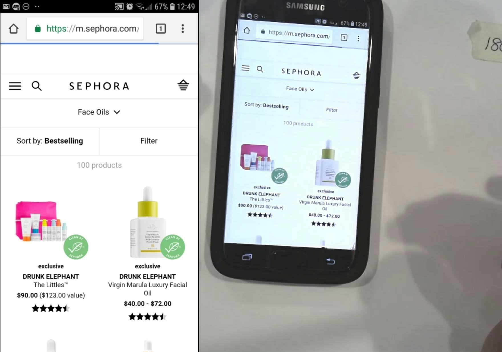
“It keeps coming back up to the very start. I would prefer if it went back to where I last left it.” This user on Sephora didn’t like how she was brought to the top of the product list after tapping back from a product page.
When users are taken to the top of the product list, rather than to where they were before visiting the product page, they become disoriented and must refind where they were in the product list.
Not only is this tedious — users must redo all the work they had previously done by scrolling the product list again — but it can also be challenging to remember exactly where they were before visiting the product page (e.g., if the product list is a selection of blue dresses with similar but not identical styling, or similar-looking office chairs, as seen in the video above).
Now, imagine if someone was in a bricks-and-mortar bookstore and she found a book of interest in the middle of a very long bookshelf. If she was “returned” to one end of the shelf when she replaced the book, and had to walk back to the original spot again to explore similar books, the shop would lose a customer.
Furthermore, users are quite likely to lose patience if they have to look at many separate products and keep getting placed back at the top of the product list.
For example, if someone wanted to learn about 10 products in detail, they’d have to refind 9 items scattered throughout the list.
“When I backtracked I got kicked way back up in the scroll…now I’m just scrolling fast to get back down to where I was.
In this situation, there’s a very good chance that they’d just give up due to the time needed to scroll to find each one.
Indeed, given that 87% of sites in our benchmark return users to the same place in the product list, most users won’t expect to be taken to the top of the list.
(This issue is one example of not adhering to common practice regarding “Back” button behavior, where users have a very specific mental model of how an interface should behave.)
The difficulty in refinding the product can depend also on the method used for loading products.
There are 3 loading schemas on e-commerce sites:
- “Pagination”
- “Load More”
- “Endless Scrolling”
With “Endless Scrolling”, the issue of refinding items in a product list could be really severe, given that users could load a large number of items quite quickly if they simply scroll quickly through the list before visiting a product page.
With “Pagination”, on the other hand, the number of items loaded by default could be relatively small and users wouldn’t need to scroll excessively to refind the position they were in.
Similarly, with “Load More”, the difficulty in refinding the right spot in the list would depend on the number of products loaded at once.
However, whatever the loading schema is, if the process of refinding the correct place in the product list is too time-consuming and troublesome, users may well give up looking for a suitable item.
The Problem Is Worse on Mobile
“When you use the “Back” button, it takes you right back to the beginning. Rather than where you left off.” This user spent significant time during testing scrolling down the Walgreens product list refinding products after tapping back from product pages.
Users of mobile sites will find it even harder than desktop users to refind the last product viewed when returned to the top of the product list after visiting a product page.
One reason is that desktop users can avoid losing their place in the product list by opening product pages of interest in new browser tabs — a behavior observed during our desktop testing, but only by a small subgroup of users. Then, they can return to the product list by simply returning to the relevant browser tab and resume scrolling from where they left off.
On mobile, opening multiple tabs is a more cumbersome process that none of our most recent mobile test participants attempted.
Another reason the issue is more severe on mobile is that scrolling is often slower and more cumbersome — users were frequently observed inadvertently selecting text or tapping links during mobile testing, which wasn’t an issue when scrolling during desktop testing.
“When you use the “Back” button, it takes you right back to the beginning. Rather than where you left off”
Additionally, a small subgroup of desktop users have been observed to use keyboard commands (e.g., using “option” + the down arrow or “Page Down” on Windows) to more quickly navigate to where they’d like to go. A few tech-savvy desktop users may even use the “Find” feature (e.g., CMD+F) to more quickly jump to where they were in the product list — but this was a behavior not observed during mobile testing (e.g., using the “Find on Page” feature in iOS).
Furthermore, on desktop, more items are visible in each viewport. On mobile, fewer items can be seen at once.
For example, a product list with 40 items will take up around 20 viewports on mobile devices, but only between 10 and 13 on a typical desktop monitor. As a result, desktop users will generally reach the previous spot in the product list more quickly than on mobile.
A final reason for why the issue is worse on mobile is that page load times can be much longer than on desktop.
During testing on mobile devices, users frequently had to wait for considerable amounts of time for pages to load.
Excessive page load times, in addition to having to refind the product last tapped on the product list, can make it quite an ordeal for mobile users to move back-and-forth between product lists and product pages.
Ensure Users Can Easily Refind Their Place In a Product List
When sites don’t return users to the correct place in the product list, therefore, product finding becomes less efficient, and users’ time is wasted refinding the item they last viewed.
Also, users can’t immediately resume scrolling where they had previously left off, and start viewing products that they had not previously seen.
Furthermore, users will be discouraged from visiting product pages in the knowledge that, if the product is not quite suitable, going back to the product page will troublesome and looking for alternatives will take time.
Given the significant drawbacks, it’s surprising that 13% of sites in our desktop and mobile benchmarks return users to the top of the product list.
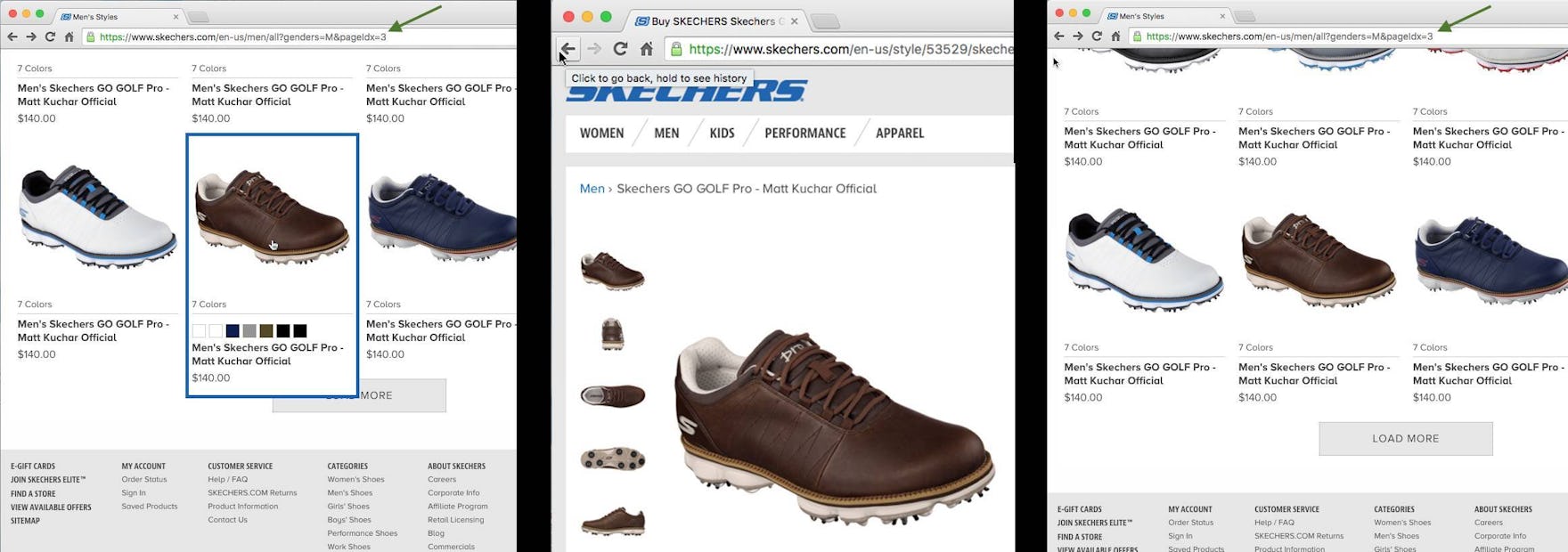
At Skechers.com the “Load More” implementation actively addresses the “Back” button issue by rewriting the URL each time users click the “Load More” button. Consequently, as users click the browser “Back” button on a product page they are taken back to the right position in the product list (e.g., to “page 3”).
When returning users to the same place where they were in the product list, there’s a technical implementation detail that’s critical to get right when using “Load More”: “Back” button support through ‘history.pushState’.
The HTML5 History API allows sites to honor users’ expectations of where they’ll end up when going back from a product page to a product list.
More specifically, the history.pushState() function allows a site to invoke a URL change without a page reload, meaning the site can align the browser “Back” button behavior to match user expectations. The URL needs to be altered on each “Load More” click so the correct product list content can be loaded when a user moves backwards.
Returning users to the same place in the product list on returning from the product details page, therefore, speeds up product finding, and is particularly helpful to mobile users.
Finally, it’s one of the recommended ways to support “Back” button use and has widespread support across our benchmark sites, making it a “web convention” users have come to expect — breaking this expectation makes a site seem especially “clunky” or hard to navigate for users.
This article presents the research findings from just 1 of the 650+ UX guidelines in Baymard Premium – get full access to learn how to create a “State of the Art” e-commerce user experience.