Product images are among the most utilized product page content, and are critical to online shopping. Often product images act as users’ primary method for inspecting and evaluating a product, and they are their substitute for physically holding the item in their hands. In fact, 56% of users’ first actions when arriving at a product page is to inspect images.
Furthermore, in the mobile context product images have some special requirements, including that they must scale proportionally when the mobile device is in landscape mode.
However, our large-scale Mobile E-Commerce usability testing shows that 52% of sites don’t scale up product images proportionally when switching to landscape mode. Rotating the mobile device to landscape mode was a user behavior we observed time and again during testing, when product images were too small, or when users found the narrow width of portrait mode too limiting.
In this article, we’ll discuss the test findings from our Mobile E-Commerce usability study related to scaling product images in landscape mode.
Why Images Must Scale Proportionally in Mobile Landscape Mode
Our mobile usability testing shows that most sites understand the importance of product images, and have invested resources in producing high-resolution images that provide users with a good visual overview of a product. In fact, most sites provide images on mobile devices that are sufficiently large (82%) and offer detailed views of the product (62%).
However, it’s also clear from testing that most mobile e-commerce implementations haven’t given enough thought to how to display product images when a user switches from portrait to landscape mode.
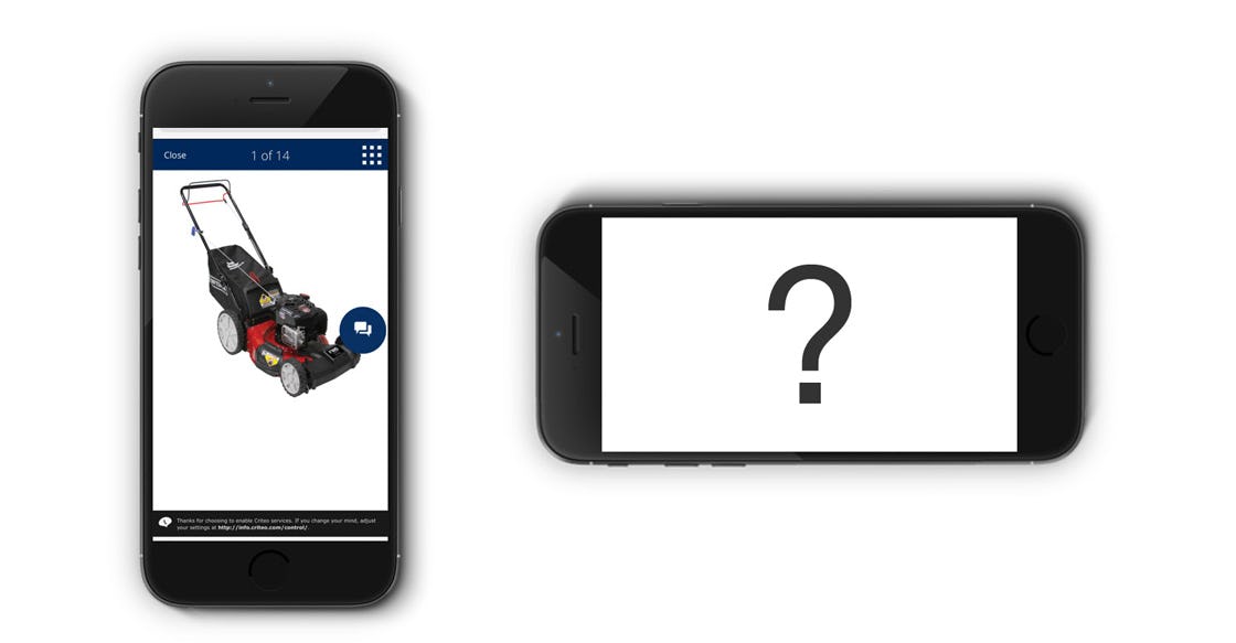
A common, mobile-specific behavior observed in testing, as many users attempted to get larger product images, was users switching from portrait to landscape mode (i.e., turning the device from a vertical to a horizontal orientation).
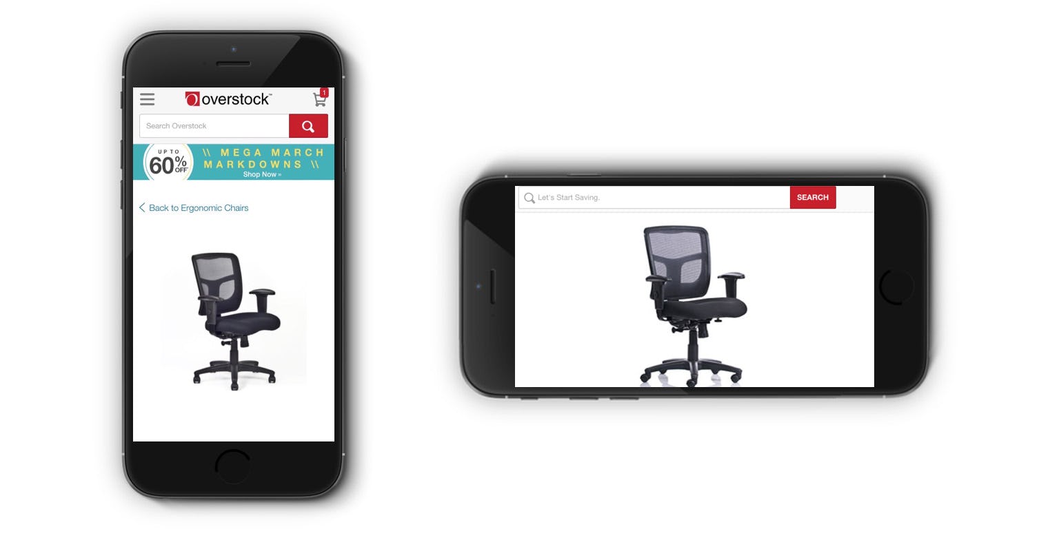
At Overstock, an office chair fails to scale up when viewed in landscape mode. Users will be frustrated when images fail to scale proportionally in landscape mode, as up to 50% of mobile users switch to landscape mode mainly to get a larger image.
In fact, 50% of mobile users who were unsatisfied with the small size of product images tried at least once during testing to turn their mobile device from portrait mode to landscape mode — with the intention of getting a larger image. Furthermore, some users consistently browsed the category and search results lists in portrait mode (to get an overview) and then instantly switched to landscape mode when visiting a product page (to see the product images as large as possible).
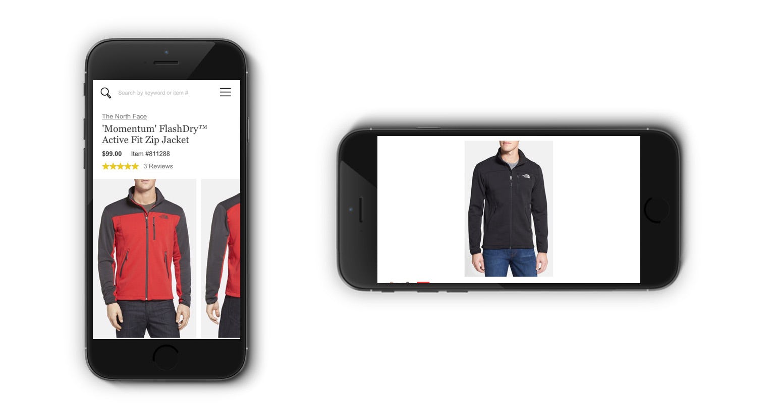
Similarly, at Nordstrom a jacket also fails to scale up when viewed in landscape mode.
However, at 52% of mobile e-commerce sites users are out of luck, as the images don’t increase in landscape mode, limiting users’ ability to get an adequate visual impression of the product.
This common user behavior of turning to landscape mode must be supported. Otherwise, some users are likely to abandon out of frustration, if they find they can’t use the product images to visually assess the product (which in some cases is the most important criterion for deciding whether to purchase a product).
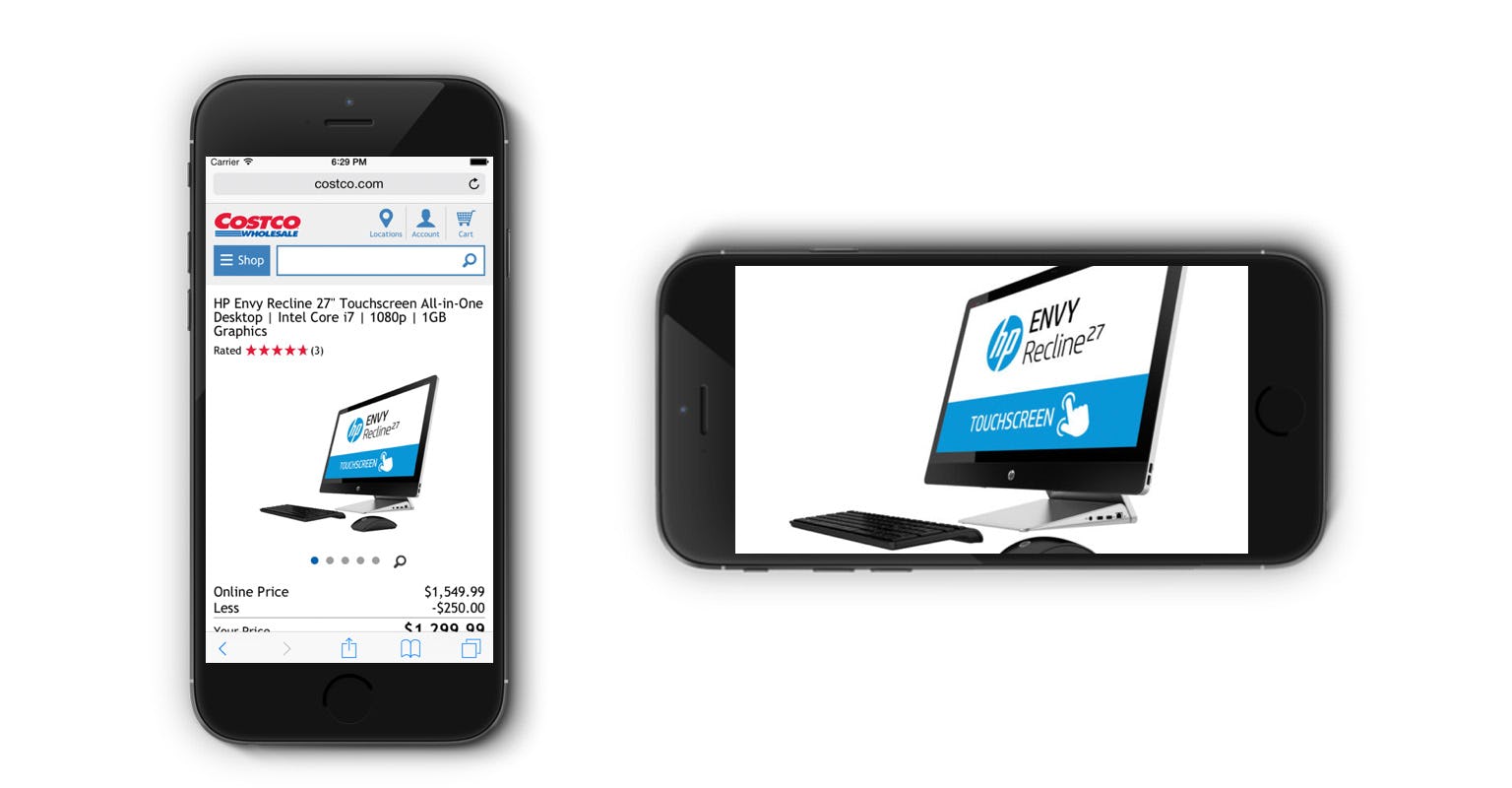
At Costco, an image of a computer scales proportionally when viewed in landscape mode, helping users to better visually inspect and evaluate the product.
Scaling images in landscape mode can be as simple as defining the image size as a relative width of the viewport. The images at the product page will then scale up when switched to landscape mode, allowing users to switch between portrait and landscape mode depending on their current needs.
Match User Expectations by Scaling Product Images Proportionally in Landscape Mode
Despite a massive increase in the percentage of mobile vs. desktop traffic to e-commerce sites over the years, shopping on a mobile device continues to be a challenging experience.
In fact, our research shows that, though many users begin shopping on a mobile device, 61% sometimes or always switch to their desktop devices when having to complete the mobile checkout process (Mobile E-Commerce guideline #81).
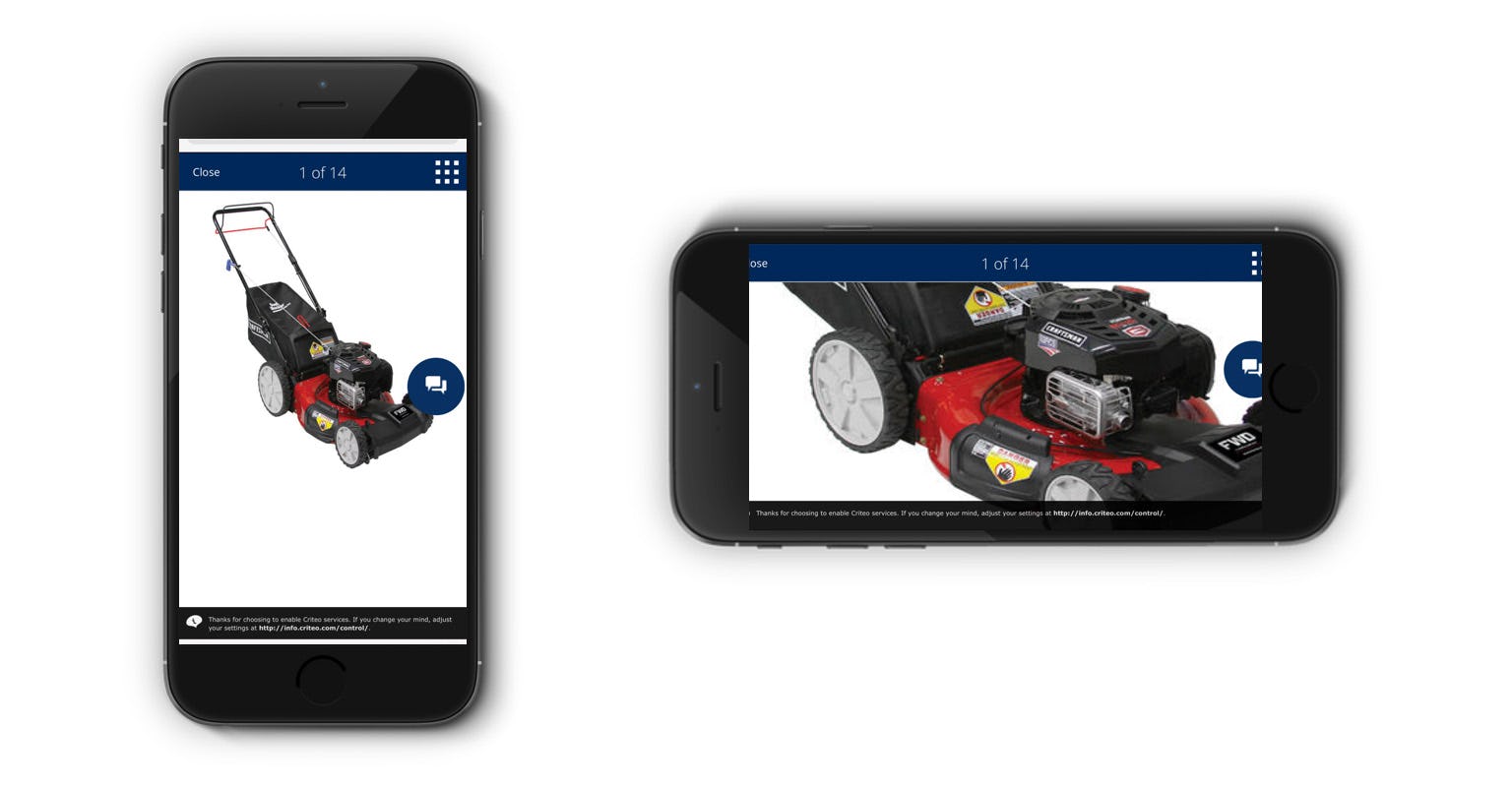
At Sears, although the image scales up in landscape mode, the resolution is low, making it difficult to get a good visual sense of the product.
Furthermore, while sites generally perform well when it comes to the size and quality of images on mobile (e.g., 80% of mobile sites have primary product images in 90%+ of the screen width), mobile-specific issues continue to be a problem, as 40% don’t support touch gestures such as pinch or tap-to-zoom on product images and 52% don’t scale images proportionally in landscape mode.
The end result is that some users will find it difficult to gather the visual information they need to determine if a product will fit their needs.
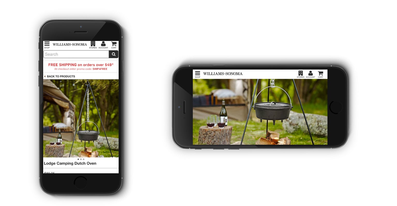
At Williams-Sonoma, users get larger images when viewed in landscape mode, and the resolution is sufficient to view product details.
Therefore, it’s important to match users’ expectations of how product images should perform on mobile devices by scaling up images when users switch from portrait to landscape mode. And yet 52% of mobile sites don’t.
This article presents the research findings from just 1 of the 650+ UX guidelines in Baymard Premium – get full access to learn how to create a “State of the Art” e-commerce user experience.