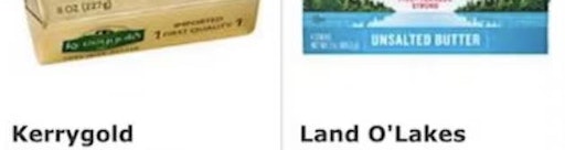
In usability testing we see that spec sheets on the Product Page can be immensely helpful to both users considering spec-heavy products, users with a high level of domain knowledge about a specific product type, and users trying to decide between different products of the same product type.
However, our large-scale Product Details Page usability testing consistently shows that many product specification sheets suffer from design flaws that hamper users’ ability to use them effectively.
In fact, our UX benchmark shows that 50% of e-commerce sites have spec sheet designs that are difficult for users to scan. This ensures that most users will have to work harder to find the information they’re looking for, while others won’t be able to find the information at all, which can lead users to discard perfectly relevant products.
In this article, we’ll discuss 4 test findings from our Product Page usability study related to product spec sheet scannability, including:
- Why semantic grouping of specifications is necessary
- How to help users focus on the most critical specifications
- How styling can improve spec sheet scannability
- Why multi-column formats should be avoided for most spec sheets
1) Why Specifications Need to Be Grouped Semantically into Sections
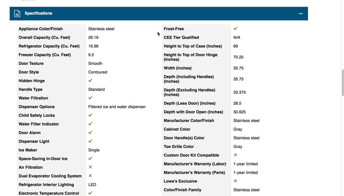
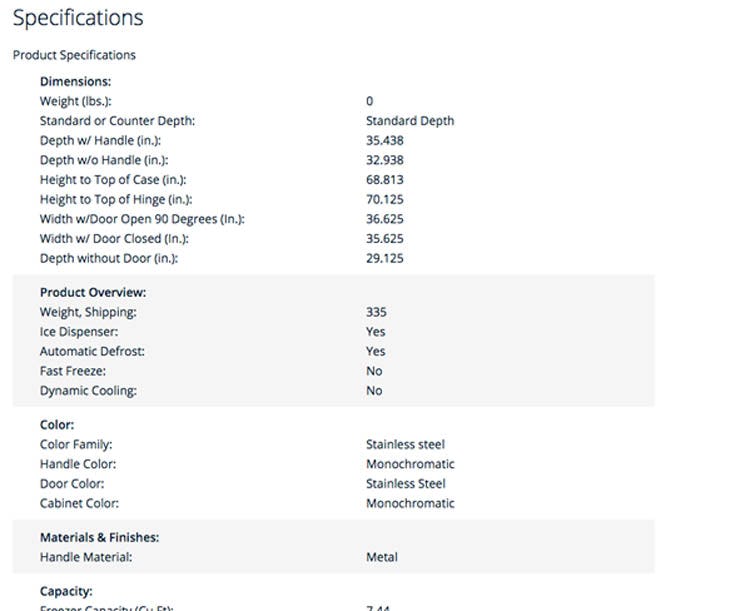
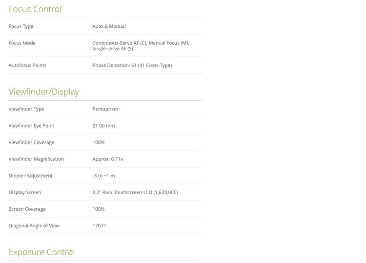
Multiple test subjects had issues identifying core attributes of a fridge at Lowe’s — in particular the specs for size and warranty information. Note how the two-column spec sheet is simply one long ungrouped list of specs.
On the other hand, Tesco sematically groups specs into sections, making the long spec sheet much easier to get an overview of and allowing users to quickly access specs they’re looking for.
When users are presented with unorganized or ungrouped product specification sheets, getting an overview and locating specific specs becomes very difficult.
In fact, during testing even relatively short spec sheets became unscannable when they were presented as a “wall of specs”. This forces users to spend more time trying to find specifications they’re interested in, instead of spending the time interpreting the relevant specs and how they impact their purchasing decision.
Yet our benchmark reveals that 23% of e-commerce sites don’t group specs semantically into sections.
Spec sheets of just medium length (for example, anything more than 20 specs) need to group the specifications into sub-sections of related information, each with a title.
The groupings and titles was shown in testing to allow for much faster scanning but also have the benefit of making the overall spec sheet less intimidating (by breaking up the “wall of specs”).
Furthermore, grouping the spec sheet into sub-sections ensures related specs are always presented near each other, further improving scannability. For example, including all specifications related to the dimensions and weight of a product in a “Dimensions & Weight” sub-section allows users to quickly access that content when first browsing the spec sheet.
Finally, specification grouping titles should be tailored to the type of product they describe. Hence, the specification grouping titles will need to differ across the product types sold, for sites that sell a diverse set of product types (e.g., titles in spec sheets for fridges will differ from titles in spec sheets for drills).
2) How to Help Users Focus on the Most Critical Product Specs
Costco doesn’t provide a summary of the key specs at the top of a long list of specifications, making it difficult for users to zero in on the most critical specs.
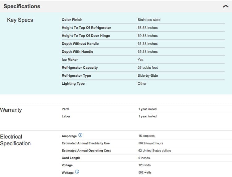
Best Buy offers a “Key Specs” summary at the top of the spec sheet, duplicating the most important specifications in the long spec sheet at the top. In addition the display sequence of the spec groups generally reflects the popularity of the spec type.
In a product spec sheet, all information is not of equal importance. Most product types will have a few critical specs that most users will seek out.
While the most sought-after information in the specification sheet will vary across industries, it often is the same within product categories. Hence the sequence in which the groups of specifications are listed can be optimized, so that the most sought-after specifications are presented first.
In addition to helping users find important product specifications quickly, identifying the most important specifications is also a highly valuable asset if implementing truncation of the spec sheet.
For specification sheets exceeding two full viewports, consider if a summary of the key specifications should additionally be provided.
However, if using a summary, make sure the specifications contained in a summary are also repeated where applicable in the overall spec sheet, to ensure users can find them if they skip over the summary.
Furthermore, specification sheets that are shorter than two viewports will likely not require a summary of key points, but instead can rely only on a prioritized display sequence of the spec sub-sections.
Despite the benefits they offer, only 3% of sites use a summary to highlight the most critical product specs.
3) How Styling Can Improve Spec Sheet Scannability
The background coloring at Sears does provide visual distinction between sections, but does little to help users associate and trace the specification labels to the specification values.
Both vertical and horizontal shading at REI enabled test subjects in our eye-tracking study to easily move between vertically scanning only the specification labels until finding the spec type of interest — and then move on to horizontally tracing the line for that specification label to its associated value.
During testing it was clear how spec sheets without any horizontal styling made it difficult to trace the spec label to its associated value. The distance between the two simply makes it needlessly difficult and error prone for users to trace unstyled horizontal lines, especially given the often somewhat small font size used in spec sheets.
This stands in sharp contrast to the behavior observed in our eye-tracking study, where subjects at the sites that used horizontal shading (like alternating row colors) were able to both much more quickly and reliably trace the horizontal lines when associating the specification labels with values.
Background colors, icons, and lines are all techniques that can be applied to spec sheets to make the information more readable. An added bonus with some styling tools like icons is that they can give life or add visual interest to an otherwise dull and text-heavy list.
Our benchmark data reveal that 23% of sites don’t use such visual aids to help users scan and interpret the spec sheet.
4) Why Multi-Column Formats Should Be Avoided for Most Spec Sheets
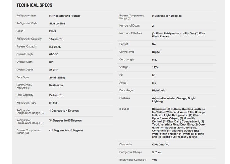
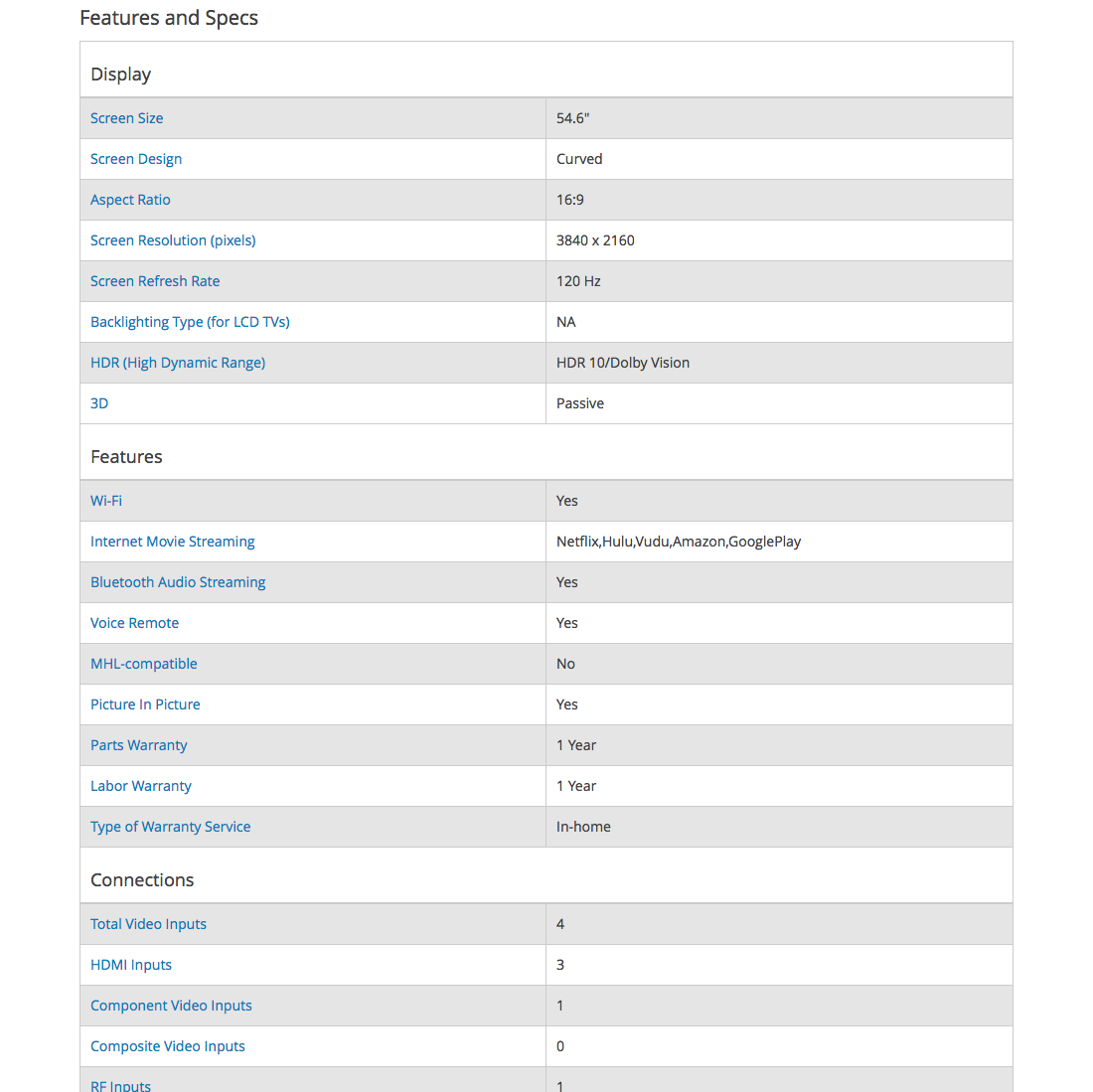
Two columns for specs at Grainger makes the spec sheet harder to scan, and may make some users mistake the specs for a single product for a comparison feature instead.
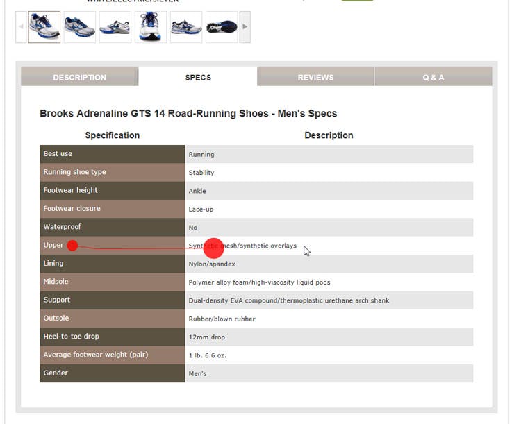
A single column for specs at B&H Photo helps users navigate the specifications and reduces the chance they’ll misinterpret the spec sheet for a comparison feature.
In testing, a two-column layout was shown to make it much harder for subjects to locate and interpret information, when compared to a one-column design.
This tracks with our general findings on multi-column layouts for forms, where we found they should generally be avoided due to being prone to misinterpretation.
The most severe usability issue with using a multi-column format for spec sheets is that some users are likely to completely misinterpret the two-column specification sheet as a comparison sheet — rendering the data included almost useless. In other words, a user may think she is viewing specs for two different fridges, as opposed to looking at the specs for a single fridge.
Yet our benchmark reveals that 20% of sites use multiple columns in the spec sheet.
Instead of using multiple columns to conserve vertical height, consider truncating parts of the spec sheet in its default state. (See our article 6 Guidelines for Truncation Design for more on truncation designs in general)
Help Users Get the Most Out of Product Spec Sheets
Crutchfield has a highly scannable spec sheet that groups specs into semantic sections, uses alternating row colors for scannability, and uses a single column format.
By its very nature the product spec sheet is difficult content to scan, as users must skim through very text-heavy content. To ensure users are able to use the spec sheet as efficiently as possible, and to avoid the issue of users discarding products because of design flaws with the spec sheet,
- Group specs into related sub-sections with titles
- Consider promoting the most sought-after specs in a summary, but be sure to include them in their “normal” place in the spec sheet as well
- Use background colors, icons, and lines (e.g., alternating rows) to help users connect spec sheet labels and values
- Avoid multi-column formats
Lastly, beyond the 4 above items, the specifications in the spec sheet itself needs to have a uniform and consistent structure acrosss all products, which will require e-commerce sites to Post-Process Vendor-Supplied Product Data (something 52% of sites currently don’t).
Having highly scannable product spec sheets will allow users to focus on what’s most important — evaluating whether a product meets their needs — instead of how to read and interpret a difficult-to-scan spec sheet.
This article presents the research findings from just 1 of the 650+ UX guidelines in Baymard Premium – get full access to learn how to create a “State of the Art” e-commerce user experience.