Size is one of the most common variations for users to select before purchasing a wide variety of different product types, from apparel to beauty to hardware; all of the sites in our e-commerce UX benchmark of the top-93 e-commerce sites have different size options for at least some of their products.
During our large-scale UX testing, we observed that, when presented as a drop-down menu, users during testing were prone to overlook the size selector entirely.
Additionally, when they did activate the menu, they were often surprised or disappointed by the sizes available.
Despite the issues demonstrated by drop-down size selectors, 28% of desktop benchmark sites that sell many products with size variations continue to use them.
In practice, some users who overlook the size selector risk triggering an avoidable error message.
Other users must check to see if their size is available for each variation under consideration — a potentially tedious task that often leads to users simply giving up.
In this article we’ll discuss the test findings from our mobile and desktop UX research related to the display of size selectors on product pages. In particular, we’ll cover:
- The risks we observed during testing when sizes were presented within a drop-down menu
- The benefits of displaying sizes as “buttons” instead of within a drop-down
- How to display size “buttons” when there are an abundance of size options available — even on a small mobile screen
Drop-Down Menus Hide Available Size Options and Require Interaction to Browse
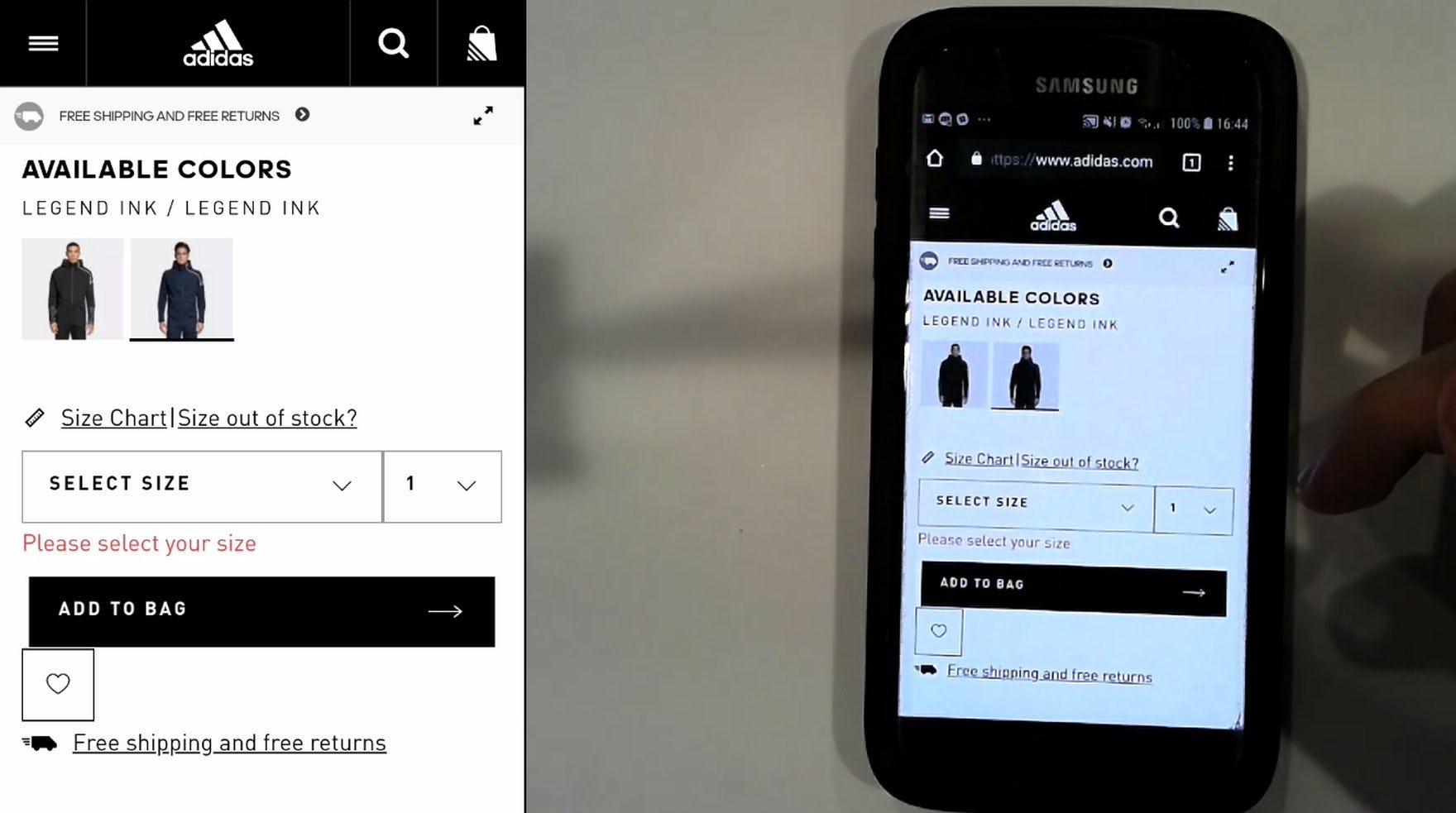
“These are cute!” This user shopping on Adidas found a pair of shoes she liked (first image) but couldn’t see that her size was out of stock until she interacted with the size drop-down menu (second image). “Oh, they don’t have my size.” Hiding sizes within a menu makes it harder to tell what sizes are in stock, which can set users up for disappointment.
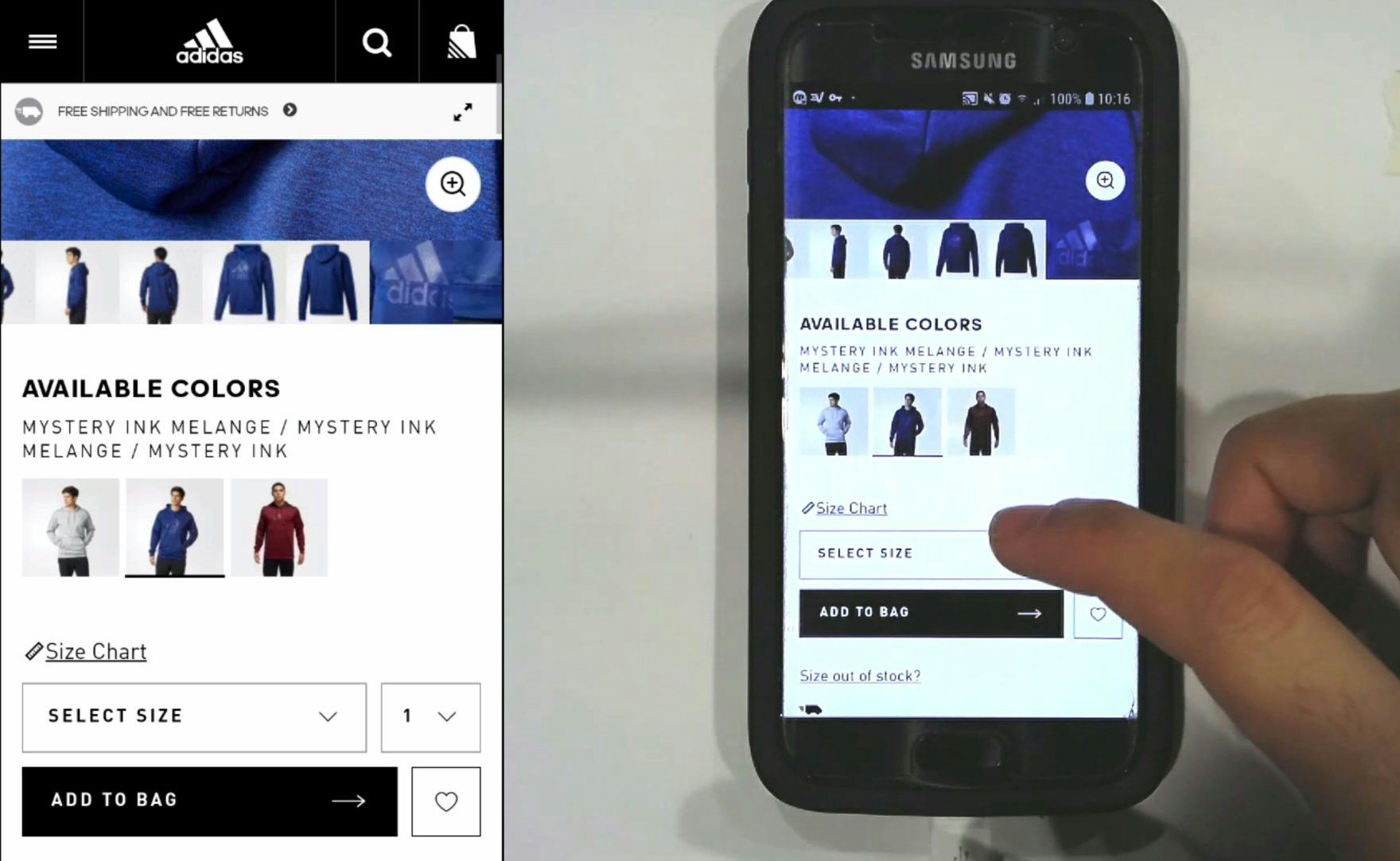
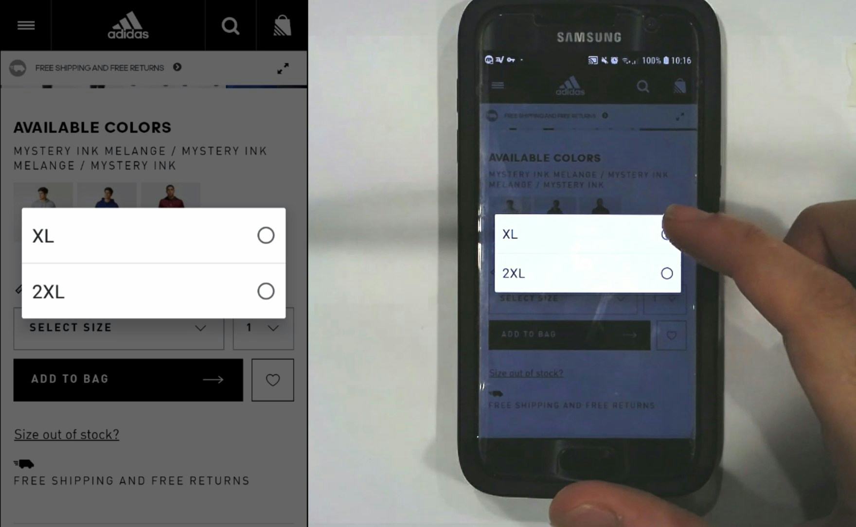
“Oh, so there’s only extra-large and 2 extra-large…I would have to back out…that was silly of me not to look before…I didn’t consider that they wouldn’t have medium.” This user on Adidas was disappointed to discover that a hoodie he was interested in wasn’t available in his size. When size variations are hidden within a menu, users are not able to immediately discern which sizes are available.
When size options are located within a drop-down menu, they are essentially hidden by default until users interact with them.
During Baymard’s large-scale usability testing across desktop and mobile, we repeatedly observed users spending considerable time and effort exploring a product, only to be disappointed when they opened the size drop-down selector to discover it was out of stock in their preferred size — and that their time had been wasted.
In fact, we’ve observed similar issues not only for color and size selectors on the product details page, but also for drop-down menus within Checkout and filtering product lists.
In effect, users are less able to find, review, and understand their choices, increasing the likelihood of wasted effort and error.
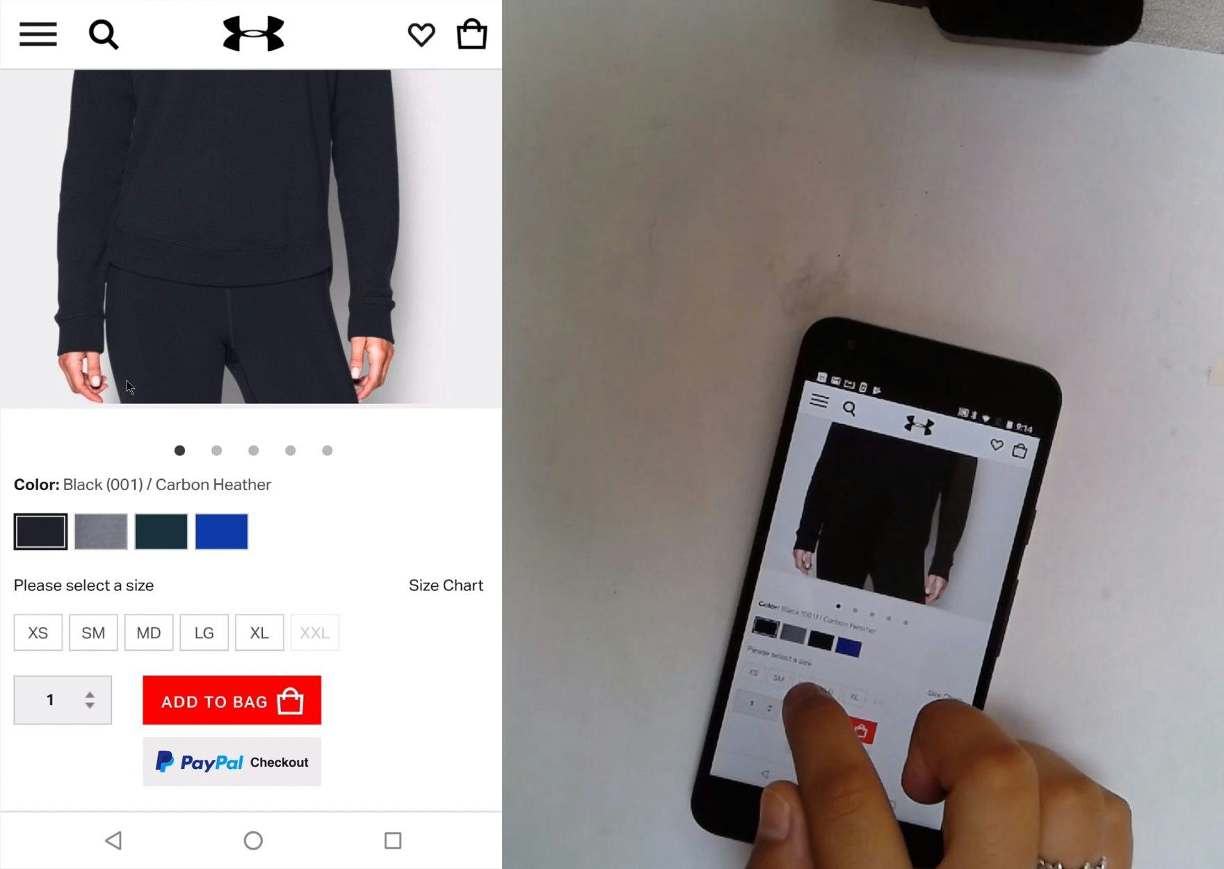
This user on Adidas neglected to select a size from the drop-down menu before tapping the “Add to Bag” button, resulting in an error message. Users are likely to overlook subtle drop-down menus.
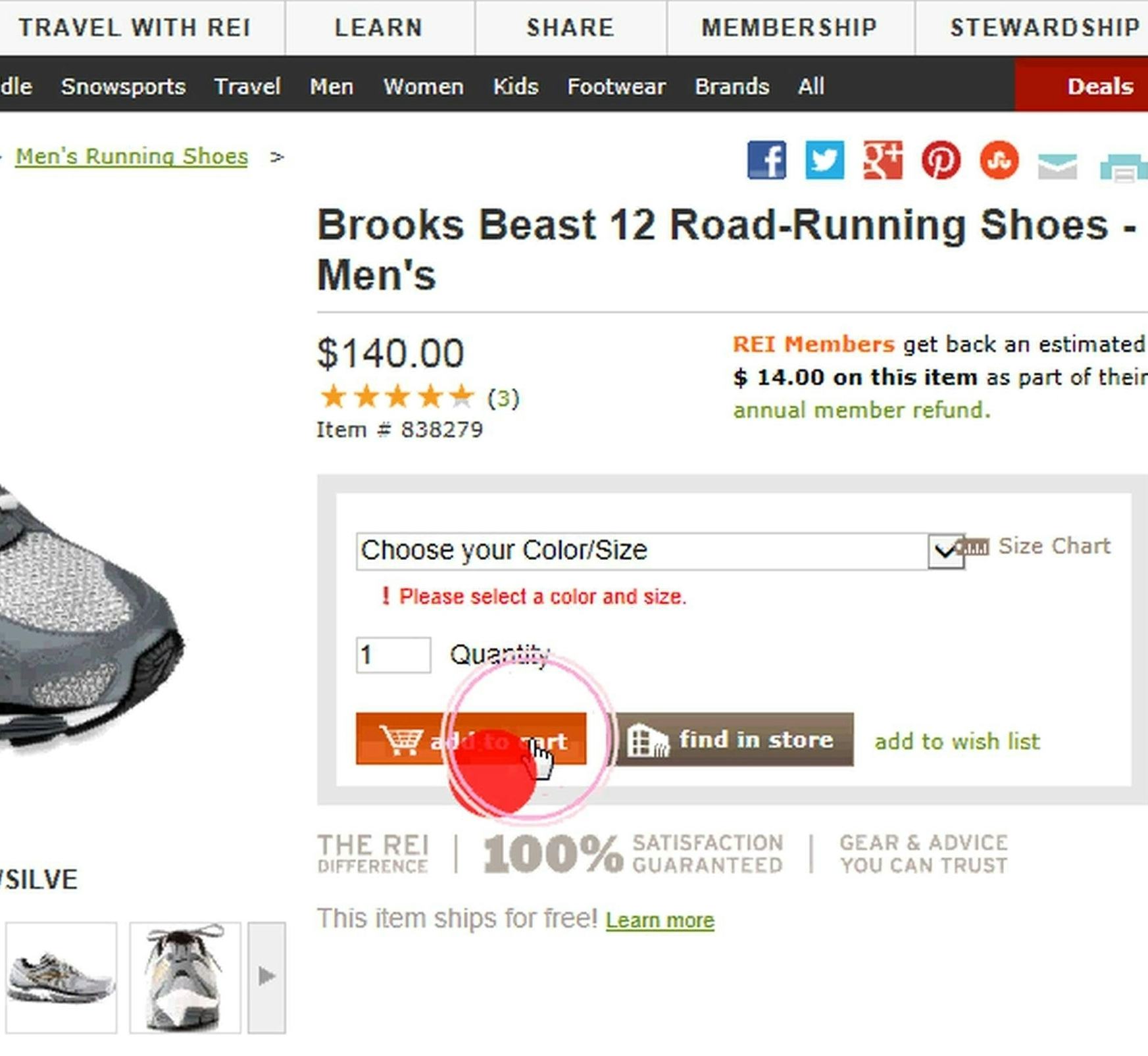
A user at REI received an error message after clicking “Add to Cart” before selecting a size for a pair of running shoes. From our eye-tracking study, we observed users were more likely to overlook size selectors presented as drop-down menus.
What’s more, while the majority of users during both desktop and mobile testing eventually found size variations when presented within a drop-down menu, a significant subgroup overlooked the size drop-down menu altogether — even when placed near or within the “Buy” section, where it should have been easily visible.
In most cases, these users will trigger an avoidable error message, which presents a speed bump in their buying process. After receiving the error message, they typically then notice the size drop-down and make a selection, recovering relatively quickly.
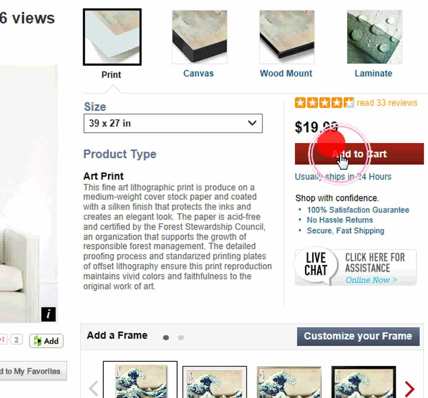
During our eye-tracking study, we observed that several users at AllPosters never even looked at the size drop-down, instead going with whatever size was the default.
However, some sites have a default preselected size for products — for example, a 39 x 27 inch poster size selected by default — which enables users to add a product to the cart without reviewing and selecting the size option at all on the product page.
While some users may catch themselves before they complete the purchase, there’s a risk that some won’t notice this fact — completing checkout and purchasing a product that was not in their preferred size.
Naturally, this experience can have long-lasting effects, and result in users negatively perceiving a site for some time to come, if not permanently.
(Of course, in practice, this kind of purchasing mistake is more likely for product types where users aren’t necessarily aware of or thinking about sizes when they arrive on the product page — for example, users may not immediately realize that different sizes are available for products like posters or backpacks, but are generally aware they will have to select a size for products like footwear and apparel.)
On mobile, this increased need for interaction becomes even more tedious, especially when products come in multiple color or style variations in addition to multiple sizes.
Due to the size of the mobile viewport, product information is squeezed into a narrower and longer-scrolling format, forcing users to scroll back-and-forth between the color selector and size selector in order to determine the availability of each combination.
Meanwhile, on desktop, the more expansive viewport typically allows even abundant color, size, and other variations to be visible within a single screen, making the process for selecting a combination of product options less labor intensive.
When there are more than a handful of color variations, some users are likely to give up on finding their preferred color and size combination, deeming it too time-consuming.
Exposed “Buttons” Allow Users to Immediately See Size Options
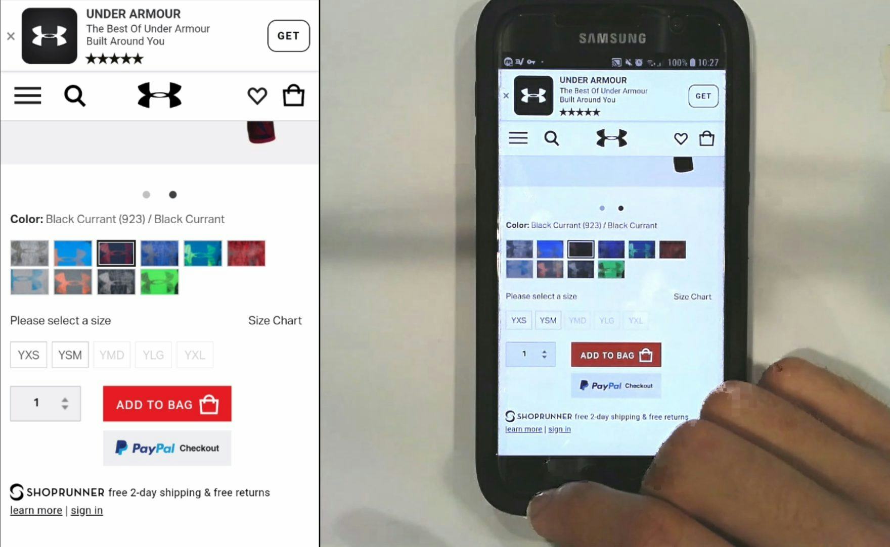
“It shows me straightaway what sizes are available. I don’t have to click in to see what sizes are available.” After experiencing disappointment on other test sites when his desired size turned out to be unavailable, this user on Under Armour expressed his appreciation that the sizes were exposed directly on the product page. When sizes are presented as individual buttons, users can easily tell at a glance which sizes are available — in this case, only 2 out of the 5.
“It seems like the size is available, yes.” Another user on Under Armour easily determined that this hoodie was available in her desired size. The exposed size buttons make it simple to review available sizes without having to interact with a drop-down selector.
Instead of using a drop-down with the size options hidden by default, exposing the size options by using button-like selectors helps to ensure that these crucial product variations are easily seen by users.
With each UI button representing a size, users are better able to see at a glance all of the available options, and the amount of effort and interaction required to learn this basic information is greatly diminished.
As one user noted, “I think the least amount of clicks I have to do, the better”.
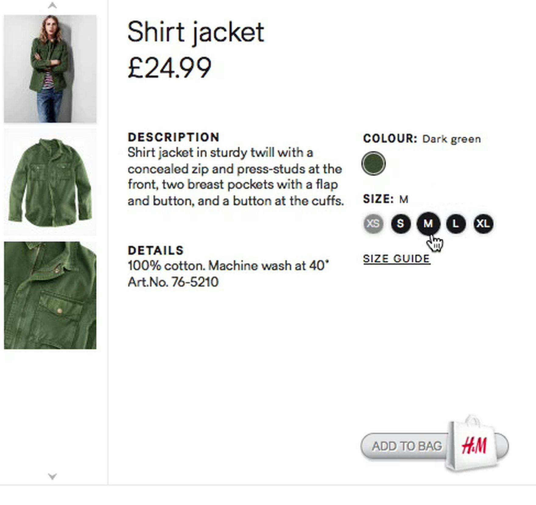
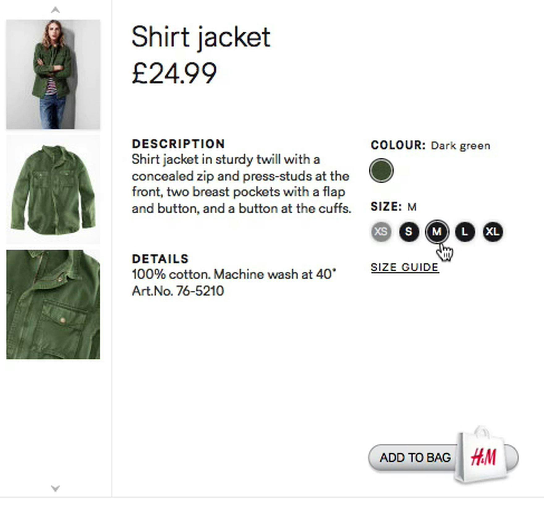
“This just has a ring around. I don’t know if that means it is selected?” H&M exposes the size selectors, but the indication that a size has been selected is overly subtle — once clicked, a small ring encircles the “M” selector. Size selectors should make it obvious to users which size is currently selected.
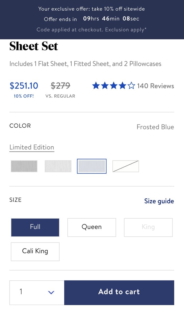
On Brooklinen, high contrast allows users to easily tell the difference between selected (“Full”), unselected (“Queen”, “Cali King”) and unavailable (“King”) size options.
Of course, once exposed, the selectors should be designed so that it’s clear which size is currently selected.
During testing, we observed some designs were much too subtle in indicating which size had been selected.
Selectors that are too inconspicuous, and selection indications that are too subdued, will slow users down, as they have to first determine if the system has recognized their input before they can move on to adding it to their cart.
Additionally, on mobile, size buttons that are not adequately sized and spaced can also lead to frustrating hit area issues, making it more difficult for users to accurately target the correct size. As with other mobile elements, ensuring size selectors are appropriately designed for touch interaction is vital.
“Buttons” Are a Better Experience, Even When There Are an Abundance of Choices
Products that come in a wide variety of sizes present a special challenge when providing individual buttons for each size variation, as they can easily take up a large proportion of the viewport — especially on mobile.
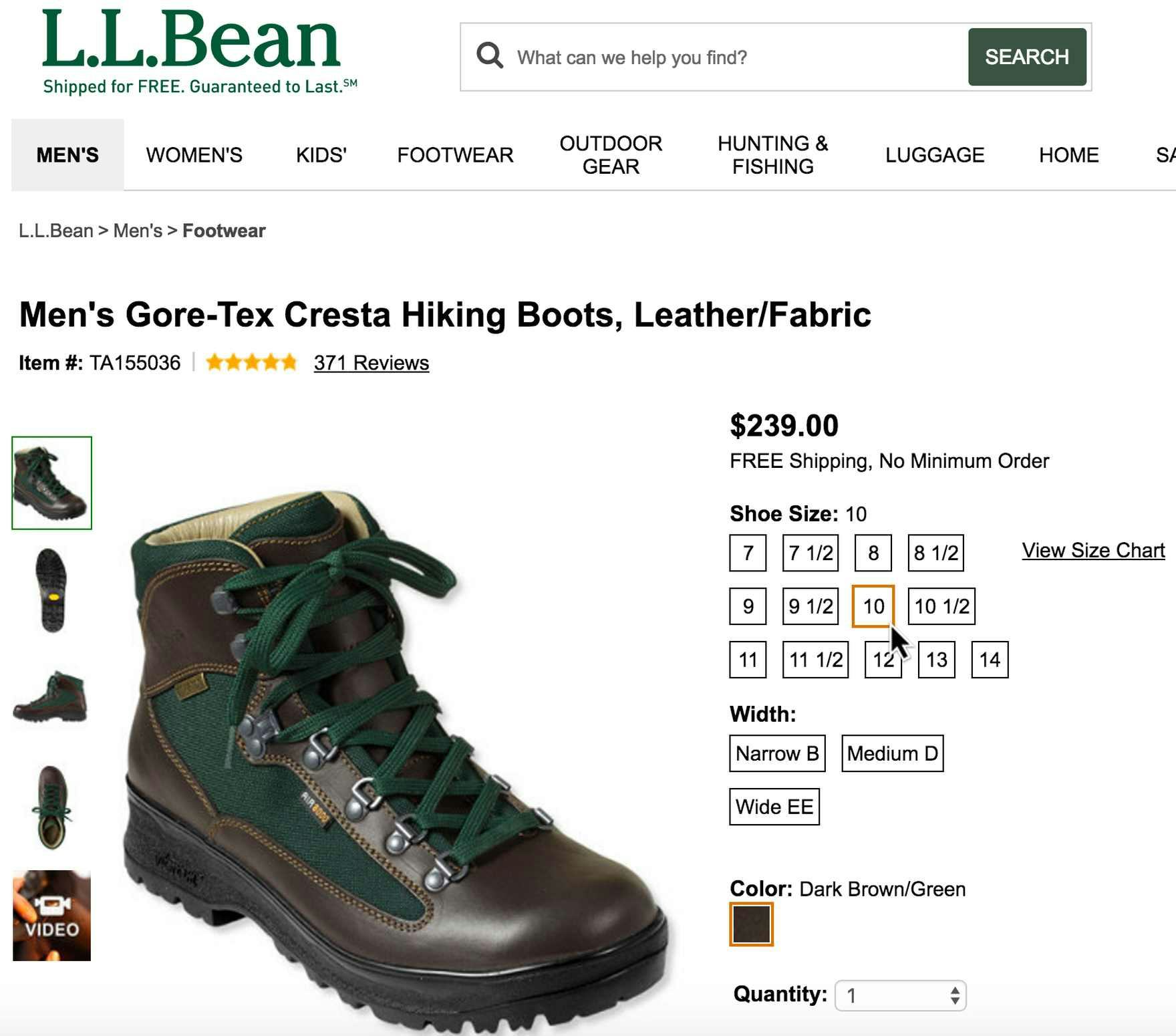
L.L. Bean effectively exposes 13 different shoe sizes on the product page without overly distracting users. Additionally, widths are also exposed, letting users easily see how the selection of one variation type changes the availability of the other.
On desktop, the more expansive screen real estate can typically accommodate a large array of size selectors, assuming they’re not overly large.
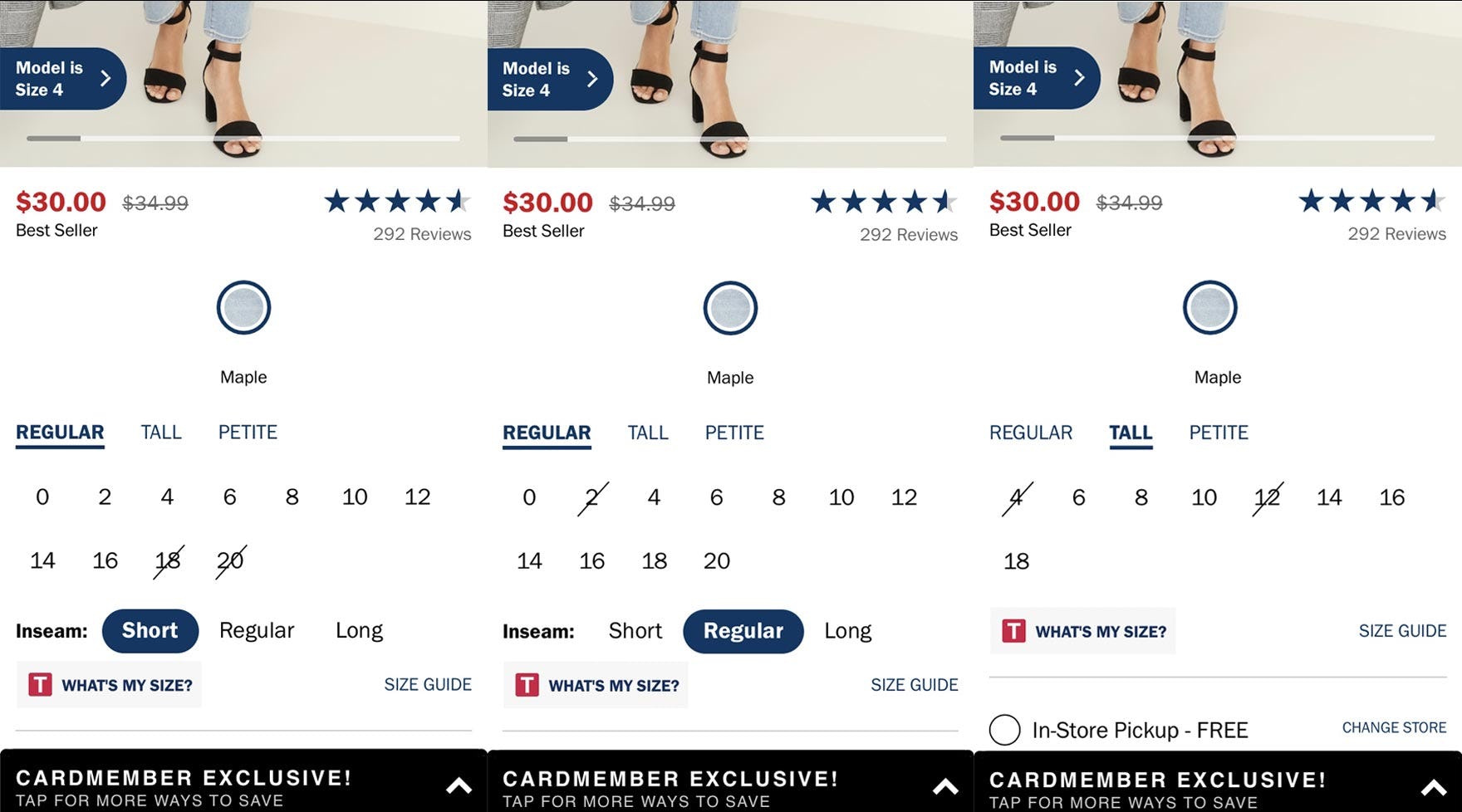
Old Navy nests sizes by type ( “Regular/Tall/Petite”) and inseam (“Short/Regular/Long”). This allows users to compare size availability while also conserving screen real estate — especially compared to listing every single available size directly on the page.
When there are a wide variety of size options, consider grouping and nesting sizes by type (e.g., “Regular” versus “Plus” sizes, “Standard” versus “Long” inseam), which allows individual sizes within each type to be available directly on the page without the need to activate and scroll through a drop-down.
This implementation is particularly vital to limit the amount of scrolling on narrow mobile screens.
Note however that a “nested size selectors” design was not tested, and thus sites should proceed cautiously if implementing.
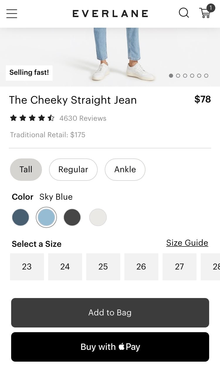
Everlane likewise nests sizes by type (“Tall”, “Regular”, “Ankle”) and further minimizes the vertical height required to display sizes by presenting them in a horizontal swipeable list. Notice how the rightmost size button is cut off by the edge of the viewport, giving a visual cue for users to swipe for additional sizes.
Additionally, a horizontal swipeable list can be used on mobile to further reduce the screen real estate taken up by the size selector, taking advantage of users’ familiarity with this design pattern for other mobile features.
Size “Buttons” Have Become a Standard Web Convention
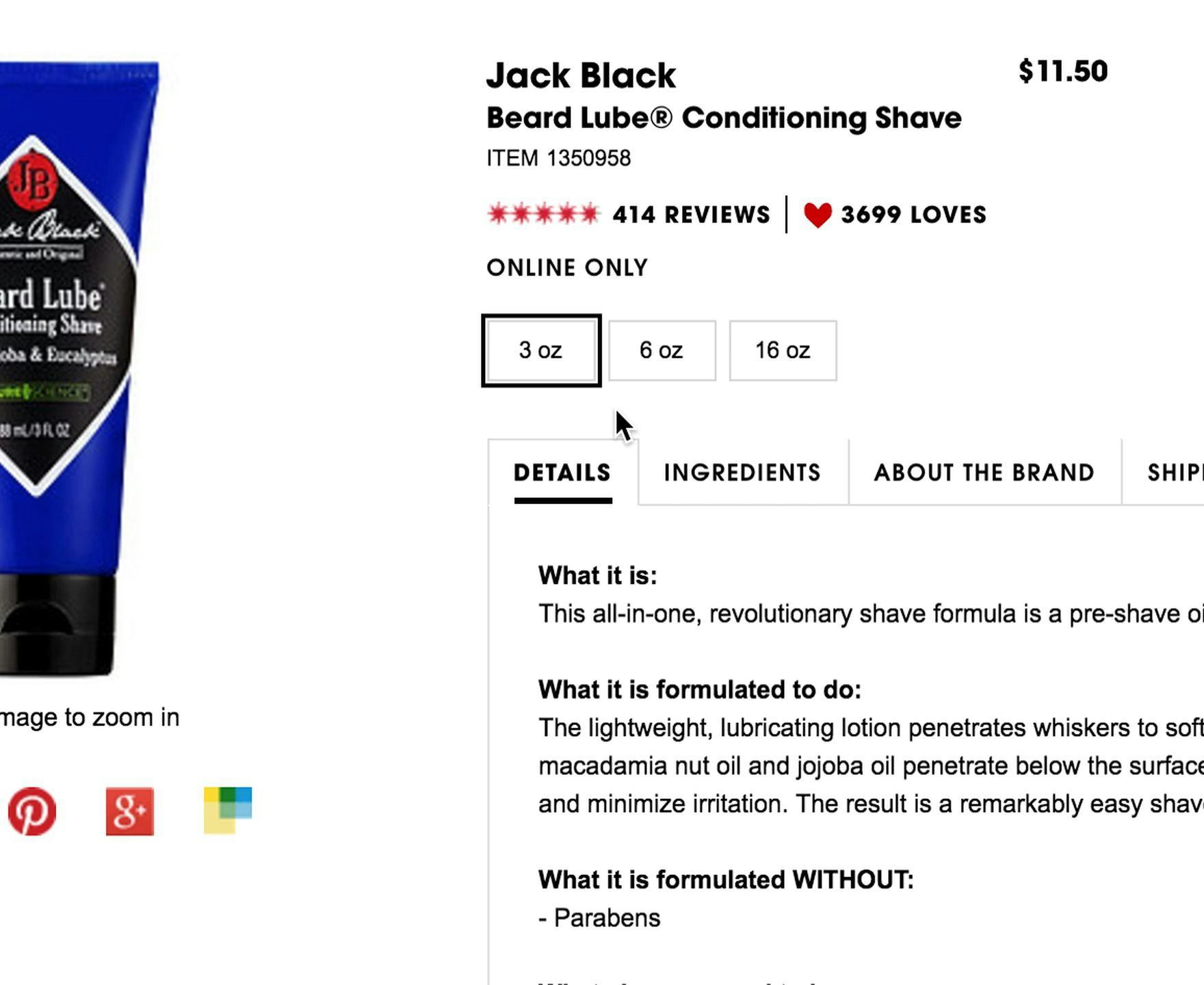
On a Sephora product page for shaving cream, 80% of users clicked the different size selectors and noted how the different sizes were reflected in the product price.
For products that come in different sizes, previewing which ones are in stock is an essential prerequisite for making the decision to purchase.
Drop-down menus, broadly speaking, are oftentimes a relic of early web design that predates modern users’ familiarity and comfort with exposed selections like color swatches.
Without the clarity of modern “button” size selectors, users may overlook their ideal color and size combination, abandoning their purchase without realizing the possibilities hidden within variations drop-downs.
On the other hand, the effortless information provided by size “buttons” presents a clear usability improvement over presenting size options within drop-down menus — which helps to account for size “buttons’” increasing popularity: 71% of current desktop benchmark sites appropriately use size “buttons”, up from 63% in 2017.
It’s therefore crucial to meet users’ expectations with regards to how size selectors will be presented on the product page — or risk users leaving, despite there being a perfect size available in the variation they desire.
(Tip: see 239 examples of product pages showing how many of our benchmark sites use size “buttons”.)
This article presents the research findings from just 1 of the 650+ UX guidelines in Baymard Premium – get full access to learn how to create a “State of the Art” e-commerce user experience.