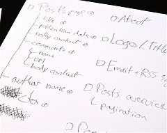
Example of a good user interface sketch.
When sketching a new user interface there’s a few things to watch out for.
Here’s 4 common pitfalls:
1. Drawing Things in Too Much Detail
People have a tendency to try and squeeze every little detail and feature into their sketch. This is not the purpose of your sketch and will distract you from getting the big things right. So focus on the big picture, the layout of things, instead of drawing every little detail.
2. Writing Actual Text
When you start writing actual text, you’ll easily get stuck thinking about the wording or making elements such as buttons much larger than they will actually be, since it’s impossible to write as tiny as most text is on screens. In general, you should refrain from writing any text in your sketch. Read our UX writing post for more tips.
3. Getting Stuck on Sizes
Should the sidebar be 35% or 40% of the total width? The important thing here is not to get all the proportions absolutely perfect but rather that you show the relationship between the different elements on the page and the intention of sizes.
4. Misrepresenting Visual Dominance
Since everything in a sketch typically consist of boxes and lines, visually dominant elements like pictures are easily misrepresented. Images in sketches usually aren’t nearly as visually dominant as they are in the final product because they’re just a simple box, whereas in the final product they are suddenly a block of complex colors and compositions.
Give all visual elements, such as pictures, a big black shadow so their visual dominance is properly represented in your sketch too.
Post a comment with your personal UI sketching pitfalls or any UI sketching tips.