Our research shows that users rely on ratings distribution summaries even more than the content of individual reviews. Yet 43% of e-commerce sites don’t have a rating distribution summary.
Updated with new data in 2024
In our latest large-scale UX testing of product pages, it was clear how important product reviews are to users: 95% of users relied on reviews to learn more about products.
In particular, a product ratings distribution summary at the top of the reviews section allowed users during testing to get a feel for how the product has been rated overall. In fact, the ratings distribution UI was the most utilized feature of the reviews section, and was relied on by users even more than the actual review content.
Yet 43% of the world’s 60 top-grossing e-commerce sites, in our latest benchmark of product pages, don’t provide users with a ratings distribution UI, which can have serious consequences.
Our testing showed that when ratings distribution summaries aren’t provided, users are more likely to conclude that the reviews are fake if they see mostly positive reviews listed first in the section, or misinterpret how a product has been rated if they see mostly negative reviews.
In this article, we’ll cover the UX research findings from our latest product page study, as well as from our other e-commerce research, that relate to users’ experience with ratings distribution summaries. In particular, we’ll address
- Why it’s important to provide a ratings distribution UI at the top of the reviews section
- How not providing a UI for the ratings distribution summary can severely mislead users’ interpretation of reviews
- 5 crucial design details for ratings distribution summaries
User Reviews: Qualitative vs. Quantitative Information
Many of us likely think of user reviews as being composed of qualitative information: users describe their experiences with a product, and those descriptions are read by other users interested in buying the same product.
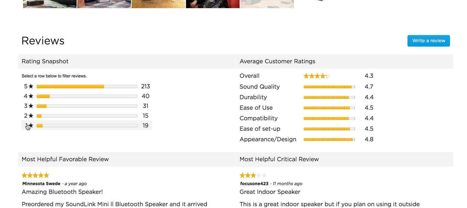
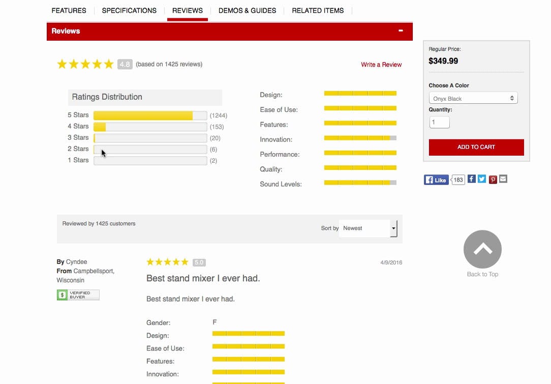
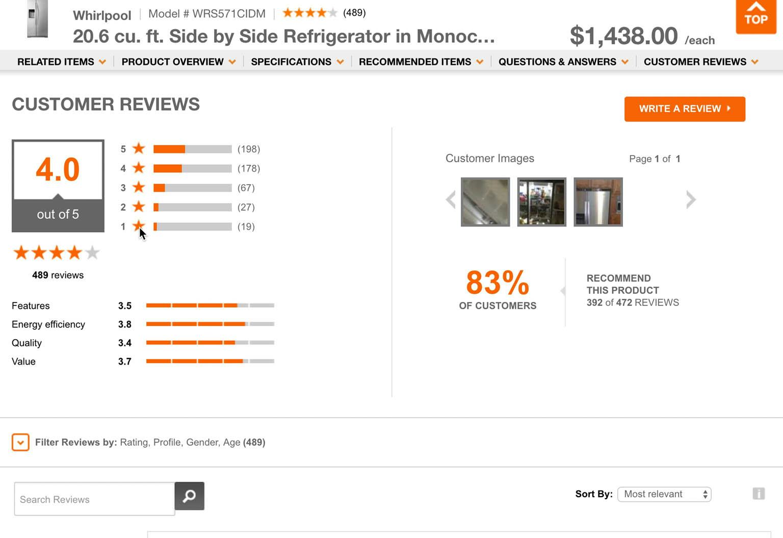
For user reviews, quantitative information (top of the screenshot) is often as or even more important to users than qualitative information (bottom of the screenshot).
However, an interesting finding from our latest product page study was that users rely heavily on ratings distributions to provide the overall picture of how other users experienced a particular product. This quantitative information, which provides data on the total number of reviews and the ratings breakdown as an illustration (usually a bar chart), allows users to see at a glance how a product has been rated. It’s immediately apparent, for example, that a product with 50 reviews, and consisting of forty 5-star, three 4-star, one 3-star, one 2-star, and five 1-star reviews has been overall highly rated by users.
In retrospect, perhaps it’s rather obvious that users would rely so heavily on ratings distribution summaries to give them a picture of a product’s overall rating, rather than wade through the sometimes lengthy text of hundreds or even thousands of reviews. In fact, many users during testing were observed to use the ratings distribution UI to get an overall picture of how the product was rated, and then pick a few of the reviews to read in more depth.
However, without a ratings distribution summary UI at the top of the review section, users are prone to let the first handful or page of reviews determine if they perceive the product as being overall well or poorly rated.
Ratings UX: The Problems with Not Providing a Ratings Distribution Summary
“I do wonder if it’s rigged a little, to leave out the bad reviews.” A user interpreted positive reviews with no reviews summary with skepticism because he was unable to see anything other than 5-star reviews.
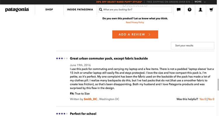
“The fact that it’s their best-selling and yet it has several reviews up at the top that are less than five stars makes me a little bit concerned. Makes me wonder why it’s their best-selling one,” another user said at Patagonia, misinterpreting the product to be somewhat mediocrely rated based on the first couple of reviews, while in fact the product had a 4.2-star ratings average.
Not providing a UI showing the ratings distribution was observed to mislead users in two different ways:
- If users saw only overwhelmingly positive reviews when scrolling through the first page of reviews, they sometimes speculated that the reviews were fake
- If users saw mostly negative reviews listed first, they perceived the product as being overall poorly rated, when the opposite was in fact the case
In either case, the end result is that users misinterpret the product reviews, leading them to discard products that they think are “rigged” in terms of the product’s ratings, or apparently poorly rated products.
In both of these cases reviews, which were otherwise proven to be so useful in testing, actually create an unnecessarily negative impression of the site or the product. Without a ratings distribution, users’ overall interpretation of how a product is rated will be more or less random, depending entirely on the default sorting pattern — which for 60% of sites in our benchmark isn’t “Relevance”, meaning some users will get a homogeneous batch of reviews listed first (i.e., all negative or all positive).
“I don’t want to just read the perfect reviews. I want to see what its shortcomings are.” A user was interested in reading the negative reviews of a mixer on at KitchenAid.
Additionally, some users during testing would seek out the most negative reviews, to “find the dirt” on a product and determine what its flaws are as judged by the reviewers. Without a ratings distribution summary, users who seek out the negative reviews miss out on the perspective a summary can provide — for example, they may read 3 very negative reviews but see that the product has hundreds of positive reviews, at which point they may begin to doubt the reviewers more than the product.
Despite the crucial benefits that a ratings distribution summary provides users, 43% of sites in our latest benchmark of product pages don’t provide users with a ratings distribution summary. Many users at these sites will find it very difficult to get an overall picture of how a product has been rated, and consequently some may consider leaving the site to try and find a better breakdown of reviews at another competing site.
“The fact that it’s 4.5 out of 5 is the first thing that I look at.” The overall average was noted by several users when provided, but ratings summaries should not substitute for providing users with full ratings summary distributions.
It’s also important to note that rating UIs that provide a ratings average and the total number of ratings (e.g., “4.5-stars based on 242 ratings”) aren’t enough and don’t replace actual ratings distribution summaries. A product with an average rating of 4 stars, based on one hundred ratings, could have either one hundred 4-star ratings or it could have twenty-five 1-star and seventy-five 5-star ratings — two very different stories of how a product has been rated. Without the information contained in a distribution, users will not be able to see how the ratings break down, and whether a product has mainly decent ratings or rather a mix of very poor and very good ratings.
5 Crucial Design Details for Ratings Distribution UIs (39% Neglect at Least One)
Once the decision to include a ratings distribution summary has been made, testing revealed that there are, in particular, 5 implementation details that are important to get right for the overall UX performance of the summary. Otherwise, users are likely to not use the distribution, have interaction issues, or resort to simply sorting to see the negative reviews (53% of users during testing actively sought out the negative reviews of a product) — which provides a very skewed picture of how a product has actually been rated.
1) The ratings distribution design should include a graphical breakdown
Lowe’s provides a rating summary but, by not offering a graphical representation of the distribution of ratings, users can’t quickly scan the summary to get a visual impression of how well or poorly rated the product actually is.
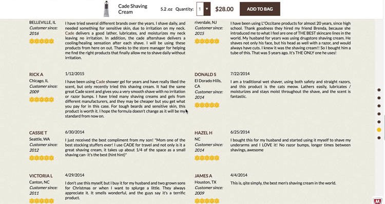
It’s important to provide a ratings distribution design that includes an actual graphical illustration and breakdown of the ratings, e.g., a bar chart. Some sites during testing simply provided a text-based breakdown of the ratings, which makes it difficult for users to scan and get a quick overview of a product’s ratings.
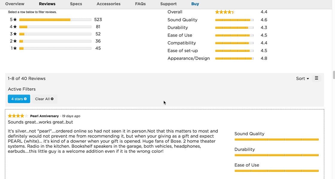
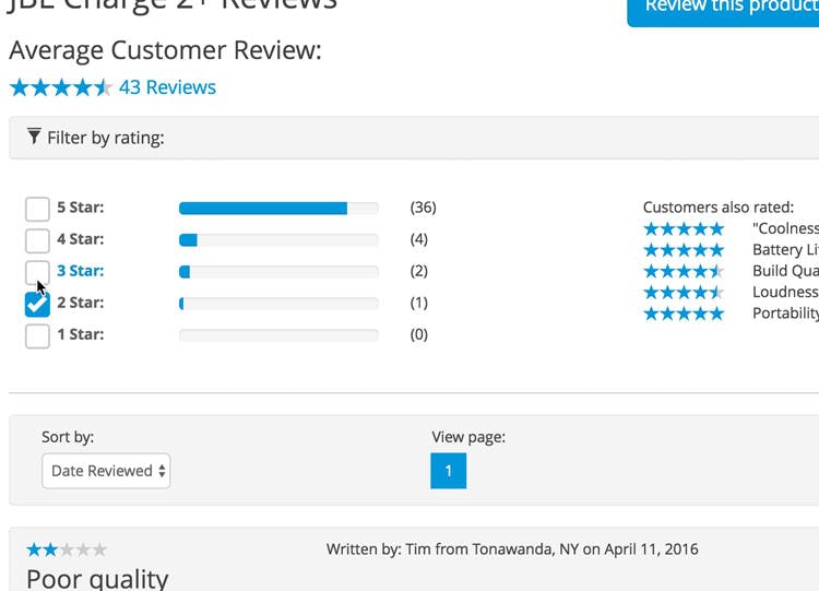
2) The ratings distribution UI must act as ‘star’ filters
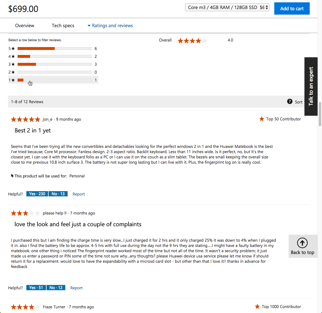
At Microsoft a bar chart is used to allow users to understand the ratings distribution at a quick initial glance. Furthermore, it’s clear that the rating bars are clickable. When hovered, the entire bar is highlighted with a grey background color and the mouse cursor changes to the hand icon.
Time and again during testing, users were observed to instinctively click on the bars in rating distribution summaries in order to filter reviews by the just-clicked-on rating. In fact, 90% of subjects who wanted to seek out specifically rated reviews tried to filter the displayed reviews by clicking the ratings distribution summary. However, only 61% of benchmarked sites with a ratings distribution summary implement the star ratings as clickable filters, meaning that many users will be frustrated to see that their clicks have no effect on the 39% of sites with ratings distribution summaries that aren’t clickable.
It’s clear that this has become an ingrained user behavior, and users will expect any ratings distribution summary to be clickable, and that they’ll be able to filter reviews by rating simply by clicking on the rating they’re interested in.
3) The ratings UI should be expanded by default
Home Depot hid the ability to filter in a collapsed state. As a result, only 11% of subjects during testing utilized filtering at Home Depot, despite the fact that most subjects desperately tried clicking the ratings distribution bar chart. (Note the “Filter Reviews by” toggle at the bottom of the screenshot.)
The ratings UI should be exposed or expanded by default. While collapsing content is recommended in some cases on product pages, it should not be used to hide the ability to filter reviews by rating. Because such a large subset of users are shown to use the ratings summary distribution to filter reviews, this functionality should be integrated into the rating distribution, and not be hidden within a general review filtering interface. Indeed, during testing only 7% of test subjects filtered by rating when the ratings filter was hidden by default.
4) Use mutually exclusive ratings filter

A test subject at Crutchfield, who wanted to switch from 2-star reviews to 3-star reviews, was frustrated when she realized she had to uncheck the 2-star checkbox to clear those reviews. “Okay, I only want three stars, thank you.”
Each ratings filter should be mutually exclusive — that is, the ratings filters should be implemented with a logic similar to radio buttons, rather than checkboxes. This is in contrast to what we’ve observed in our Product Lists & Filtering study, when users in a product list will need to be able to apply multiple non-exclusive filtering values at once to narrow a product list.
During this study on product pages we did not observe that users combine multiple rating filtering values. In fact, even when offered the ability to view more than one set of ratings, no test subjects looked at more than one set of ratings at a time. Quite the contrary. By using checkboxes to filter ratings, it becomes difficult for users to go directly from seeing one type of reviews to the next (e.g., first seeing 1-star reviews and then seeing 3-star reviews), as users will first have to select the new filter, and then deselect the old filter. Therefore, rating filters should be mutually exclusive and simply be implemented as traditional links.
5) Consider hiding the ratings UI when there are less than 5 ratings
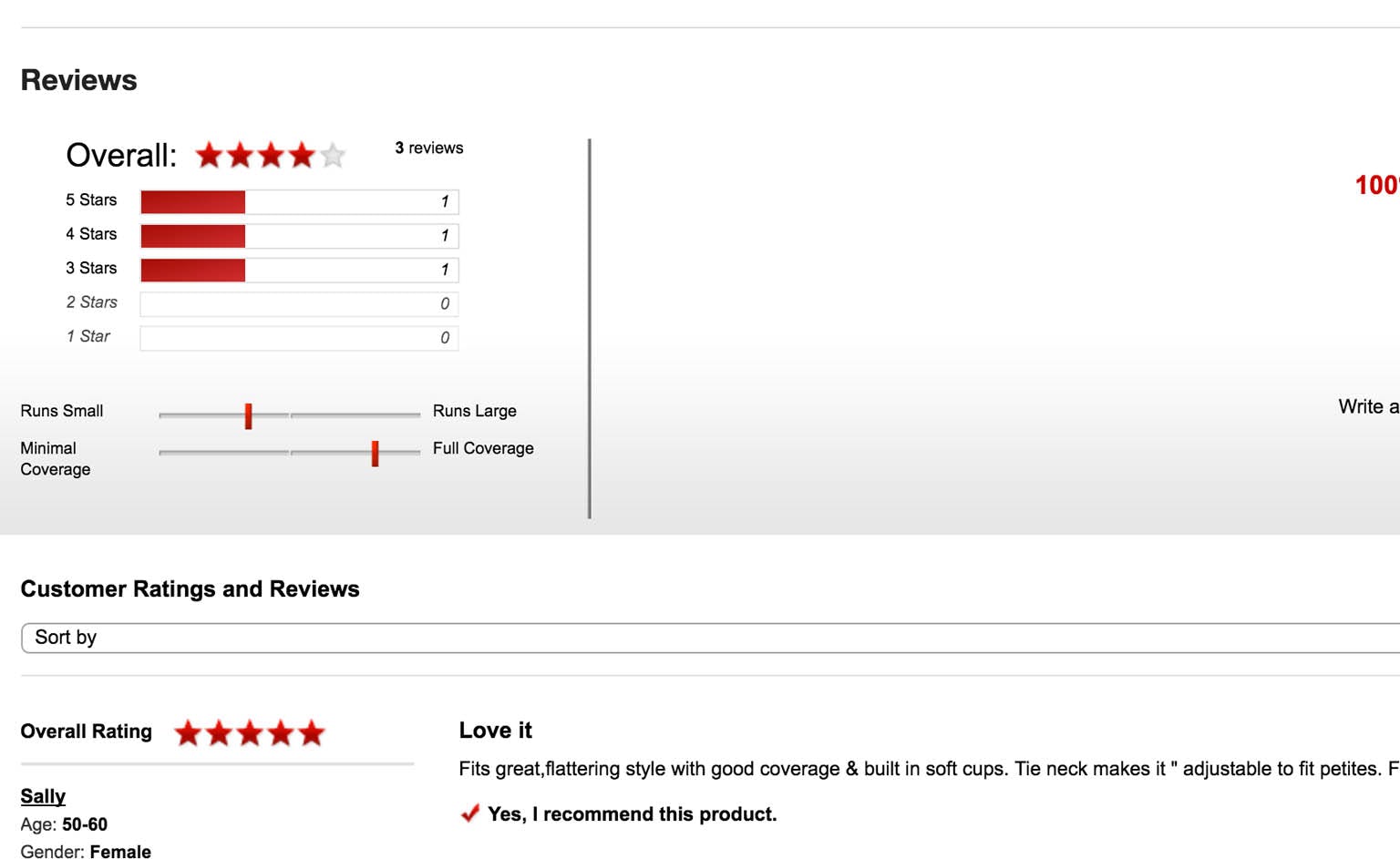
A ratings distribution summary affords a quantitative interpretation of the reviews, seldom warranted when there are 5 or fewer reviews available, as seen here at Macy’s.
Lastly, consider dynamically hiding the rating summaries for a given product when there are too few user reviews available (e.g., five or fewer), as the summary will force too much focus on the quantitative data and downplay the qualitative insights the actual review texts might provide.
While quantifiable interpretation is the whole purpose of a ratings distribution, we’ve seen this backfire in our product page testing, our mobile e-commerce testing, and in a survey we conducted of US users. If there are only a small number of ratings available (e.g., 5 or fewer ratings) many users think that those products don’t justify having a quantitative review interpretation provided for them.
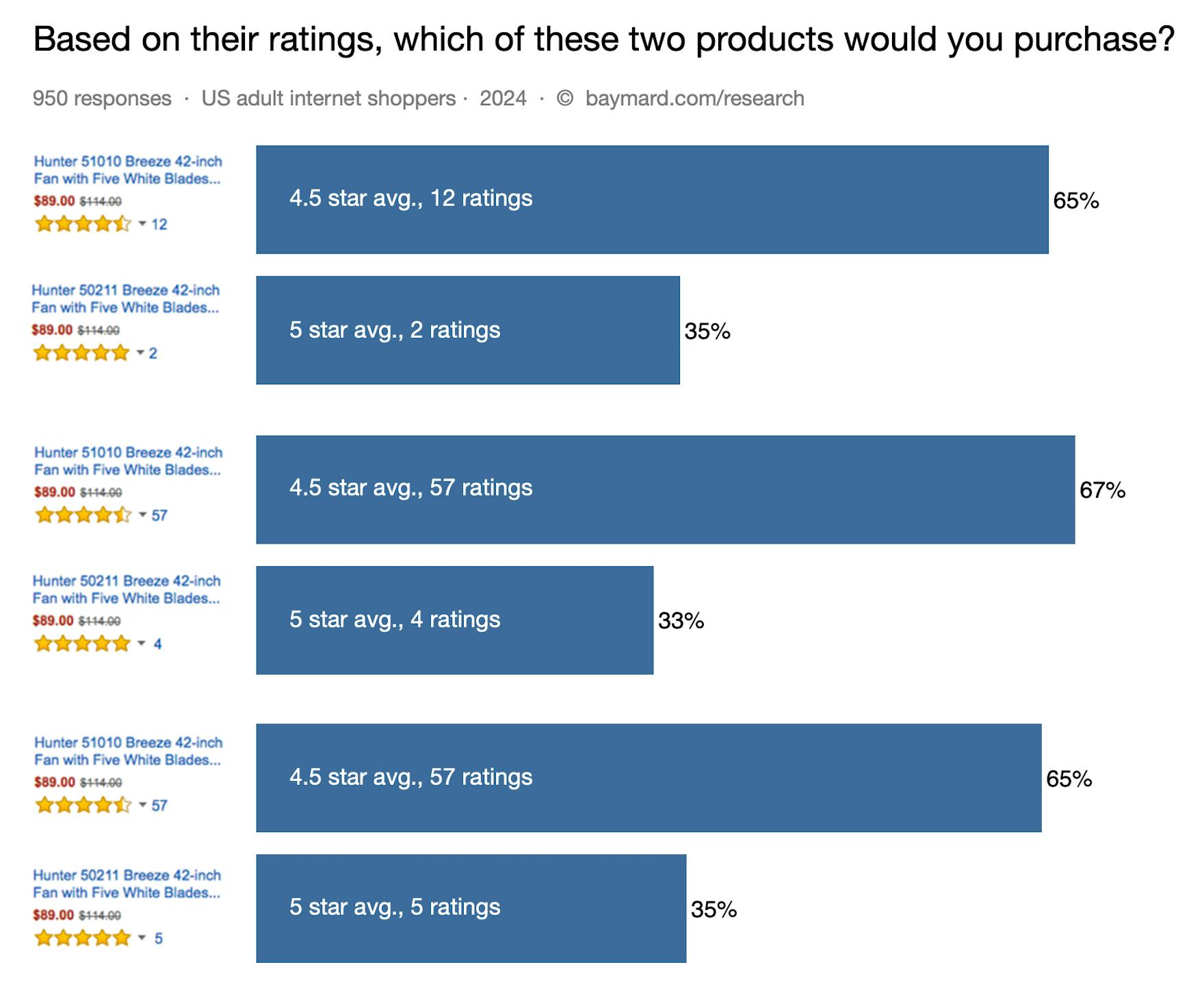
Methodology: In total three surveys were conducted with 950 participants (split roughly evenly across the three surveys), testing different rating averages versus the number of ratings. Each survey showed the respondents two list items (shown in the result graphs) and asked them to pick which one they would purchase. The price and product descriptions were kept identical — the difference between the two list items was in the combination of the user rating average and the number of ratings. To avoid sequencing bias, the display sequence for the answer options were randomized for each respondent.
In fact, our survey of US users found that users are more likely to purchase a product with more ratings, but a slightly lower ratings average, than a product with a higher ratings average but only a few ratings. For example, users would be more likely to purchase a product with a ratings average of 4.5, and with 12 total ratings, than a product with a ratings average of 5, but with only 2 ratings. (For more see our article Users’ Perception of Product Ratings (New Qualitative & Quantitative Findings)). Thus ratings distribution summaries shouldn’t be included for products with only a small number of ratings.
Help Users Get the Most Out of Product Reviews With Optimal Rating Design
Ratings distribution UIs should be considered an essential component of the product page reviews section. In addition to avoiding the UX pitfalls described above — users’ distrust of positive reviews and users misinterpreting negative reviews when there’s no ratings distribution summary — a summary UI of the quantity of reviews also provides the intrinsic value (when a large quantity exists) of bolstering the perceived popularity of the product. And yet 43% of sites miss out on this benefit by not having ratings distribution summaries.
During testing users often explicitly noted the popularity of a product if it had many reviews. For example, one user stated that the number of reviews led her to think very highly about the product: “It’s something that people have bought for years and years and continue to purchase. Just liking a product sometimes isn’t enough, being loyal to that product tells me more…so the longevity that people have been using the product is pretty impressive.”
Of course, all implementations of ratings distribution summaries should take into account the 5 implementation details described above, yet 39% neglect at least one. To summarize, ratings distribution summary UI should:
- be graphical illustrations (normally horizontal bar charts),
- act as “star” filters,
- be exposed or expanded by default,
- use “or” radio button logic, rather than “and” checkbox logic, and
- be hidden when there are only 5 or fewer reviews.
Providing a well designed ratings UI that shows a distribution summary, will help ensure users can use the reviews to make an quick and informed assessment of a product’s suitability to their particular needs.
This article presents the research findings from just 1 of the 650+ UX guidelines in Baymard Premium – get full access to learn how to create a “State of the Art” e-commerce user experience.