42 Product List UX Articles
These articles are based on observations and test findings from our usability research on list items, sorting, and filtering.
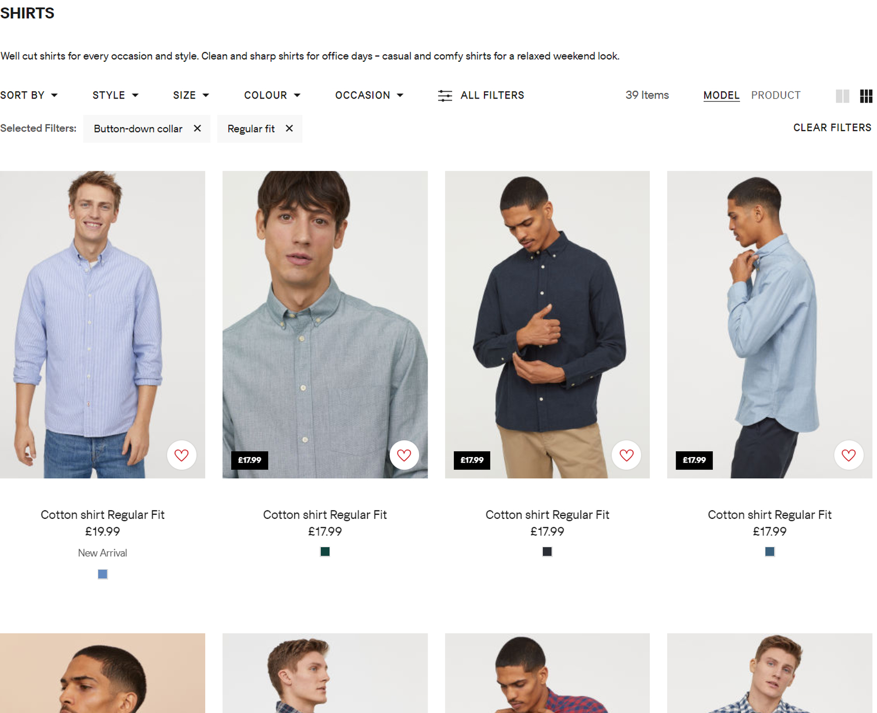
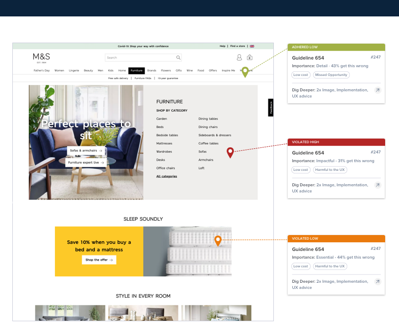
Combine Variations of Products into One List Item (12% Don't)
Displaying product variations as separate list items in product lists can negatively impact product finding, yet 12% of sites do so. Read our latest research on product lists.
Featured
B2B Electronics: Use “Product Tables” to Display Product Listings on Desktop
April 10, 2024
Apparel E-Commerce: Visually Group and Clearly Label Size Filter Options
March 26, 2024
Always Explain Industry-Specific Filters (62% Don’t)
February 27, 2024
Always Allow Users to Combine Multiple Filtering Values of the Same Type — an ‘OR’ Logic (15% of Sites Don’t)
January 23, 2024Popular
Consider Promoting Important Filters (61% Don’t)
November 21, 2023
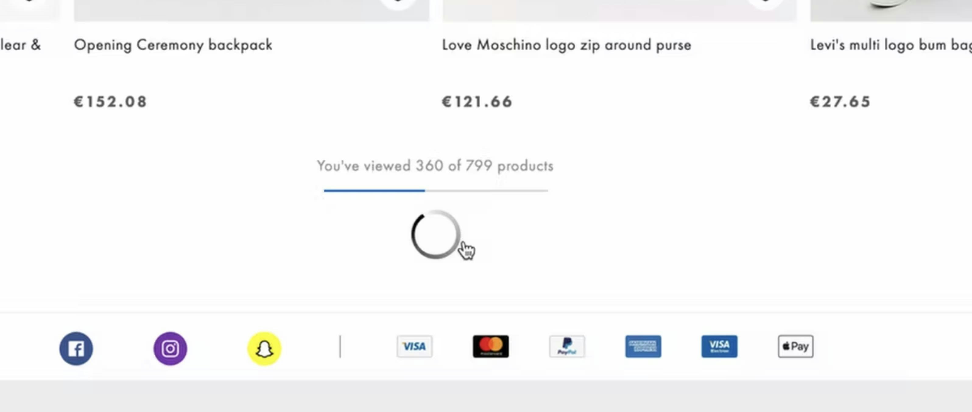
Product List UX: The Number of Products to Load by Default (52% Get it Wrong)
Our testing reveals that the ideal amount of products to load by default (in a product list) varies by more than a factor 10 depending on the type of products displayed, and whether the user is mobile or desktop. See our test findings here.
Featured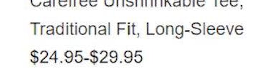
Always Show the Number of User Ratings in List Items (5% Don’t)
August 29, 2023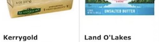
2 Key Design Principles for Product Listing Information (64% Get at Least 1 Wrong)
August 22, 2023Popular
Make All Color Swatches Available in Mobile List Items for Visually Driven Product Types (57% Don’t)
August 8, 2023Popular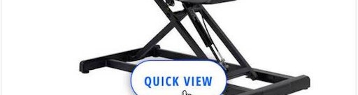
Avoid “Quick Views” for Spec-Driven Product Types (21% Don’t)
August 1, 2023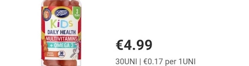
Display “Price Per Unit” For Multiquantity Items (86% Don’t)
July 18, 2023
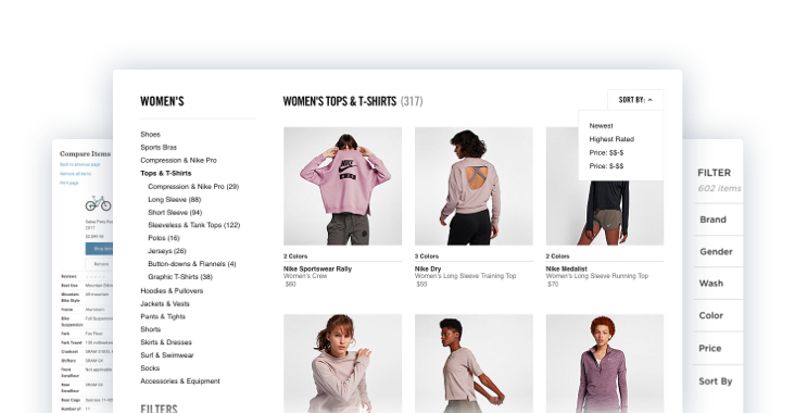
Display "Applied Filters" in an Overview (32% Aren’t Using the Best UX Practices for Filtering)
Our large-scale usability testing reveals that overviews of applied filters speed up product finding and help orient users, but 32% of sites don't provide them
Featured
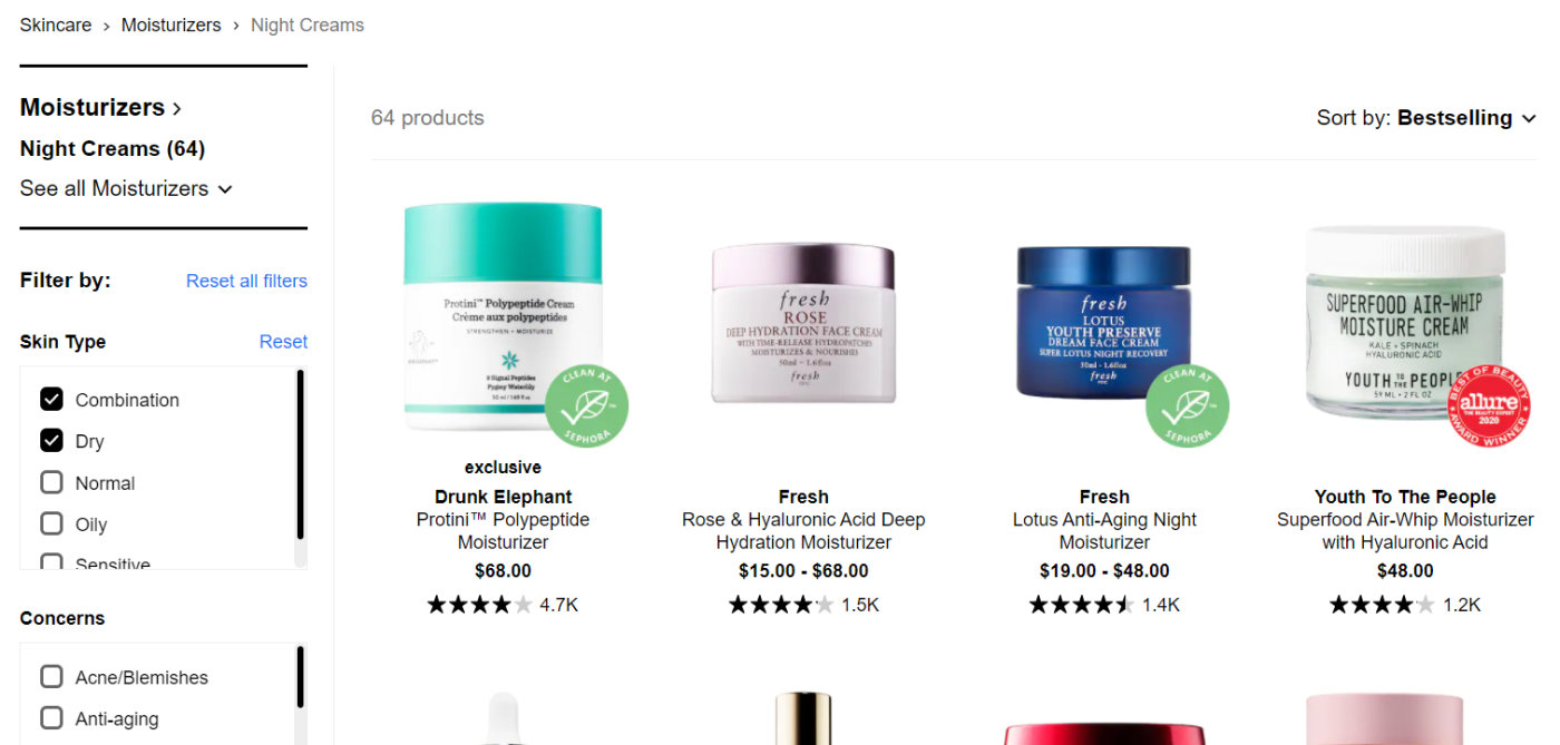
Product Listing UX: What Information to Display in Product Listings (50% Get It Wrong)
May 30, 2023Popular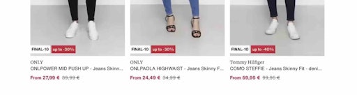
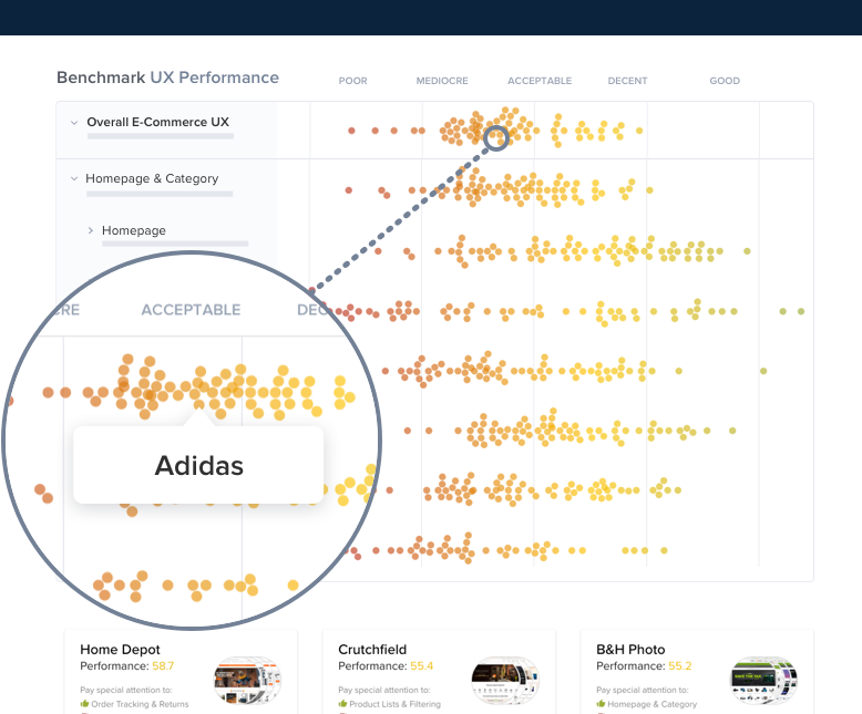
The Current State of E-Commerce Product List UX Performance (15 Best Practices)
April 25, 2023Popular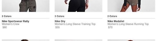
New 2023 Product Lists & Filtering UX Benchmark with 6,100+ Performance Scores and 4,400+ Best Practice Examples
February 14, 2023
4 Ways to Optimize the Comparison Feature for Scanning
October 19, 2022Popular
Product Comparison UX: Always Provide Comparison Features for Spec-Driven Industries (17% Don’t)
September 6, 2022
Provide “Quick Views” for Visually Driven Products (50% Don’t)
August 9, 2022Popular
Direct-to-Consumer UX Benchmark: 5 Common DTC Pitfalls
February 22, 2022
The Optimal Layout for Hotel & Property Rental Search Results & 3 Pitfalls to Avoid
February 8, 2022
250+ New Examples Added from Large-Scale Testing on European Sites
November 9, 2021
Combine Variations of Products into One List Item (12% Don’t)
September 7, 2021
Always Sort Product Lists by Diversity-Based “Relevance” (24% Don’t)
May 5, 2021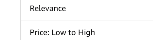
Allow Sorting by “Price”, “User Rating”, “Best-Selling”, and “Newest” (64% Don’t Allow All 4)
April 20, 2021
Return Users to the Same Place in the Product List When Returning from the Product Page (13% Don’t)
November 17, 2020
Display “Applied Filters” in an Overview (32% Aren’t Using the Best UX Practices for Filtering)
October 6, 2020Popular
Inspirational Images Should Link to All Depicted Products (9% of Sites Don’t)
September 8, 2020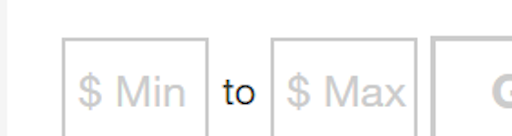
5 Essential Filter Types Users Need on Product Listing Pages (57% Don’t Offer All 5)
August 18, 2020
4 Design Patterns That Violate “Back” Button UX Expectations – 59% of Sites Get It Wrong
July 20, 2020Popular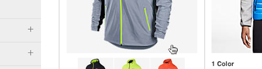
Product Lists: Display Extra Product Info and Images on Hover (70% of Sites Don’t)
June 2, 2020
Product List UX: The Number of Products to Load by Default (52% Get it Wrong)
January 7, 2020Popular
Filter List Design: Have Filters for All Displayed List Item Info (38% Don’t)
September 17, 2019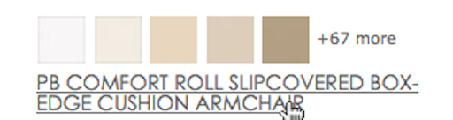
Hover UX: Use Synchronized Hover Effects & Unified Hit-Areas (76% Don’t)
August 16, 2016
Product List and Category Navigation: Highlight Items Already in the User’s Cart (96% Don’t)
April 19, 2016
External Article: Testing Pagination Against Infinite Scrolling and ‘Load More’ Buttons
March 1, 2016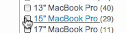
6 Use Cases for Compatibility Databases on E-Commerce Sites
October 6, 2015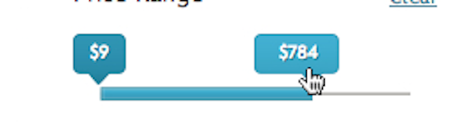
Improve Form Slider UX With These 5 Requirements for Slider Interfaces
September 15, 2015
7 Filtering Implementations That Make Macy’s Best-in-Class
July 1, 2015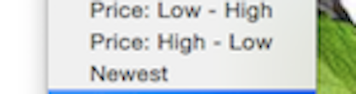
Don’t Base ‘Customer Ratings’ Sorting on Averages Only
June 16, 2015
Contextual List Item Information – A New E-Commerce Personalization Technique
May 19, 2015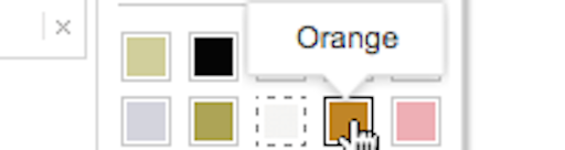
Filter UI Design: A Horizontal Toolbar Can Outperform the Traditional Sidebar
May 5, 2015Popular
External Article: The Current State of E-Commerce Filtering
April 20, 2015
Category-Specific Sorting: A New Way to Sort Products
April 14, 2015
E-Commerce Product List Usability: Report & Benchmark
March 3, 2015
Want to learn more about this topic?
Explore Other Research Content
244 top sites ranked by UX performance.
14,000+ annotated designs for systematic inspiration.
Code samples, demos, and key stats for usability.