Key Takeaways
- Our new research has uncovered 1,350+ new usability issues specific to the e-commerce Checkout experience
- The research has resulted in 110+ new and updated Checkout guidelines that describe the issues, as well as design patterns verified to perform well for users
- 20 new Checkout guidelines have been added and 62 previously existing Checkout guidelines have been heavily revised
At Baymard, our research team has just spent 4,000+ hours usability testing and researching Checkout features, layouts, content, and designs — leading to our revised and expanded Checkout research study.
The research is based on more than 200 qualitative user/site usability test sessions following the “Think Aloud” protocol (1:1 remote moderated testing).
This Checkout study focused on a mix of mass merchant and smaller sites, for a total of 16 sites: Etsy, Theo Chocolates, CVS, Best Buy, Stance, Hayneedle, Apple, Everlane, Container Store, Williams Sonoma, Overstock, Walgreens, Snowe Home, Wayfair, American Eagle, and Samsung.
During testing the users encountered 1,350+ medium-to-severe checkout usability issues.
These issues have subsequently been analyzed and distilled into the 110+ UX guidelines found within our Checkout research study (all of which are available as part of our Premium research findings).
The 110+ guidelines cover most aspects of the Checkout UX, at both a high level of general user behavior as well as at a more granular level of specific issues users are likely to encounter.
Expanded and Updated Checkout Research
This latest round of large-scale Checkout testing provides the following:
- An exhaustive review and reverification of all of our existing Checkout research
- New examples from user testing highlighting user issues on the test sites, as well as test site implementations that were verified to perform well for users
- New insights into Checkout user behavior, discussed in particular in 20 new Checkout guidelines and 62 heavily revised guidelines
- A more streamlined Checkout research-consumption experience for Baymard Premium users
1) An Exhaustive Review and Reverification of All of Our Existing Checkout Research
At Baymard, we’ve conducted Checkout research since 2010. This latest round of research reverifies nearly all of our previous findings.
This 2024 Checkout research ensures that our existing Checkout research — first conducted in 2010 and periodically conducted since — remains robust and up-to-date with the latest UX findings.
This large-scale study dedicated 4,000+ research hours and conducted more than 200 qualitative user/site usability test sessions solely to investigating e-commerce Checkout UX.
Analyzing the Checkout test session data, we’ve reverified all of our existing Checkout research — meaning that our previously identified Checkout issues and recommendations (published as Checkout articles or in Baymard Premium) are again shown to be primary drivers of the Checkout UX for end users.
2) New Checkout Test Examples
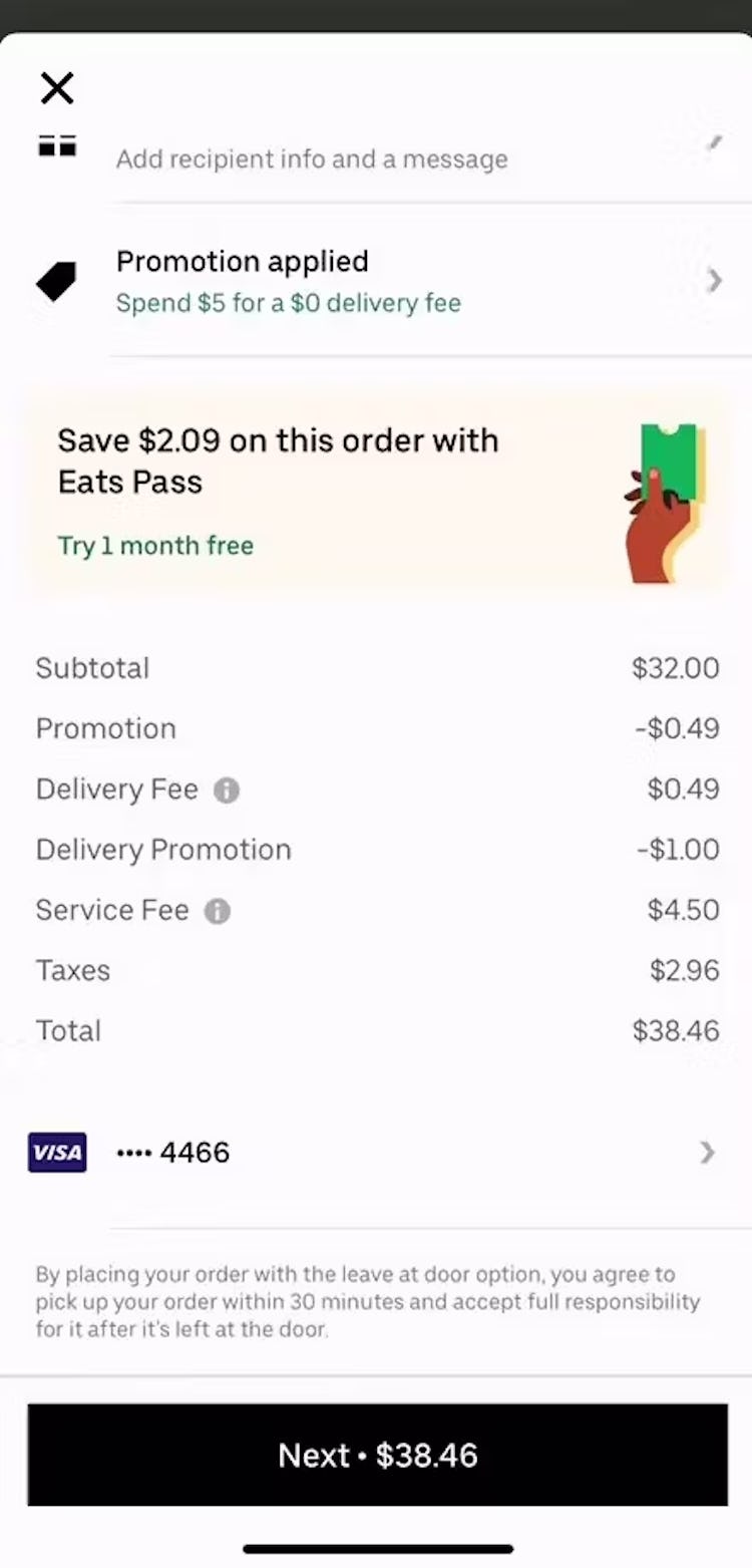
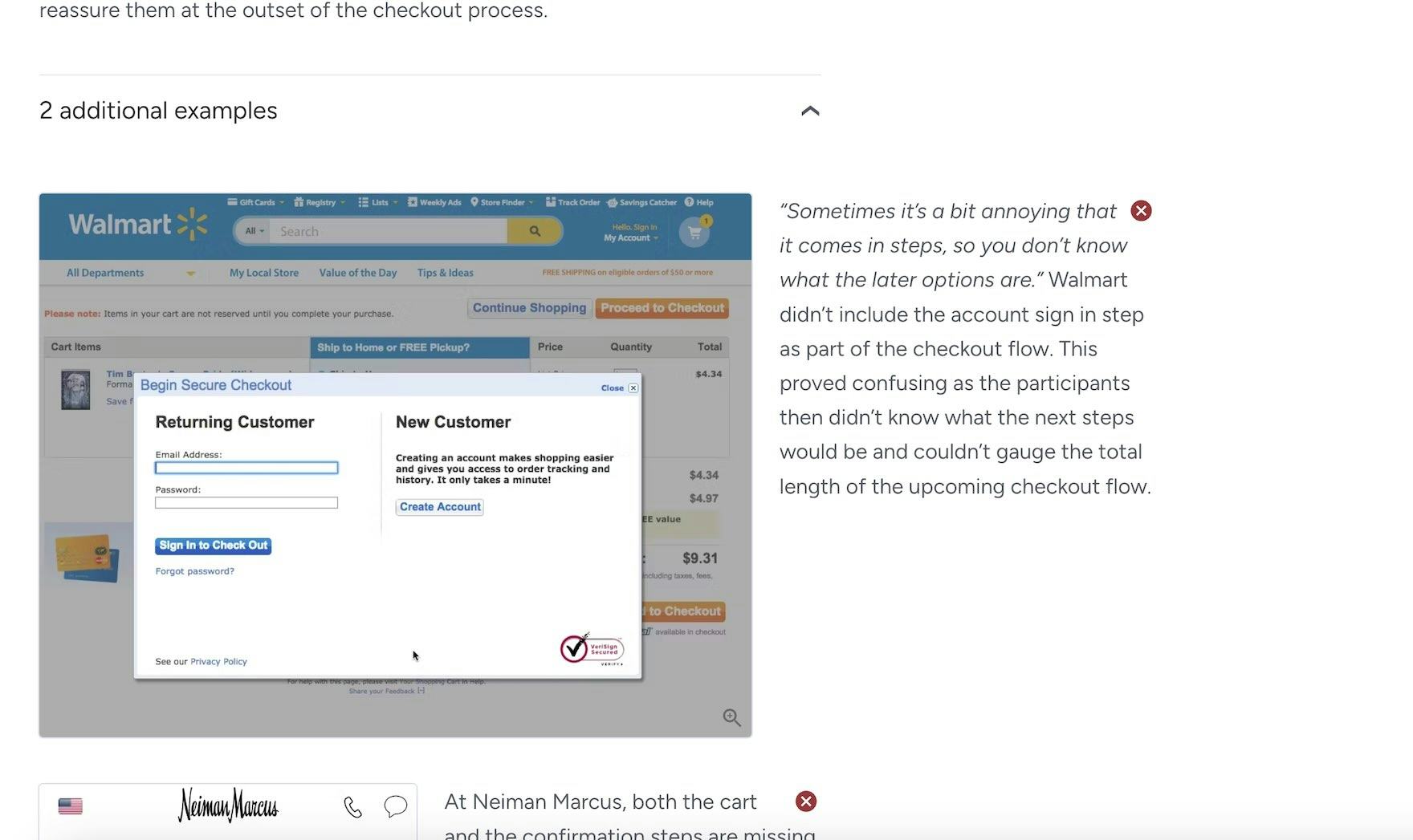
“I’m not sure if I click the ‘Next’ button, will it charge? Because it’s already showing me my credit card number and the subtotal, so it’s kind of confusing here. It says ‘Next’ instead of ‘Submit’ or ‘Confirm’. So I’m not sure if it will already process my order or it’ll take me to another page.” This participant checking out on UberEats was unsure if the next page would be an order confirmation. In fact, the following step, prior to submitting an order, was the step to tip the delivery driver.
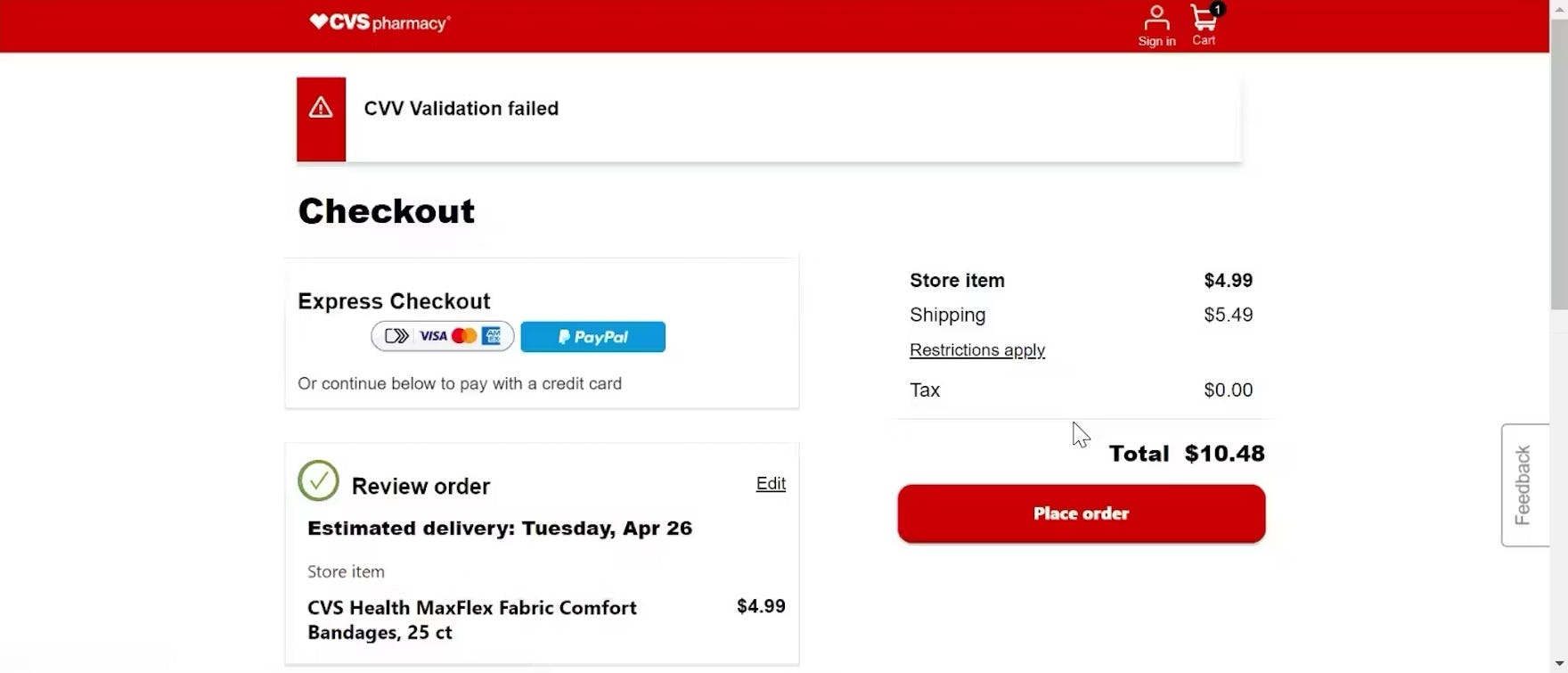
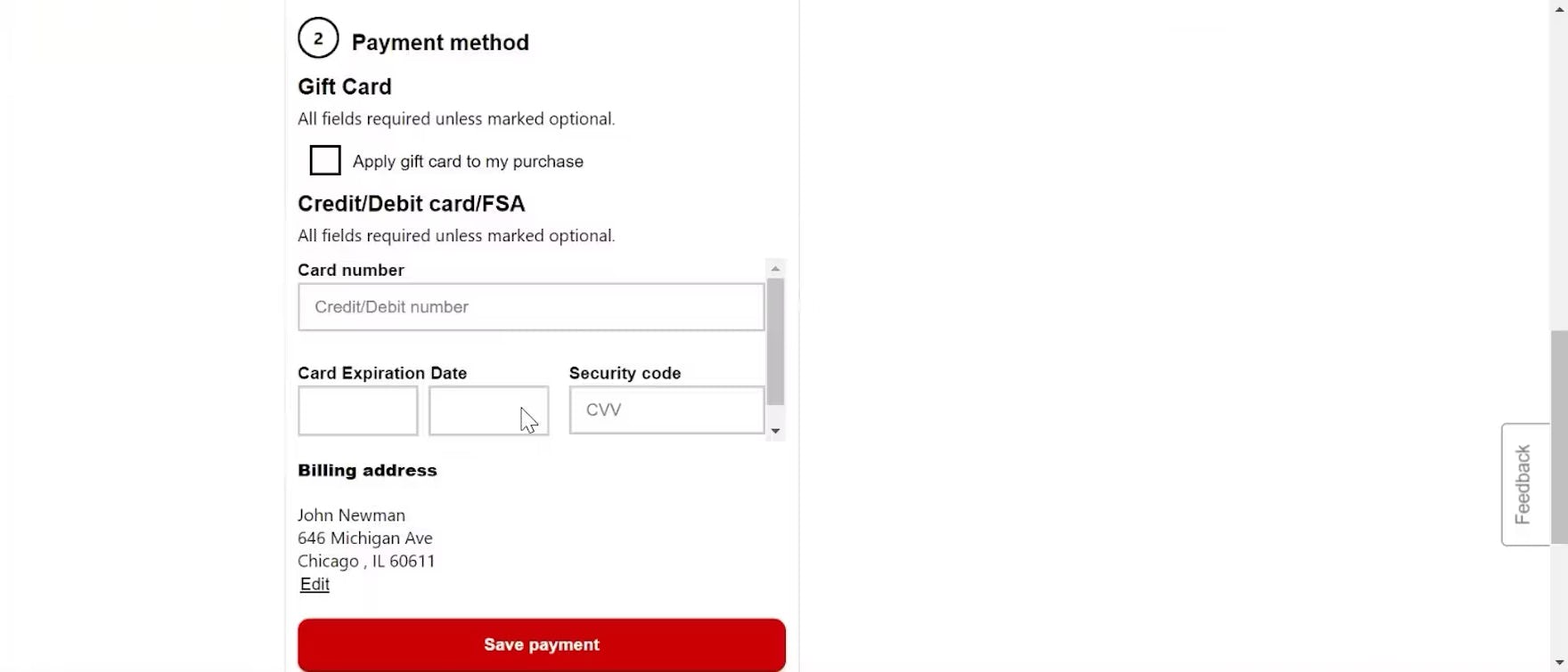
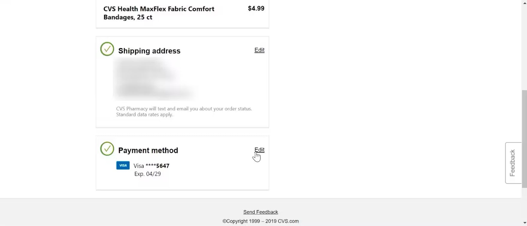
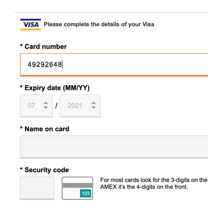
“It says ‘CVV validation failed’…what did I put in wrong?…Oh, I see. And they’re making me put it in all over again. [That’s] a little annoying.” After choosing “guest” checkout at CVS, a participant submitted her order for verification, but she encountered a validation error message (i.e., “CVV Validation failed”; first image). However, when she opened the “Payment method” section to change her credit card number (second image), she discovered that the site had cleared all of her previously entered data, requiring her to reenter her payment information in its entirety (third image).
Along with reverifying our Checkout research, we’ve also updated our Checkout research catalog with hundreds of new examples.
The examples are from the test sessions at the 16 test sites listed above, as well as from our e-commerce UX benchmark (desktop, mobile, and app).
3) New Insights into Checkout User Behavior
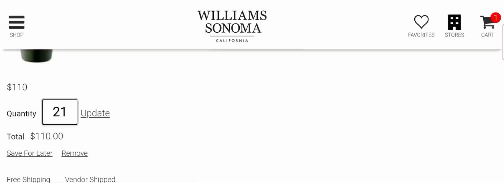
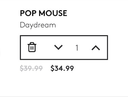
“Whoops, no, we don’t want 21…Hold on, let’s try that again.” This participant on Williams Sonoma meant to update the quantity from 1 to 2, but the default quantity “1” remained even after she began inputting her desired quantity, resulting in the incorrect “21”.
While many user issues and patterns persist from year-to-year, there are some genuinely new issues that arise, and new approaches to resolving these issues.
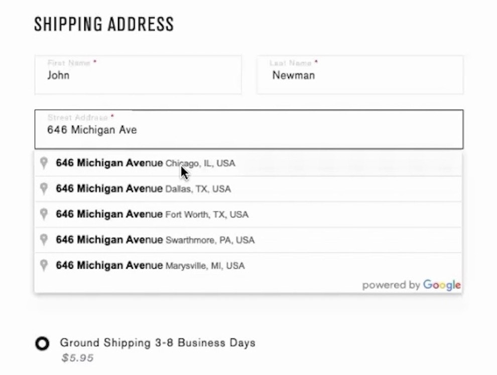
As such, we’ve added 20 new Checkout guidelines based on this latest 2024 test data, some of which we’ve already published as articles (e.g., see “Include All Order-Fulfillment Options in the Fulfillment-Selector Interface (50% Don’t)”, “Provide a “Fully Automatic Address Lookup” Feature (55% Don’t)”, and “Use Buttons or Buttons Plus an Open Text Field for Updating Cart Quantity (61% Don’t)”).
Additionally, 62% of our existing Checkout guidelines that were reverified in this study have been heavily revised — meaning that, while the core issues observed and solutions recommended largely remain the same from the previous guideline, the revised guideline has added arguments, implementation details, additional considerations, and other content that provides for a more robust overall guideline.
4) An Improved Reading Experience in Baymard Premium
Finally, some of our Premium subscribers may notice that there have been some changes to the research catalog in the Checkout theme.
As part of our 2-year Checkout research study we’ve identified 36 guidelines to archive to improve the overall experience for our Premium customers and clients.
In particular, we’ve archived 36 guidelines, for 1 of the following reasons:
- The guideline had overlapping issues and solutions with another guideline or guidelines and thus was merged to improve understandability of the Checkout research catalog on the whole (e.g., “Support the ‘Back’ Button for Navigating to any Previous Checkout View”, “Be Extremely Cautious about New and Unconventional Features”; 55% of the archived guidelines)
- The guideline was originally written based on user issues that are no longer observed in this latest large-scale Checkout research study (e.g., “Make Credit Card Icons Secondary in the Payment Interface”, “Make Social Media Account Creation Secondary to Traditional Email Account Creation”; 27% of the archived guidelines)
- The guideline addressed a relevant Checkout UX issue but was deemed to be so niche and unlikely to impact the vast majority of users or sites that the research findings were condensed and merged into other, related guidelines (e.g., “Avoid Multistep Gift Card Redemption Flows”, “Be Extremely Cautious about Semiautomatic Address Lookup Features”; 16% of the archived guidelines)
Due to these archived guidelines, the number of Checkout guidelines has dropped from 134 guidelines (in 2022) to 119 in 2024 — which have been combed through by our research team to ensure they are not only valid but clear, actionable, and highly relevant to determining a particular site’s Checkout UX performance.
In addition to archiving 36 guidelines, we’ve also improved the reading experience in Premium by updating topic titles and the overall organization of the catalog, and we anticipate that these changes will make for a more reader friendly and less intimidating experience for Premium users in the Checkout theme.
14 Years Later: Checkout UX Is Still Largely about Getting the Fundamentals Right
At Baymard, we’re not new to Checkout UX research.
Indeed, we conducted our first Checkout study back in 2010, and have been testing e-commerce checkouts ever since.
However, if a client or customer happens to see a screenshot from one of our test sessions of an interface that looks dated, we’re sometimes asked, “How do I know this research is still relevant?”
In particular, some seem to think that, with new design trends emerging all the time, any UX research that hasn’t been conducted in the past 3–6 months is irrelevant, or is of diminished relevance.
Yet what this latest round of Checkout research has shown (and what we’ve observed more generally for e-commerce UX) is that, while design trends come and go, user issues and user needs remain largely the same over time.
For instance, consider an example from that 2010 Checkout study, compared against a much more recent example.
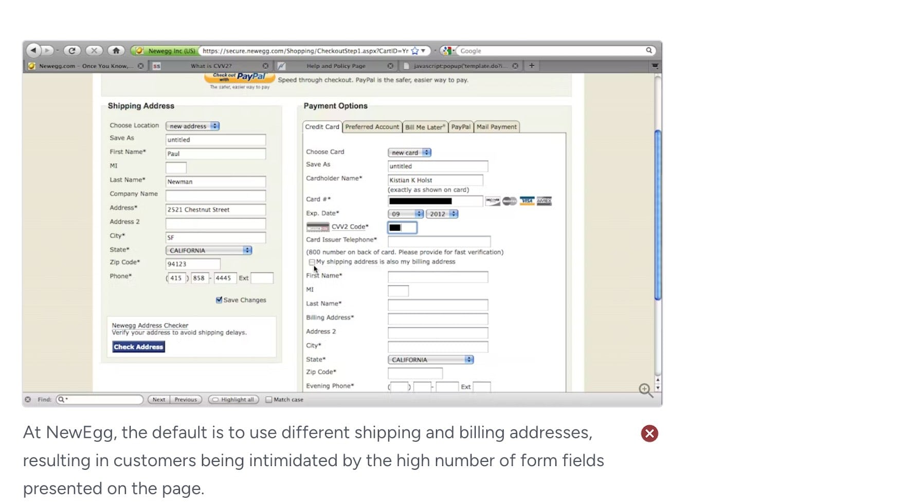
In the 2010 study, we identified a user issue where some users were forced to reenter a billing address after having already provided a shipping address, or otherwise struggled with the “Billing Address” fields.
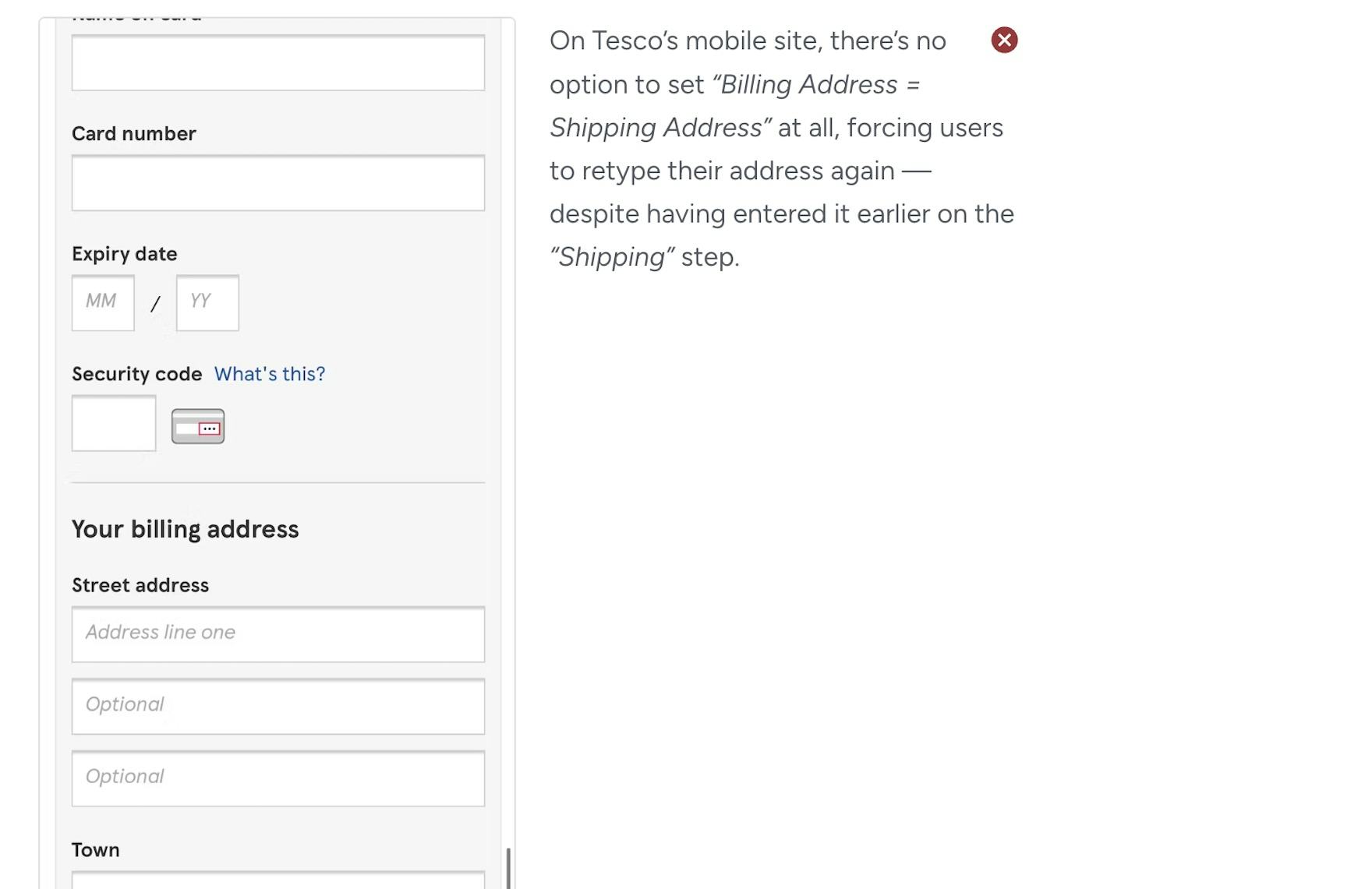
14 years later, in this latest round of Checkout research, we identified 35 instances where users encountered the exact same, or very similar, issues or implementations regarding the billing address.
Thus, in this one example we see how, despite flashy new designs, a site’s Checkout UX performance depends on “Checkout UX fundamentals”: forms, form fields, and Checkout elements and features that have been around for a decade or more.
Despite these issues persisting over the years, we find that on many sites they remain unresolved — leading to friction-filled checkout experiences, negative user brand perceptions, and users abandoning checkouts.
This latest 2-year Checkout research study shows that, to improve Checkout UX, the vast majority of sites need to solve problems that we’ve identified 3, 5, or even 10 years’ ago — and have now verified with this 2024 research.
Thus, the research (even if including a screenshot that’s not the latest version of x site’s interface) remains valid, and implementing the recommendations will improve the experience of a site’s users today (despite the issue being identified years’ ago).
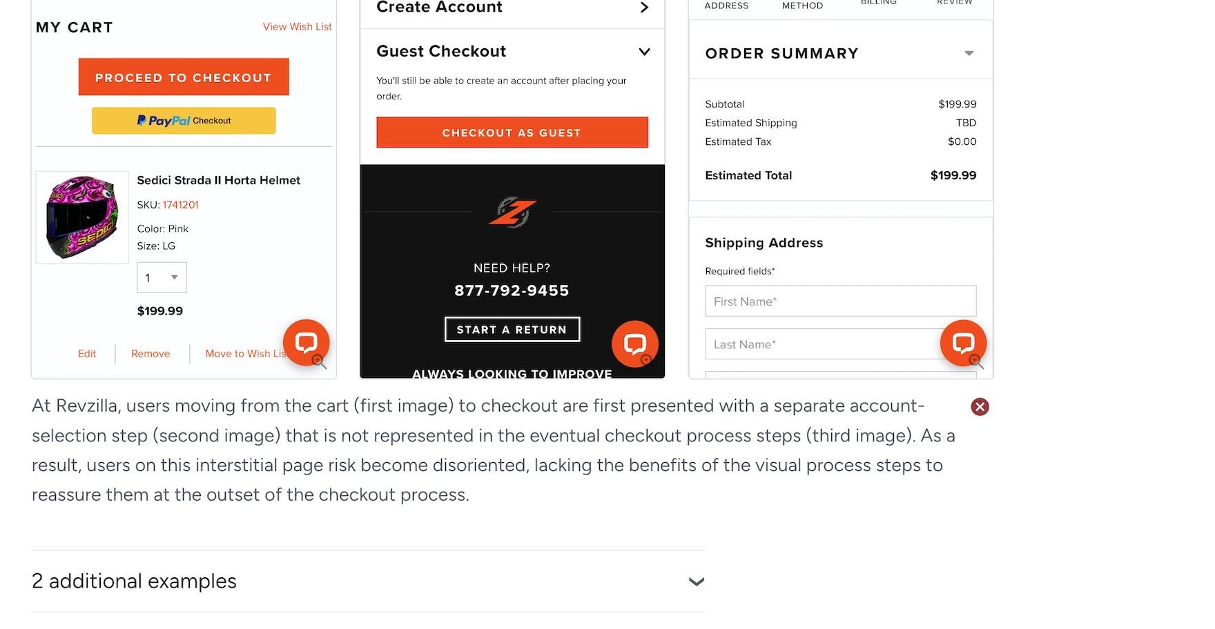
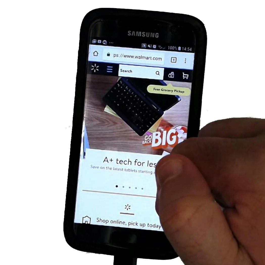
Guidelines in our Premium catalog will often contain examples from our latest research (e.g., at Revzilla, first image) along with older research (e.g., at Walmart, second image) to illustrate that a particular UX issue has persisted over time, even if site interfaces have changed.
Indeed, in many of our guidelines we include “old” examples along with the newest examples of users experiencing issues during Checkout — precisely to illustrate the longevity of the UX issue.
4,000+ More Hours of Checkout-Specific Research
In addition to 4,000+ more hours of research, our latest Checkout-specific research study adds an additional 200+ qualitative user/site sessions, for a total of 650+ qualitative user/site sessions for our Checkout research only, conducted periodically from 2010 to 2024.
Note that this figure doesn’t include site sessions from our industry-specific studies, the majority of which have Checkout findings as well.
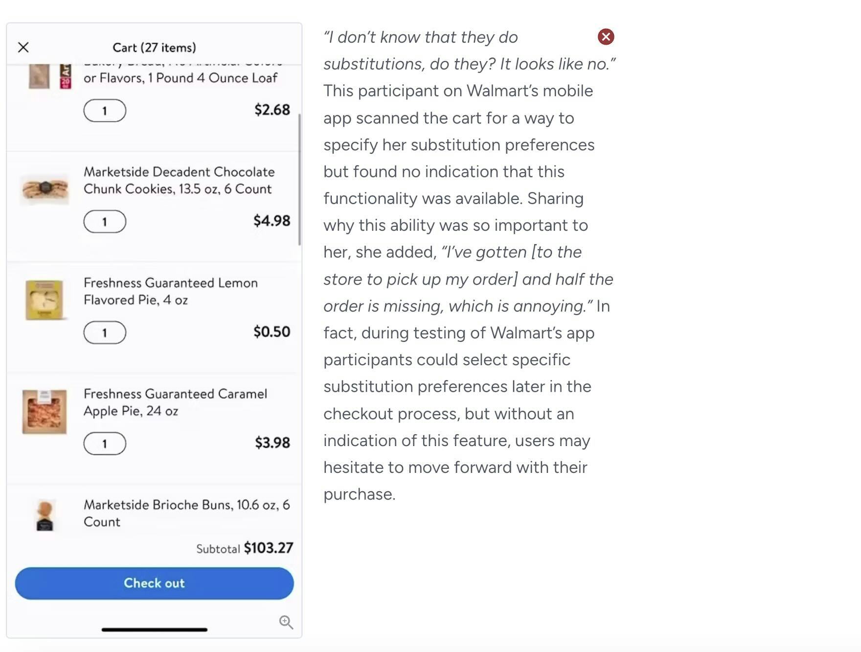
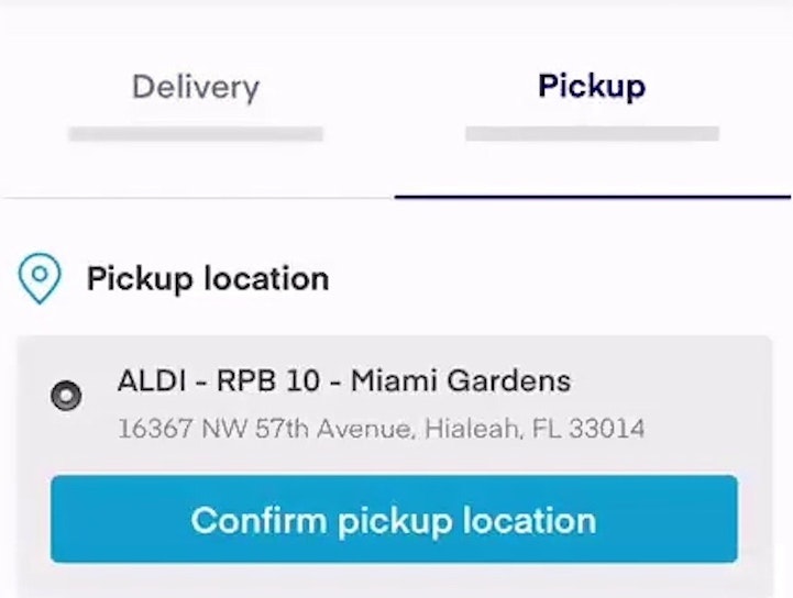
Our industry studies, such as this example from our Grocery study, serve to both verify that Checkout guidelines identified in broad, B2C research (such as this latest Checkout 2024 study) apply as well to particular industries. Additionally, we always find some industry quirks that need addressing (as is the case here, for our Grocery Checkout guideline on substitutions in grocery orders).
For example, our dedicated research tracks on Vitamins and Supplements, Travel Accommodations, and Online Grocery all contain Checkout findings that largely support our broad Checkout B2C research, along with some Checkout findings that are specific to those industries.
Finally, in addition to our Checkout guidelines (many of which are available for free as published articles), be sure to view our Checkout benchmark based on over 24,000 performance ratings, as well as our Checkout page designs, which includes over 6,600 desktop and mobile Checkout examples.
Getting access: all 110+ Checkout UX guidelines are available today via Baymard Premium access. (If you already have an account open the Checkout study.)
If you want to know how your desktop site, mobile site, or app performs and compares, then learn more about getting Baymard to conduct a UX Audit of your site or app.