“How do I get back? Just press ‘Back’. Navigation, this isn’t great to be honest. And now it’s brought me back to the women’s. OK. Don’t like this.”
During all our usability studies we’ve observed how users, both novice and expert, rely extensively on the browser “Back” button. Indeed, the “Back” button has long been a staple of web navigation, and users’ often decades-long experience with using it has caused them to develop a very specific mental model of how it should behave.
Often this has severe usability implications when many common web design patterns — such as overlays, anchor links, dynamically injected views, hidden content, etc. — have a default technical structure that breaks users’ expectations for how the “Back” button is supposed to work. In fact, our benchmark reveals that 59% of e-commerce sites gets at least one of these 4 user expectations wrong in terms of how they technically support use of the “Back” button.
The consequences of breaking the user’s expectations of how the browser “Back” button should behave can be dire. During our usability tests, it has been the direct cause of abandonment, with users leaving test sites with much swearing and cursing (even from the calmer test users).
In this article we share our large-scale usability research and discuss our findings regarding:
- How users expect the “Back” button to work
- Issue 1: Overlays & Lightboxes (37% of sites don’t do this)
- Issue 2: Filtering & Sorting (27% of sites don’t do this)
- Issue 3: Accordion Checkouts
- Issue 4: Product Page to Product List navigation
- 5 other views affected by “Back” button issues
- A simple solution to all of this
While the solution is simple, it’s surprisingly often neglected in the implementation phase — even on the largest websites, as you’ll see below, and especially on mobile sites.
How Users Expect the “Back” Button to Work
The short version: users expect the “Back” button to take them back to what they perceived to be their previous page. The notion of perception is the key factor here, since there’s often a difference between what is technically a new page and what users perceive to be a new page — which can create discrepancies between where the user expects the “Back” button to take them and where it actually takes them.
Generally, we’ve observed that if a new view is sufficiently different visually, or if a new view conceptually feels like a new page, it will be perceived as one — regardless of whether it technically is a new page or not. This has consequences for how a site should handle common product-finding and -exploration elements like overlays, filtering, and sorting. For example, if users click a link and 70% of the view changes to something new, most will perceive this to be a new page, even if it’s technically still the same page, just with a new view loaded in.
Much the same way users have little technical understanding of website security and, instead, go with their gut feeling (learn more), they similarly show little appreciation for the (often arbitrary and minute) distinctions of when a new view is technically a new webpage or just an expanded element on the existing page. And therein lies the rub: the browser “Back” button takes the user back to their previously visited URL, which isn’t necessarily the same as what the user perceived to be their previously visited page.
Users therefore often rely on an element’s visuals, its context, and prior site experience when shaping their expectation of when something is a new webpage vs a slightly altered element on the same page. It’s the outcome of this subconscious snap judgment that determines where the user expects the browser “Back” button to take them.
4 of the Most Common “Back” Button UX Pitfalls
Below is a walkthrough of the 4 website elements we most often observe to be implemented in ways that break user expectations — that is, where the user isn’t sent back to what they perceived to be their previous page when using the browser “Back” button.
- Overlays & Lightboxes (37% of sites don’t do this)
- Filtering & Sorting (27% of Sites Don’t Do This)
- Accordion Checkouts
- Returning to the Product List from the Product Page
(Our introduction to the UX design process and workflow explains how UX designers determine and match user expectations.)
1) Overlays & Lightboxes (37% of Sites Don’t Do This)
Overlays and lightboxes are by design meant to convey a new page that’s laid on top of the previous page. It should, therefore, come as no surprise that users perceive these as separate pages and expect the browser “Back” button to bring them back to the original page. Alas, during testing, the vast majority of user-initiated overlays at the tested sites did not close as the users clicked the browser “Back” button, but instead sent them way back past the overlaid page.
This user expectation of “click ‘Back’, exit overlay” was observed during testing on both desktop and mobile sites, for all types of overlays. For example, site-initiated newsletter–sign up requests, image gallery overlays, or live chat offers. Thus users should always be exited from an overlay when clicking “Back”, and returned to the page the overlay is on top of (not the previous page).
It’s worth noting that users’ likely use of the “Back” button to exit an overlay varies in proportion to how prominent the site-provided “Close” element is (e.g., an “X” to exit the overlay). Very prominent “Close” elements are likely to be used more frequently by users compared to inconspicuous “Close” elements, and thus the strain on the “Back” button is reduced when overlays have highly prominent “Close” elements. Of course, users should still be exited from the overlay when clicking “Back”, even if provided with a prominent “Close” element.
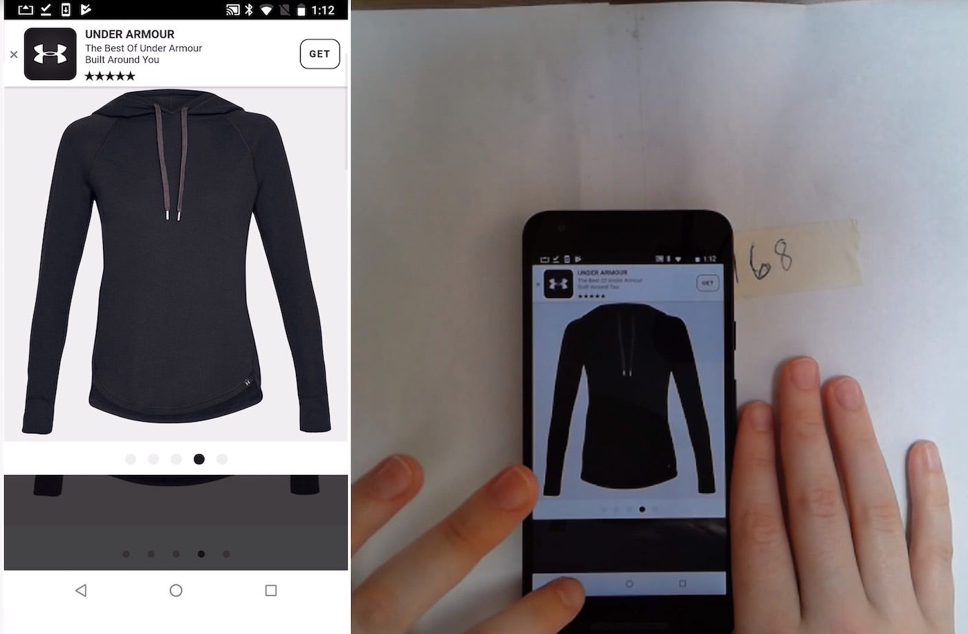
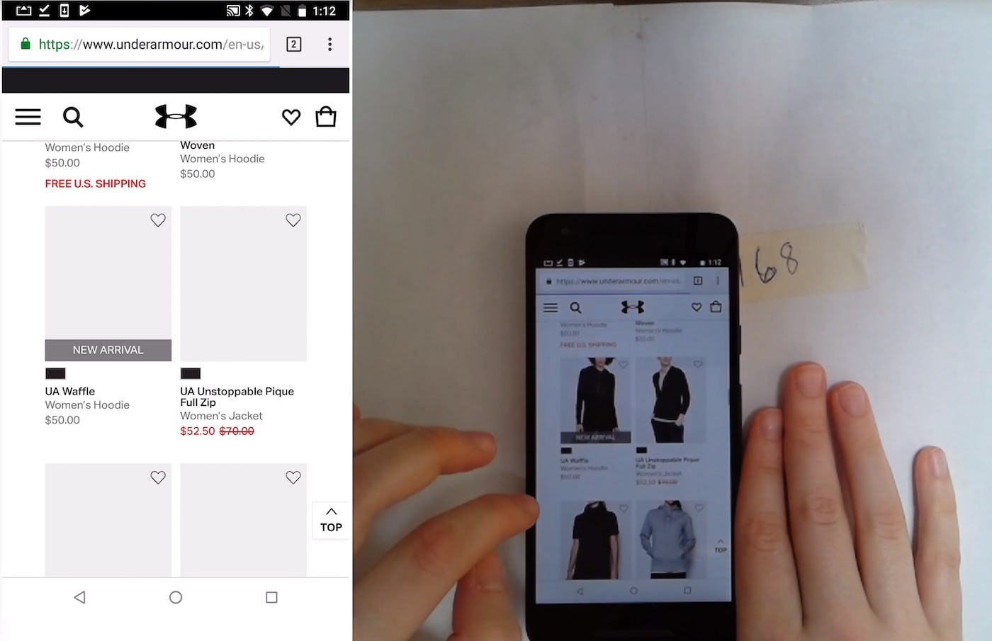
“I don’t know how to get out of this…’Back’ button? So that took me all the way back to the hoodie-finding section [the product list].” A user tried to exit an image gallery overlay by tapping the “Back” button (first image), but she was taken back to the product list instead (second image). (The site-provided “Back” link was actually hidden by the “Install App” ad.)
During mobile testing, we observed users having more difficulty closing overlays using site-provided “Close” elements, often due to hit area issues, with the “X” often being placed close to the edge of the screen, or an “Install App” ad covering a “Close” element (see our article on Deemphasize ‘Install App’ Ads or Avoid Them Entirely). Thus mobile users are more likely to use the “Back” button to close overlays compared to desktop users, and it’s even more important that their expectation of exiting the overlay is supported when tapping “Back”.
2) Filtering & Sorting (27% of Sites Don’t Do This)
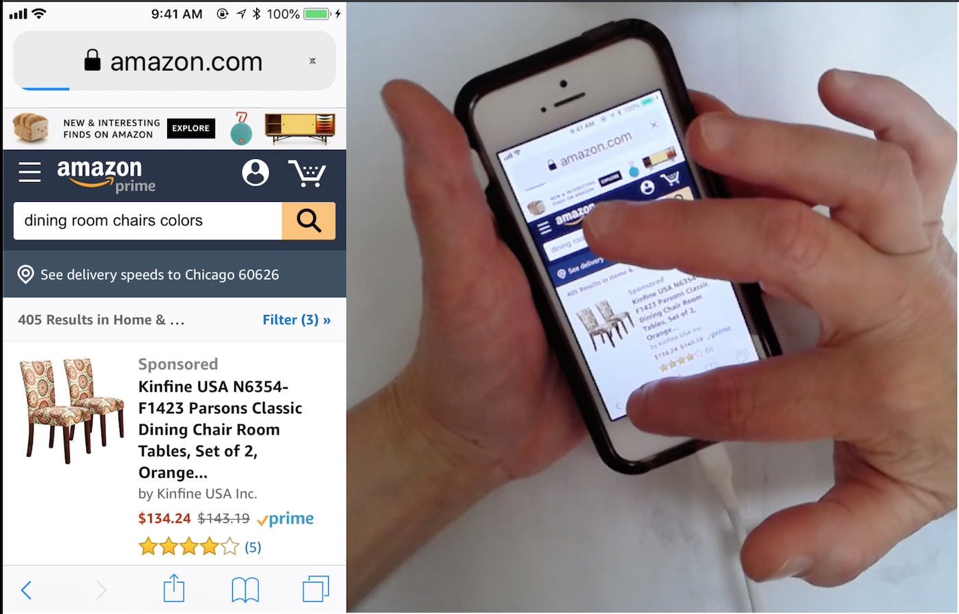
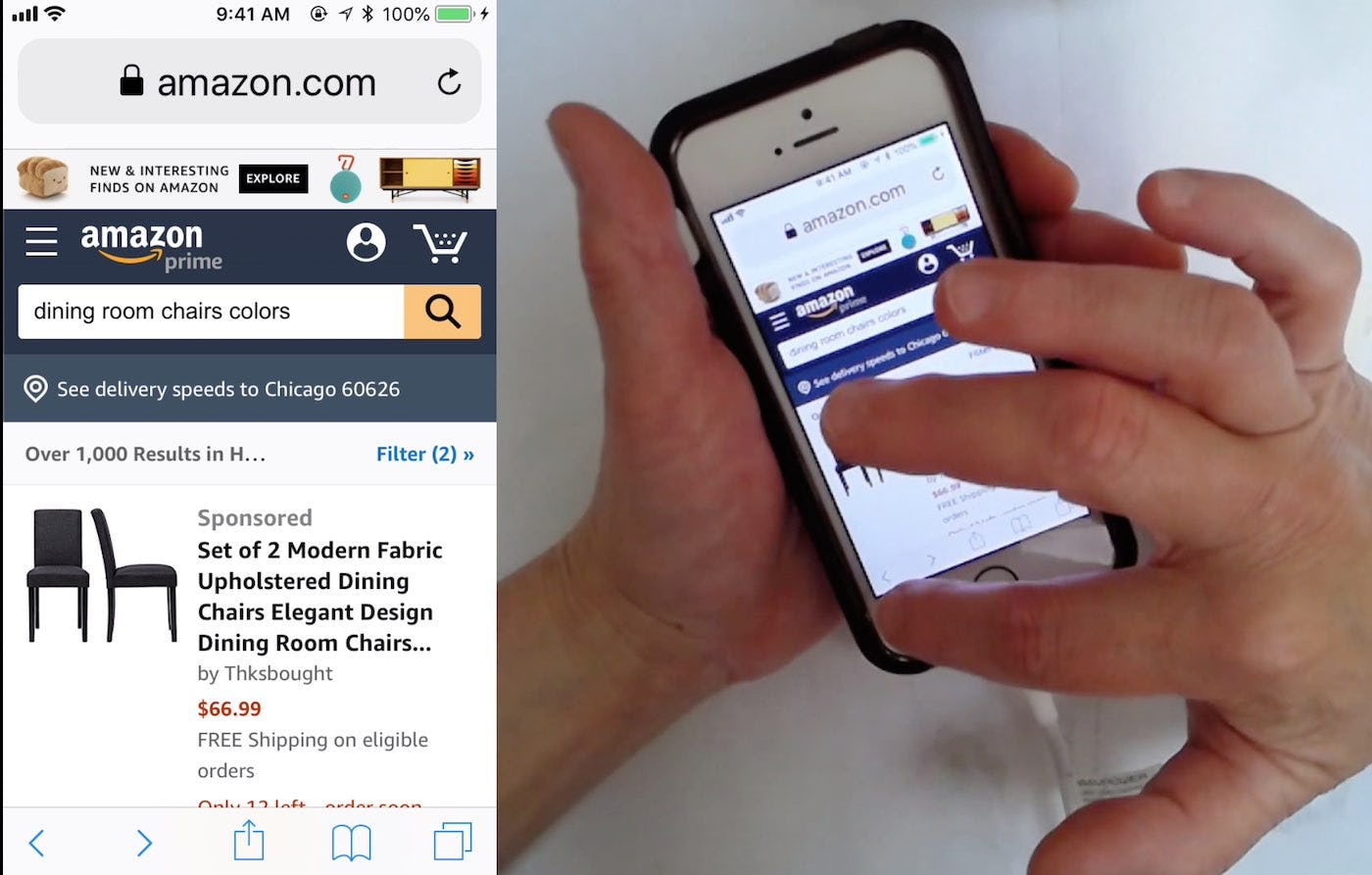
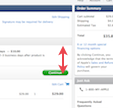
A user on Amazon taps “Back” after applying 3 filters (first image). This removes the last-applied filter, and it’s now shown that there are 2 filters applied (second image). Tapping “Back” after applying filters should begin removing the applied filters.
Filtering and sorting generally yield an entirely new product list and users therefore perceive each of these actions as a distinct view. Even when the filters or sorting directions don’t invoke a page reload, we still found during our large-scale usability study of Product Lists & Filtering that the users generally perceive each discrete iteration of their filtering as a new view (most likely because it is a user-initiated action and each iteration produces a new set of results).
This underscores how users don’t make technical distinctions between what is and isn’t a new page, but rather rely on what they perceive to be a new page. Filtering and sorting, of both categories and search results, should therefore support that users flick back through each list state by using the browser “Back” button, and the sorting directions should also be changed to the previously set sorting direction.
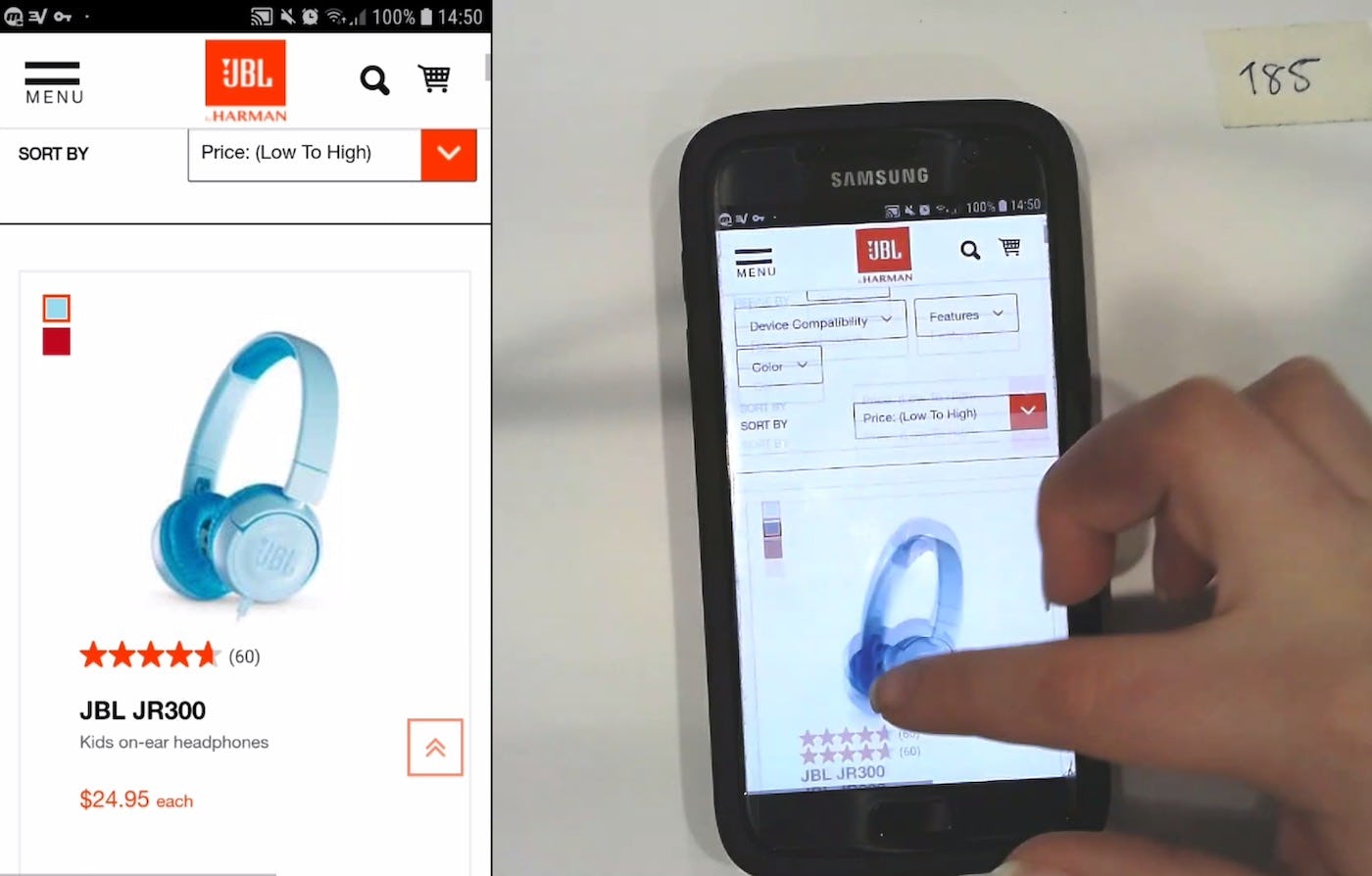
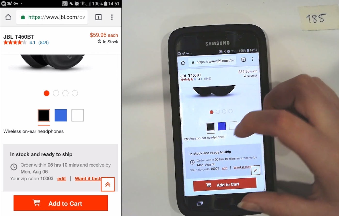
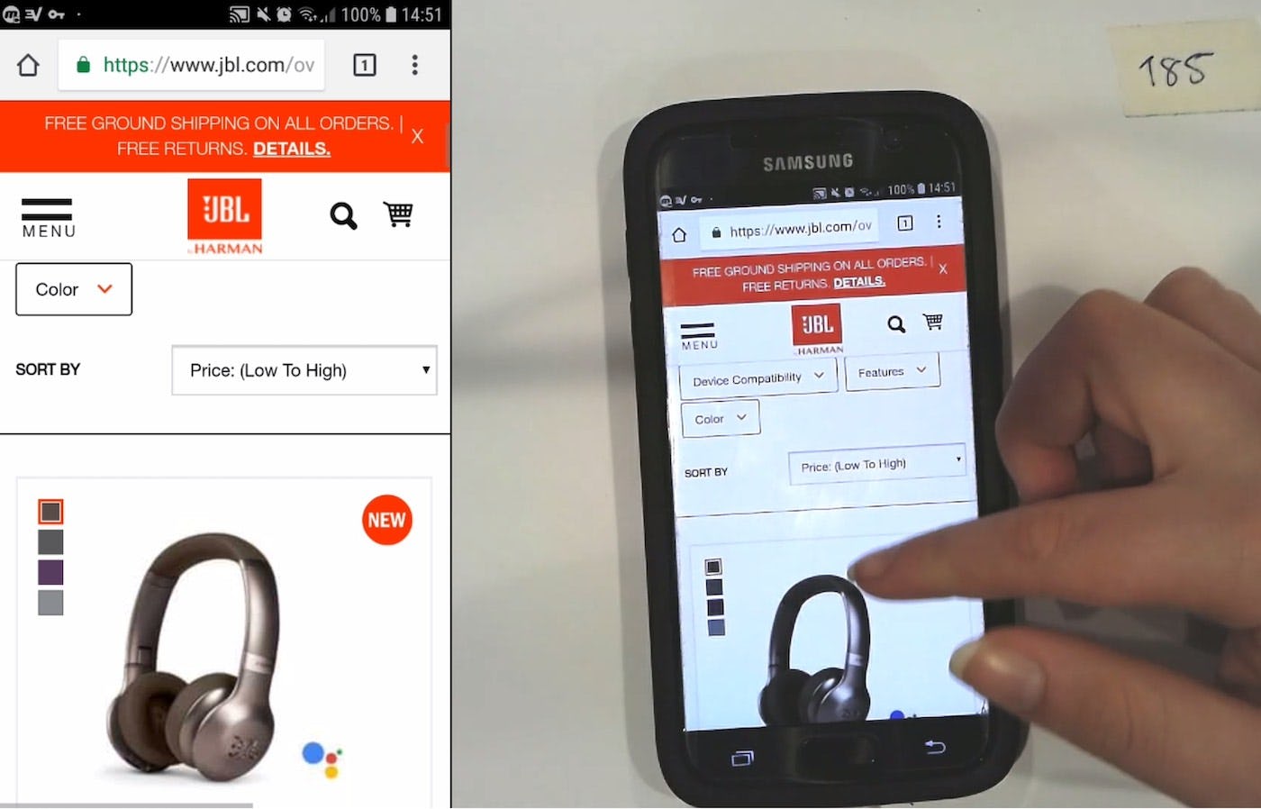
“I guess I’ll go back…” A user at JBL sorted a product list of headphones by price from low to high (first image). After exploring a product on a product page, she decided she wanted to keep browsing, and tapped to go back to the product list (second image). However, she tapped twice: this led her to be taken back to the product list and also changed the sorting direction — but the sorting direction was only changed on the back end, as the sorting direction still read “Price: (Low To High)” (third image). As she said, “The filter [sorting direction] took away even though it says it is still working…They are not in filter [sort] order…The ones I was looking at, I can’t find them.” Such technical bugs were quite common during testing, and caused uncertainty for users with regards to product list sorting.
However, it’s important to note that during testing there were many instances of users tapping “Back” and a filter being removed or a sorting direction being changed — but this wasn’t communicated to users on the front end. In other words, while tapping the “Back” button technically did remove a filter or change a sorting direction, it appeared to users that nothing had changed, as the (now removed) filters were still shown as applied or the sorting direction shown didn’t match the actual sort order of the product list. This obviously will lead to confusion for users, who will wonder whether their “Back” button click or tap has been successful when there’s a mismatch between their actions and what they see displayed in the interface.
If filtering or sorting is in an entirely separate interface — which is very common on mobile sites — it’s critical that tapping “Back” while in the interface acts as an “Exit” link would (i.e., similar to exiting an overlay). That is, users should be returned to the view they had been looking at just prior to opening the filtering or sorting interface, after tapping the “Back” button from within the interface.
3) Accordion Checkouts

“Arhh no. Do I have to start over? Now I’m getting angry. Doesn’t it have my shit already [referring to his already typed address and card info]. Now I’m leaving. This isn’t a serious store.” During one of our earlier mobile checkout test rounds, a user at Foot Locker clicked the “Back” button after having progressed and filled out all the required information in the payment step. Alas, he was sent all the way back to the cart and all his typed data was lost. The quote speaks for itself.
Contrary to what one might think, accordion checkouts are not perceived as a one page checkout with multiple collapsed sections. Instead the vast majority of users perceive them as a multistep process with summaries (more on how users perceive accordion checkouts). This can turn out problematic on sites where the accordion steps are technically implemented as a single page with one URL, as users wanting to go backwards to a previous checkout “step” (e.g., to edit previously entered information) will be sent all the way back to the cart.
Instead, it’s key that accordion checkouts ensure that the browser “Back” button takes users back to the previous viewed step — regardless if it’s technically the same or a separate page.
4) Returning to the Product List from the Product Page
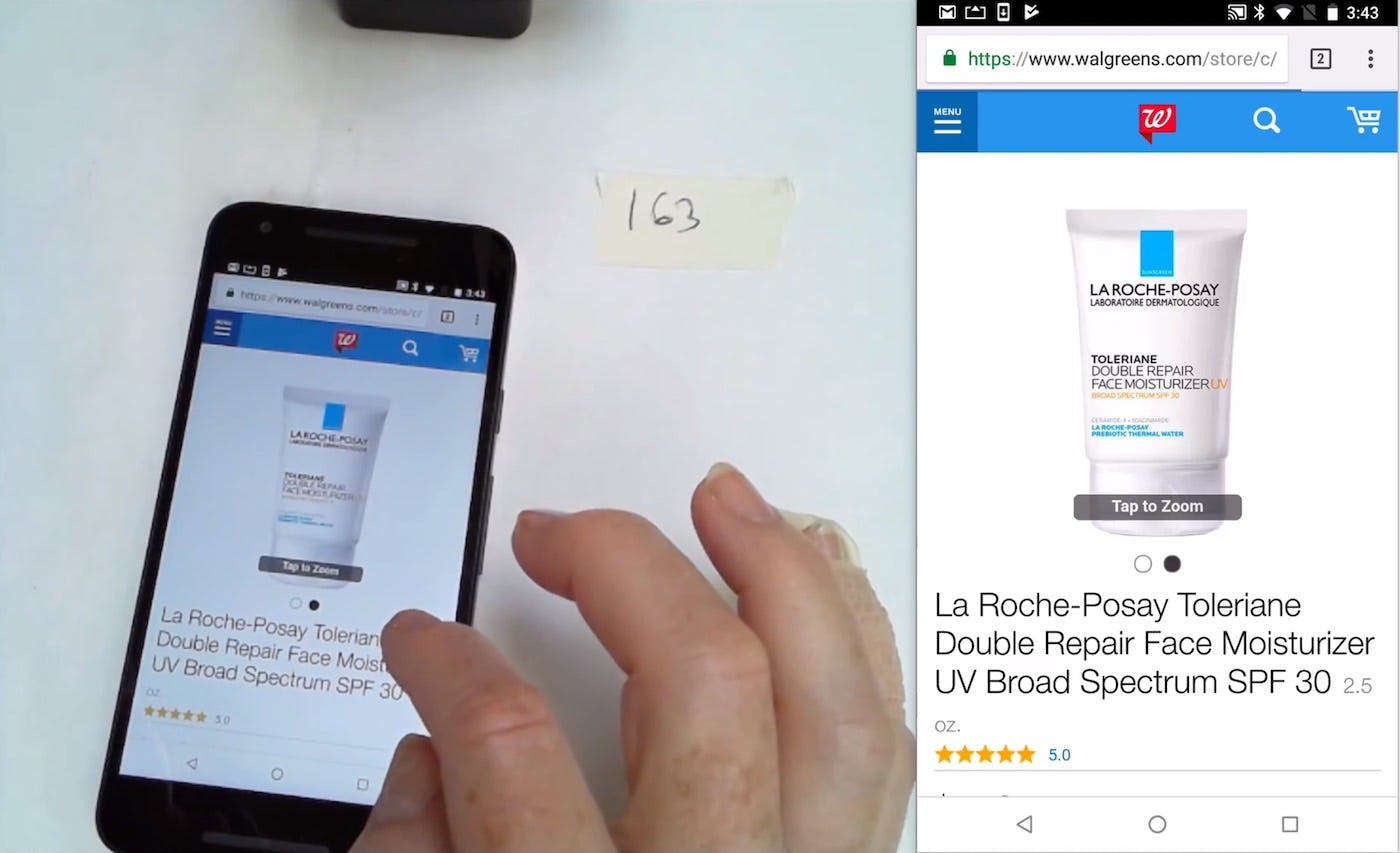
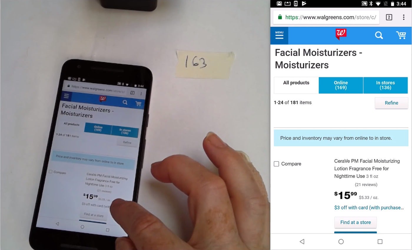
“When you use the “Back” button, it takes you right back to the beginning. Rather than where you left off.” This user spent significant time during testing scrolling down the Walgreens product list refinding products after tapping back from product pages.
Many users will look through a great number of products in order to find what they are looking for, and this will include some back-and-forth between the product list and the product details pages. Users who are not taken back to where they were previously on the product list — for example, back to the middle of the product list, rather than the top — have to go through the tedious process of refinding the last place they were. During testing this was observed to be especially difficult for mobile users due to the more cumbersome process of scrolling.
When users are taken to the top of the product list, rather than to where they were before visiting the product page, they become disoriented and must refind where they were in the product list. Not only is this tedious — users must redo all the work they had previously done by scrolling the product list again — but it can also be challenging to remember exactly where they were before visiting the product page (e.g., if the product list is a selection of blue dresses with similar but not identical styling, or similar-looking office chairs).
“When you use the “Back” button, it takes you right back to the beginning. Rather than where you left off.”
Users brought to the top of the product list may have to scroll through many items before they find the right place in the list. Depending on the product-loading schema of the site, the difficulty in refinding the product can range from moderate to extreme.
Regardless of the product-loading schema used, if the process of refinding the correct place in the product list is too time-consuming and troublesome, users may well give up.
But it doesn’t stop there. The above four examples are typical mismatches where users often expect one thing to happen yet sites are implemented in a way that causes something else to happen. However, this type of misalignment goes beyond those common examples. Generally you should watch out for all new views states initiated by the user which either look like, or conceptually feel like, a separate page.
When it comes to overlays, filtering, or sorting, testing shows that how users expect the “Back” button to behave is consistent, and thus what should be shown to users after clicking “Back” is clear-cut. There are, however, other views users encounter during product finding and exploration where what should be shown to users after clicking the “Back” button isn’t so obvious. Five of these are discussed below.
5 Other Views Affected by Browser “Back” Button Issues
When it comes to overlays, filtering and sorting, accordion checkouts, and going back to the product list from a product page testing shows that how users expect the “Back” button to behave is consistent, and thus what should be shown to users after clicking “Back” is clear-cut. There are, however, other views users encounter during product finding and exploration where what should be shown to users after clicking the “Back” button isn’t so obvious. Five of these are discussed below.
Note: this list isn’t meant to be exhaustive, but more illustrative of “gray” areas where special consideration should be given to how the “Back” button should perform in a given context.
- Multistep processes within a page
- Expanding content
- Anchor links
- Truncated content
- Variations on the product page
1) Multistep Processes Within a Page
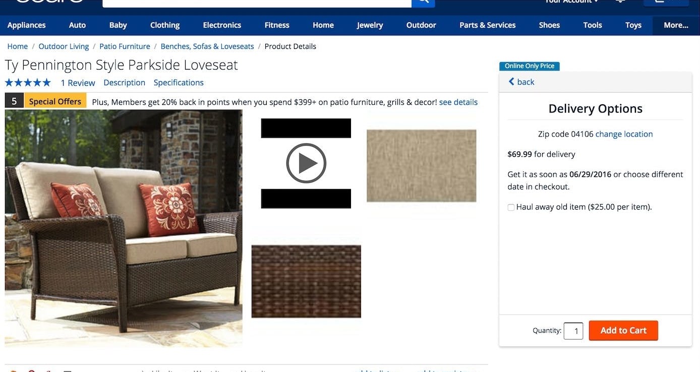
1) Multistep processes within a page. A user during a previous round of testing on Sears was interacting with a multistep shipping estimator on a product page (the “Delivery Options” box). He went through several steps, before clicking the browser “Back” button. However he was only scrolled up to the top of the page, rather than being taken to the previous step in the shipping estimator, as he had expected. He then clicked the site-provided “back” link in the shipping estimator and was able to step backwards through the process.
It’s often difficult to determine what to show users after they click the “Back” button when they’re interacting with a multistep process embedded within a page — for example, shipping estimators, product-finding wizards, questionnaires, etc. While some users may assume they’ll be taken to the previous page, others will assume they’ll be taken to the previous step in the process.
The design of the embedded process itself likely highly influences user expectations. For example, when a process takes up more than 50% of an interface — which will very often be the case on mobile — many users are likely to expect that after clicking “Back” they’ll see the previous step in the process, not the previous page.
However, the length of the process is also a factor here. It’s not difficult for users to click back through, for example, a 3-step process, even if they had expected the “Back” button to take them to the previous page. Hence the consequence of forcing all users to do this aren’t so grave. If, on the other hand, the process is lengthy — for example, a 7-step process — then the act of clicking back becomes much more tedious if, for example, users have to click back through 6 separate views to finally get back to the previous page they were on.
Lastly, if the embedded wizard will lose any significant amount of data the user has typed when the back button is used, then the consequences of not taking users to the prior step also increase greatly.
Thus, the size and prominence of the embedded process, the length of the process, and any potential data loss of large amounts of user-provided data should be considered when deciding whether each step in the process should have its own separate URL (requiring users to click back through each step in the process) or not (where clicking “Back”, even if a user is several steps into a process, returns the user to the previous page, or alternatively exits them from the process).
2) Expanding Content
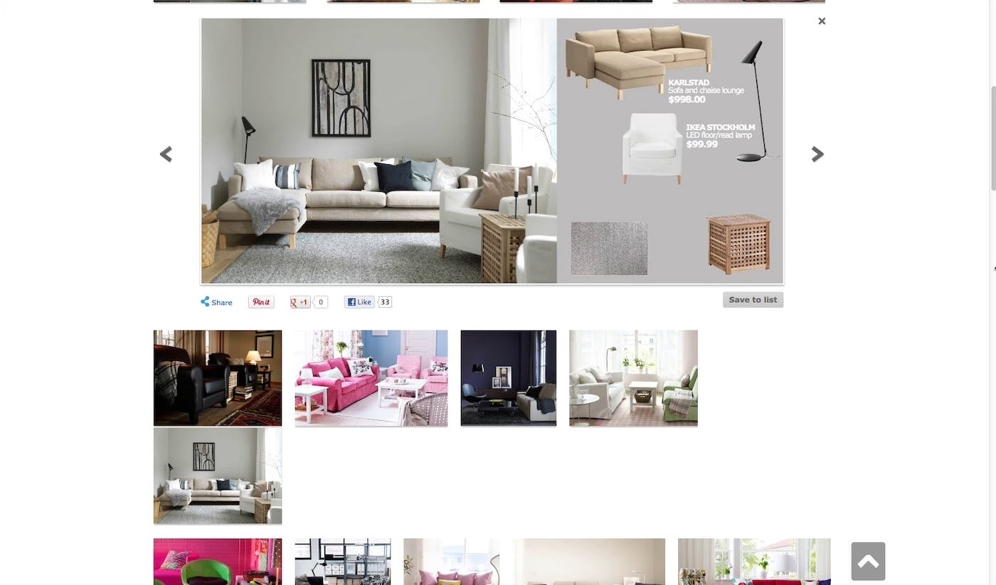
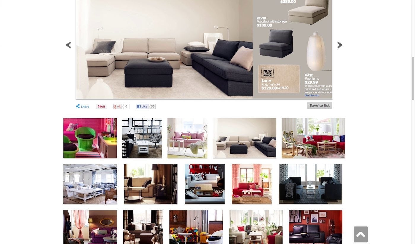
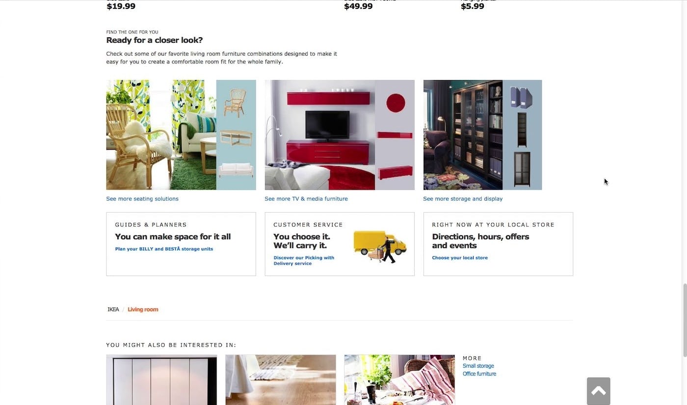
2) Expanding content. In one of our first rounds of testing of navigation, a user was exploring image thumbnails in IKEA’s “Seating Solutions”. Each thumbnail expanded to fill the entire page width when clicked. Having expanded the first thumbnail (first image), the user expanded another thumbnail, but then wanted to go back to the first image, and clicked the browser “Back” button (second image). The “Back” button however took him all the way back to the main category page, rather than back to the first image he expanded (third image), as the expanded options weren’t part of the browser history.
Expanding content could include elements such as thumbnails expanding to larger images, or a line of text expanding to a paragraph. However, the expanded content doesn’t appear to the end user the way an overlay does, where the page background is dimmed, and it’s quite clear that one page is “overlaid” on another. Therefore, with expanding content users could reasonably interpret the expanded content as either a new view or simply the same view, with some content that’s been changed.
Not using expanding content, but instead switching to an overlay, where it’s clear what to take users to when they click the “Back” button (i.e., exit them from the overlay and return them to the page they were on), may be the easiest solution in some contexts (if both UI types are otherwise equally attractive to use). Otherwise, similar to multistep processes embedded in pages, much depends on how prominent the expanding content is. If it takes up a large part of the interface then many users will interpret it as a separate page, and thus each piece of content should have its own separate URL.
3) Anchor Links
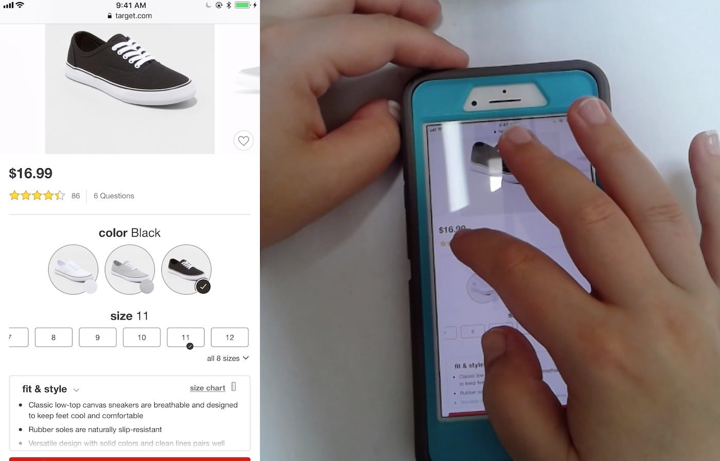
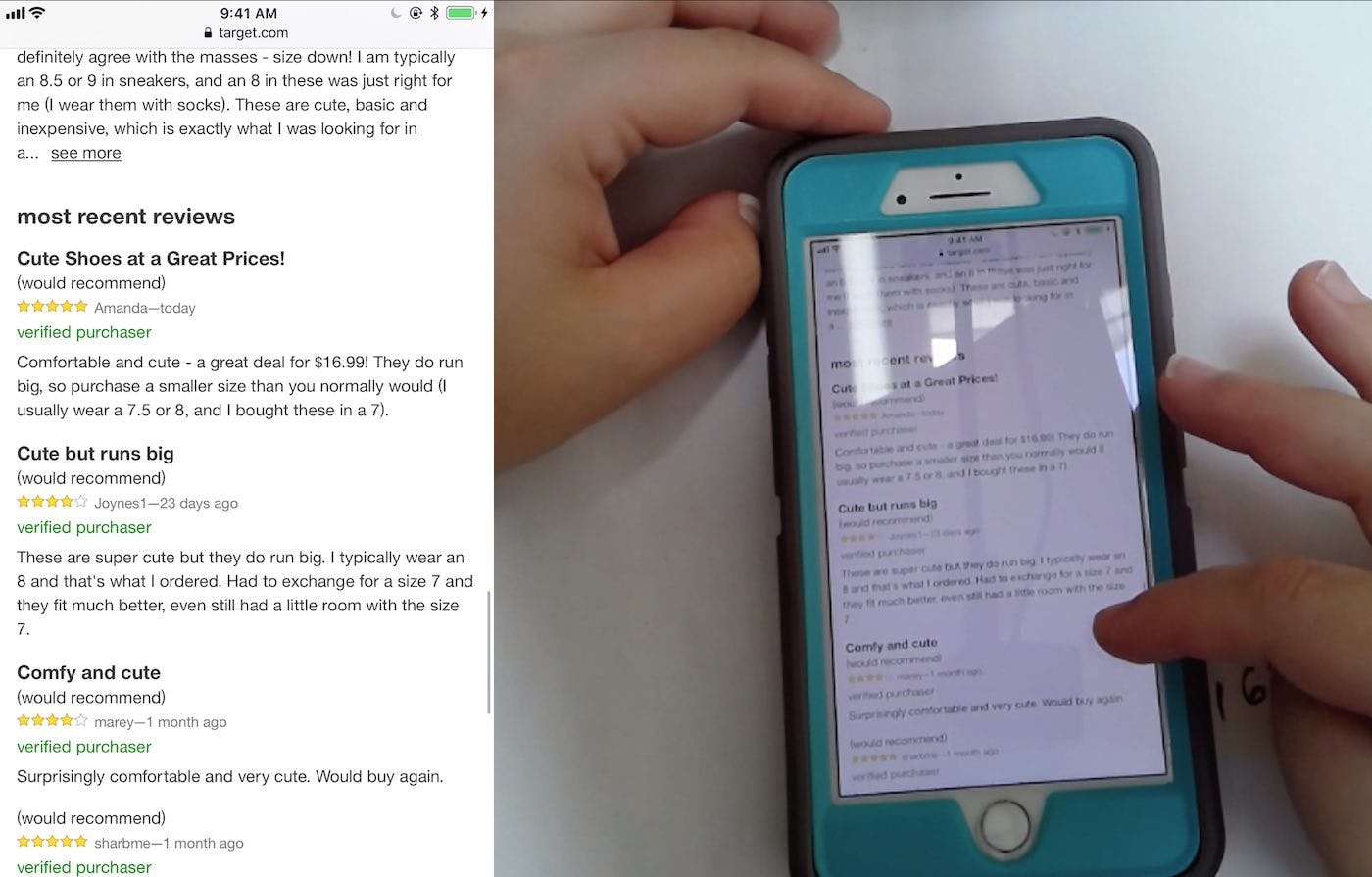
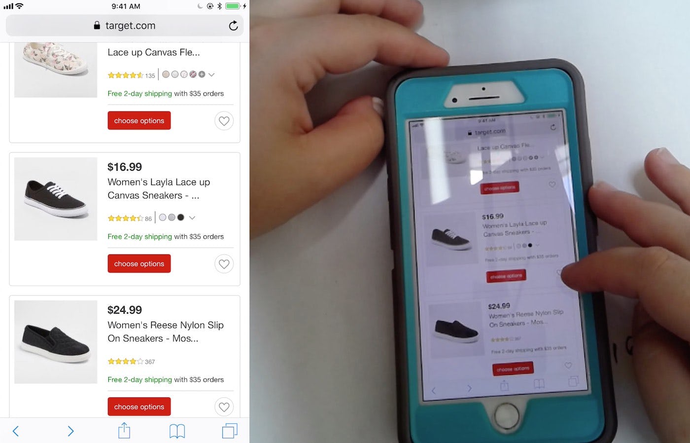
3) Anchor links. A user on a Target product page tapped the review star average at the top of the page (first image), and was jumped down to the reviews section (second image). Being satisfied with the reviews, the user tapped “Back” but wound up in the product list, rather than back at the top of the product page as she intended (third image). She refound the product list item she was interested in, tapped to go back to the product page, then added the product to her cart.
When it comes to anchor links, much depends on whether users are immediately jumped down the page when the anchor link is tapped or if they are smoothly scrolled to the new position on the page. Testing reveals that if users are jumped down the page, then tapping “Back” should return them to the previous position on the page.
For example, if a user is jumped down to the reviews section after tapping a reviews star average at the top of the product page, then they should be returned to the top of the product page when “Back” is tapped. This is due to the fact that when users are jumped down a page, they tend to lose overview of where they are after the jump, and they can think they are indeed on an entirely new page (especially on mobile sites). Returning them to where they originally were when they tap “Back” ensures that they don’t become too disoriented.
However, it’s less clear-cut if a user is smoothly scrolled down the page. Since users are scrolled down the page, they retain an overview of where they came from as they go to a new location. Therefore they’re much less likely to completely lose overview compared to users who are jumped down the page.
Thus, some users who’ve been smoothly scrolled to a new position on a page may feel like a site isn’t meeting their expectations if after they tap “Back” they aren’t brought back a page, but rather returned to their previous location on the page. As they’ve been smoothly scrolled, they know where they are — they could easily scroll up if they want to, but by tapping “Back” they’re signaling their intention to go back a page instead. (Note that it’s recommended that users always are smoothly scrolled, rather than jumped, when tapping an anchor link.)
Thus, the particular context in which the “Back” button would be tapped after a user has been smoothly scrolled after tapping an anchor link should be taken into account. If a user is on a mobile site, and it’s a very long product page, and there’s no “Back to top” option, then it likely makes sense to take users to the anchor link that was tapped, rather than back a page, when they tap the “Back” button.
Alternatively, if there are many anchor links on a page (meaning a user could potentially bounce around the page for awhile when tapping “Back”, if many of the anchor links have been tapped), or if the page isn’t very tall, then taking users back to the anchor links could be disruptive, and it may simply be better to return them to the previous page instead.
4) Truncated Content
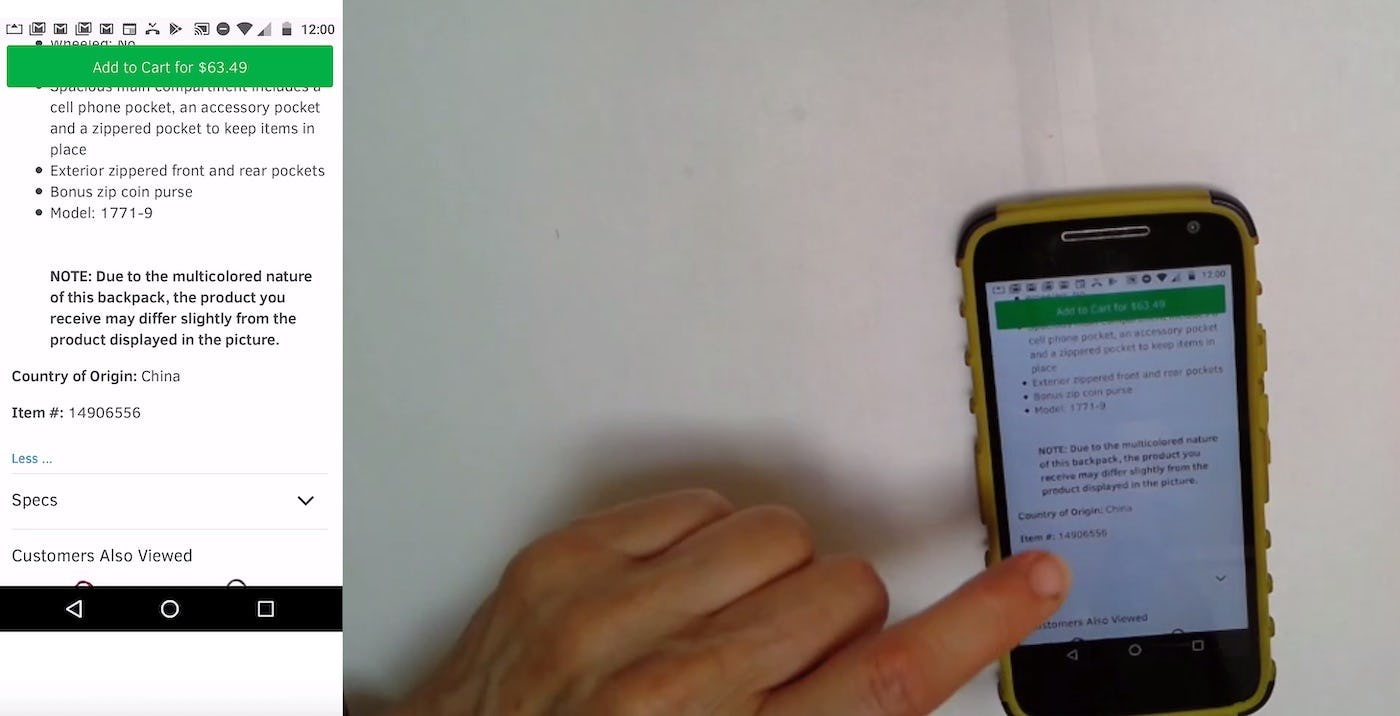
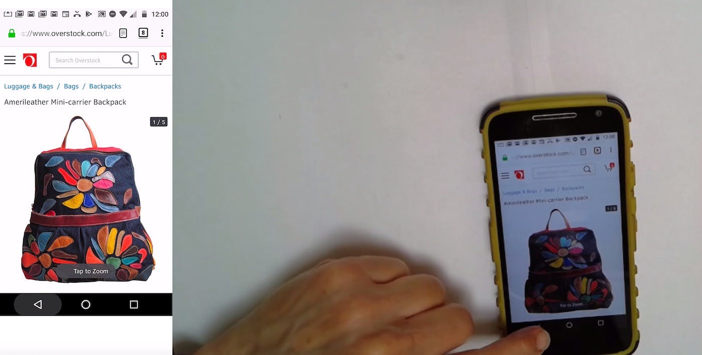
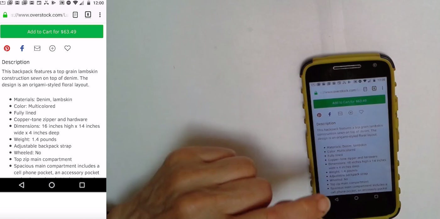
4) Truncated content. A user at Overstock was exploring a product page, and in the process she tapped to expand truncated content (first image). Ready to go back to the product list, she scrolled to the top of the page and tapped “Back” (second image). However this brought her back to the content she had just been viewing in the middle of the page (third image). She tapped “Back” again and this time was returned to the product list. Taking users back to a link they tapped to expose truncated content results in a jarring user experience.
Truncated content that’s expanded when users tap a link or button shouldn’t be a separate URL that users revisit when they tap “Back”. For example, it’s quite common on mobile product pages to offer a couple of lines of text or a paragraph of the product description, and then hide the rest behind a “More” link. While this can make product pages more scannable, users should be taken back to the previous page, rather than back to the previous content, when they tap “Back”.
Expanding truncated content isn’t enough of a “view change” where users would expect to be taken back to that area of the page when tapping “Back”. Consider also giving users more of an overview of where they are when they tap to expand the content by smoothly expanding the new content (e.g., by gracefully expanding the content, rather than abruptly jumping to the new content).
5) Variations on the Product Page
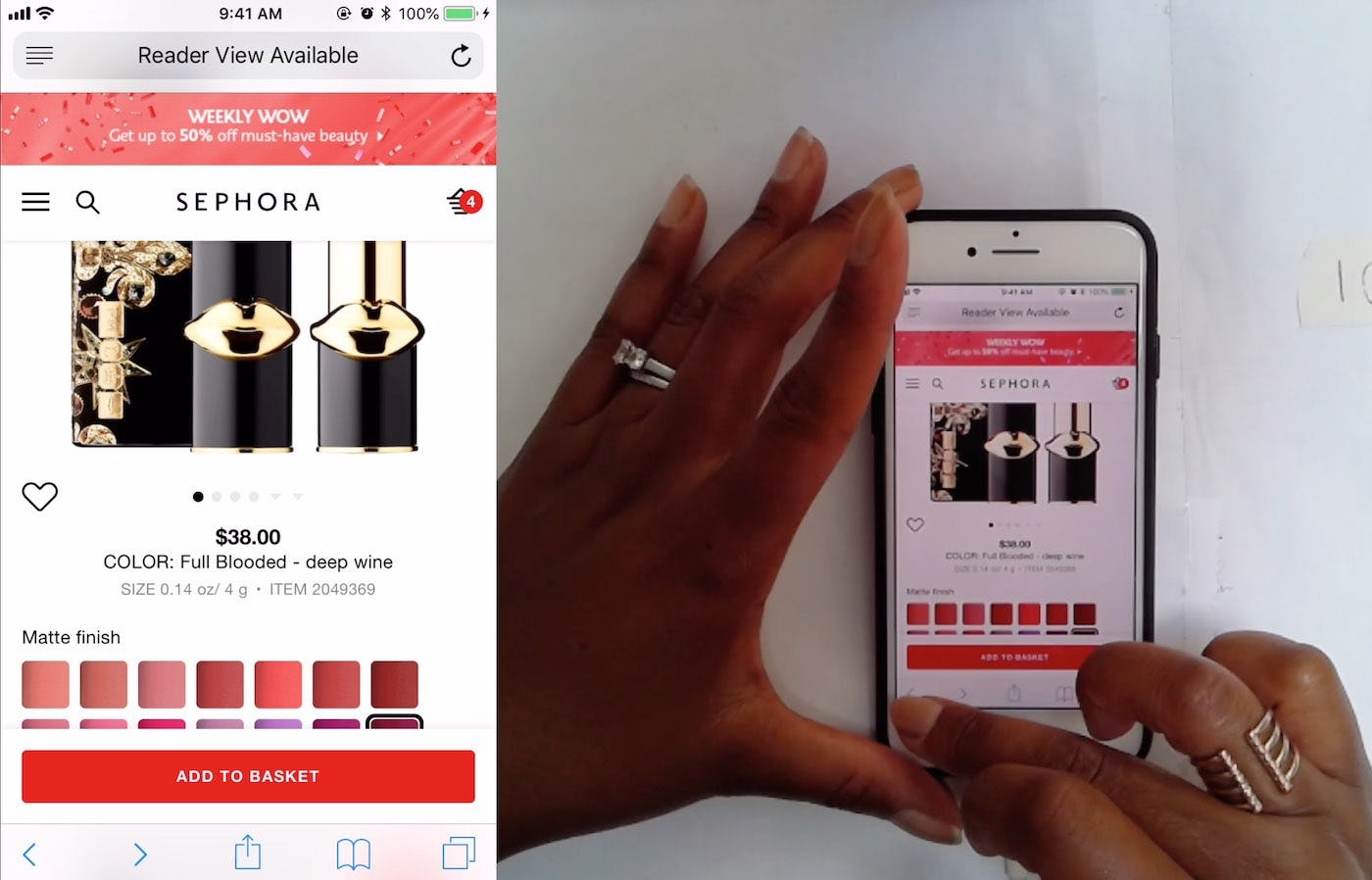
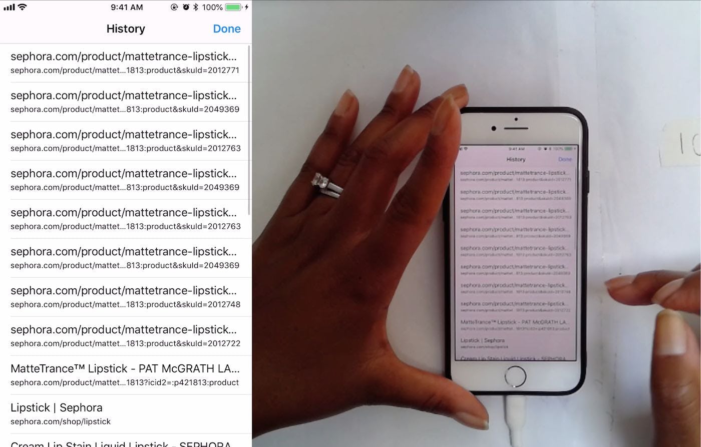
5) Variations on the product page. “OK that’s annoying…Just trying to get back to the lipstick page where we were [the product list]. Am I just not holding it [the browser “Back” button] down right?” A user at Sephora tapped the “Back” button multiple times but nothing seemed to happen, beyond the page moving up slightly (first image). She then opened her browsing history by holding the “Back” button, and was able to return to the product list this way (second image). Prior to tapping the “Back” button the user had been exploring the color swatches, and from the browser history it appears Sephora had implemented each color variation as a separate URL. Yet the product image never changed for the user when she tapped “Back” (but it had when she was initially exploring the swatches).
Product variations should be combined into one product list item. Users can then explore the variations on the product page. Whether or not those variations should have separate URLs, however — and thus users would step back through each previous variation they had already explored when tapping “Back” — again depends on the context.
When there are generally few product variations, in particular color, for users to consider, then having them as separate URLs may be the best choice, as most users wouldn’t have to tap “Back” more than a few times to get to the actual previous page (often the product list or search results page). While some users will be slightly annoyed at having to tap back 2 or 3 times to get back to the previous page, others will likely be more severely annoyed if they tap “Back” to go to a previously viewed variation and are instead kicked off the product page entirely.
This could become a much more disruptive experience if, for example, they’re not returned to where they had previously been in the product list — forcing them to refind the product they had just been viewing.
If each variation has its own separate URL, however, it’s critical that the product image changes after each tap of the “Back” button. Otherwise, users will be tapping “Back” with no indication that anything is happening in the interface (even if they are technically seeing different URLs). This is a recipe for disaster, as most users will assume the site is “stuck” or will simply be unclear why it appears that their actions are having no effect.
If, however, there are dozens of variations — for example, lipstick shades — then it can become a more tedious exercise to step back through potentially dozens of “pages” to finally get back to the previous page the user was on. If it’s decided that tapping “Back” skips previously viewed variations and instead sends users back to the previous page they were on, then it’s critical that users are returned to where they were in the product list (if that was the previous page) so that refinding the product is easy. A list of “Recently Viewed” items could be helpful as well.
The Solution
The good news is that HTML5 provides for a relatively straightforward solution: the HTML5 History API. More specifically, the history.pushState() function allows a site to invoke a URL change without a page reload, meaning the site can align the browser “Back” button behavior to match user expectations. (The reverse is also possible: to change the URL without invoking an entry in the user’s history.)
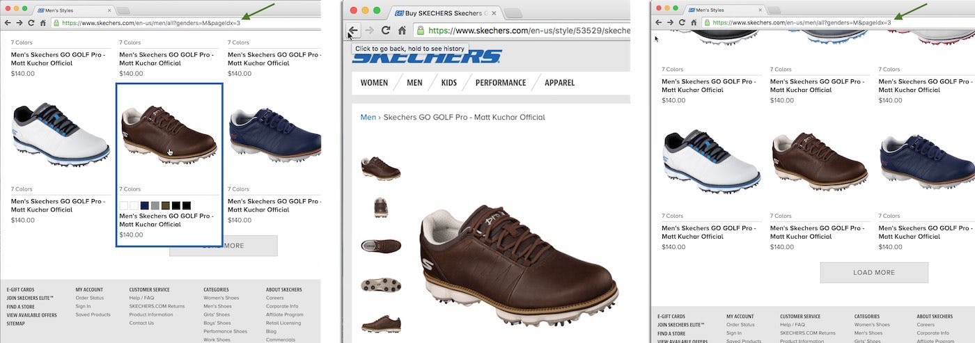
At Skechers.com the “Load More” implementation actively addresses the “Back” button issue by rewriting the URL each time users click the “Load More” button. Consequently, as users click the browser “Back” button on a product page they are taken back to the right position in the product list (e.g., to “page 3”).
This means that when opening, for example, an overlay, the site can invoke a history change in the user’s browser, allowing the user to “go back” from the overlay view by using the browser “Back” button. And this of course goes for anything, including user-initiated overlays and lightboxes, AJAX-based pagination, filtering and sorting of lists, accordion checkouts — any element which the user would expect to have invoked a browser history but technically hasn’t.
Therefore, use the history.pushState() to create a new entry in the user’s browser history for any view that the user will perceive as a new page (i.e., any view that is sufficiently different visually or conceptually to be perceived as such). This way, you can ensure that site behavior and user expectations align.
In summary: Use history.pushState() to make sure your site invokes “Back” button behavior that aligns with the user’s expectations. Specifically, ensure that any visual change the user will perceive as a new page is added to their browsing history, regardless of whether it’s technically a new page or not. This includes, but is not limited to:
- Overlays/lightboxes
- Filtering and sorting selections
- Accordion checkout steps
- Product list location
Additionally, some new views are “grey areas”, and the prominence of the view and other factors need to be considered when deciding whether to implement the new view as a new “page”. These include
- Multistep processes within a page
- Expanding content
- Anchor links
- Variations on the product page
Truncated content should in general never be implemented as a new “page” using history.pushState().
Users rely on an element’s visuals, its context, and prior site experience when shaping their expectation of when something is a new webpage vs. is a slightly altered element on the same page. It’s therefore critical to support users’ “Back” button expectations to avoid unintended detours and changes that during testing were often a direct cause of abandonment. Despite the severity of the issue and the somewhat simple solution, 59% of sites that don’t support at least one of the 4 core “Back” button expectations.
This article presents the research findings from just 1 of the 650+ UX guidelines in Baymard Premium – get full access to learn how to create a “State of the Art” e-commerce user experience.