
Research Topic
Mobile E-Commerce UX
How do you design a user-friendly shopping experience for a 5-6 inch screen?

Mobile traffic has soared in recent years and now often constitutes 50% of all traffic on many e-commerce sites. However, it’s not uncommon for mobile e-commerce sites to still have a significantly poorer conversion rate than their desktop counterpart – in some cases converting less than half as many visitors into customers.
At Baymard we’ve conducted the world’s most comprehensive research study of mobile e-commerce UX, spanning more than 20,000 hours of testing only mobile user behavior. This mobile usability study examines how the touch interface, the small screen, and users’ mobile behavior introduce a whole host of pitfalls to watch out for when designing and running a mobile e-commerce site.
Despite testing the mobile sites of 50+ of the largest e-commerce players in the world, the test participants encountered a staggering 3,600+ mobile-related usability issues during the test sessions. These usability issues have been analyzed and distilled into 400+ mobile UX guidelines on how to best design and structure a high-performing mobile e-commerce site, as well as documenting how end-users perceive and interact with mobile sites in a shopping context.
This page provides you with an overview of our research specific to Mobile E-commerce UX. All of this research is available as part of Baymard Premium.
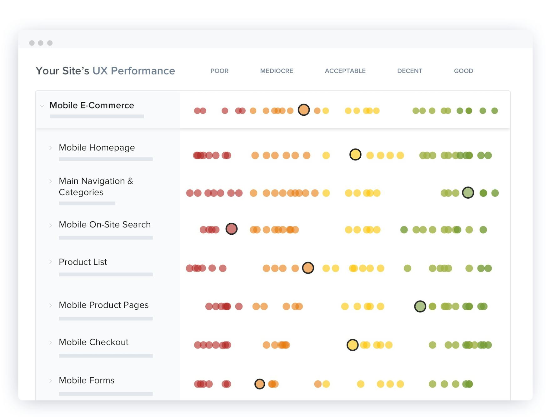
The Current Mobile E-Commerce UX Performance
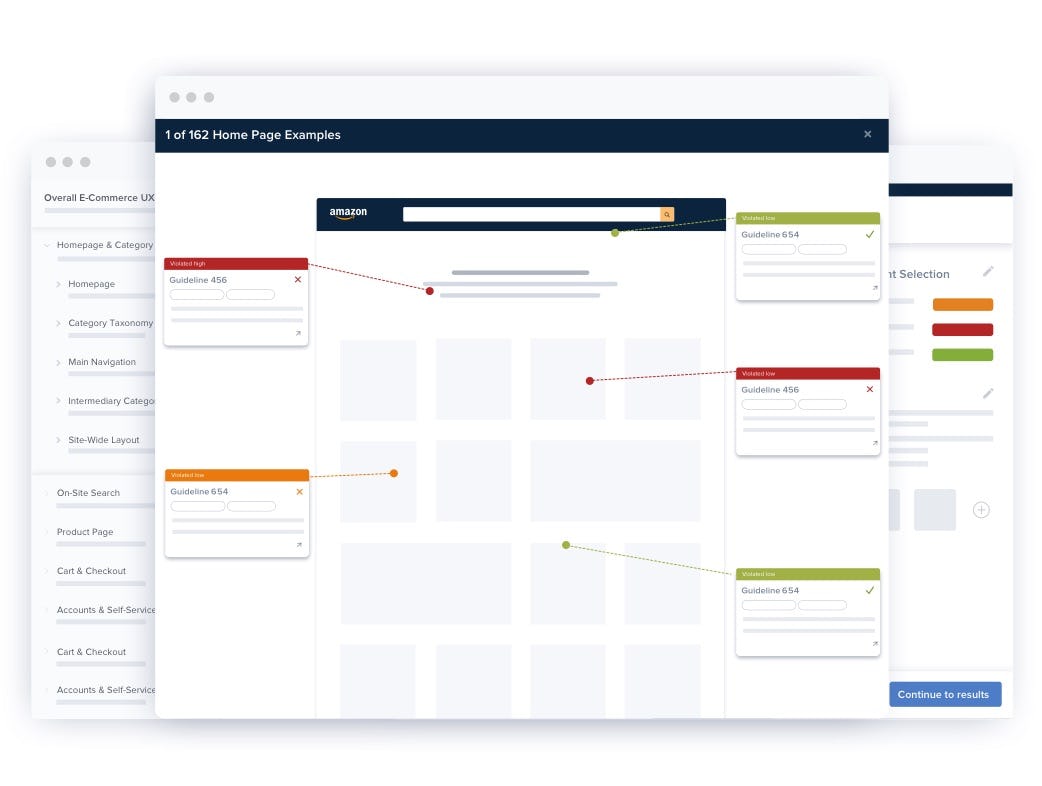
Based on the findings from the qualitative usability research study we’ve also benchmarked the full mobile user experience of 138 of the largest US and European mobile sites. This provides you with 14,000+ worst and best practice mobile UX examples and 25,000+ mobile UX performance scores.
The UX benchmark of the 138 major mobile e-commerce sites provides a clear picture of the general state of mobile e-commerce performance, and identifies common design flaws as well as strategic oversights and opportunities.
The Mobile E-Commerce UX performance for the average top-grossing US and European e-commerce site is “mediocre”, with none of the mobile sites benchmarked having an overall “good” UX implementation and performance. This leaves nearly all sites in a tight cluster of 62% “mediocre” (or worse), and 38% “decent”. That said, while there aren’t any standout performances, there are also very few “poor” or outright broken experiences.
In comparison, in most of the other e-commerce UX studies we’ve conducted at Baymard Institute the average UX performance also amounts to “mediocre”, but also tends to have a wider spread of variation and performance scores.
This benchmark dataset thus shows that there’s ample room for improvements when looking within the specific topics of the mobile user experience — in particularly the UX within Mobile Homepage & Category Navigation: Main Navigation, Mobile On-Site Search: Search Autocomplete, Mobile Forms, and Mobile Sitewide Features & Elements. These topics carry issues for many sites, and also include some “missed opportunities” for the e-commerce industry as a whole. Also, note that this is an analysis of the average performance across 138 leading US and European e-commerce sites. When analyzing a specific site there’s nearly always a handful of critical UX issues along with a larger collection of worthwhile improvements — this is the case even when we conduct UX audits for Fortune 500 companies.
In Baymard Premium we provide an in-depth walkthrough of the UX performance and competitive landscape within the 48 topics of Mobile E-Commerce UX, along with “missed opportunities” to be extra alert to.
Lastly, and most importantly, it’s worthwhile mentioning that the mobile platform is truly difficult to design for – the lack of screen real estate causes a dramatic loss of page overview for users (as described in this article). As a result, most of the best-performing solutions and patterns, including those identified in this study, are, in the end, still a compromise. They provide the best attainable results and mobile UX given the limitations of the mobile platform.
This is a subset of the full benchmark which includes 327 e-commerce sites.
View our full UX benchmark
2,500+ Categorized Mobile Design Examples
FREE RESEARCH CONTENT
Explore design patterns across 2,500+ page examples of mobile designs and features from leading e-commerce sites, all annotated and organized into 17 different page types. This is a great way to get inspiration for your own mobile design, and to get a feel for emerging trends in Mobile e-commerce.


127 Research Articles on Mobile E-commerce UX
FREE RESEARCH CONTENT
We’ve released a small subset of the Premium research finding on Mobile UX for free in these 127 mobile articles:
Electronics & Office UX Benchmark: 5,000+ Performance Scores and 3,900+ Best Practice Examples
March 31, 2026
New Health and Beauty UX Research: 3 High-Level Takeaways from 3,000+ Hours of Testing
February 25, 2026
The Baymard Ecommerce UX Awards 2025 - Recognizing the Top 1% of Sites
December 16, 2025
Announcing Baymard’s New Theme: Loyalty Program UX
December 9, 2025
Research Reports on Mobile UX
PAID RESEARCH CONTENT
All 400+ mobile UX research findings are available as part of Baymard Premium, and are divided into the following topics (2,000+ pages of research findings in total):
Mobile Ecommerce (Mobile Web and Native App) Topics
Mobile Homepage
Mobile Homepage
How to design a high performing mobile homepage, the opportunities it can provide to both new and repeat mobile users, homepage structure, carousels, personalization, promotions, etc.
Mobile Ecommerce (Mobile Web and Native App) Topics
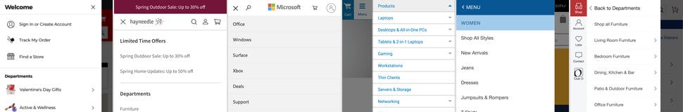
Mobile Main Navigation
Mobile Main Navigation
How to design the main mobile navigation, incl. the visual hierarchy, the levels of nesting, how the mobile nav. needs to differ from desktop, courtesy navigation, etc.
Mobile Ecommerce (Mobile Web and Native App) Topics
Mobile Category Taxonomy
Mobile Category Taxonomy
The structural foundation of a mobile site’s product categories, including mobile information architecture, catalog breadth, and category naming.
Mobile Ecommerce (Mobile Web and Native App) Topics
Mobile Category Pages
Mobile Category Pages
How Mobile Category Pages can guide users toward better-defined categories and products, how to use inspirational paths, featured products, and curated content.
Mobile Ecommerce (Mobile Web and Native App) Topics
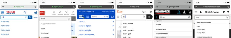
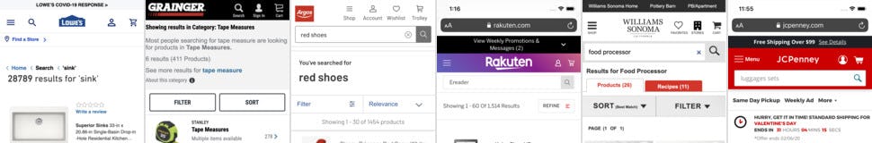
Mobile Search: Autocomplete
Mobile Search: Autocomplete
How the mobile autocomplete (aka ‘predictive search’) should be designed, the types of suggestions it should make, how it should align and differ to the desktop design, and more.
Mobile Ecommerce (Mobile Web and Native App) Topics
Mobile Search: Query Types
Mobile Search: Query Types
Understand the 10 different types of search queries that users typically submit on mobile ecommerce sites, the nuances of how users really search, and how to best support it.
Mobile Ecommerce (Mobile Web and Native App) Topics
Mobile Search: Design & Logic
Mobile Search: Design & Logic
The mobile search results logic and mobile search designs that perform the best with users, mobile ‘no results’ pages, field design, search submit, search iteration flows, etc.
Mobile Ecommerce (Mobile Web and Native App) Topics
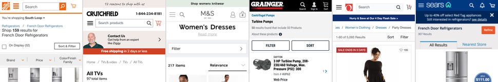
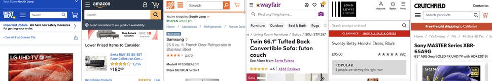
Mobile Product List Layout & Features
Mobile Product List Layout & Features
Creating a balanced product list experience within the confines of a mobile screen, incl. how to design hit areas, information to include in list items, ‘Load More’ buttons, indicating product variations, etc.
Mobile Ecommerce (Mobile Web and Native App) Topics
Mobile List Item Content
Mobile List Item Content
How information to include in Mobile List Items, formatting and displaying info, what product thumbnails to display and how to design them, making products easy to compare, etc.
Mobile Ecommerce (Mobile Web and Native App) Topics
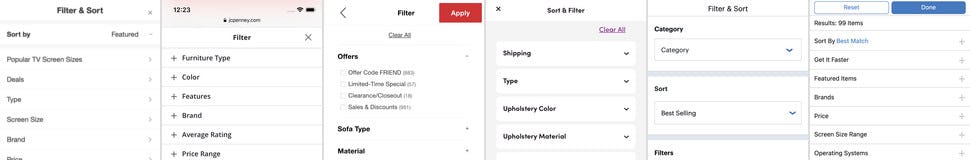
Mobile Filtering & Sorting: Interface, Layout, & Results
Mobile Filtering & Sorting: Interface, Layout, & Results
This topic covers how to ensure users can find the mobile filtering and sorting interfaces, how to design the interface to make it easier to locate filter types and options of interest, and how the process of applying filters and sorting options differs from the desktop process.
Mobile Ecommerce (Mobile Web and Native App) Topics
Mobile Filtering & Sorting: Filter & Sort Types
Mobile Filtering & Sorting: Filter & Sort Types
This topic covers which filtering and sorting types users need to organize and narrow down product lists to a manageable selection, including filtering by price, user ratings, compatibility, themes, ‘New Arrivals’, ‘Sales’ or ‘Deals’, and more.
Mobile Ecommerce (Mobile Web and Native App) Topics
Mobile Product Pages: Layout
Mobile Product Pages: Layout
Mobile product page UX, including the optimal layout that addresses users’ lack of page overview, how to best design product page features and content.
Mobile Ecommerce (Mobile Web and Native App) Topics
Mobile Product Pages: Product Images & Videos
Mobile Product Pages: Product Images & Videos
How mobile users rely on images and videos on the product page, the different product image types users generally need, the amount of images needed, and how large sites can approach some of the image sourcing.
Mobile Ecommerce (Mobile Web and Native App) Topics
Mobile Product Pages: Product Image Gallery
Mobile Product Pages: Product Image Gallery
How to design a high-performing mobile image gallery that serves as the perfect container for the product images, incl. how to present additional images, the overall layout of the mobile image gallery, and the required detail and size of product images within the gallery.
Mobile Ecommerce (Mobile Web and Native App) Topics
Mobile Product Pages: Shipping, Returns, & Buying
Mobile Product Pages: Shipping, Returns, & Buying
The best-performing designs on the product page for displaying shipping and return info, including how to present offers of “free shipping”, delivery date, as well as price and discount info, gifting options, and “Find in Store” features and quantity displays.
Mobile Ecommerce (Mobile Web and Native App) Topics
Mobile Product Pages: Product Variations
Mobile Product Pages: Product Variations
Products that come in multiple variations have a unique set of requirements for how variations are technically handled by the site.
Mobile Ecommerce (Mobile Web and Native App) Topics
Mobile Product Pages: Product Descriptions & Specs
Mobile Product Pages: Product Descriptions & Specs
This topic discusses how users engage with product descriptions and spec sheets, the best-performing designs to display product information, what information should be included, and where that information should be placed.
Mobile Ecommerce (Mobile Web and Native App) Topics
Mobile Product Pages: User Reviews
Mobile Product Pages: User Reviews
How to ensure that the user reviews section of product pages leverages the power of ratings and reviews, and allows users to get an accurate and quick impression of others’ assessments of products.
Mobile Ecommerce (Mobile Web and Native App) Topics
Mobile Product Pages: Cross-Sells
Mobile Product Pages: Cross-Sells
The vital role of cross-sells-sells and cross-navigation in users’ overall success at locating desired products, including cross-sell design, placement, and logic, and cross-navigation elements like breadcrumbs, recently viewed, parent category links, etc.
Mobile Ecommerce (Mobile Web and Native App) Topics
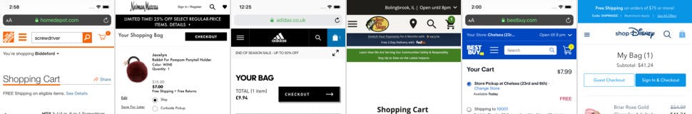
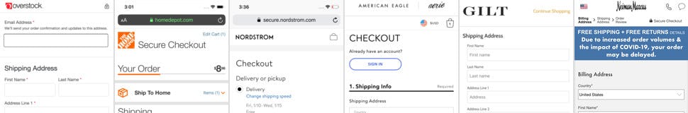
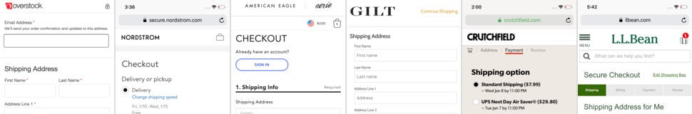
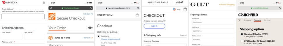
Mobile Checkout: Shopping Cart
Mobile Checkout: Shopping Cart
The mobile shopping cart page, incl. mobile cart design, quantity and save features, estimating order total, displaying fees, etc.
Mobile Ecommerce (Mobile Web and Native App) Topics
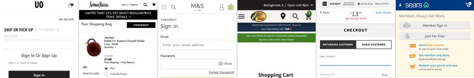
Mobile Checkout: Account Selection & Creation
Mobile Checkout: Account Selection & Creation
How to best optimize guest-checkout for mobile devices, incl. account sign-in and password fields, along with account createion. signing up for an account.
Mobile Ecommerce (Mobile Web and Native App) Topics
Mobile Checkout: Gifting Flow & Features
Mobile Checkout: Gifting Flow & Features
How the checkout flow and fields need to change when users gift-mark items, where and how users should be able to gift-mark items, and how the actual gifting features needs to be presented to avoid issues.
Mobile Ecommerce (Mobile Web and Native App) Topics
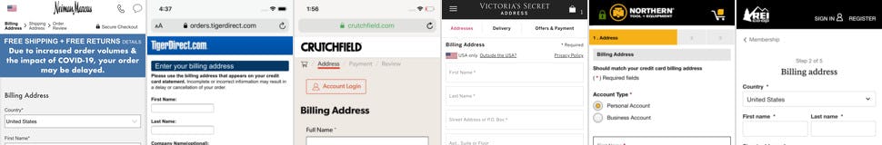
Mobile Checkout: User Info
Mobile Checkout: User Info
How to best handle the form fields for all personal user data on mobile, incl. privacy concerns, addresses, international addresses, phone fields, auto-detection techniques, etc.
Mobile Ecommerce (Mobile Web and Native App) Topics
Mobile Checkout: Payment
Mobile Checkout: Payment
The payment methods interface, how to display 3rd party payment methods, the many nuances of creating high-performing credit card form field on mobile, and more.
Mobile Ecommerce (Mobile Web and Native App) Topics
Mobile Checkout: Shipping & Store Pickup
Mobile Checkout: Shipping & Store Pickup
The shipping and store-pickup designs that perform the best on mobile, including displaying and describing shipping costs and speed, how to display store pickup, etc.
Mobile Ecommerce (Mobile Web and Native App) Topics
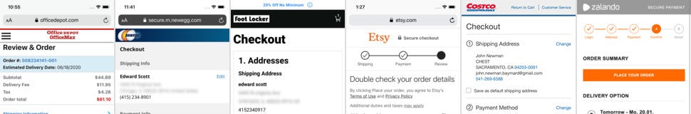
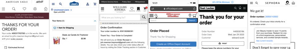
Mobile Checkout: Order Review & Confirmation
Mobile Checkout: Order Review & Confirmation
Mobile order review steps and confirmation pages, incl. how users review their order info, how they can best edit it, along with what to include on order confirmations.
Mobile Ecommerce (Mobile Web and Native App) Topics
Mobile Checkout: Layout and Features
Mobile Checkout: Layout and Features
All layouts and features that are used throughout the mobile checkout flow, including load indicators, primary buttons, the overall checkout design, etc.
Mobile Ecommerce (Mobile Web and Native App) Topics
Mobile Forms: Form Fields
Mobile Forms: Form Fields
How mobile form field nuances can either aid or hinder mobile users’ checkout completion, in particular how form fields should be labeled, marked, and placed within mobile checkouts.
Mobile Ecommerce (Mobile Web and Native App) Topics
Mobile Forms: Field Validation
Mobile Forms: Field Validation
How to ensure mobile users don’t get stuck when they run into a validation error, incl. writing helpful error messages, how to position error messages on mobile, how users correct info, how to design address validator alerts, etc.
Mobile Ecommerce (Mobile Web and Native App) Topics
Mobile Forms: Input Optimization
Mobile Forms: Input Optimization
How sites can greatly optimize the mobile form-filling experience for users, through field simplificaiton, smart defaults and autodetections, incl. all touch keyboard optimizations.
Mobile Ecommerce (Mobile Web and Native App) Topics
Mobile Site-Wide Features & Elements
Mobile Site-Wide Features & Elements
How to design site-wide mobile features that perform well with users, incl. ‘Install App’, ‘Save Product’, location requests, overlay dialogs, ‘live chat’, footer sections, etc.
Subscribe to Baymard Premium to access all of our Mobile UX research
Get full access to all our Mobile E-Commerce UX research reports, mobile benchmarks, and page designs previewed here, along with our complete 650+ guidelines for Homepage & Category Navigation, Search, Product Listing, Product Details Page, Checkout, and Accounts & Self-Service. Utilize our 200,000+ hours of UX research to improve your mobile user experience and to document your UX decisions.
Test Methodology
This research on Mobile UX is part of Baymard Institute’s full 200,000+ hours of large scale research catalog, which is based on:
- Usability Testing: 25 rounds of qualitative usability testing with 4,400+ test participant/site sessions following the "Think Aloud" protocol (in-person 1:1 moderated lab usability testing).
- Manual benchmarking: 54 rounds of benchmarking the world’s 327 top-grossing e-commerce sites across all 650+ UX guidelines (175,000+ implementation examples and 275,000+ UX performance scores).
- In-lab eye-tracking testing.
- Quantitative studies: 12 studies with a total of 20,240 participants.
Baymard’s research methodology is described in detail here.
UX Audit Service
GET YOUR MOBILE SITE REVIEWED
What are the 35 most important changes you can make to your mobile e-commerce site?
We will put together a detailed report of the 35 most important usability improvements you can make to your mobile shopping experience.
What Our Clients Are Saying

“Baymard produces some of the most relevant and actionable user experience research available. They really understand the needs of UX and Product Management professionals, and their deep experience in the eCommerce field allows them to offer sophisticated, nuanced insights.”Kerry McAleer Former Director of UX Research at Sears

“Baymard has been a great resource in helping us improve the customer experience. We are continually applying these best practices to our sites.”Bryan Trogdon Director of User Experience at Office Depot

“I can not tell you how much help your benchmark studies have been for our company, e-commerce and UX teams. We have used and continue to use these reports for baseline benchmarks as we build test protocols or eye tracking scripts etc. in lab.”Catherine Brunson Customer Experience Strategist at Belk

“Thanks again for the great work on our checkout project. Our whole group found it incredibly insightful. We’re applying the suggestions you provided to our new checkout design which launches at the end of the month! One of my colleagues was also interested in your group’s competitive expertise with regard to responsive web and native apps.”Jaime Wilson Sr. Director of Design & Development at Overstock.com

“Thank you. This was an excellent piece of work: professional, thorough, and actionable for the team. We’re very happy with the work Baymard has done for us.”Alex Wright Director of Research at Etsy

“Thank you very much for the 7 usability audits of our country-specific sites. The audits have provided us with specific and actionable advice, allowed us to prioritize development resources, and enabled us to compare UX performance between the 7 different country-specific sites, and against State of the Art implementations. The audit itself is done really professionally, and the recommendations contain actionable and insightful information.”Mirko Sablic EU eTransformation at Deutsche Telekom / T-mobile

“Intelligent, consumer-focused insights that are clear and actionable. The team in the room really loved the way the Baymard Institute highlighted the optimizations in the various user experience elements (copy, layout, design, calls-to-action…), from the perspective of consumer struggles. Baymard’s Usability research really complements our other existing research tools.”Will Close Director of A/B Testing at Nike.com

“Thank you, this was really insightful!”Andrew Wright Product Design Manager at Instacart

“We’ve received some awesome feedback from our Merchant Success team as well as our merchants about all of the UX Audits we’ve had thus far with Baymard. Thank you so much to you and your team for all of your hard work. The pilot with Baymard has been going fantastic and I’m really excited with all that we’re learning! You have an amazing platform, team and super helpful data base for us to work with.”Nicole Papp Merchant Success Manager, Shopify

“Having Baymard is like having access to a magical UX super power. I can't believe how helpful and easy to use it is, given the vast array of tools and information they provide!”Ariana Biedebach Manager, UX Research at Levi Strauss & Co.

“Baymard's audit services give us a detailed view of usability improvements across our entire site. This is so much more comprehensive than running individual usability studies.”Gideon Ansell UX Director, Global eCommerce at Staples

“Clear, concise, actionable, data-driven insights!”Dani Ibarra SEO Manager at Caleres

“I was able to bring these designed solutions home with me and kickoff multiple optimization projects that I am confident will affect the site in a positive way, both in usability and conversion.”Nick Frame Lead UX Designer at TaylorMade

“I just wanted to take a minute to thank you for the amazing work on this audit. You should know that this has been very well received internally and there’s a lot of excitement around adopting the ideas you have shared.”Sudeep Agarwal Growth Manager at Google Shopping

“Very thorough and professional UX review of our website, based on an extensive amount of previous UX research insights within the industry, and specifically targeted to our needs. We received both critical and, most importantly, constructive feedback, along with actionable, prioritized suggestions and best-practice examples. This will allow us to address the areas of improvement and significantly help ameliorate the experience users have on our website, which in turn is expected to drive conversion rates and reduce the number of customer service requests. We can highly recommend Baymard's UX audit.”Julia Fink UX Researcher at On Running

“Damn. The reports that the @Baymard folks do cost money, but they’re worth it.”Steve Krug Author of ‘Don’t Make Me Think’

“This has been fantastic: really good recommendations, really comprehensive.”Bill Quinn SVP Digital at Hibbett

“The walkthrough today was great. The report was very, very well done and loaded with great opportunities for us to improve our business. I wanted to again express my appreciation for working with us on such a condensed time frame last month. You and your team have been amazing partners to us and we very much appreciate the work, expertise and partnership.”Wendy Bonnstetter UX Director at Hallmark Cards, Inc.

“Excellent tool – looking forward to using it with our other sites and prototypes as they’re developed.”Leah Kaufman Senior UX Research Manager at Lenovo

“We found the audits extremely helpful and validated a number of changes we have been wanting to make or are in the process of making, so thank again for all the great insights.”Colleen Kersting eCommerce Marketing at Harley-Davidson

“This was indeed very helpful guidance and a very well-documented roadmap for us to fix, validate, organize, collectively understand and continually improve our ecommerce foundation.”Cat Brunson UX Manager at Columbia Sportswear

“It is immensely valuable having a thorough, independent study to help validate my work and in particular, help facilitate buy-off from stakeholders. Baymard has quickly become one of my most trusted resources for the UX/UI field.”Jason Greene UX Design Lead at ClickBank

“I found the UX audit a very comprehensive evaluation, with clear reports and actionable recommendations. Baymard's commitment to excellence in user experience shines through its thorough approach!”Giulia Moliterno Product Designer at AB InBev

“Thanks for everything. The audit was extremely useful, I think we have gained valuable insight.”Tara Costa Senior Manager at Jarden Consumer Solutions (FoodSaver, Breville, etc.)

“This was…mind-blowing. We’ve been having conversations on the side as you’ve been presenting the audit findings. There’s so much to do!”Ethan Leonow UX Designer at DSW

“These reports are fabulous. The content is exactly what our team has been looking for, and so much more! Extremely helpful, thank you!”Cary Moody Usability Researcher at Hallmark

“I have found the M-Commerce and E-Commerce reports very useful, thank you!”Josh Shaw Web Manager at Keurig Green Mountain

“I’m an avid user of your reports and recommendations. I have leveraged your articles and findings throughout my career in B2B, B2C, and hospitality.”Jenny Urban User Experience Director at Ace Hardware

“The Baymard team has been a delight to work with on the JohnLewis digital platform audit. They responded to the brief very well, have been very accessible for ongoing clarification and queries and Rebecca was excellent in the recent team share, articulately presenting findings in an engaging walk-through with the wider team which will really support driving engagement and a robust response. Many thanks for all the effort and focus folks.”Greg Woods UX & UI Design and Research Manager at John Lewis

“The Baymard reports have proven to be an invaluable resource for us. Comprehensive, pragmatic and actionable. We have redesigned our checkout process and made changes to our category pages based on usability guidelines in the reports.”Jill McDonald UX Architect at Room & Board

“Thanks for this audit and your good work. This was exactly what I was aiming for. Also thanks for the very, very professional presentation, and answering all our countless questions. Very good work.”Andreas Blank Head of E-Commerce at V-ZUG

“I just wanted to let you know that I think your site is the best thousand bucks I’ve ever spent. I wish I found you years ago.”Chris Lambrinides Partner at Window Cleaning Resource

“First off, thank you. This was the most engrossed I’ve ever been in a 2-hour meeting. This [audit presentation] was incredibly insightful and very helpful. Many, many thanks.”Yvonne Kim Head of E-Commerce at Ōura Ring

“We are very excited to finally proceed with the UX improvements, and I truly believe your audit report will be super helpful to put us ahead of the wave. If you ever need a reference, please do not hesitate to share my contact.”Marian Gradl-Schikora Managing Director at Best Secret

“Baymard has helped so much: UX was a brand new role at my company when I was hired. I was researching, planning, and designing UX & UI for 5 different products, all by myself. After showing real-world, bottom-line results from a UX centered approach to our products, we have expanded our UX team and greatly improved our UX-to-product process. Baymard’s research database was a critical component to my (and my company’s) success. Thank you!”Geoff Jensen Head of UX at Wrench Inc.

“Wanted to thank you again for the checkout audit and walking us through the process. It was super helpful and we can’t wait to apply the changes to our checkout for a better user experience.”Ramona Rejali Senior UX Designer at prAna

“The recommendations in our audit were awesome - well prioritized, actionable and helped us focus on what to optimize. This audit, along with the ecommerce database access, are my go-to resources for thorough, insightful information. Thank you!”Erin Straub UX Design Manager at Nutrisystem

“This is awesome so far. Everyone wants to know what's going on – you just got everyone's attention here. Everything that you've called out is definitely eye-opening for us over here.”Arthi Karthik VP Ecommerce at Party City

“Some time ago we purchased the Ecommerce Homepage & Category report - the research and insights are extremely useful to us and help us a lot in our work!”Eliza Savov CX Research Team Lead at Clicktale

“Given the tricky science of conversion rate optimization, it is great to know that you are dealing with professionals whose advice is based on solid research. It was a pleasure collaborating with the Baymard team.”Aaron Henig Operations Manager at Epicenter Consulting, New York

“Within a very short time Baymard Institute provided 15 clear, useful improvement suggestions for our checkout process. We intend to implement all of them. It’s easy to find companies that offer website improvement suggestions. But, most companies don’t do their homework and don’t provide specific examples of how best to make the improvements. With Baymard Institute, the checkout process suggestions they made were intuitive, specific, and actionable. I highly recommend their audit service.”Chris Hall President of RepairClinic.com

“This UX audit has been very helpful, not just for our design and product teams, but even for the UX research team, because we can reference back to the audit, either in the design of a user research session or when we analyze findings. Thank you very much; this has been incredibly valuable.”Heather Vaughn Senior Director of User Research at Shutterstock

“The Baymard UX audit has been a revelation for our organisation and will likely become a vital tool in our process moving forward.”Peter Fitzsimons Product Design Team Lead at CarTrawler

“Working with Baymard for our UX audit was an exceptional experience from start to finish. Their attention to detail, depth of analysis, and clear communication throughout the process truly exceeded our expectations. The insights they provided were not only actionable but profoundly insightful. I highly recommend Baymard for their expertise, professionalism, and commitment to elevating user experiences.”Mehmet Cakir Ecommerce Product Manager at Monster Notebook

“The audit opened our eyes once again, as we are often blind to our own operations. The comparison with competitors' best practices was particularly helpful.”Derrick Drakeford UI/UX Designer at IONOS SE