Key Takeaways
- Our latest Checkout UX benchmark shows that most ecommerce checkouts have substantial room for improvement
- A poor Checkout experience risks users abandoning their cart and ultimately failing to purchase
- In this article, we provide 10 ways to improve Checkout UX across desktop sites, mobile sites, and apps
Key Stats
- 64% of Desktop sites have a “mediocre” or worse Checkout UX performance
- 63% of Mobile sites have a “mediocre” or worse Checkout UX performance
- 46% of Apps have a “mediocre” or worse Checkout UX performance
During Baymard’s 16 years of large-scale checkout usability testing (including our most recent checkout deep-dive study), we have found that checkout design and flow is frequently the sole cause for users abandoning their cart during the checkout flow.
What’s more, abandonment rate statistics reveal that 70% of ecommerce users abandon their purchase after adding items to their cart.
With users so close to completing their purchase, it is almost unbearable to think about them leaving their cart because of an unnecessary barrier to checkout.
Baymard’s research findings further reveal that the average large-sized ecommerce site can gain as much as a 35% increase in conversion rate just by making design changes to their checkout process.
Our 2025 Checkout ecommerce UX benchmark now includes:
- 41,000+ checkout performance scores that have been manually reviewed and scored by Baymard’s team of UX researchers
- 33,000+ worst and best practice examples from leading ecommerce sites in US and Europe (categorized and performance verified)
In this article, we’ll analyze this dataset to provide you with the current state of ecommerce Checkout UX and outline 10 common design best practices to follow.
Current State of Ecommerce Checkout UX
For this analysis, we’ve summarized the entirety of this year’s 41,000+ checkout usability scores (including 33,000+ worst and best practice implementation examples) across the Cart & Checkout theme’s topics and plotted the benchmarked checkout flows in the scatterplot above.
Each dot represents the summarized UX score of one site across the guidelines within that respective topic. The top row is the total checkout UX performance.
Taking desktop sites first, the benchmark reveals that 64% of the leading US and European ecommerce sites have a “mediocre” or worse Checkout UX performance, with only 2% rating “good”.
Moreover, none are rated “perfect”, and 15% of the sites have checkouts that are downright “poor” or “very poor”.
Mobile sites perform just slightly better, with 63% of sites having a “mediocre” or worse Checkout performance and only 2% rating “good”.
Finally, mobile apps score better, with 46% of apps performing “mediocre” or worse, while 7% rated as “good”.
In short: most sites (whether desktop or mobile) and close to half of mobile apps have a poor-to-mediocre Checkout UX — leading directly to lost sales.
To get started on improving this picture, below we provide 10 Checkout UX best practices to adopt to improve your site’s Checkout UX.
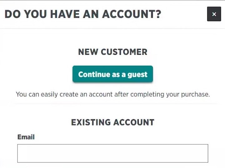
1) Make “Guest Checkout” the Most Prominent Option (62% of Sites Don’t)

“Why do I have to create an account?” Multiple participants at Room & Board mistakenly thought they had to create an account after only seeing the “New Customer” and “Returning Customer” options. This participant found a “Checkout as Guest” button under the “New Customer” section upon closer inspection, which allowed him to proceed without creating an account: “There is ‘checkout as guest’. I missed that. I was looking for that. That’s what I want.”
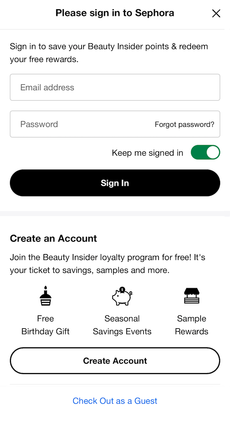
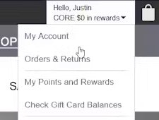
On Sephora’s mobile site, the “Guest Checkout” option is presented as a text link at the very bottom of the account-selection page, risking users overlook it.
Allowing users to check out as a “guest” is key to avoiding unnecessary abandonments, as many users will refuse to create an account simply to check out.
In fact, in Baymard’s survey of 1,026 US adults who have shopped online in the last 3 months, 18% of participants reported abandoning an order because they did not want to create an account.
Yet providing a “Guest Checkout” is much less useful to users if it’s difficult to spot on the account-selection step of checkout.
Indeed, if a user fails to see the “Guest Checkout” option, it’s as bad as if it wasn’t offered at all (see guideline #652).
Our ecommerce UX benchmark reveals that 62% of sites fail to make “Guest Checkout” the most prominent option.
As a result, many users will come to a stop at the account-selection step of checkout as they hunt for the “Guest Checkout” option — while a subgroup, moving quickly, will never find it, increasing the risk of abandonment.

“Okay, I’m gonna continue as a guest. I don’t want to make an account right now.” Continuing to check out from the cart, this participant on Etsy easily located the option for “Guest Checkout” presented at the top of the account-selection overlay.
To fix this issue, make the “Guest” option the most prominent option on the account-selection step to ensure users can easily find it.
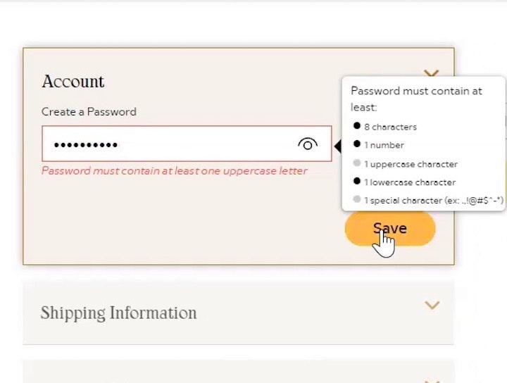
2) Avoid Overly Complex Password-Creation Requirements (65% Don’t)
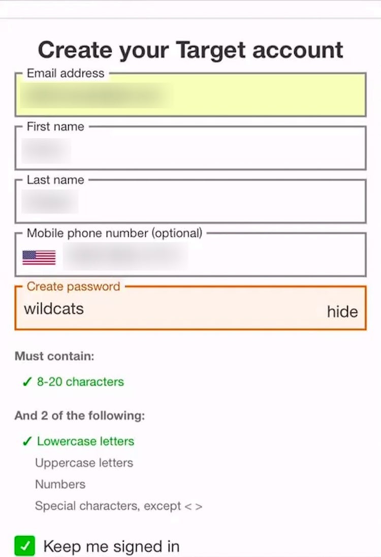
“Oh, because it doesn’t have enough. Let’s make up something here.” This participant on Target’s mobile site attempted to move forward with creating an account but was stopped because her password didn’t meet all of the many requirements. Throwing together a complex password just to get past the account-creation step can make it harder for users to sign in on later visits.
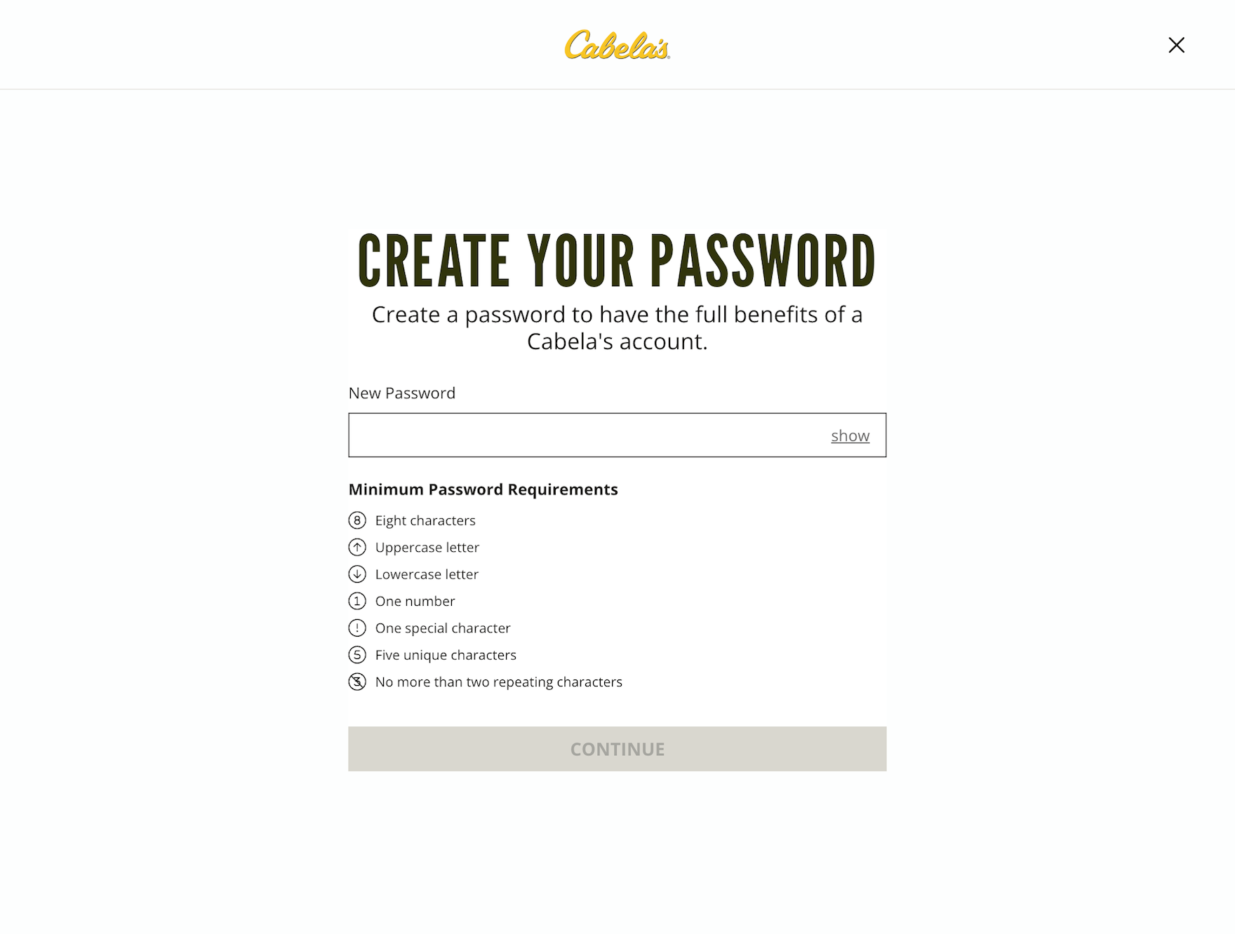
At Cabela’s, users must contend with a lengthy list of password requirements, taking considerable mental effort to craft.
During testing, we observed that extensive and strict password rules can cause up to an 19% checkout-abandonment rate among existing account users when they have trouble signing in.
In particular, the password-reset email is a very weak link in the “forgot password” chain, as any issue with the password-reset process locks a user out of their account, at which point abandonments are very likely (see guideline #677).

On Dollar Shave Club, the only requirement for passwords is a minimum of 6 characters.
Given the severe usability implications of overly strict password rules and subsequent abandonments from account owners as they try to reset their passwords, sites should impose the fewest number of password requirements allowable .
Indeed, if sites want to minimize account sign in and password-reset friction as much as possible, we recommend making the only password requirement a 6-8 characters minimum.
(Note: Lowering password requirements below what’s typically recommended for, e.g., a device password is generally possible for ecommerce sites because there are additional essential security measures available, as discussed here. What’s more, passwordless security measures, such as 2FA and “magic links”, can facilitate login even more — and more securely.)
3) Use “Delivery Date” Instead of “Delivery Speed” (48% Don’t)

“So, they give you 4-7 business days. So then, really today is almost over, so four days, next Wednesday, like, May 4th?” This participant at Snowe referenced a calendar to estimate the actual order arrival date, which was unclear from the provided shipping speed estimate.
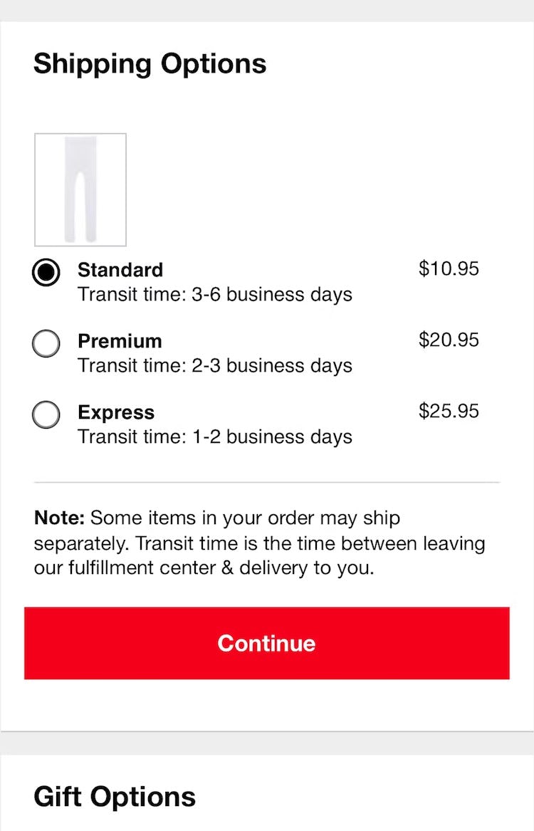
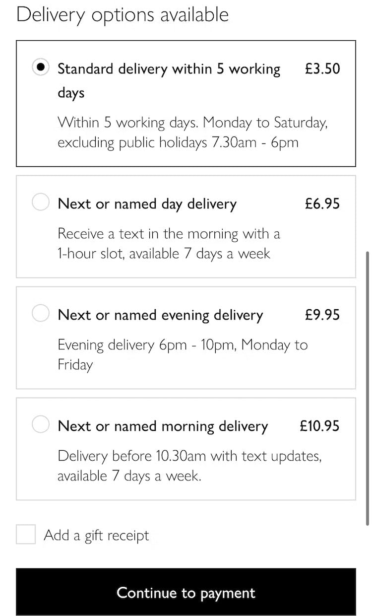
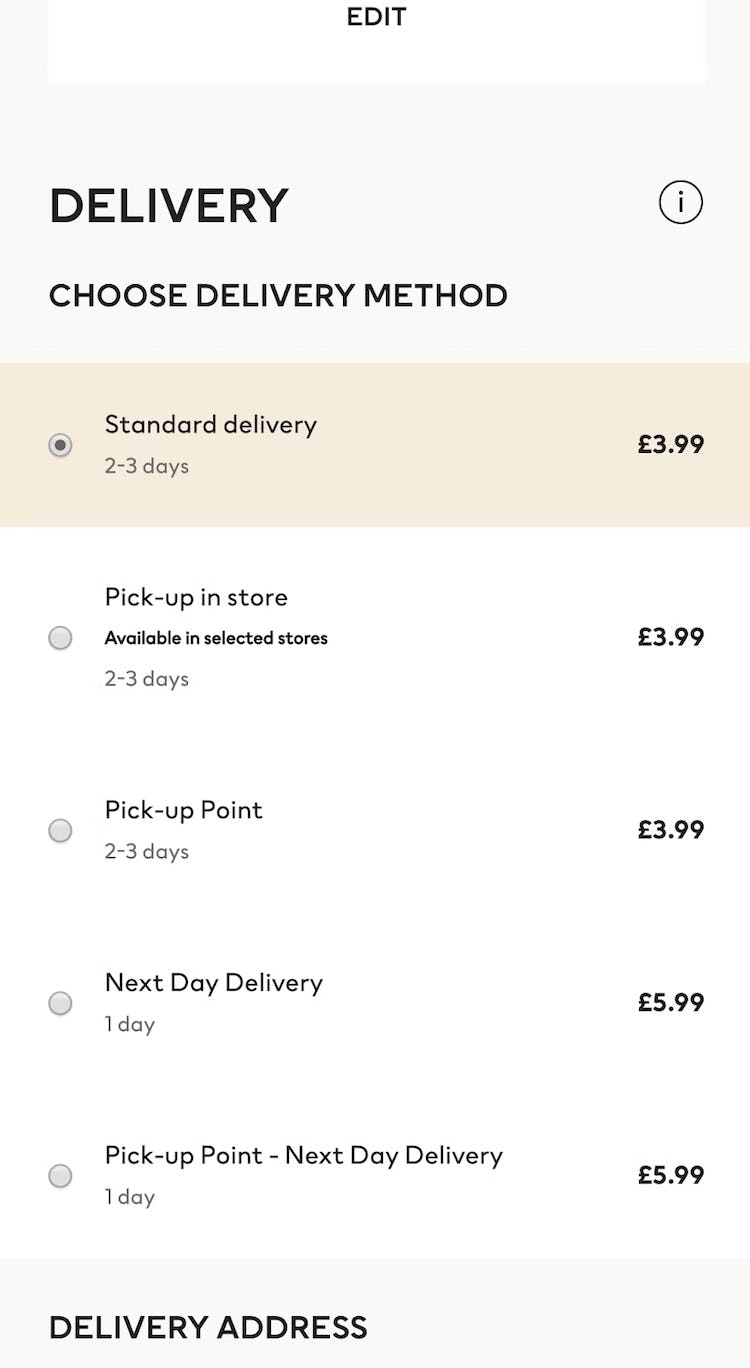
3 additional examples of how users aren’t provided with an answer to the question they’re most concerned about when it comes to delivery speed: “When will I receive my order?”. Macy’s only provides prominent shipping names and “Transit time” (first image), John Lewis forces users to consider “working days” and public holidays (second image), and H&M simply provides an estimated delivery day range (“2–3 days”) — which many users will interpret as “I’ll get my order in 2 to 3 days from today”, not considering weekends or holidays.
Users have one main concern for delivery speed: “When will I receive my order?”
The solution historically used within ecommerce is to clearly state the shipping speed for each of the shipping options; for example, “Standard: 2 Business Days – $4.95”.
However, this is a very business-centric way to convey this information.
Displaying “Shipping Speed: 2 Business Days” forces users to research, calculate, and sometimes even guess when they will actually receive their order.
This not only makes it less transparent when the order will be received, but it also introduces a lot of choice complexity into the checkout process during the user’s delivery selection (see guideline #543).
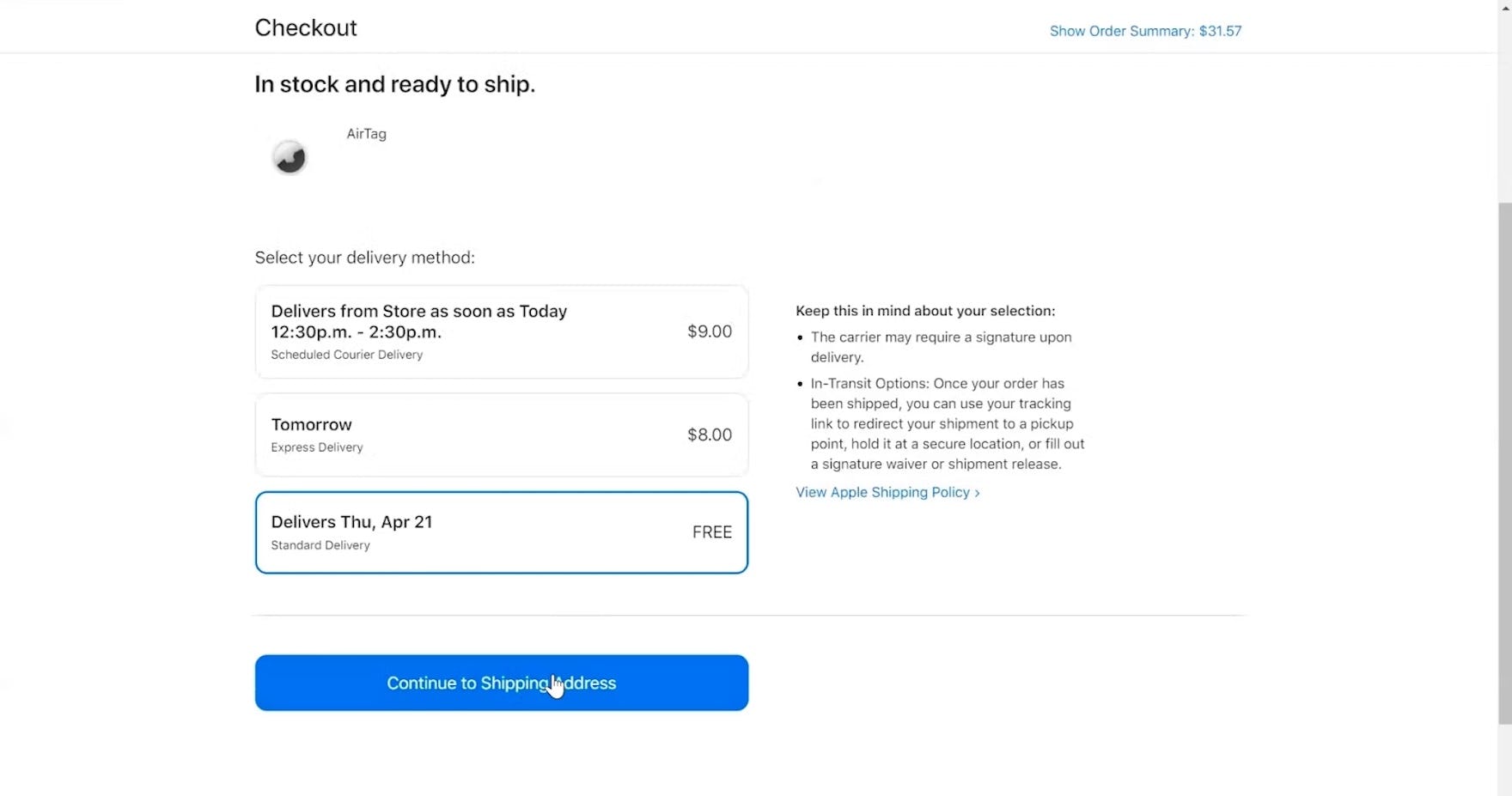
“I’d like it delivered. ‘Delivers Thursday’.” This participant shopping for a gift at Apple easily determined that his order would arrive by the desired date with the estimated delivery dates listed next to each shipping option.
Instead, providing a delivery date, or a date range, allows users to immediately understand when they’ll receive their order (e.g., “Delivery on April 4th” or “Delivery April 4th–8th”).
4) Show the Cutoff Time as a Countdown (83% Don’t)
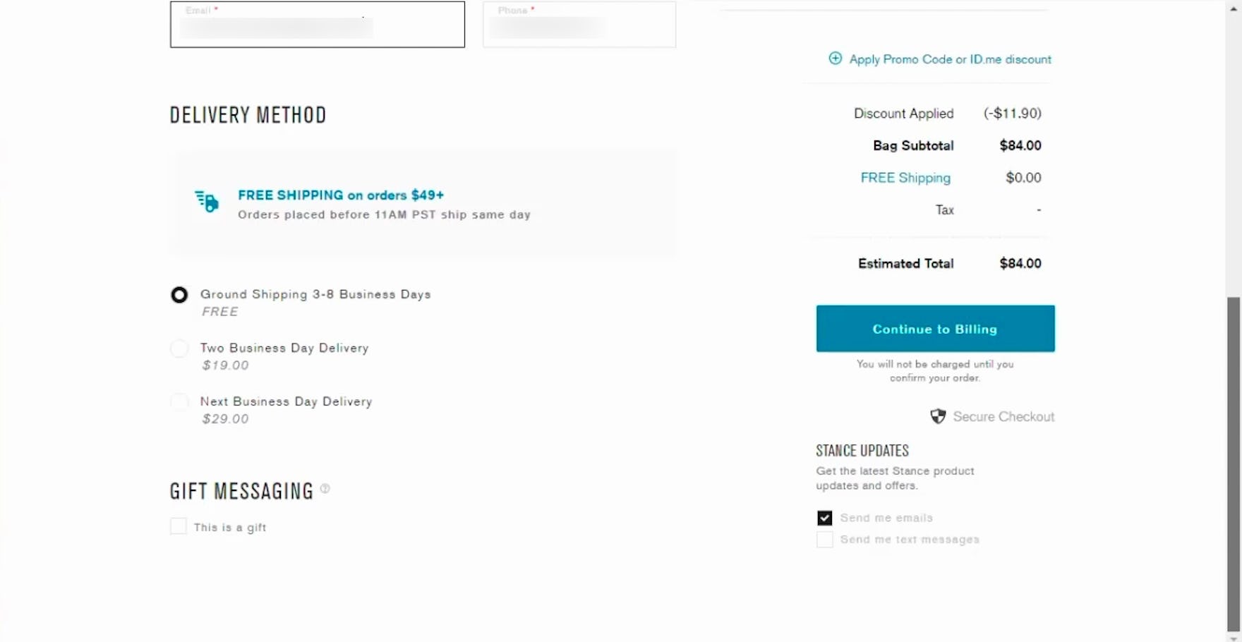
“Now, it’s almost 3:00 here, that means it’ll be noon in California…‘Orders placed before 11:00 a.m. PST ship same day’. So this is going ship tomorrow?” This participant on Stance came to a halt to mentally calculate when his order would arrive, deeply considering the static cutoff time and how it related to his current time zone (Eastern Time).

On American Eagle, static text informs users about a cutoff time listed in EST, necessitating that users not in the same time zone calculate for themselves the relevant time.
In addition to the delivery date, many users want to know when they have to place their order to have their package delivered by that date.
This is especially important for those who’ve selected an expedited shipping option — and have paid more to have their order arrive quicker.
When sites do not provide a cutoff time for ordering, they risk users selecting a shipping option but missing the nonspecified cutoff time — and getting their order later than they expected.
But the problem is not entirely solved with just a cutoff time (see guideline #548).
Participants in a different time zone than the one presented had to manually account for the time zone difference (e.g., translate “1PM ET” to Central Standard Time), bringing them to a complete halt and introducing an opportunity for errors as they attempted to convert the time in their head.
Another group of participants misinterpreted the static cutoff time as the “estimated delivery date” when quickly scanning the page.
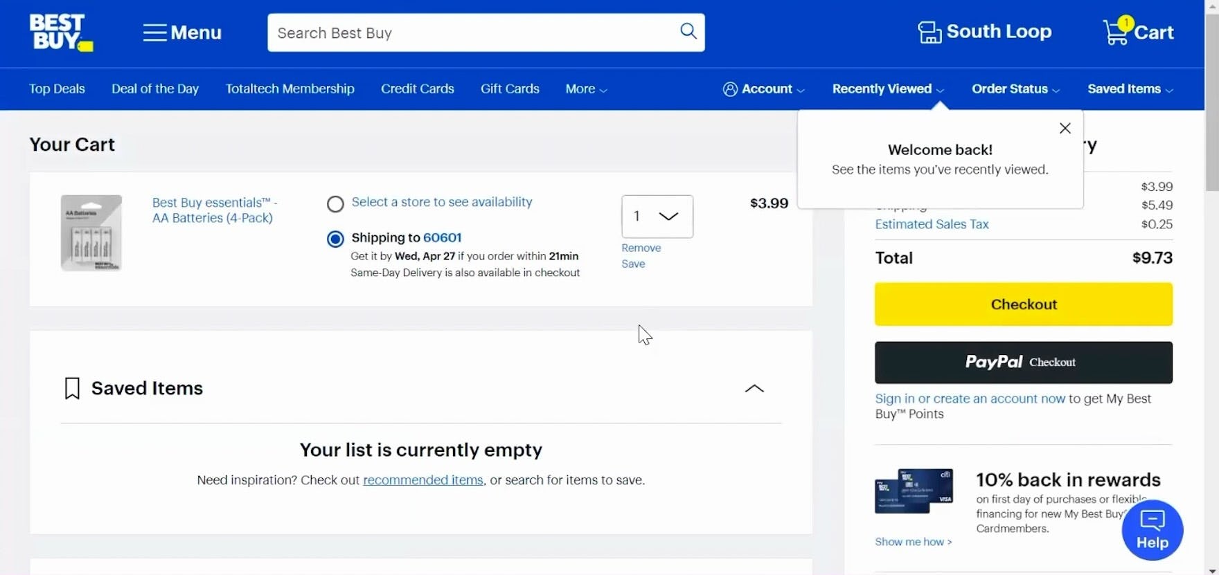
”That’s actually nice that it tells me ‘get it by this time if you order within a certain period of time’.” This participant at Best Buy noted the precise cutoff countdown, helping him quickly understand how much time he had to make his purchase decision in order to receive the order by the estimated delivery date.
Thus, the cutoff time should be displayed as a countdown rather than a static time.
For example, “Order in the next 43 minutes to receive your order by Tuesday April 4” instead of “Order by 9AM ET to receive your order by Tuesday April 4”.
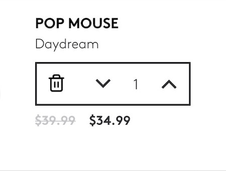
5) Use Buttons or Buttons Plus an Open Text Field for Updating Cart Quantity (97% Don’t)
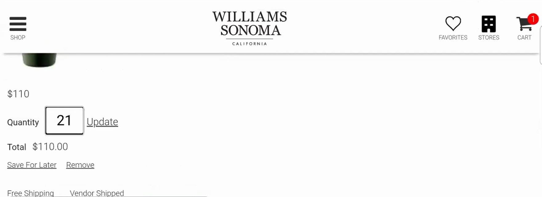
“Whoops, no, we don’t want 21…Hold on, let’s try that again.” This participant on Williams Sonoma meant to update the quantity from 1 to 2, but the default quantity “1” remained even after she began inputting her desired quantity, resulting in the incorrect “21”.
Increasing or decreasing the quantity for items in the cart is seemingly a simple and straightforward task.
However, during our large-scale testing, a subgroup of participants had significant issues with this seemingly straightforward task.
In fact, some quantity changes made to orders went unregistered by participants — which led to orders being placed with incorrect product quantities (see guideline #2152).
Moreover, mobile users are likely to be more frequently and severely challenged by unoptimized quantity selectors due to the smaller viewport and general increased risk of input errors.
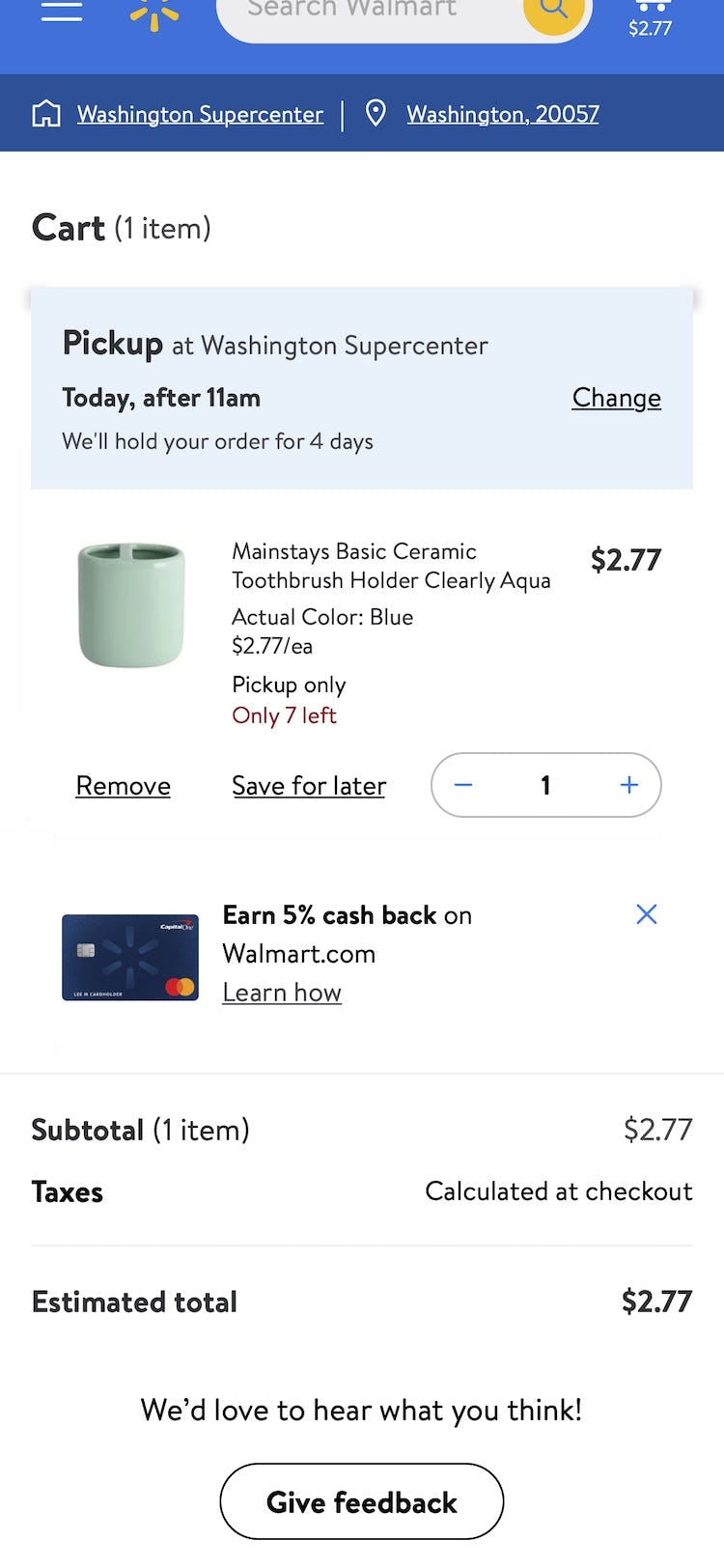
On Walmart’s mobile site, the quantity field is adjusted using either the plus/minus buttons or by entering in a new quantity into the text field.
Tweaking the quantity field UI to be buttons or buttons with a text field generally resolves issues users have with the quantity selector in the cart.
6) Include All Fulfillment Options in the Shipping-Selector Interface (52% Don’t)
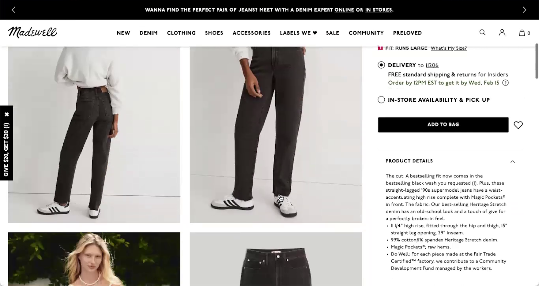
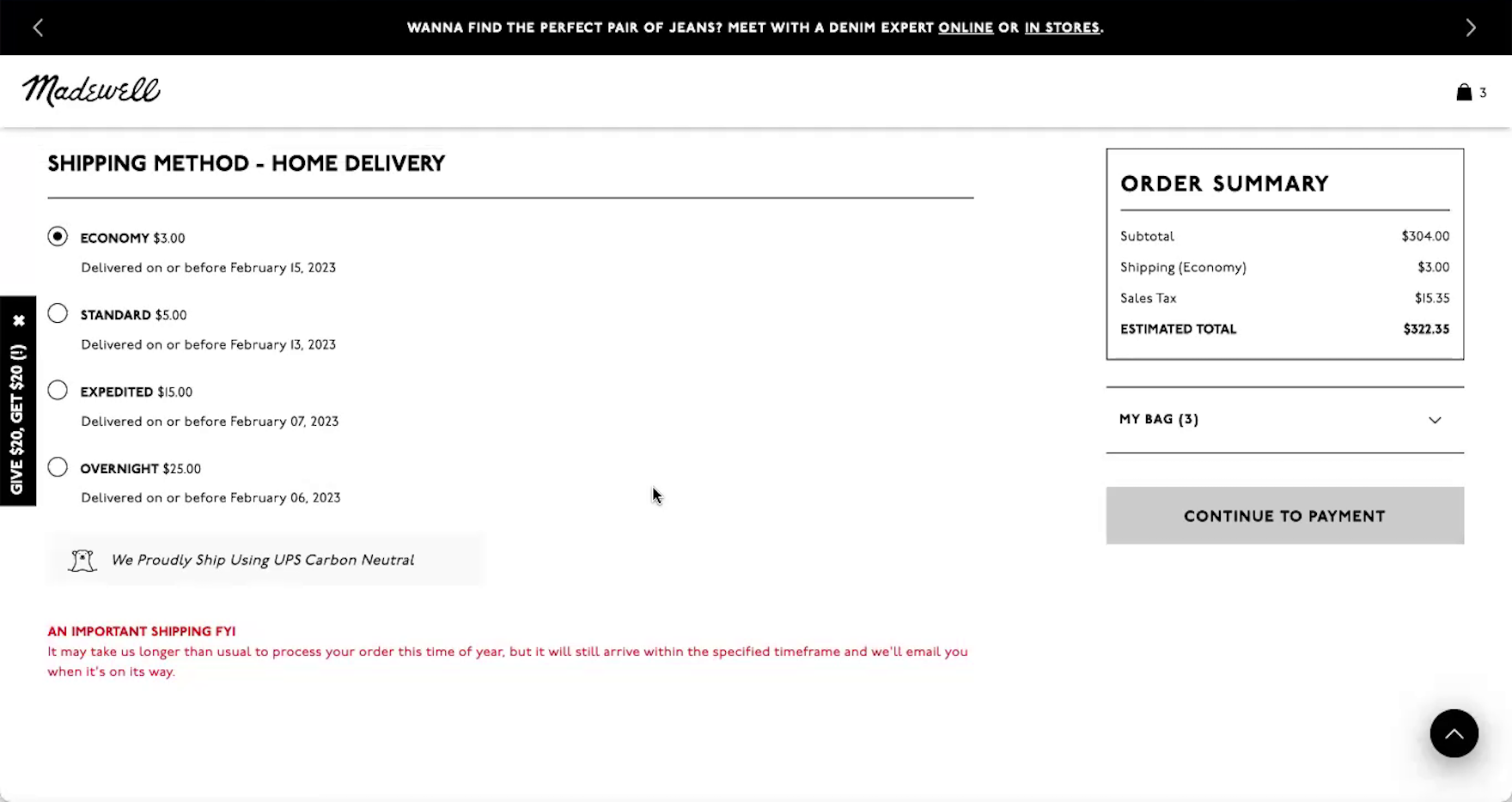
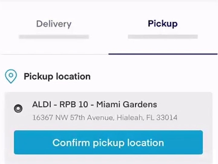
“I’m trying to see…if they would let me just go ahead and ‘ship to store’ right from here, which I guess it doesn’t. At least, I’m not seeing that there.” Despite in-store pickup being featured on product details pages (first image), this participant on Madewell was unable to switch to this option during checkout after wanting to avoid shipping charges (second image). The need to return to the cart or product page to see available alternative fulfillment methods and switch among them presents an undue burden on users who are trying to compare options.

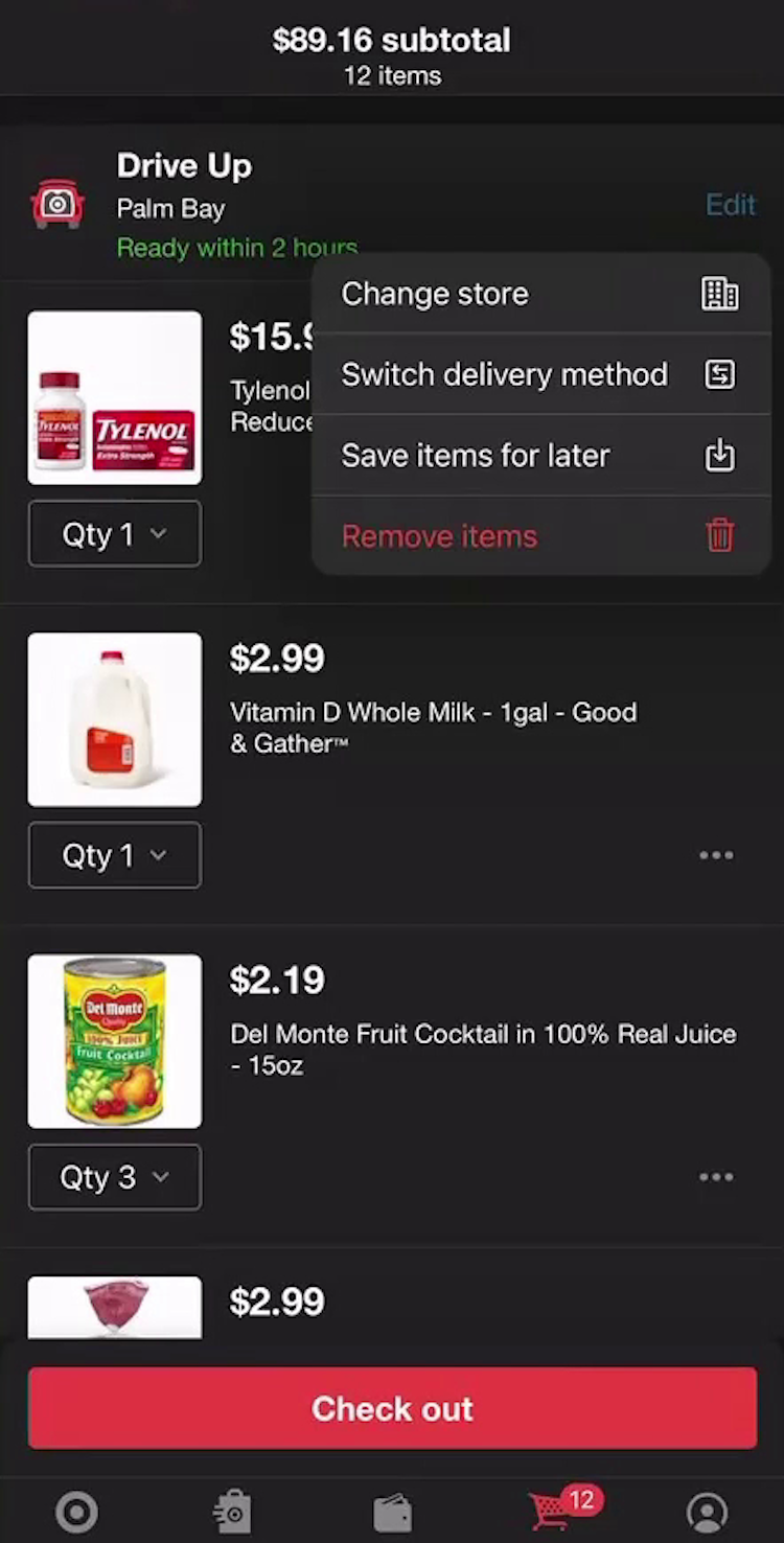
“I’m trying to click ‘Pickup person’, but that’s not it.” This participant shopping for groceries on Target’s mobile app looked for a way to switch from store pickup to local delivery during the one-step checkout process (first image), but there wasn’t a way to switch the fulfillment method. She returned to the cart to select an alternative fulfillment method (second image): “So I’m gonna go back again with my red arrow…‘Switch delivery method’, there we go.” The need to return to the cart to switch among fulfillment methods slows users moving through checkout.
While many sites provide the option for store pickup and other alternative fulfillment methods on product pages or in the cart, this wasn’t enough for participants who changed their mind during the checkout process.
In practice, depending on their circumstances and available fulfillment options, users may end up preferring store pickup, local delivery, or warehouse-based shipping for order fulfillment.
However, requiring users who change their mind at the shipping-selection step to navigate back to an earlier stage of checkout becomes burdensome and potentially disorienting (see guideline #632).
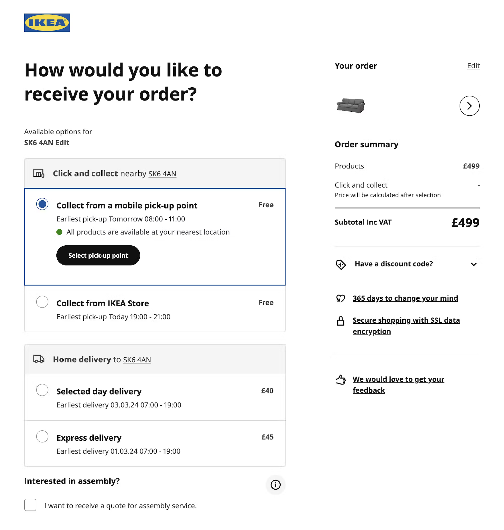
IKEA UK lists all order fulfillment options on a single checkout page, with “Click and collect” — the ideal choice for both cost savings and sustainability — selected by default.
During testing of Amazon Whole Foods’s mobile site, participants could easily switch between local delivery and store pickup at the fulfillment step, saving time and effort by avoiding having to navigate back to the cart.
Instead, all available shipping and fulfillment methods — including traditional warehouse-based options, local store delivery, and in-store pickup — should be provided directly within the shipping-selection interface of checkout.
As one participant from testing shared, “Sometimes I’ll be in this situation where I’ll be at the final stage of a checkout, and…I’ll be thinking about picking something up, and then for some reason or another, I’ll decide that I’m not going to and I’m actually gonna use shipping. So I do like that there’s still an option even at this stage to update it rather than having to manually go back to the cart and do it yourself.”
Presenting comprehensive fulfillment options together in the shipping-selection interface not only aids users who change their mind at the last minute but also allows sites to highlight alternative fulfillment options as an advantage they hold over pure online retailers.
For instance, by framing store pickup as a “Free Shipping Method” available for even the smallest of orders, an omnichannel’s online store can put forward a much more attractive and competitive offer compared to their pure online competitors, while simultaneously drawing customers into physical stores (as customers go to pick up their items).
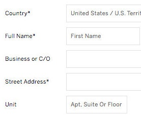
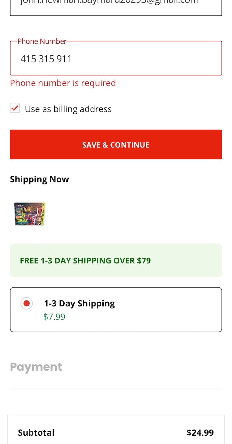
7) Mark Both Required and Optional Fields Explicitly (61% Don’t)

“I don’t normally like giving out my number in general for spam reasons and all that…So I would think/hope that they would, if I did not put in my phone number, that they would just direct it to my email.” This participant at Everlane hesitated to move forward without inputting her phone number, debating with herself before eventually deciding to try it (which was successful). When only required fields (and not optional fields) are explicitly labeled, users may still experience anxiety about the implied optional details.

Despite all of the fields being required at Wayfair, it’s impossible to tell that this is the case.
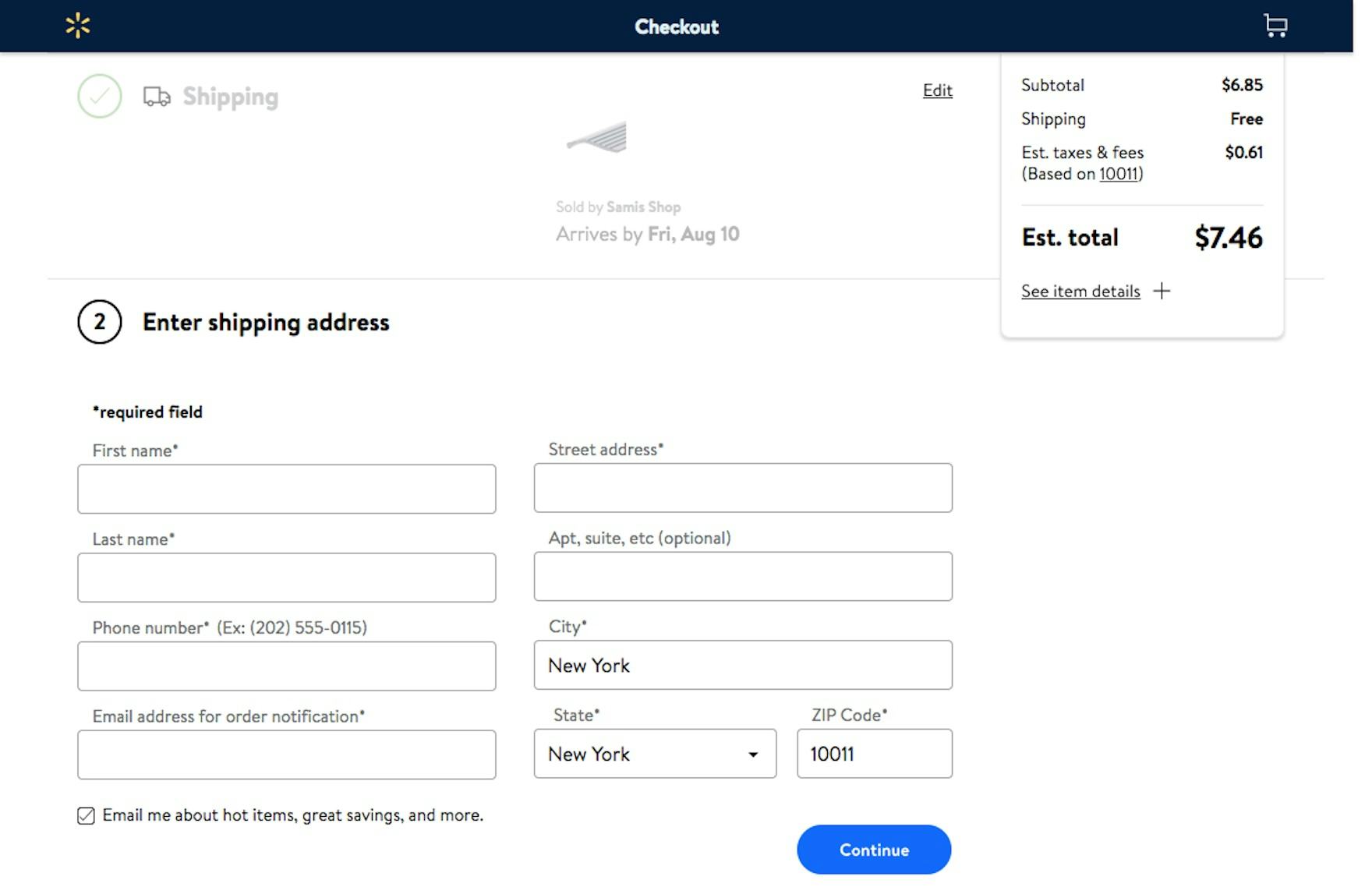
Walmart makes it easy to quickly determine which fields are required (denoted with asterisks) and which are optional (denoted with text in parentheses).
In our large-scale UX testing, 32% of participants did not complete at least one required field when encountering a form where only the optional fields were marked (see guideline #686).
Performance did not improve on forms where the required fields were marked and the optional fields were not.
And when no fields are marked, often because all are required, users often fail to notice text at the beginning of the form stating “All fields are required” — and thus leave some blank, assuming they’re optional.
In short, it’s best to be explicit and mark both required and optional fields in forms to ensure there’s no confusion.
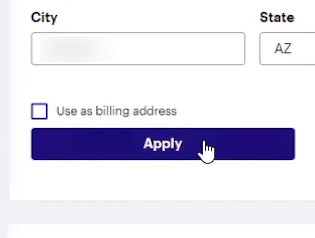
8) Choose the Right Interface Type for Optional Inputs (32% Don’t)

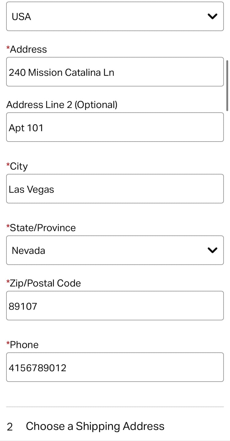
At Backcountry, the checkout form displays optional fields for ”Company” (first image) and ”Address Line 2” (second image), slowing users’ progress as they scan down the form.

At OBI, the mutually exclusive radio button options for delivery address (“Lieferung an die Rechnungsadresse” and “Lieferung an eine andere Adresse”, or “Deliver to the billing address” and “Deliver to another address”) make it harder to scan and comprehend this binary option. Instead, this input could be presented as a checkbox for “Use billing as shipping address”.
It might seem that having optional fields and selections in the checkout comes relatively “risk free”, as users will simply skip such optional fields if not relevant to them.
But during testing it became very clear that optional fields and values were often the sole cause for disrupting some participants’ checkout flows.
In particular, these fields were guilty of causing anything from participants needlessly interacting with completely irrelevant fields to causing participants to take 5–30% longer to complete checkout steps, doubting the correctness of order data, getting validation error messages, or submitting orders with incorrect information.
The most common cause of issues in these fields was the incorrect interface types used (see guideline #674).

At Lowe’s, optional fields that will not apply to all users, including ”Company Name” and ”Address Line 2” (”Add Apartment, Suite, Building, Etc.”), are hidden behind links so they are accessible but not overly distracting.
The right interface type for optional inputs depends on several factors, but uncommon inputs (e.g., “Address Line 2”) should generally be hidden behind a link.
Additionally, using radio buttons and drop-downs for entirely optional inputs should be avoided.
9) Improve Validation Errors with Adaptive Messages (94% Don’t)
“It doesn’t like that phone number. Do you want me to put ‘+44’ in front of it or something like that? I wouldn’t have thought so, but I don’t know why that’s not working…I’d go to another site at this stage. It’s obviously not working.” During testing at Appliances Online (UK), this participant could not determine how to resolve the issue with the “Mobile number” field based on the vague error messaging. In fact, the site would not accept input with a space.
The generic error message at GameStop suggests that the issue is that users have not entered a phone number — when the real issue is the phone number is incomplete and does not have enough digits to be valid.
Errors are unavoidable, but we’ve repeatedly observed that the content of the error message itself is vital to the user’s ability to quickly recover from the error rather than abandon the purchase.
But overly general error messages force users to hunt for the problem themselves, and determine how the issue can be resolved — turning what may have been merely a small speed bump into a major roadblock (see guideline #722).
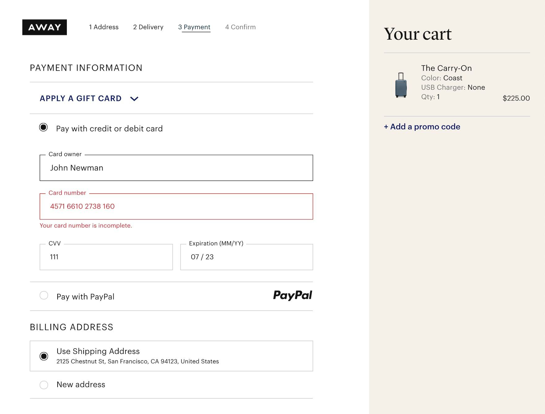
The error message at Away clearly communicates the precise issue with the card number — “Your card number is incomplete” — rather than a more generic message like “Your card number is invalid”.
Rather than providing the same generic message for all validation errors, “Adaptive Error Messages” change depending on the exact subrule that invoked the validation error, using this detail to provide the user with instructions on how they can correct their input.
Letting the user know why an error occurred makes it easier for them to fix it.
During testing, errors that gave specific details improved the error-recovery time for all users — but most importantly it dramatically reduced the number of participants who got completely stuck and had to give up on completing their purchase.
To prioritize resources, consider first tracking all validation errors that occur within the checkout flow.
With better error tracking, sites can then start to implement “Adaptive Error Messages” for the validation errors that a) occur most frequently and b) have the highest checkout abandonment rate after receiving an error.
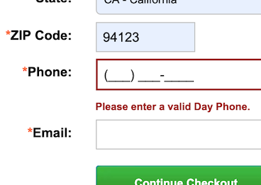
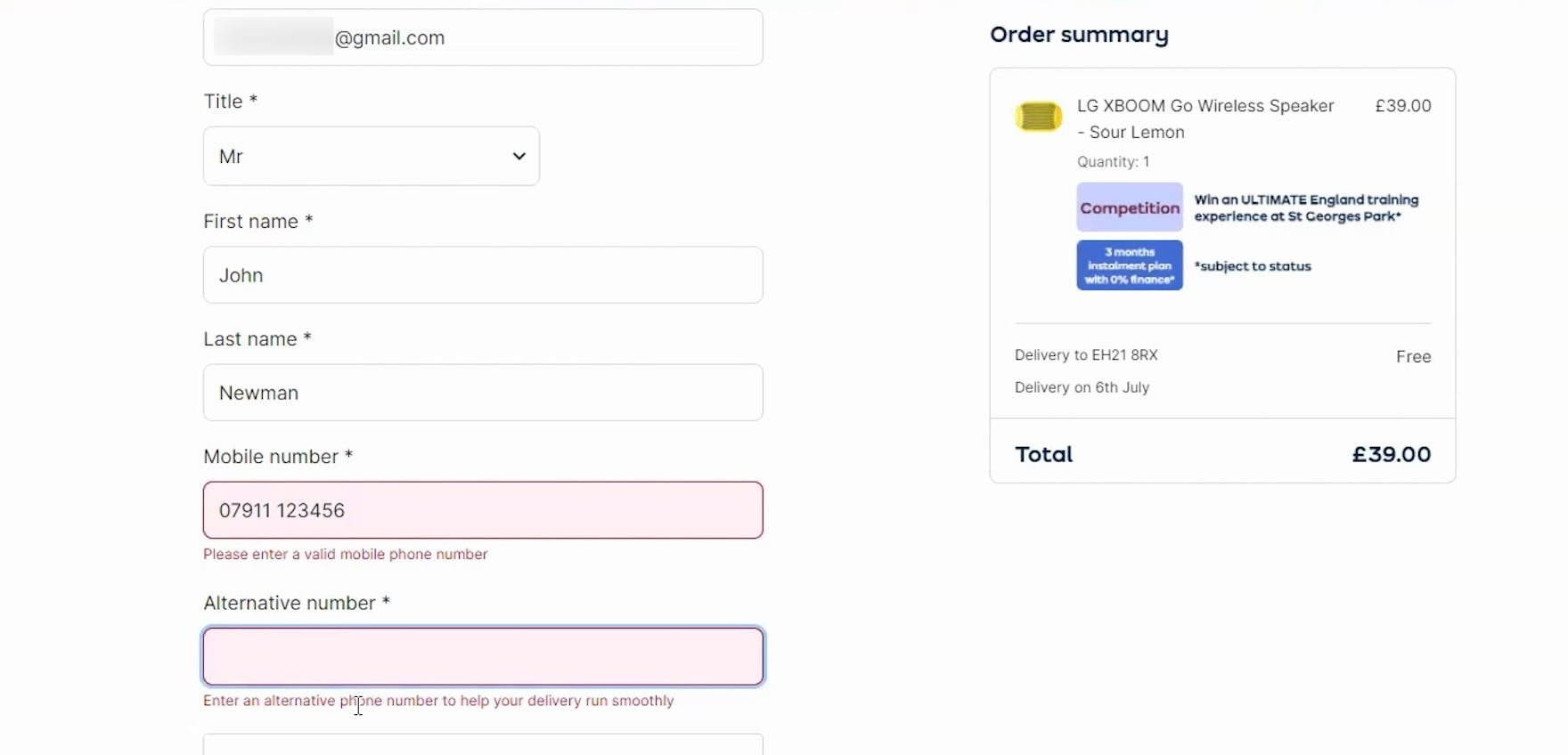
10) Explain Why a Phone Number is Required (49% Don’t)
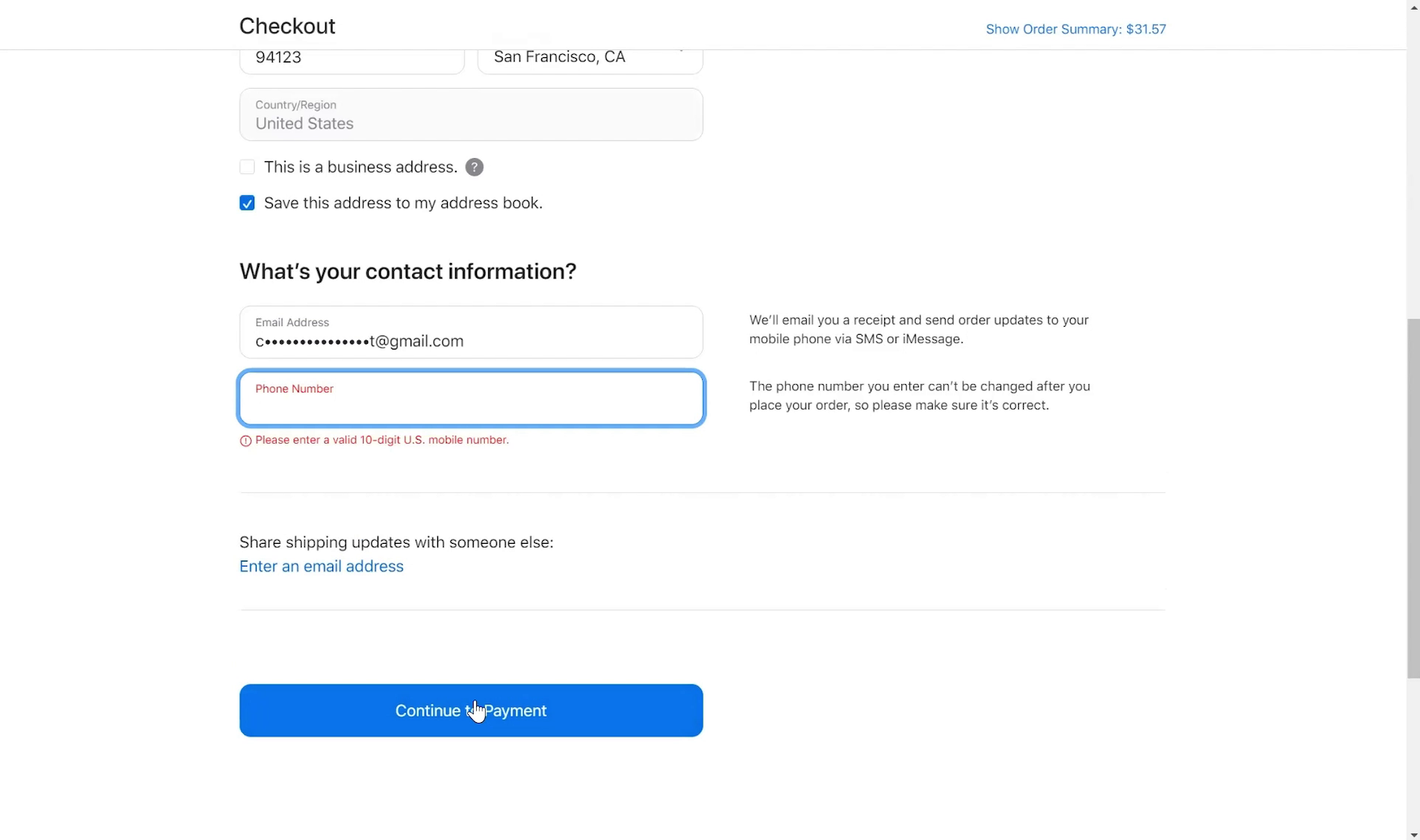
“‘Continue to payment.’ Oh, ‘Phone Number’.” This participant checking out at Apple skipped the “Phone Number” field, preferring to avoid providing this personal detail, but received an error message because it was required.
Our large-scale UX testing consistently reveals that users are concerned about the security and confidentiality of their personal information online, with a common hesitation of providing their phone number during checkout.
In fact, according to a survey conducted by Baymard, over 70% of respondents reported being reluctant to provide a phone number.
This reluctance stems from concerns ranging from receiving unwanted marketing calls to fears of identity theft. In testing, many assumed the site would use their number for unwanted marketing purposes.
When confronted with a required phone number field without any explanation, some participants in our testing provided false information or abandoned the checkout process altogether (see guideline #731).
This not only undermines the integrity of customer data but also leads to lost sales.

“’In case there’s a billing issue’, let me see…‘Don’t worry, we never share a number with anyone’. This is helpful, like they’re just saying in case I need to contact you, you have your number entered.” Checking out at American Eagle, this participant appreciated the explanation detailing how the “Phone Number” was used to verify the credit card payment.
To address users’ privacy concerns and avoid the problems caused by fake data, sites should clearly explain why a phone number is required and what it will be used for.
Our checkout testing has consistently shown that providing an explanation for why a phone number is being collected alleviates the vast majority of users’ privacy concerns.
By providing a clear, concise explanation for why the information is needed, making the field optional, or removing it altogether, sites can address the users’ privacy concerns head-on.
Checkout UX: Key Opportunities Remain
Our benchmark has revealed there’s much room for improvement in Checkout UX, given that the performance of 64% of desktop sites and 63% mobile sites is “mediocre” or worse.
While mobile apps scored better, still 46% performed “mediocre” or worse.
Furthermore, no site nor app has a “perfect” Checkout UX performance.
Avoiding the pitfalls described in this article by adhering to these 10 best practices is the first step toward improving users’ checkout experience:
- Make “Guest Checkout” the most prominent option (62% don’t)
- Avoid overly complex password-creation requirements (65% don’t)
- Use “Delivery Date” instead of “Delivery Speed” (48% don’t)
- Show the cutoff time as a countdown (83% don’t)
- Use buttons or buttons plus an open text field for updating cart quantity (97% don’t)
- Include all fulfillment options in the shipping-selector interface (52% don’t)
- Mark both required and optional fields in the checkout information flow (61% don’t)
- Choose the right interface type for optional inputs (32% don’t)
- Use “Adaptive Error Messages” that match the user’s specific subissue (94% don’t)
- Explain why the phone number is required (49% don’t)
Coming in 2026, Baymard will be conducting further research on Checkout UX best practices, so check back for further updates and insights.
For additional inspiration, consider clicking through the Cart & Checkout Page Designs, as these showcase Checkout implementations from 180+ leading US and European ecommerce sites and can be a good resource when considering redesigning a Checkout flow — finding not only what to emulate, but also what to avoid.
This article presents the research findings from just a few of the 700+ UX guidelines in Baymard – get full access to learn how to create a “State of the Art” ecommerce user experience.
If you want to know how your desktop site, mobile site, or app performs and compares, then learn more about getting Baymard to conduct a UX Audit of your site or app.