
327 ‘Cross-Sells’ Design Examples
Also referred to as: Product Recommendations, Up-Sells
What’s this? Here you’ll find 327 “Cross-Sells” full-page screenshots annotated with research-based UX insights, sourced from Baymard’s UX benchmark of 327 e-commerce sites. (Note: this is less than 1% of the full research catalog.)
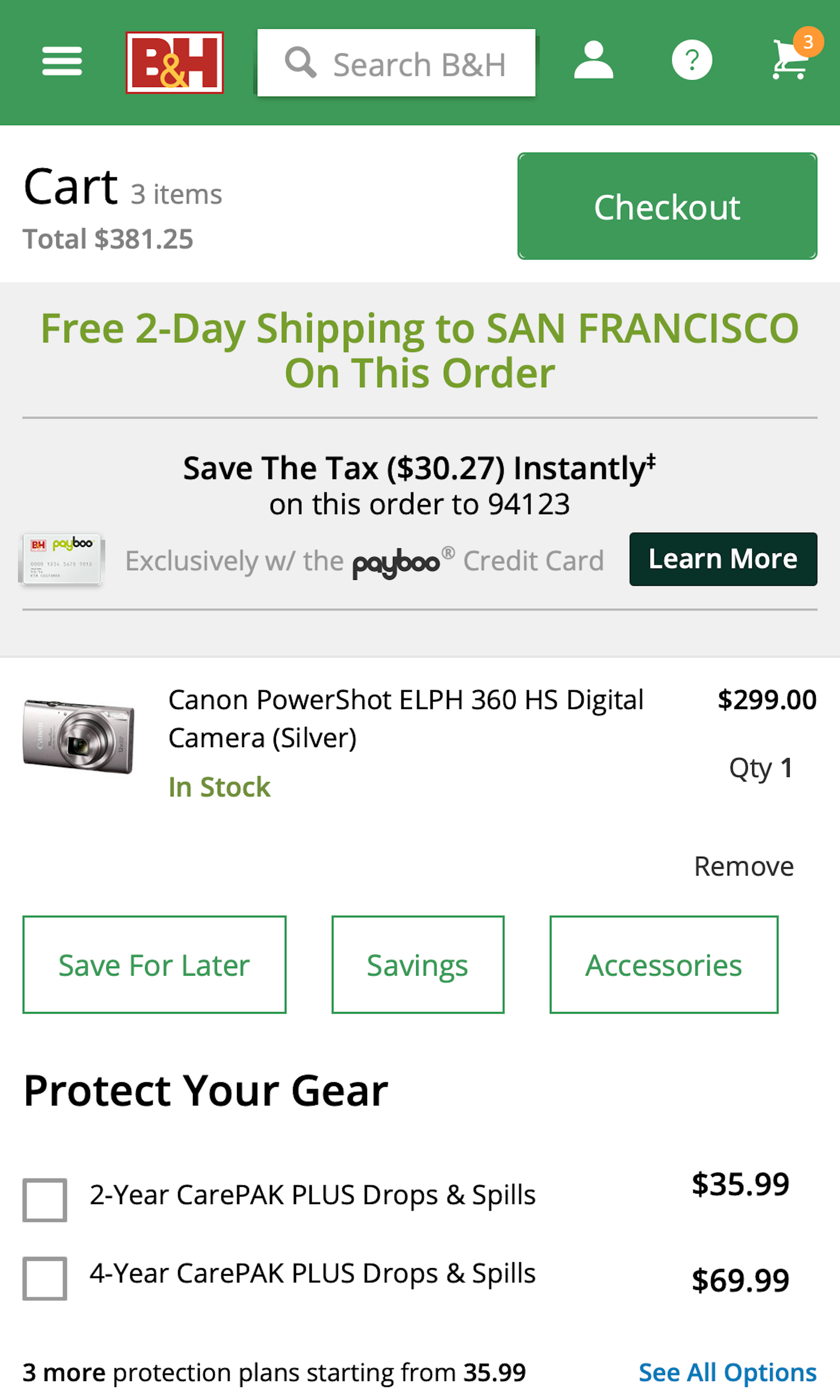
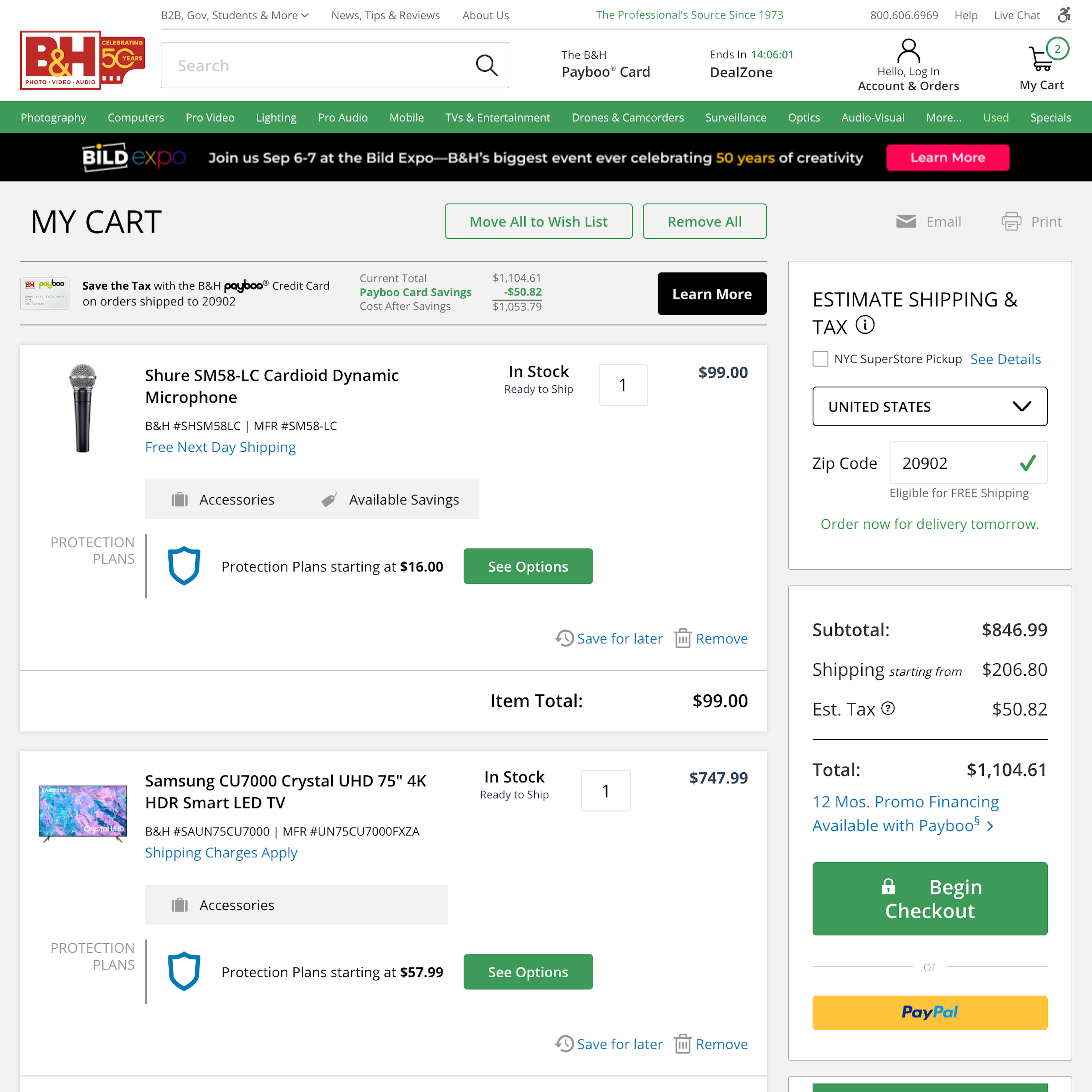
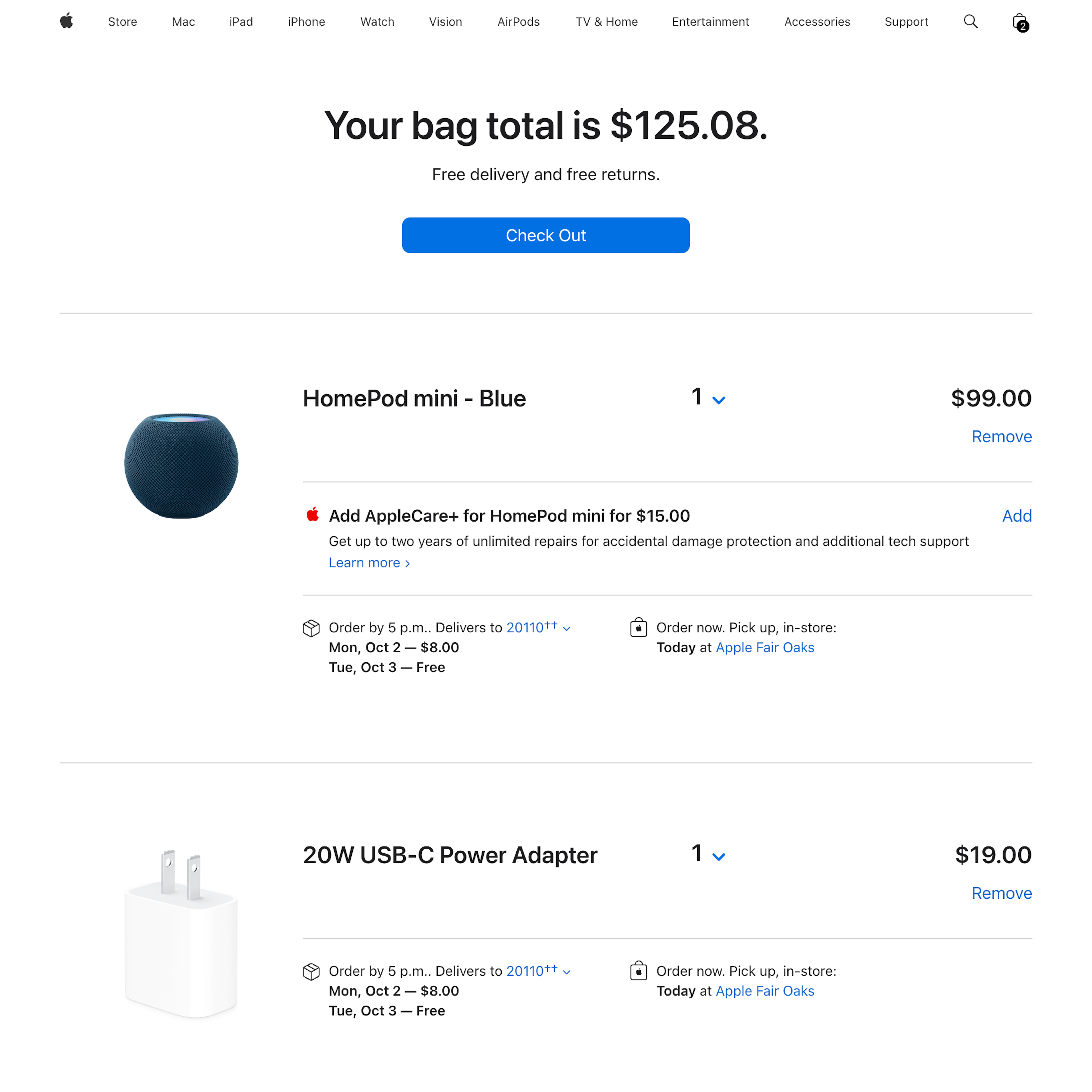
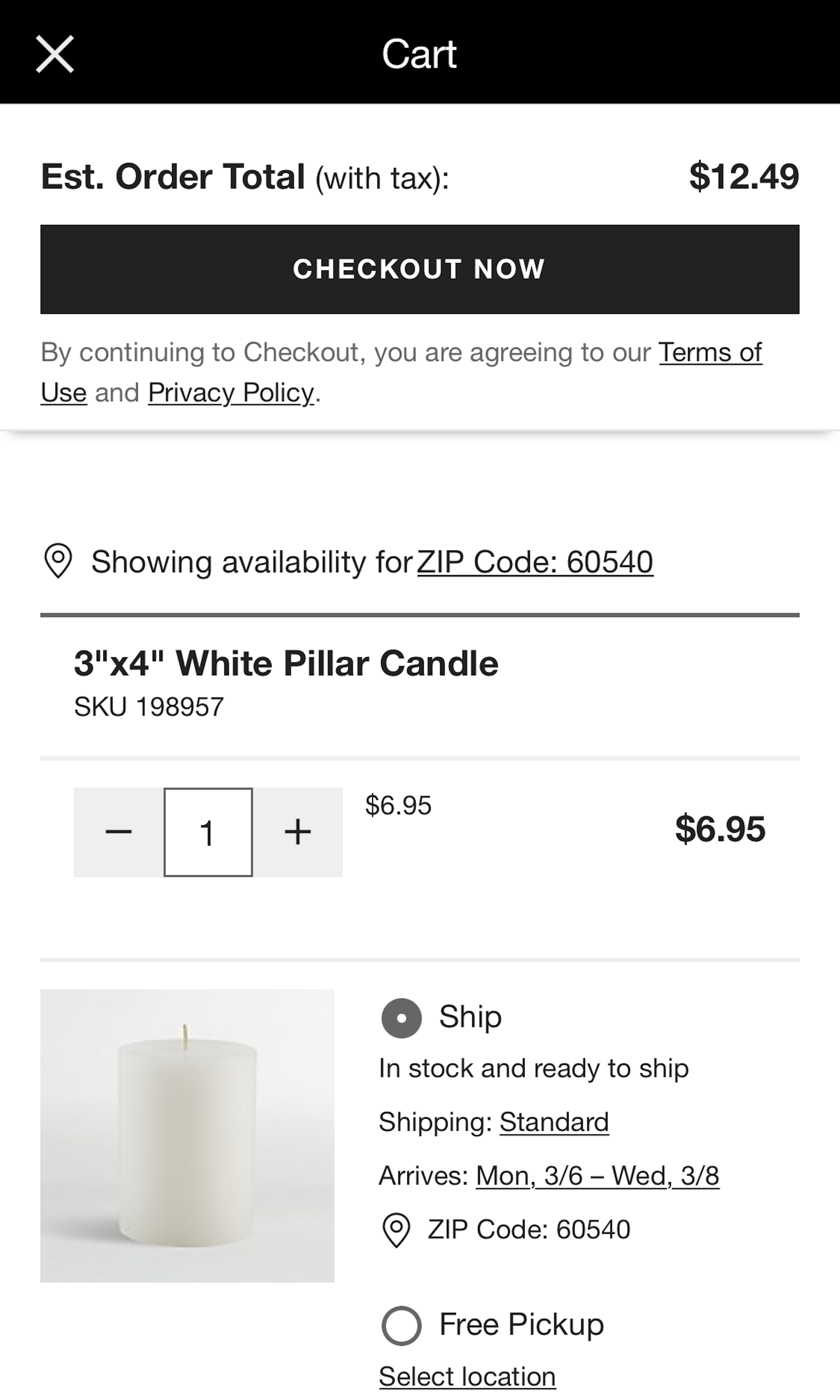
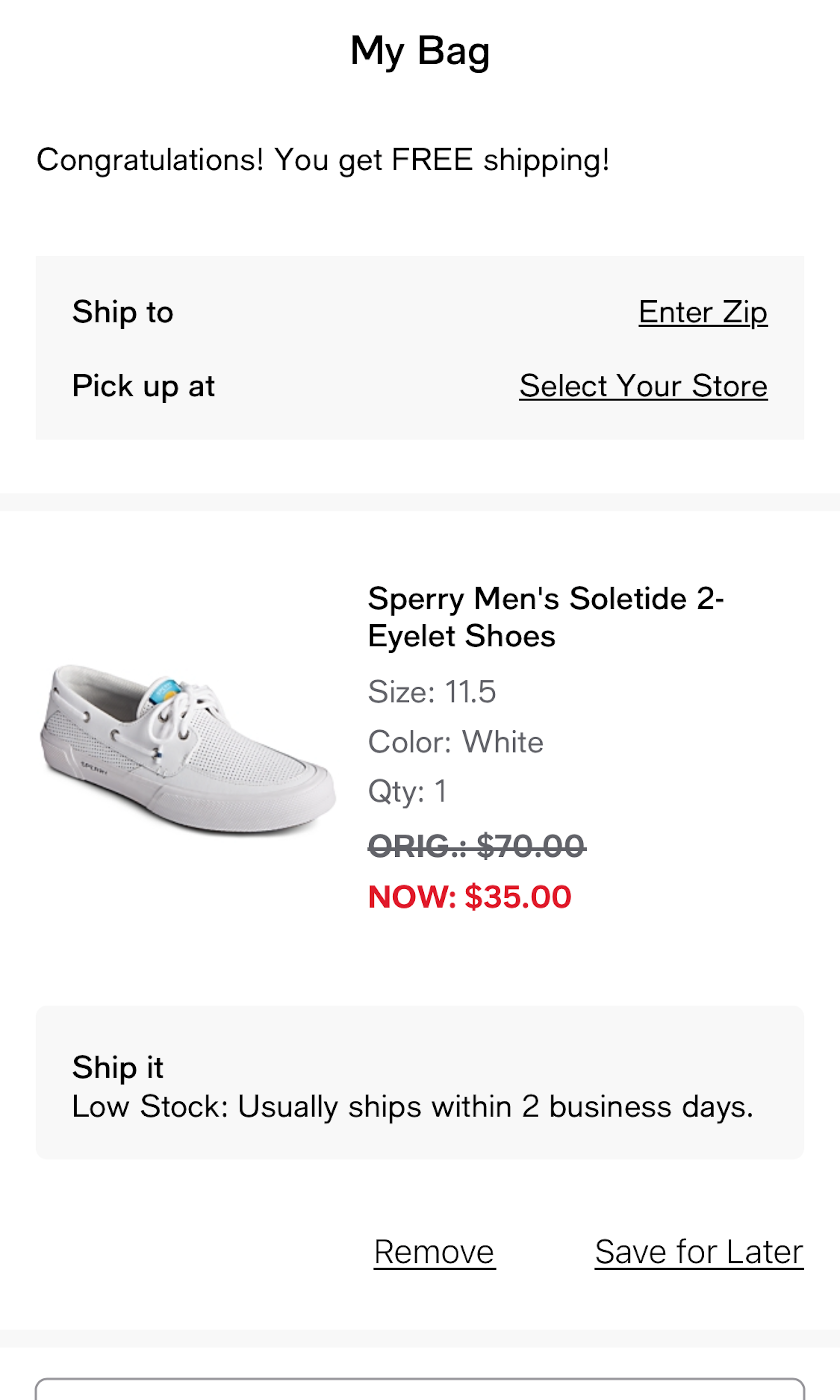
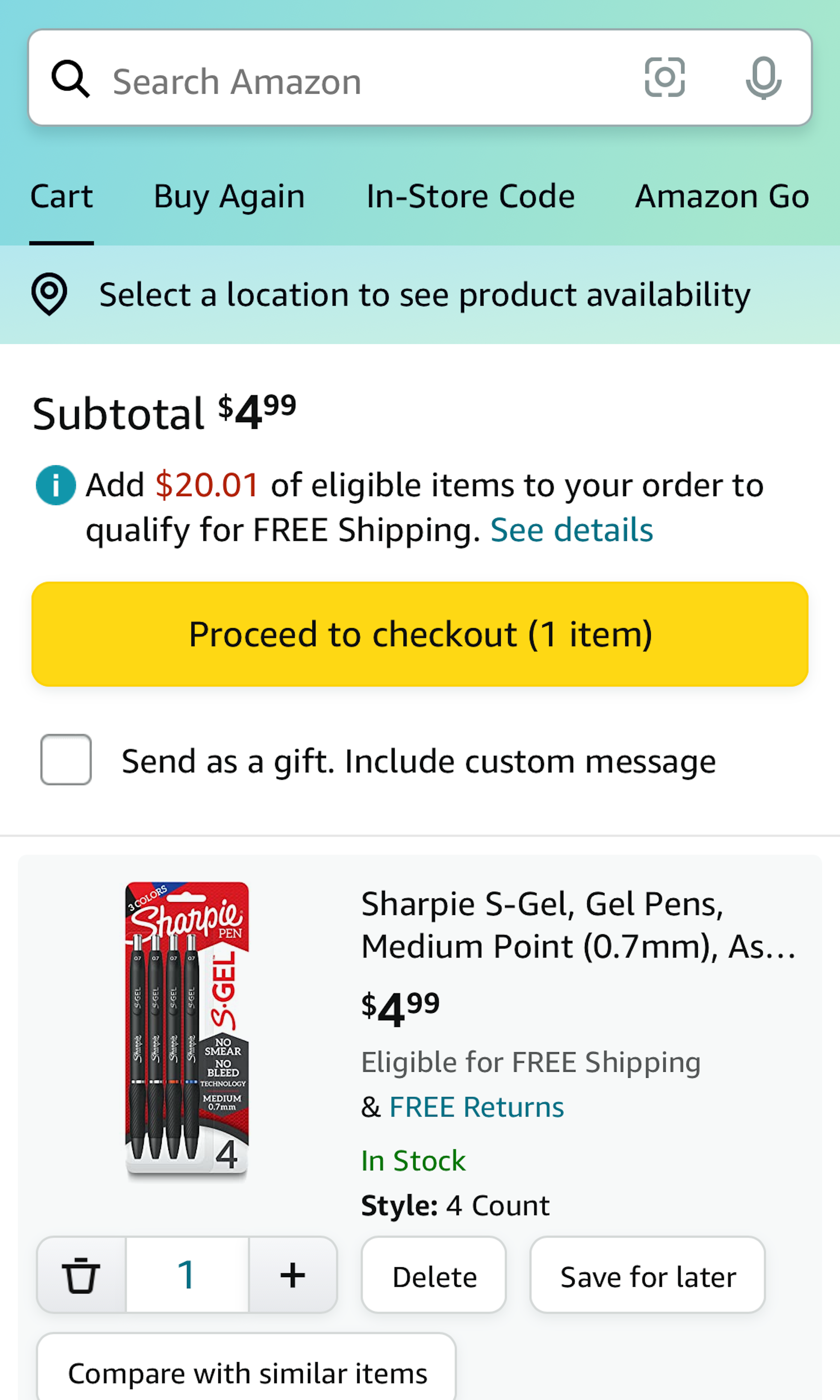
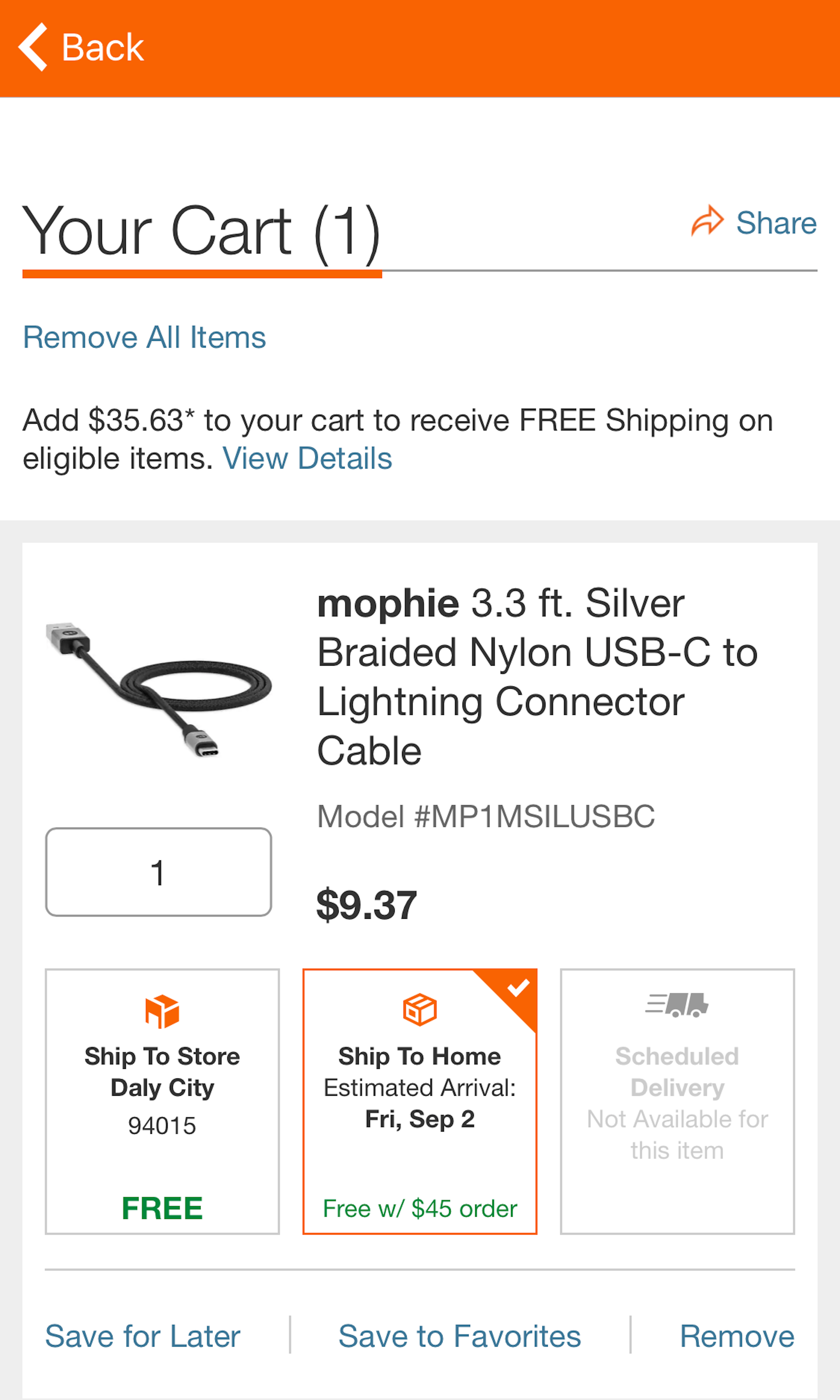
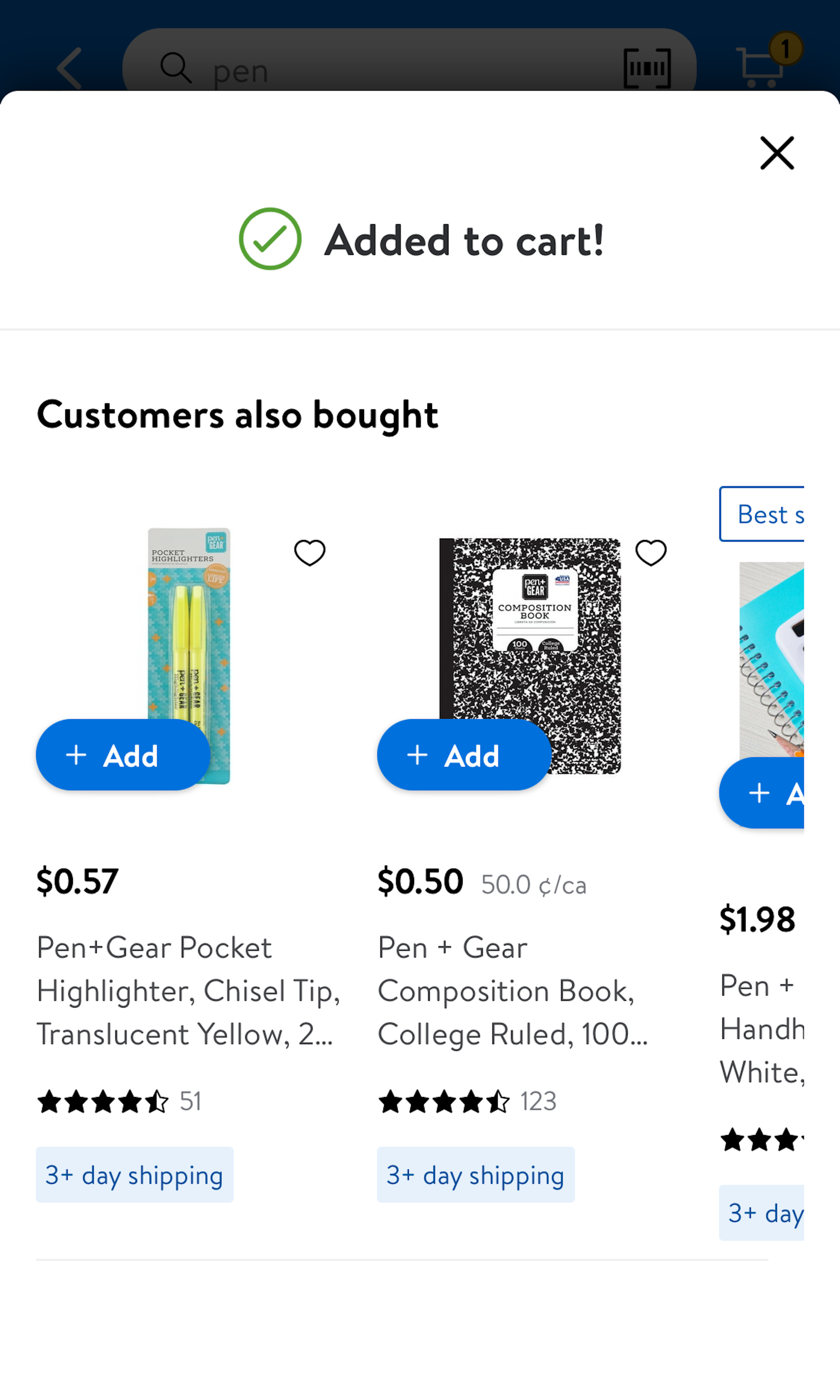
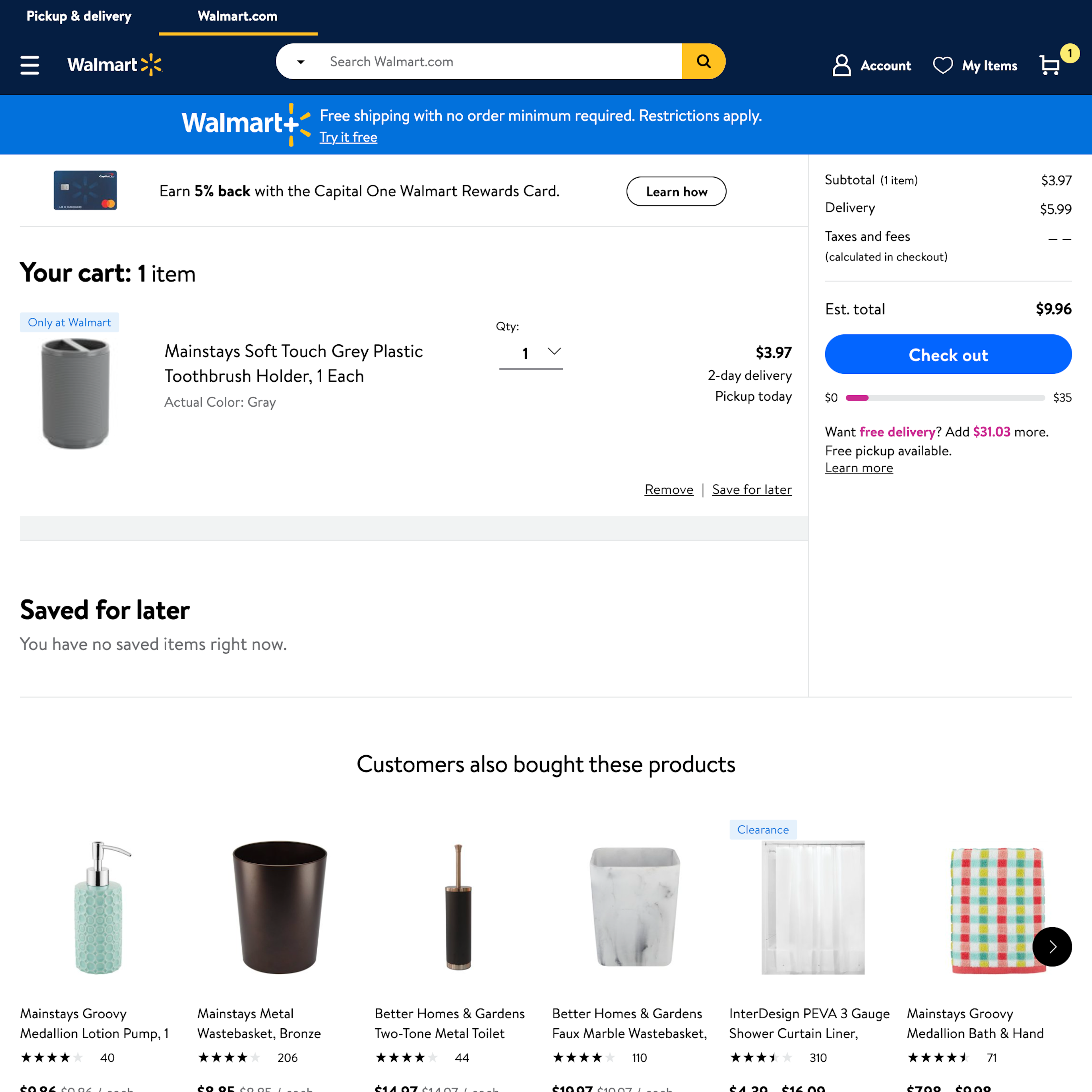
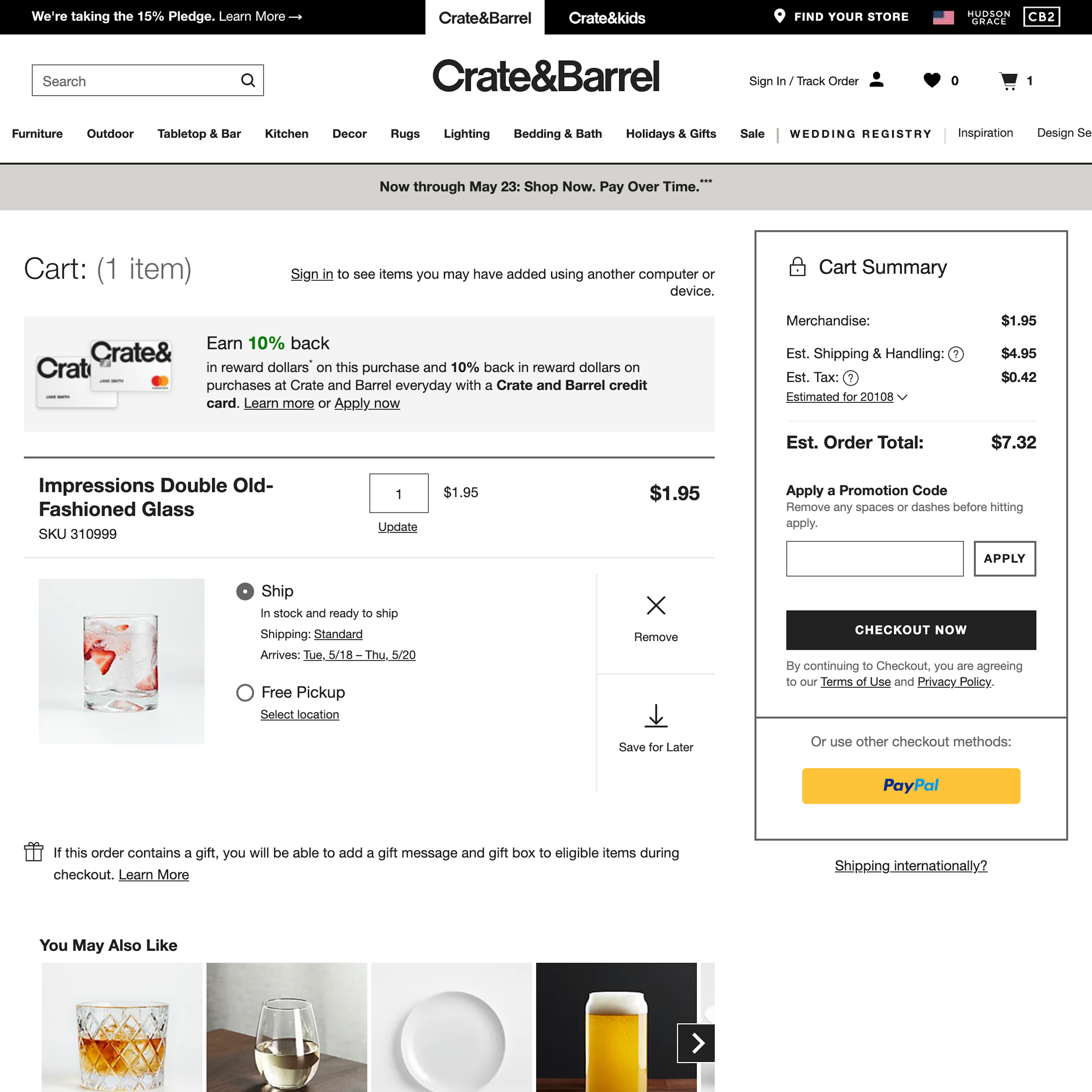
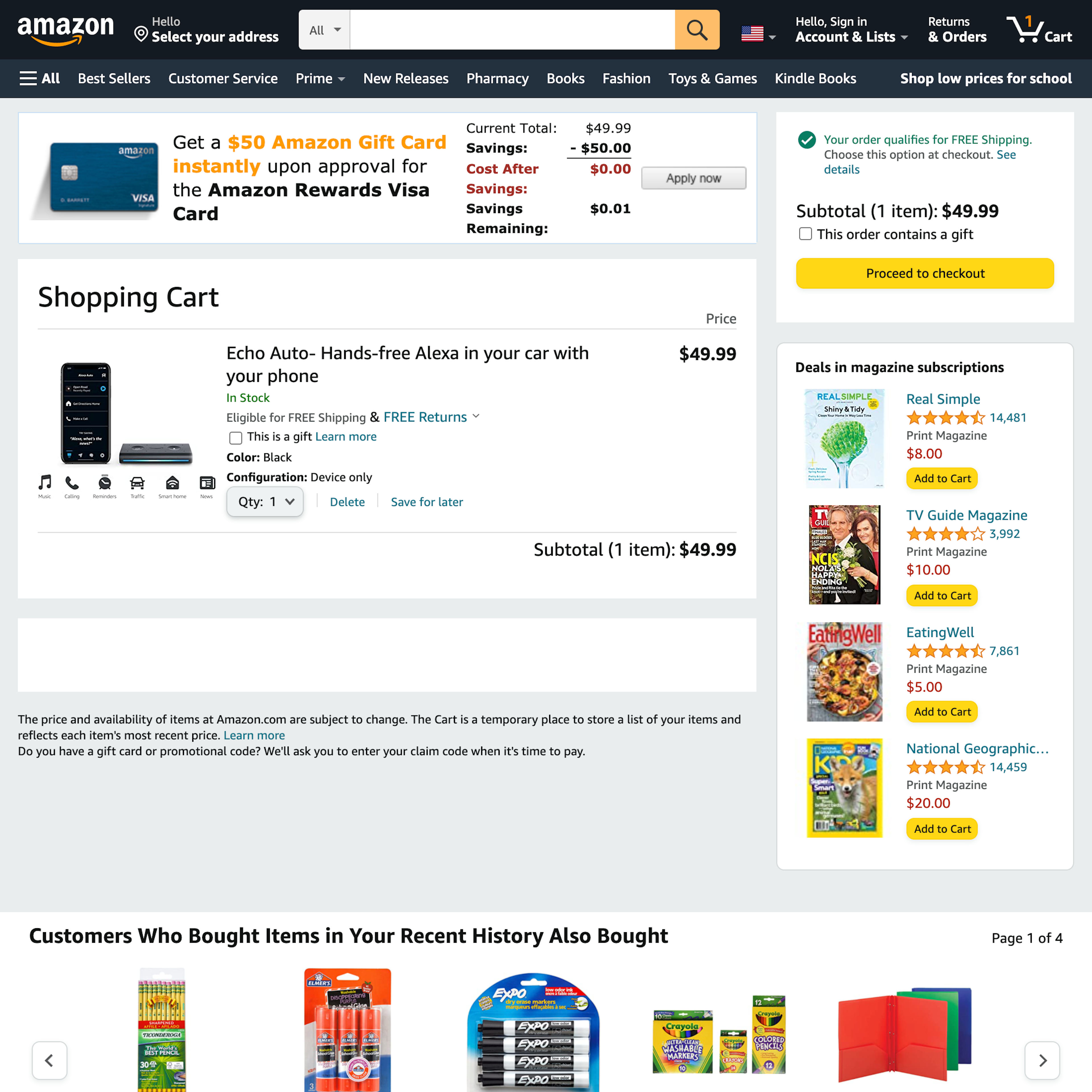
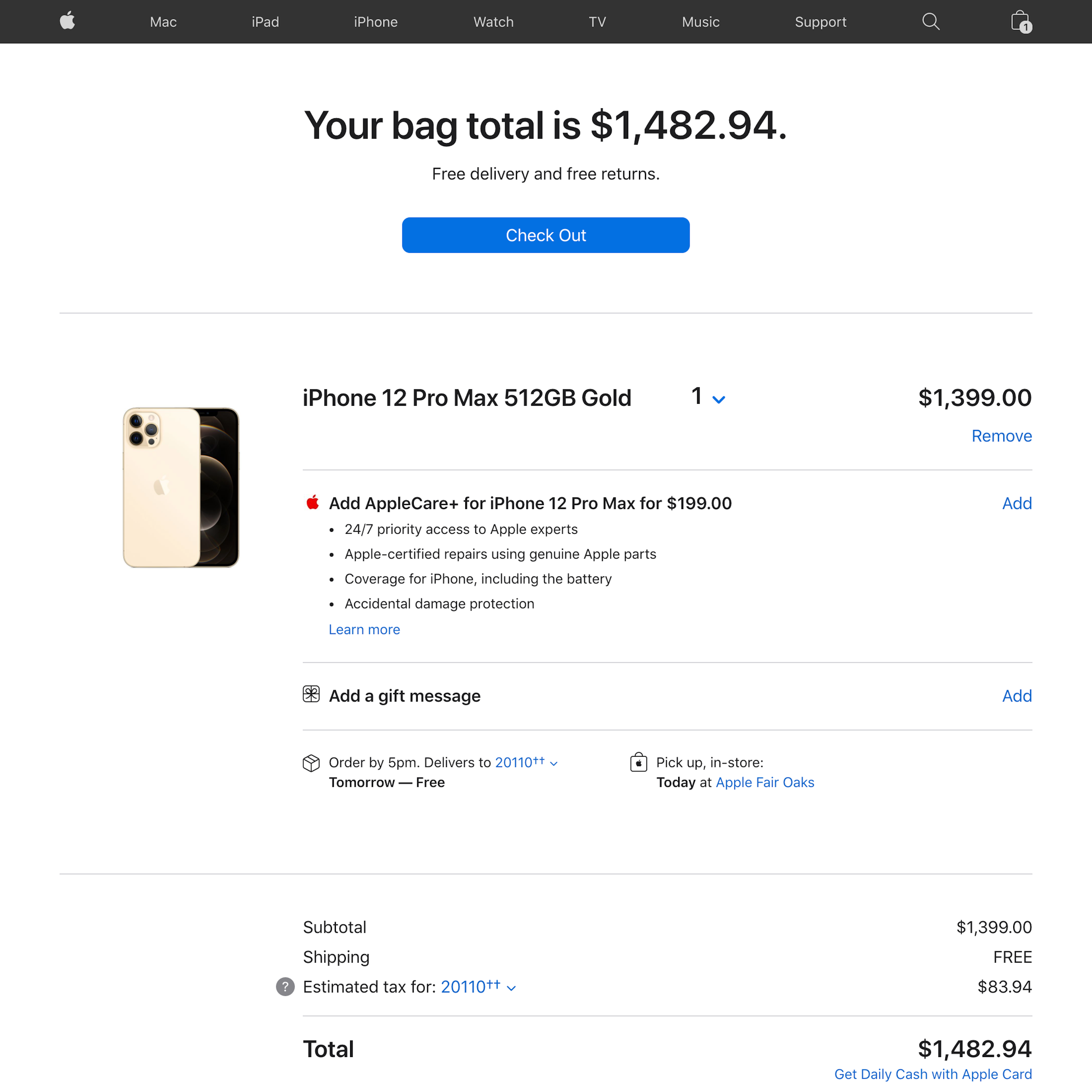
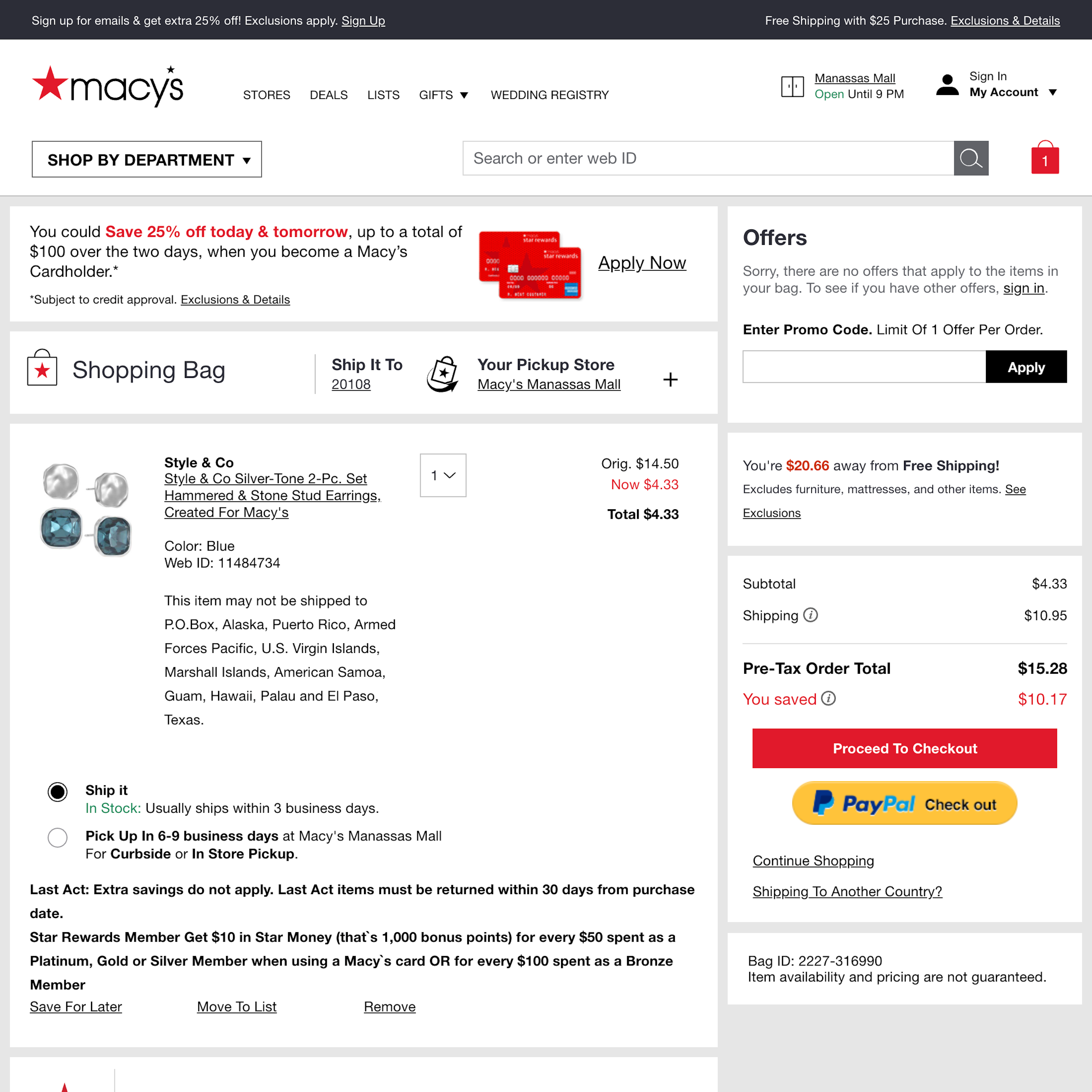
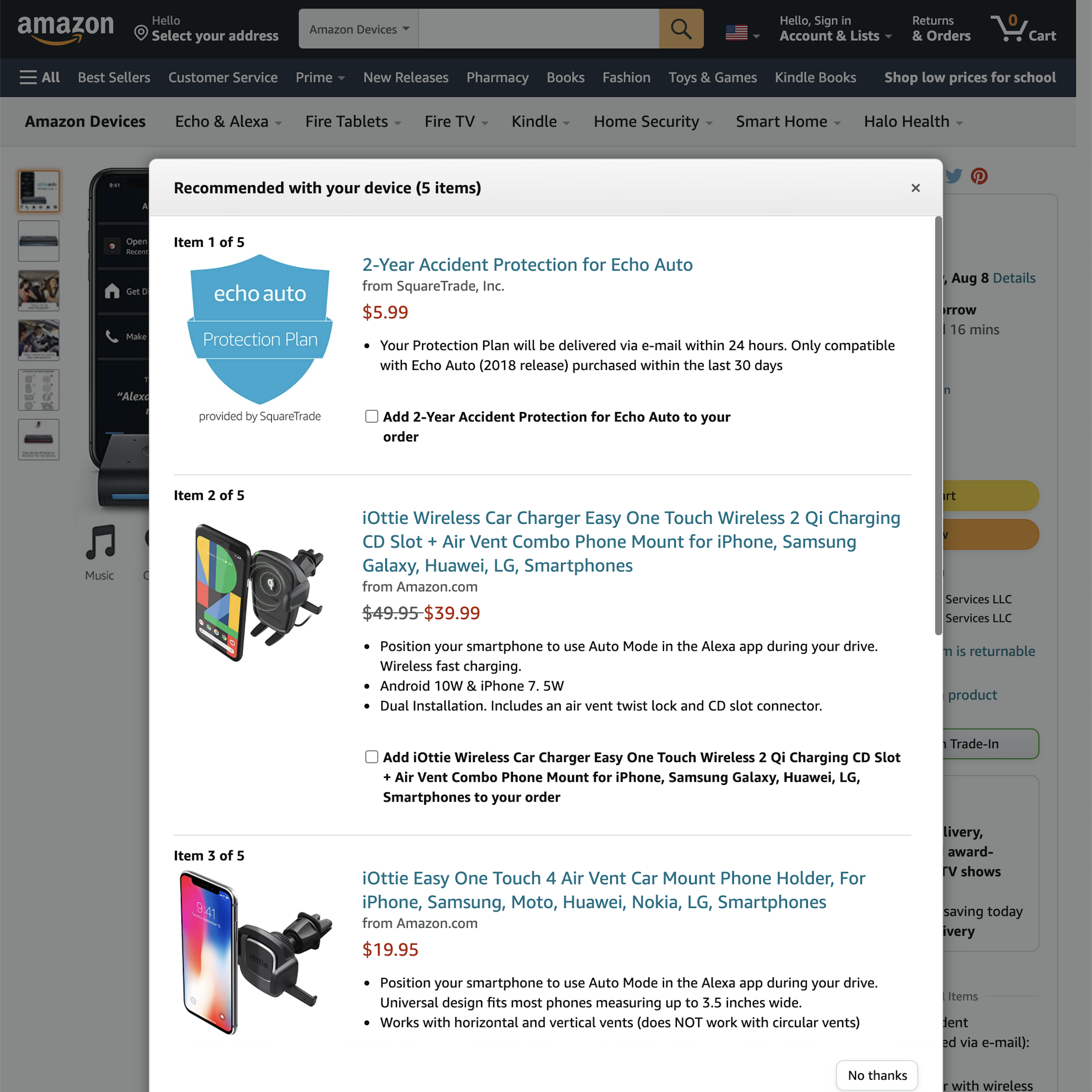
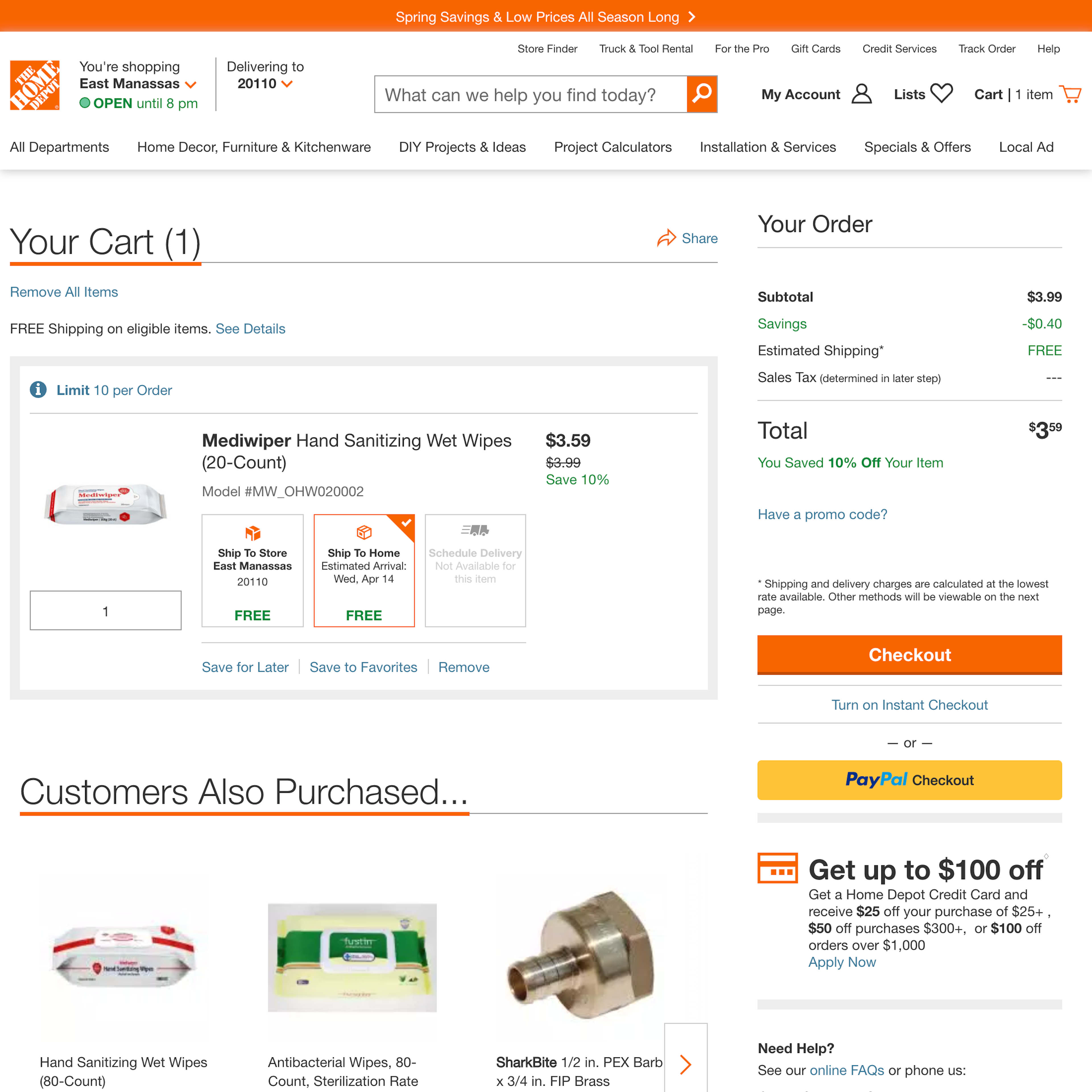
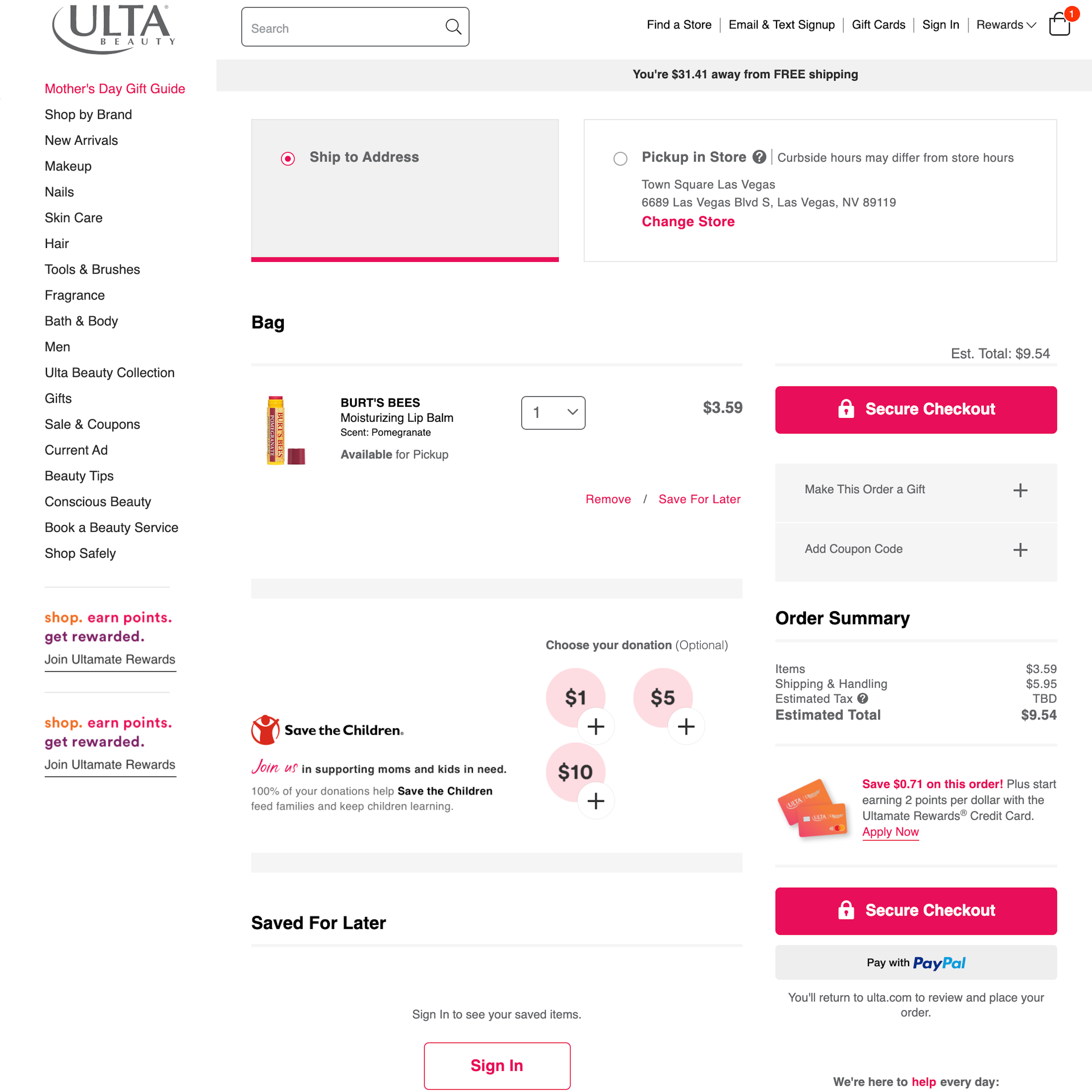
While cross-sells and product recommendations during the cart & checkout will often seem to be in the e-commerce site’s interest, there’s a delicate balance to be struck when it comes to deliberately asking users to focus on something else than completing their purchase. Especially injected cross-sells that require users to make an active decision (e.g., to accept or reject an offer) to be able to proceed to the next checkout step are, by users, often perceived as highly aggressive. For example, in our large-scale checkout testing 66% of users who had initiated a checkout and had to go through a separate step displaying a cross-sell at Amazon exhibited extreme frustration. Besides the examples below, also see our article “6 Ways to Improve the Relevance of Cross-Sells in the Cart - 52% of Desktop Sites Don’t Do Enough“.
More ‘Cross-Sell’ Insights
-
Consider also reading our related articles “6 List Item Attributes to Include for Cross-Sell Recommendations - 68% of Desktop Sites Are Missing One or More“ and “6 Ways to Improve the Relevance of Cross-Sells in the Cart - 52% of Desktop Sites Don’t Do Enough“
-
Get Full Access: To see all of Baymard’s checkout UX research findings you’ll need Baymard Premium access. (Premium also provides you full access to 200,000+ hours of UX research findings, 650+ e-commerce UX guidelines, and 275,000+ UX performance scores.)


User Experience Research, Delivered Weekly
Join 60,000+ UX professionals and get a new UX article every week.

User Experience Research, Delivered Weekly
Join 60,000+ UX professionals and get a new UX article every week.
Explore Other Research Content
300+ free UX articles based on large-scale research.

327 top sites ranked by UX performance.

Code samples, demos, and key stats for usability.