Key Takeaways
- Many mobile users prefer to use the product list to explore and compare product color variations
- However, on 57% of sites this is made more difficult as not all color variations are available in the product list
- Providing color variations via a horizontally scrollable list proved in testing to perform well for most users
In industries such as Apparel and Home Furnishings, items often come in multiple colors.
Indeed, the color of items in these industries is often key to users’ decisions on which products to buy.
Baymard’s Premium research findings reveals that these color variations should be implemented as swatches in list items — rather than text (or not noted at all) — to ease users’ ability to both note products have different color variations and to discern what color variations exist.
(Moreover, as a prerequisite, products with variations have to be combined into one list item, rather than scattered across multiple list items, in the product list and search results.)
However, during testing, even when swatches were provided for mobile list items, participants often still had to visit product pages to be able to fully assess how suitable items were when the number of swatches displayed for a product in the mobile product list was limited.
As a result, product exploration was slower and more friction-filled, resulting in a more cumbersome search for suitable products.
Yet our e-commerce UX benchmark shows that 57% of sites fail to make all swatches available in the product list — leaving some users to never find the color variation they’re interested in.
In this article we’ll discuss the following:
- Why showing only a limited number of swatches is disruptive to mobile users in the product list
- How providing a horizontal scroll area for swatches works well for most Users
- 1 Additional way to consider providing swatches (and 1 to avoid)
Why Showing Only a Limited Number of Swatches Is Disruptive

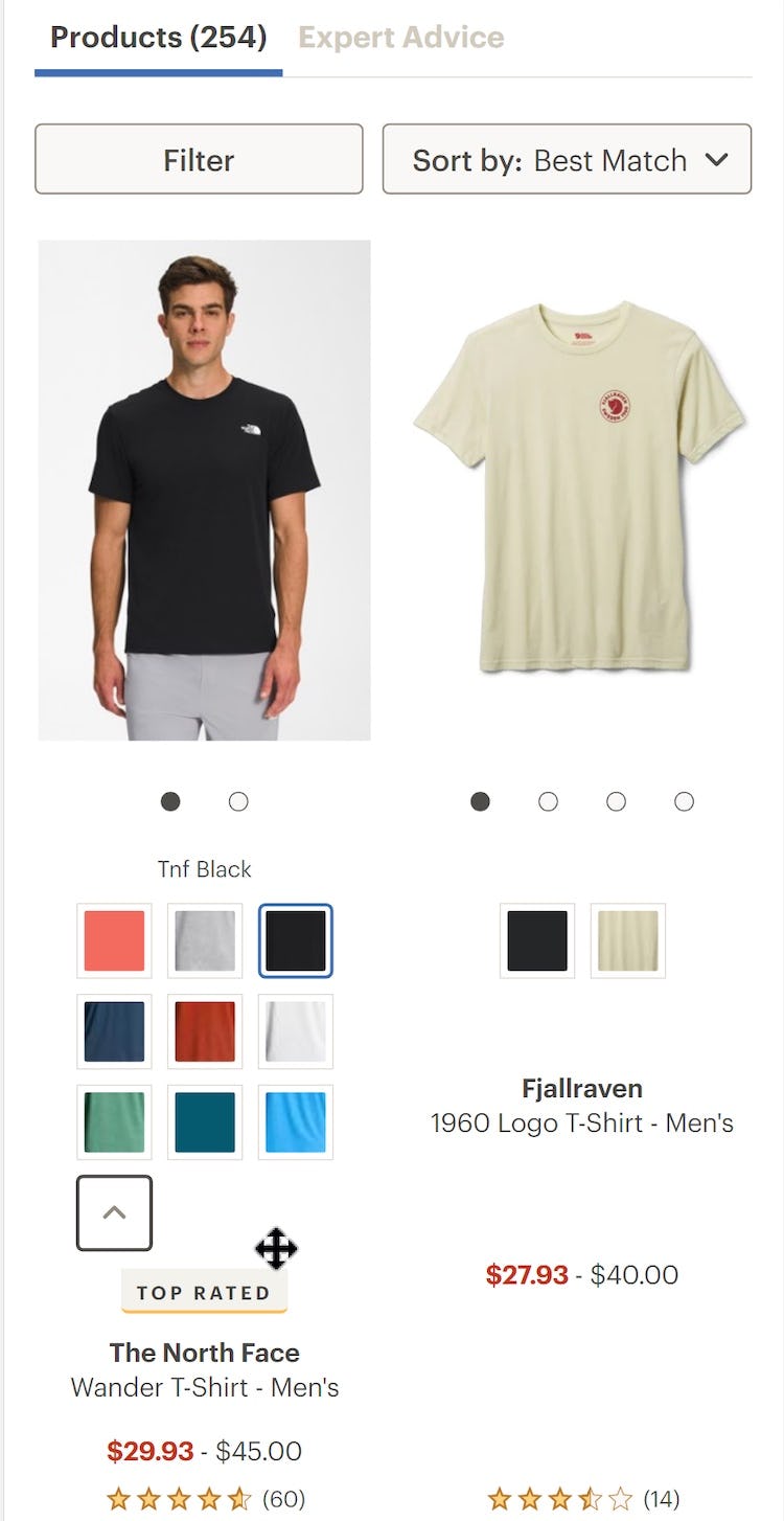
“It’s annoying when you have to click [into the product page] just to visualize it or just to see it in another color…Like this one for instance, this one here has 11 options. If I’m going to be picky, I’d like to see all 11 of course.” When some swatches aren’t shown in mobile list items, as here on The Company Store (iOS), users have to go to product pages to see the full range — introducing more friction into the process of judging suitability.
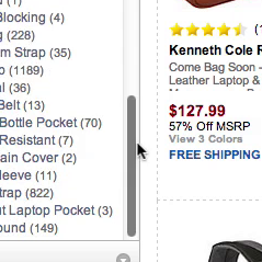
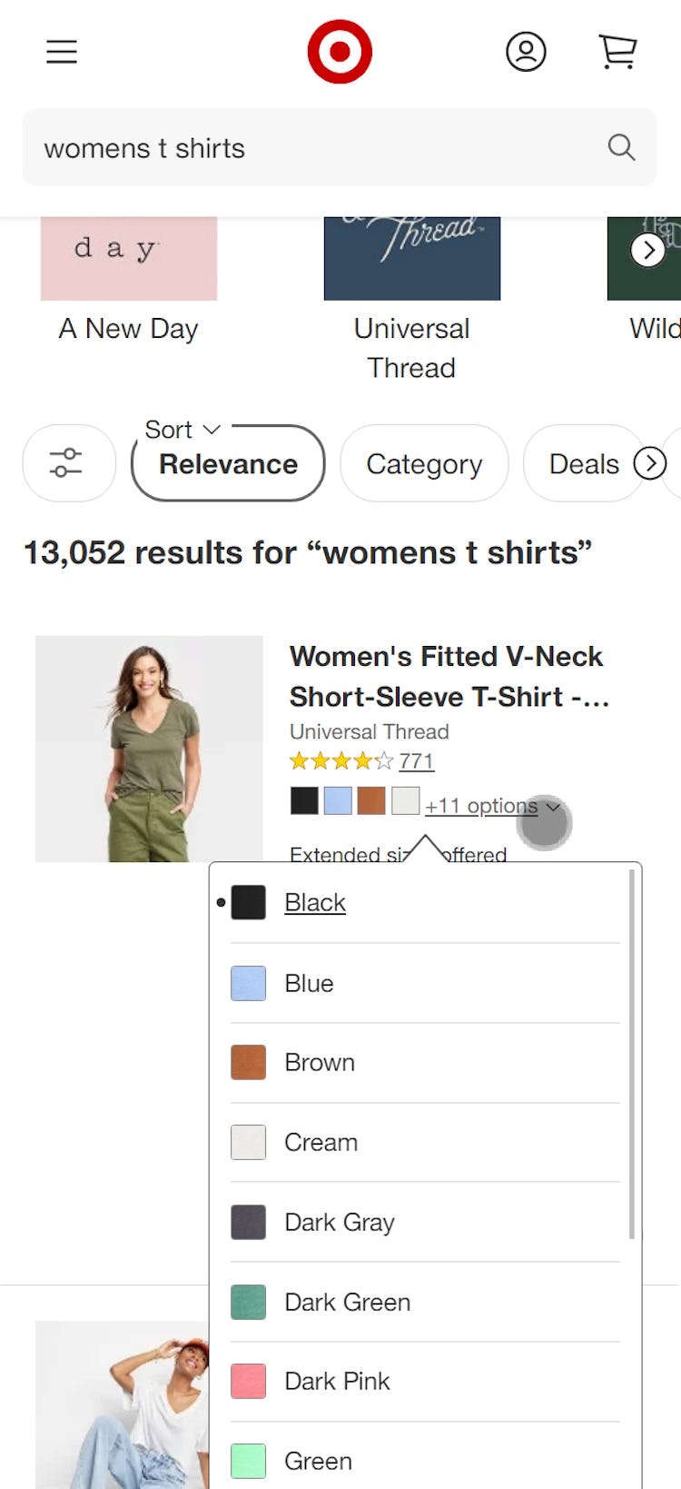
On Kohl’s mobile site (iOS) not all color swatches are available in list items. While the number of other colors available is clearly shown (e.g., “+8”), users will still need to visit product pages to see exactly what those colors are.
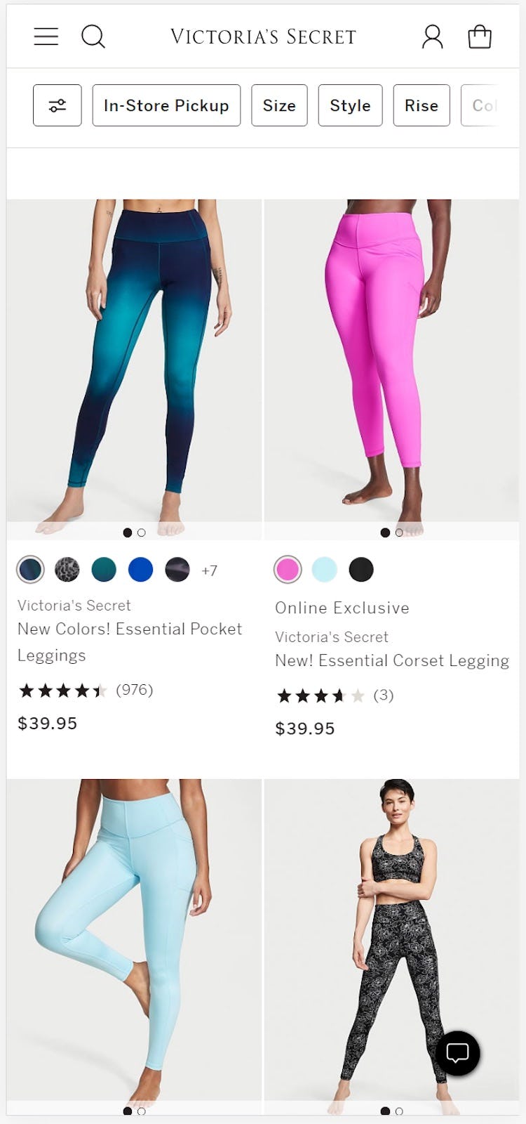
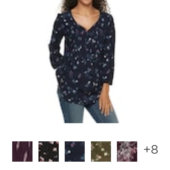
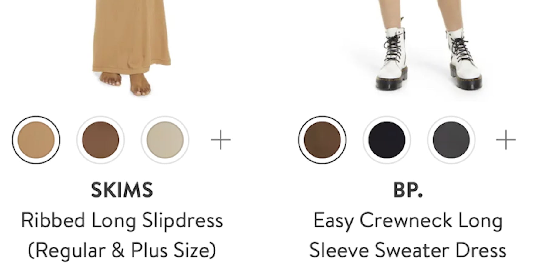
Likewise, only a subset of swatches are shown in Victoria’s Secret list items (iOS) for products with many variations, meaning that users interested in these products won’t be able to get a full idea of the range of colors without visiting the relevant product pages.
If users only see a limited number of swatches in list items, some could assume that the visible swatches represent the only options.
Indeed, during mobile testing, a subset of participants moved very quickly through product lists and search results, and sometimes overlooked small indications of additional color options such as “+7” or “more colors available”.
If a user’s desired color isn’t among the visible swatches, they could abandon their search — despite more colors being available on the product details page.
Additionally, even if users notice that more colors are available on the product details page, having, for example, “+10” alongside the visible swatches to signify the number of colors not represented doesn’t give users an accurate impression of the “hidden” options.
For example, if the visible swatches show 3 colors, there’s no way of knowing if the others will be similar (just different shades of the 3) or if there’s a genuinely diverse range of colors available.
So, if only a subset of colors are available to users in product lists, they’ll either have to visit product pages to see if any of the “hidden” colors are suitable, or abandon their search if none of the visible colors are suitable.
Moreover, during testing, participants were frequently hesitant about pogo-sticking between product lists and product pages, worried that it would slow them down significantly in the product-finding process — especially when browsing mobile sites.
As a result, not being able to see all swatches in list items could hamper users and make it harder to assess and compare products.
How Providing a Horizontal Scroll Area for Swatches Works Well for Most Users
On mobile, displaying all swatches in a horizontal scrolling area has a number of advantages.
In particular, mobile participants easily scrolled swatches using a swipe gesture (as long as hit areas are sufficient) — an intuitive behavior they’ve honed through using their mobile device.
Additionally, horizontal scroll areas were observed in mobile testing to be capable of accommodating potentially a very large number of swatches as there are no space limitations — as long as users are happy to keep scrolling, they’ll eventually see all color options available.
One potential issue with this approach is that users simply don’t recognize that the swatches can be scrolled.
For example, if users don’t notice scroll arrows at either end of the list or a truncated final swatch, they might assume that there are no more swatches to view.
To avoid this, if provided scroll arrows should be easy to discern at each side of the horizontal scroll area.
Moreover, the rightmost swatch should be clearly truncated to indicate that action is needed to see the full swatch — and in turn that there are more available to view.
And the swatches visible by default should be chosen to show a diverse set of colors, or the most popular.
1 Additional Way to Consider Providing Swatches (and 1 to Avoid)
REI integrates swatches into a section that can be expanded from one line to many. This method is particularly suited to products with a small number of color variations.
Another way to consider making all swatches available in list items is to display swatches in an area that expands downwards when a button is tapped.
One advantage of this method is that all swatches can be seen together, with none hidden.
Therefore, users can start comparing colors more easily than with a horizontal scrolling area.
A potential drawback, however, is that this method may not work well with a large number of swatches.
This is because, when the section is expanded, the row below the current one is pushed down to accommodate the extra line(s) of swatches — and if, say, more than 10 swatches are available the row below could be pushed right out of the viewport.
Other information in the viewport, such as the price or the user ratings average, could also be pushed out of sight.
Consequently, this method is best suited to products that don’t have large numbers of color options.
Finally, implementing swatches in a vertically expanded list item will almost always make the item too tall.
While this likely isn’t a critical issue for one list item or one row, it does introduce the potential for more friction to the user’s experience of browsing the product list.
Avoid Inline Scrolling Sections
Target (iOS) uses inline scrollable areas to display swatches. While this implementation allows many swatches to be displayed in list items, there are drawbacks such as a danger of scroll hijacking.
During testing, some sites made additional swatches available via an expandable, scrollable area in part of the interface.
During desktop testing, inline scrollable areas caused many issues for participants and thus should be avoided on desktop sites.
Therefore, if it’s preferable that the mobile and desktop sites align when it comes to designing interactions with swatches in the product list, inline scrollable areas should be avoided for mobile sites as well.
Moreover, while the issues with inline scrollable areas weren’t observed to be as serious on mobile sites compared to desktop sites, similar issues still remain, including the possibility of scroll hijacking and overly sensitive scrollbars.
Inline scroll areas should thus be approached cautiously on mobile sites, or avoided altogether.
Help Mobile Users Quickly Explore and Compare Product Variations in the Product List
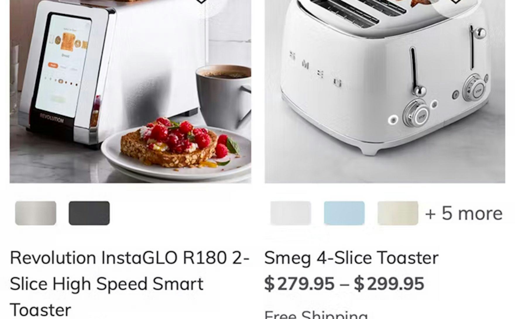
At Williams Sonoma, all color variations for toasters aren’t available in the product list — leaving users without key visual product information.
As our mobile research has shown, browsing mobile e-commerce sites can be challenging.
Thus, it’s key that any friction is reduced so that users are better able to navigate and explore products.
For visually driven product types in the product list, our mobile testing showed that having all color variations available can help users more quickly assess products.
In particular, making the color variations available via a horizontal scrolling list performed best for most participants in testing.
Yet 57% of sites don’t make all color variations available in the product list — forcing users to navigate to potentially many product details pages to find a suitable item.
This article presents the research findings from just 1 of the 650+ UX guidelines in Baymard Premium – get full access to learn how to create a “State of the Art” e-commerce user experience.
If you want to know how your desktop site, mobile site, or app performs and compares, then learn more about getting Baymard to conduct a UX Audit of your site or app.