GAP’s E-Commerce UX
This is a case study of GAP’s e-commerce user experience (UX) performance. It’s based on an exhaustive performance review of 692 design elements. 243 other sites have also been benchmarked for a complete picture of the e-commerce UX landscape.
GAP’s overall e-commerce UX performance is mediocre. Their UX is especially thwarted by usability issues related to performances.
First benchmarked in April 2012, and reviewed 26 times since then, most recently in April 2023.
Overall UX Performance
881 Guidelines · Performance:
Desktop Web
264 Guidelines · Performance:
Mobile Web
268 Guidelines · Performance:
Mobile App
349 Guidelines · Performance:
To learn how we calculate our performance scores and read up on our evaluation criteria and scoring algorithm head over to our Methodology page.
The scatterplot you see above is the free version we make public to all our users. If you wish to dive deeper and learn about each guideline and even review your own site you’ll need to get premium access.
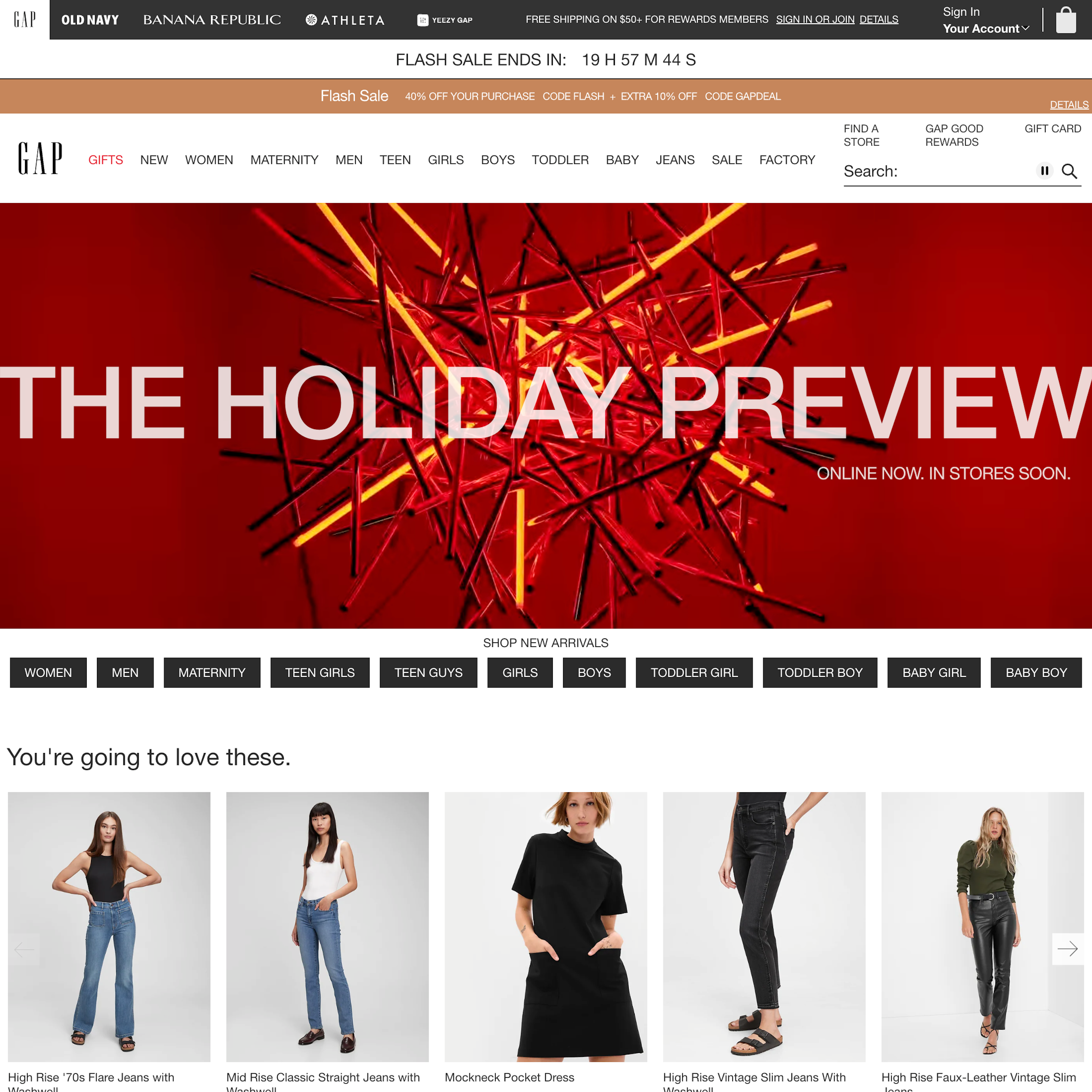
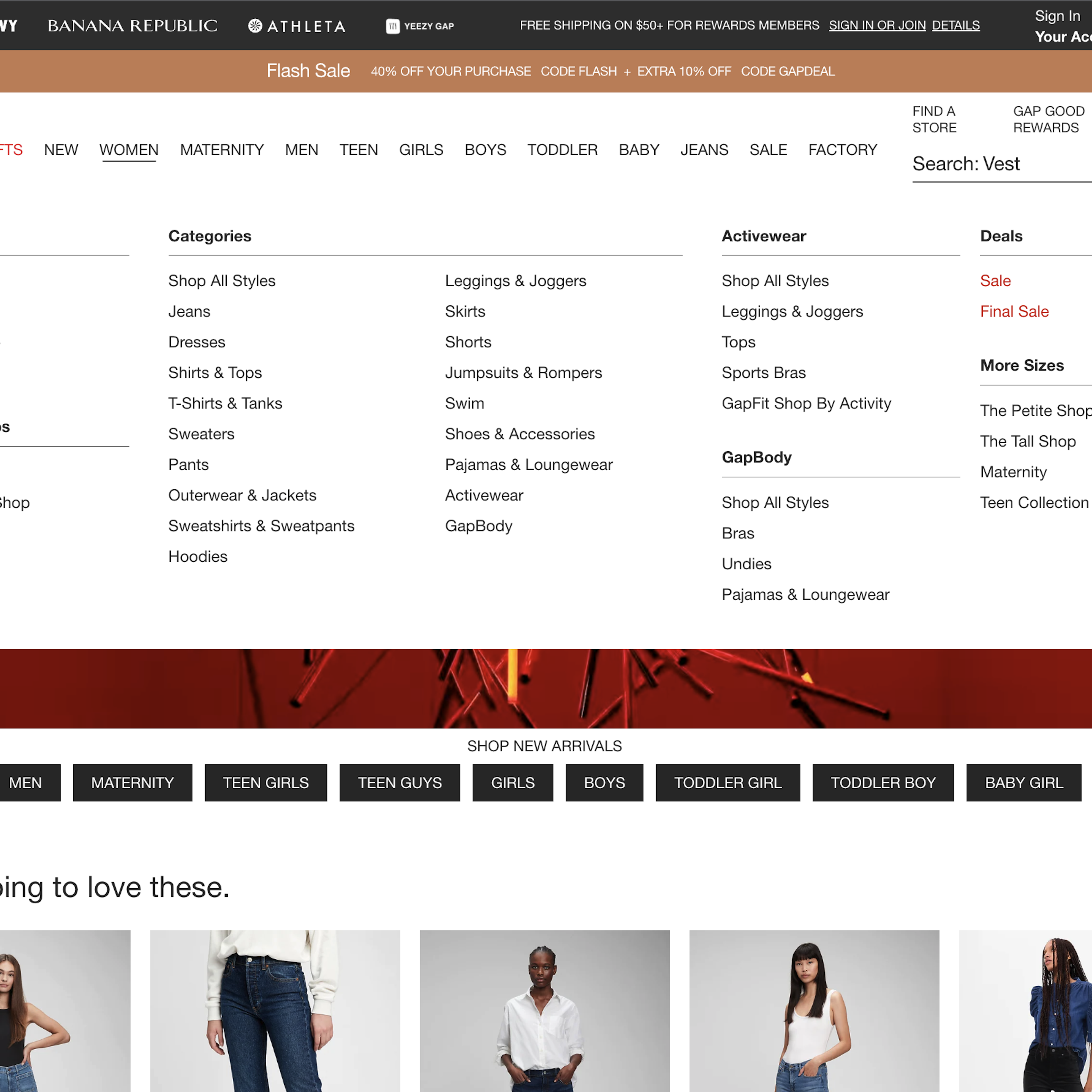
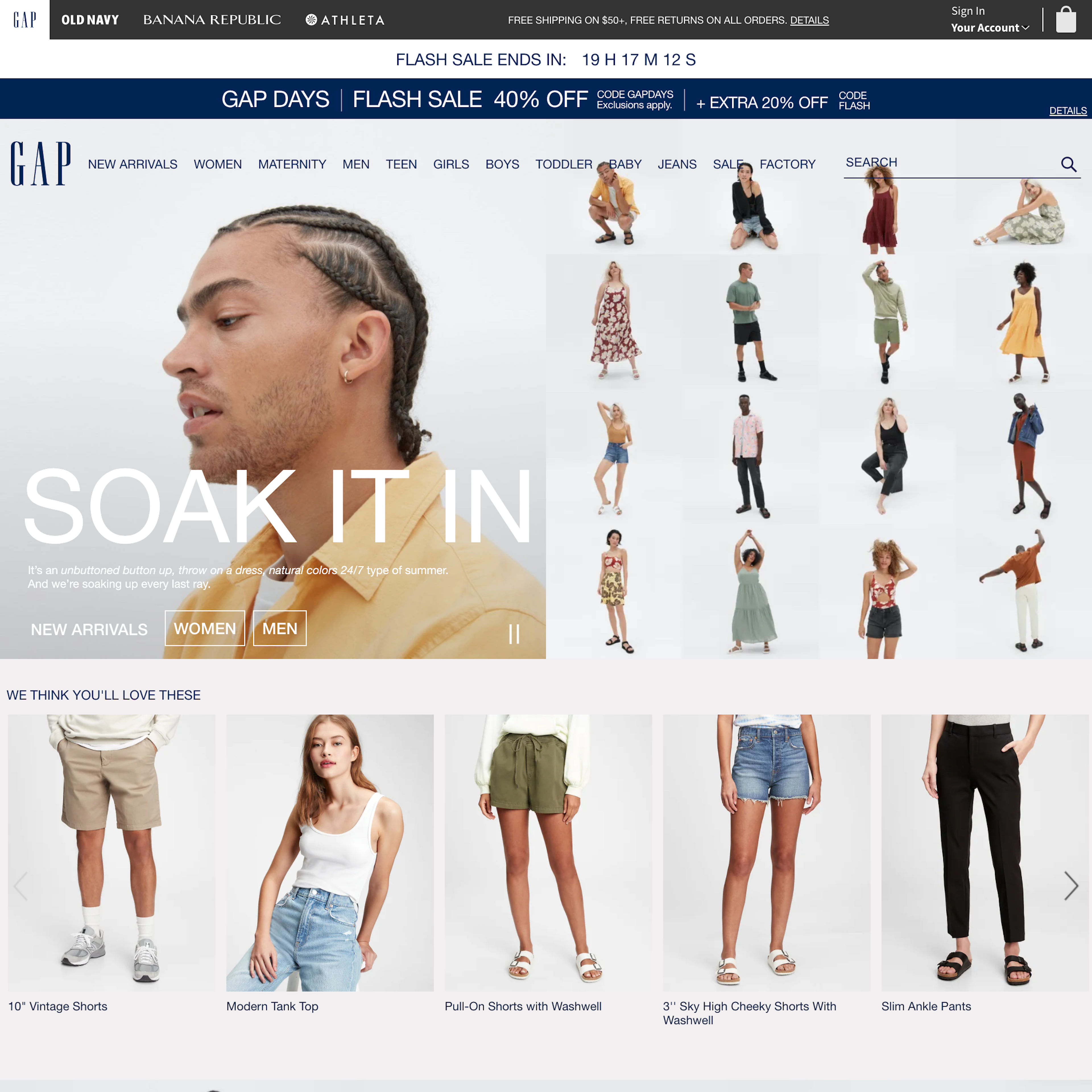
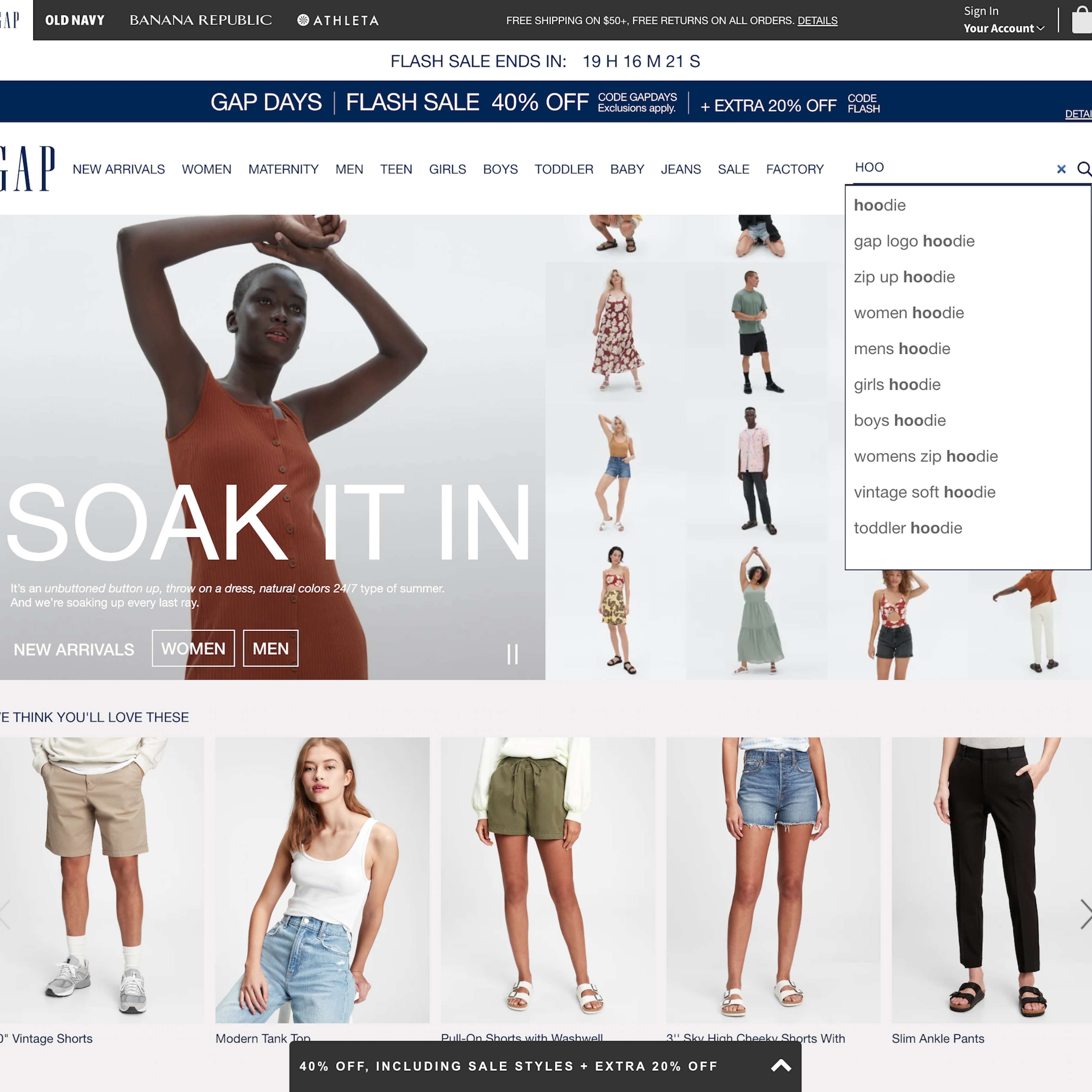
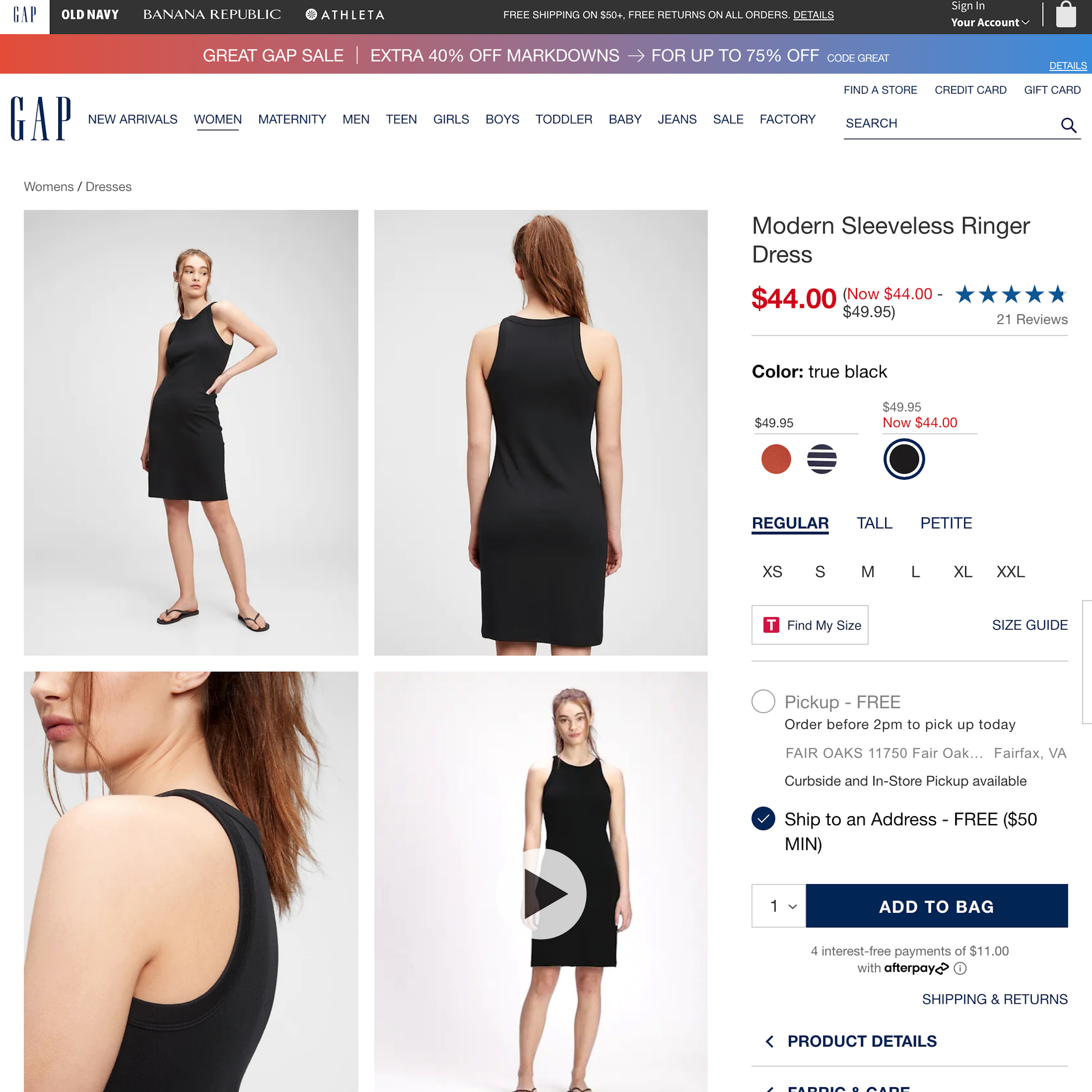
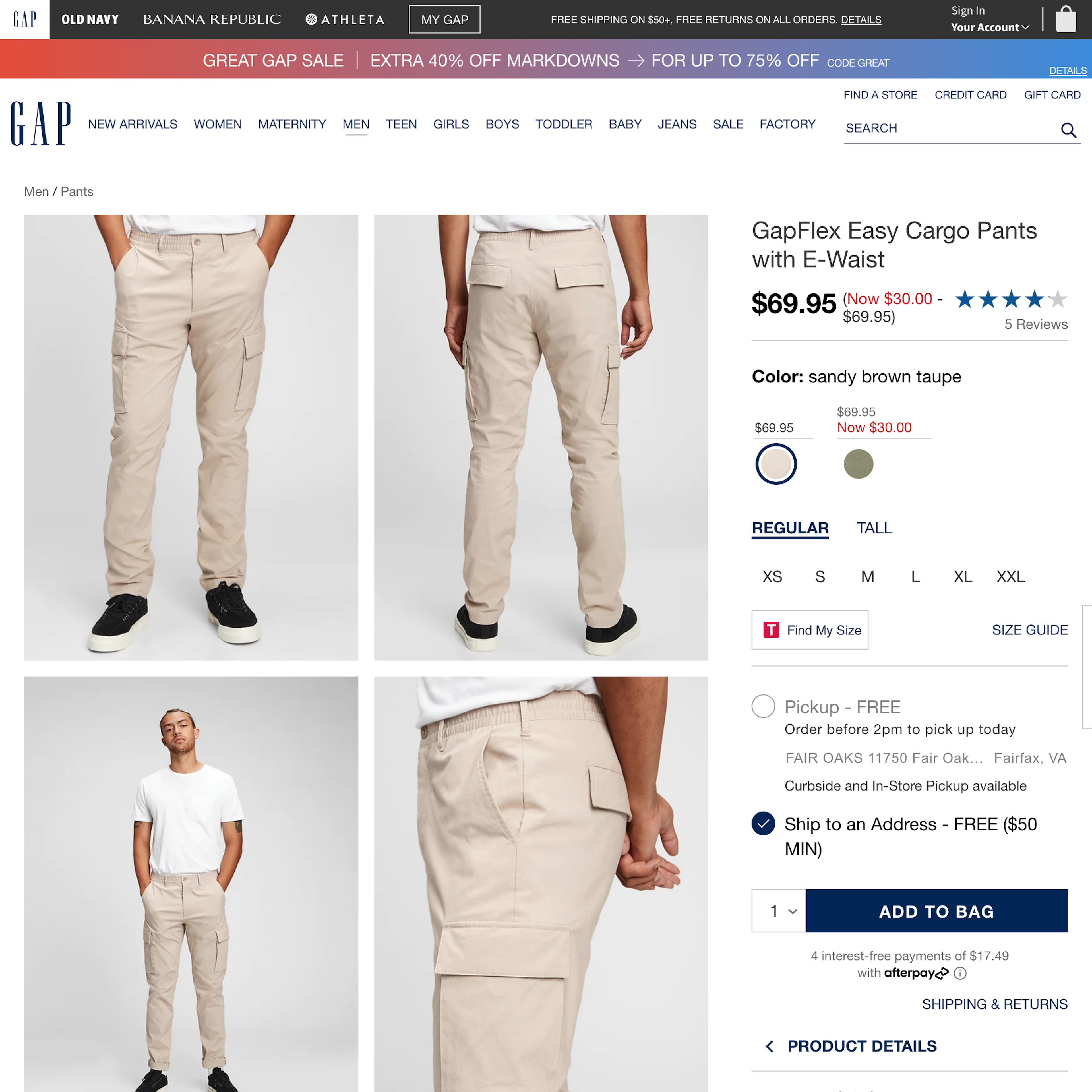
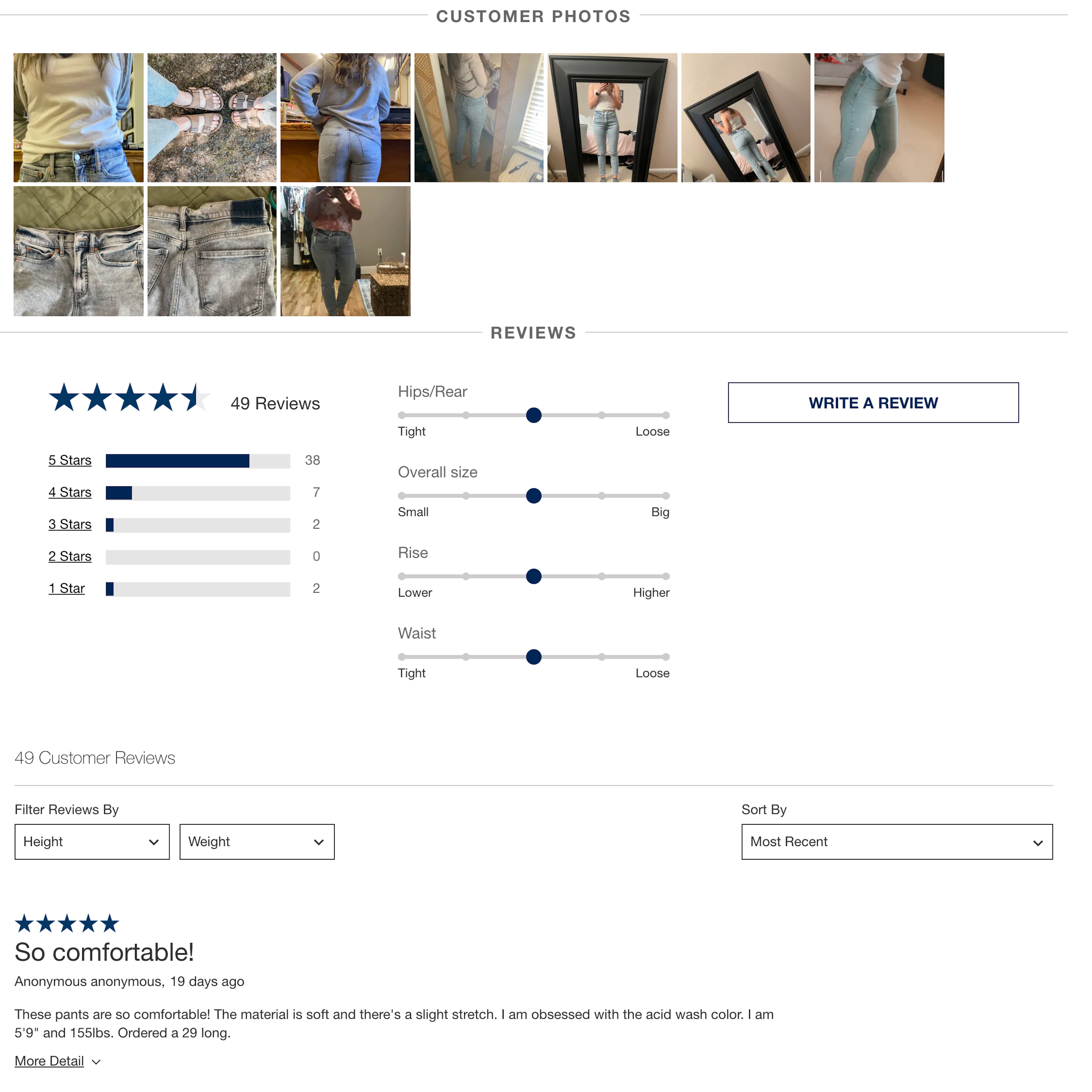
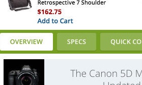
GAP’s Desktop Web E-Commerce Design
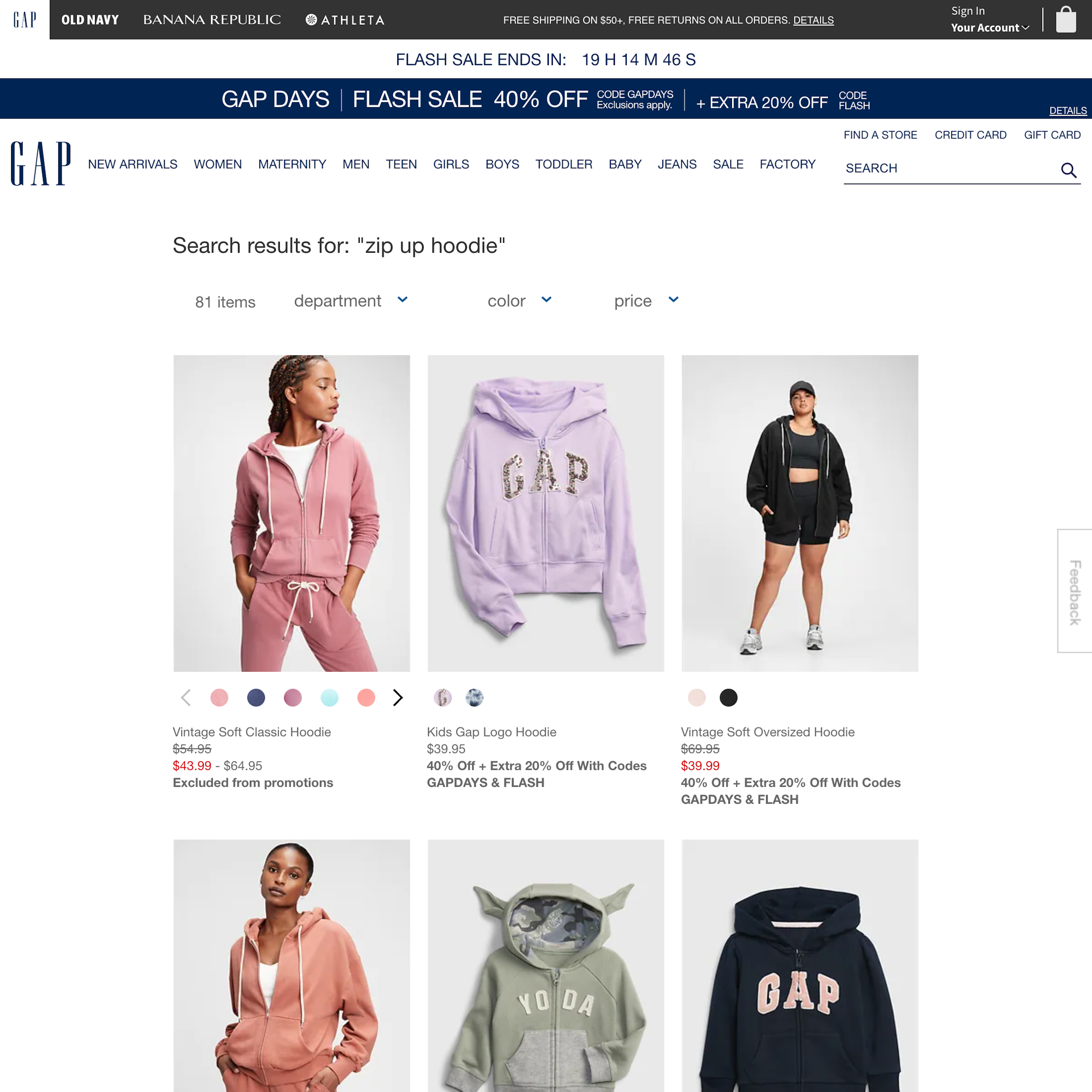
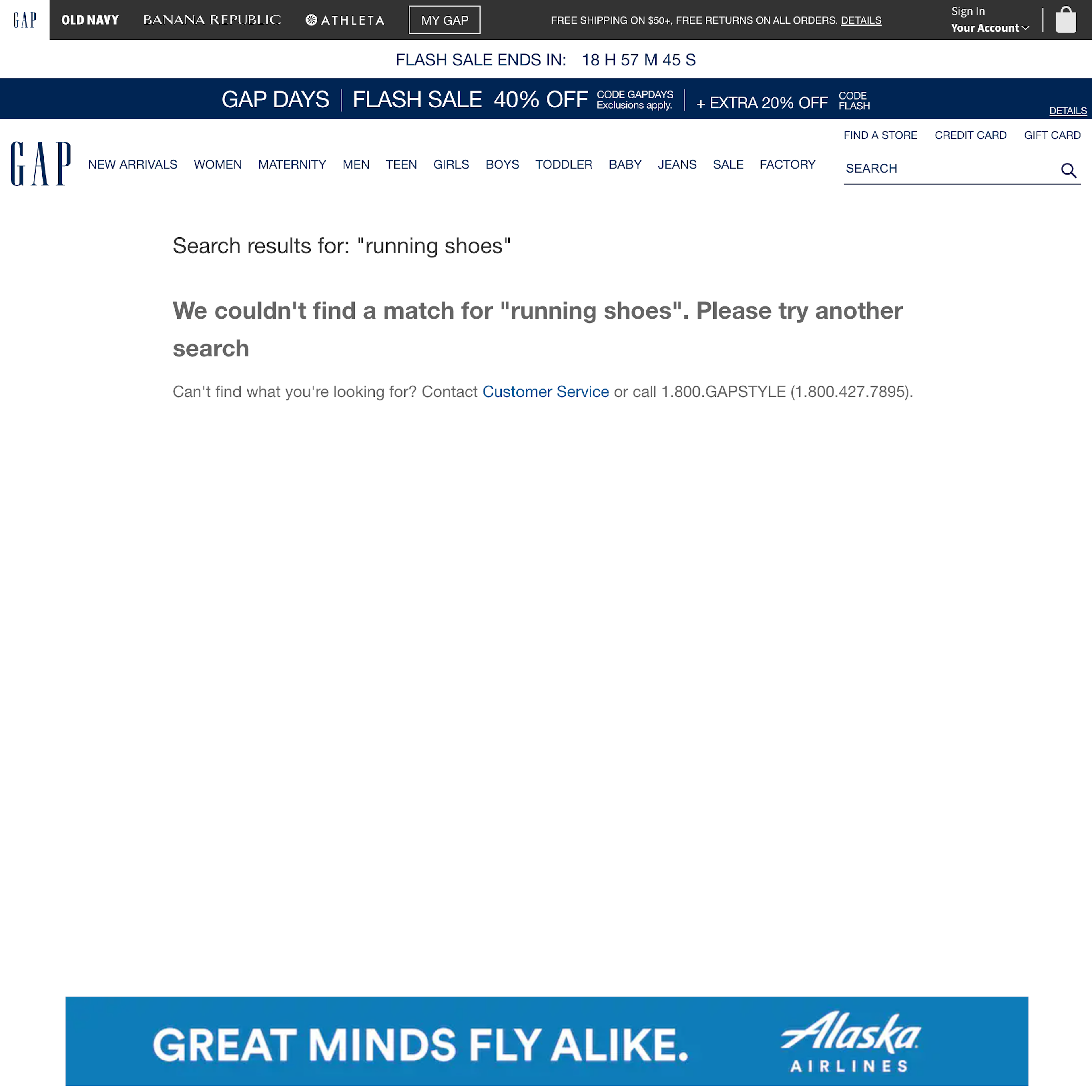
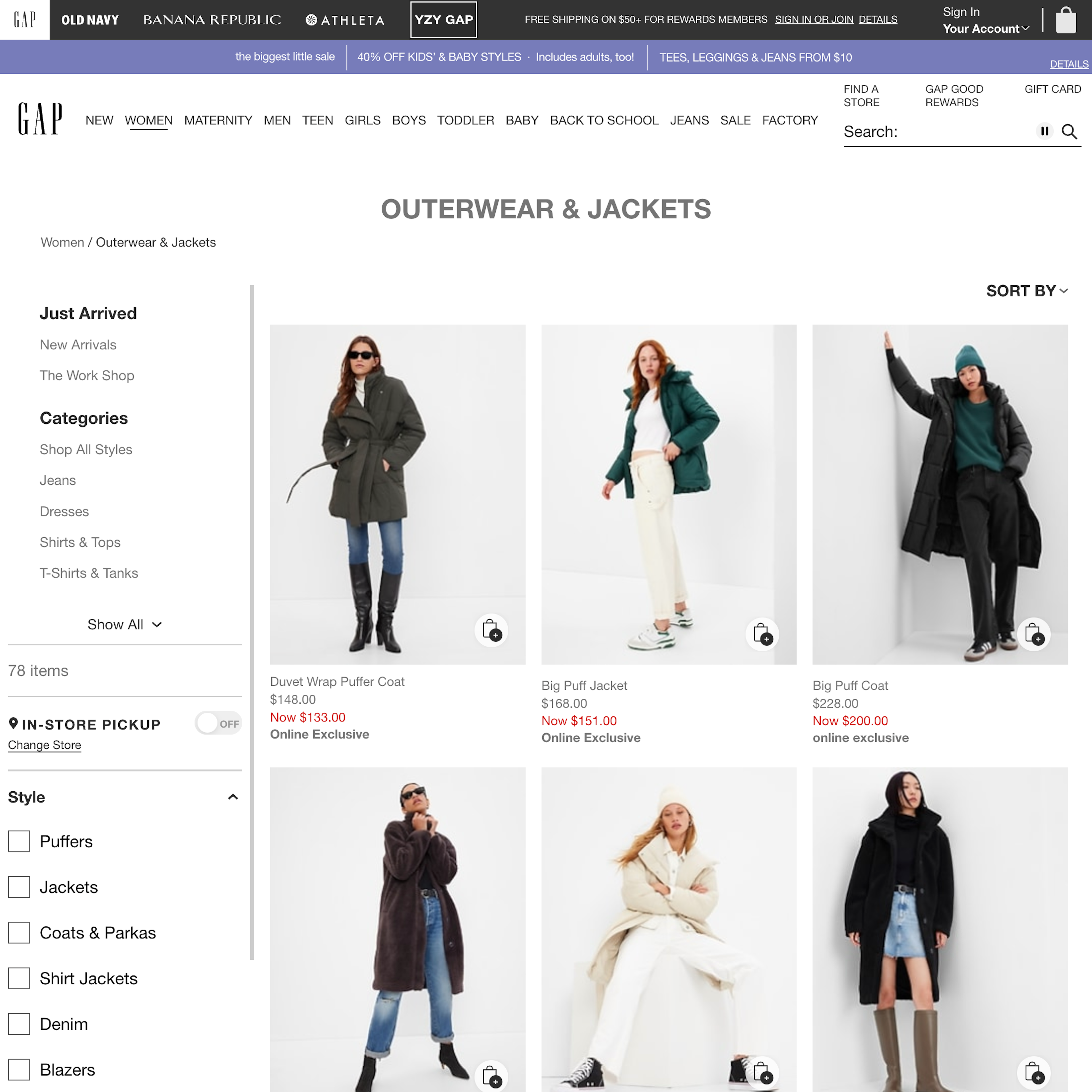
29 pages of GAP’s e-commerce site, marked up with 327 best practice examples:

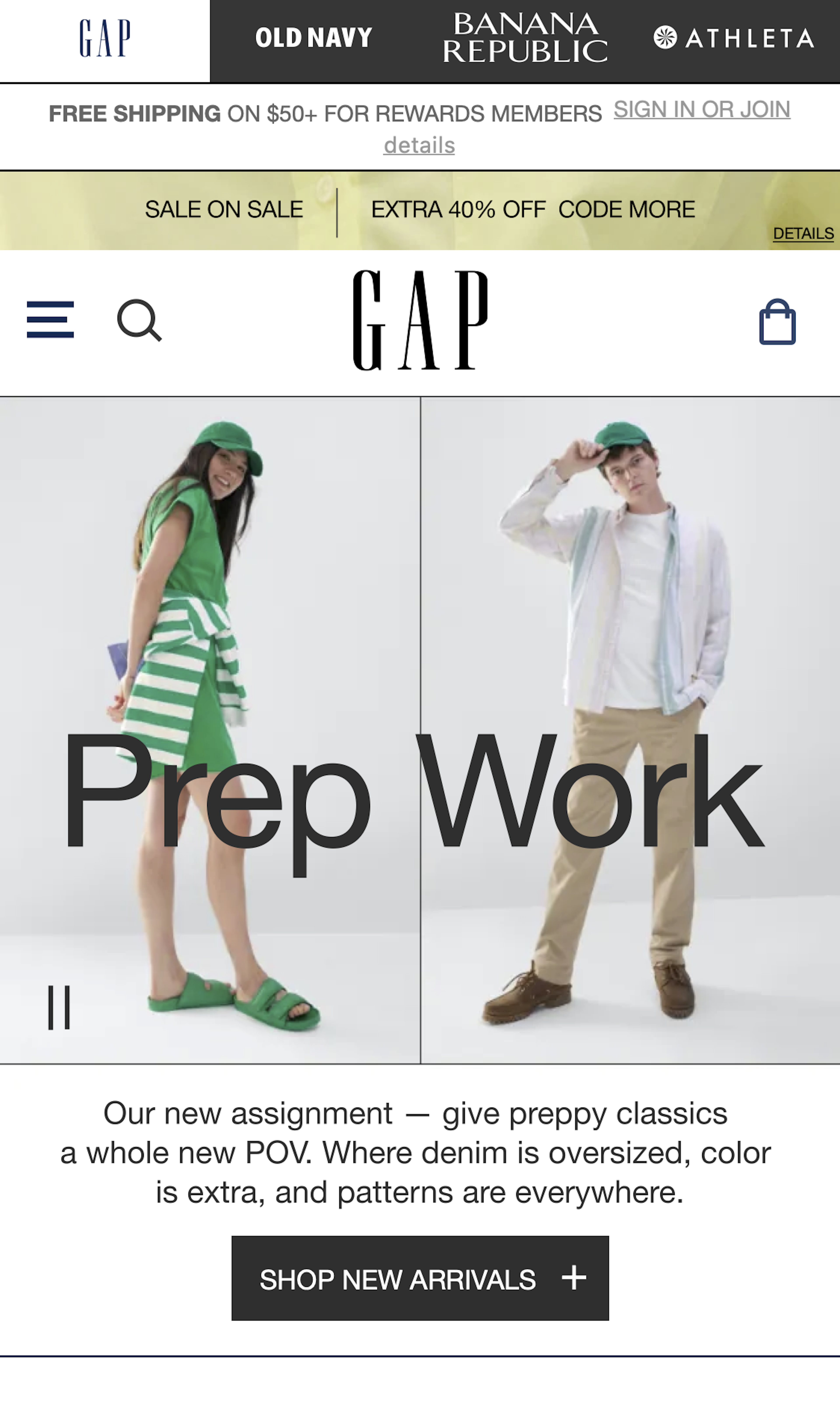
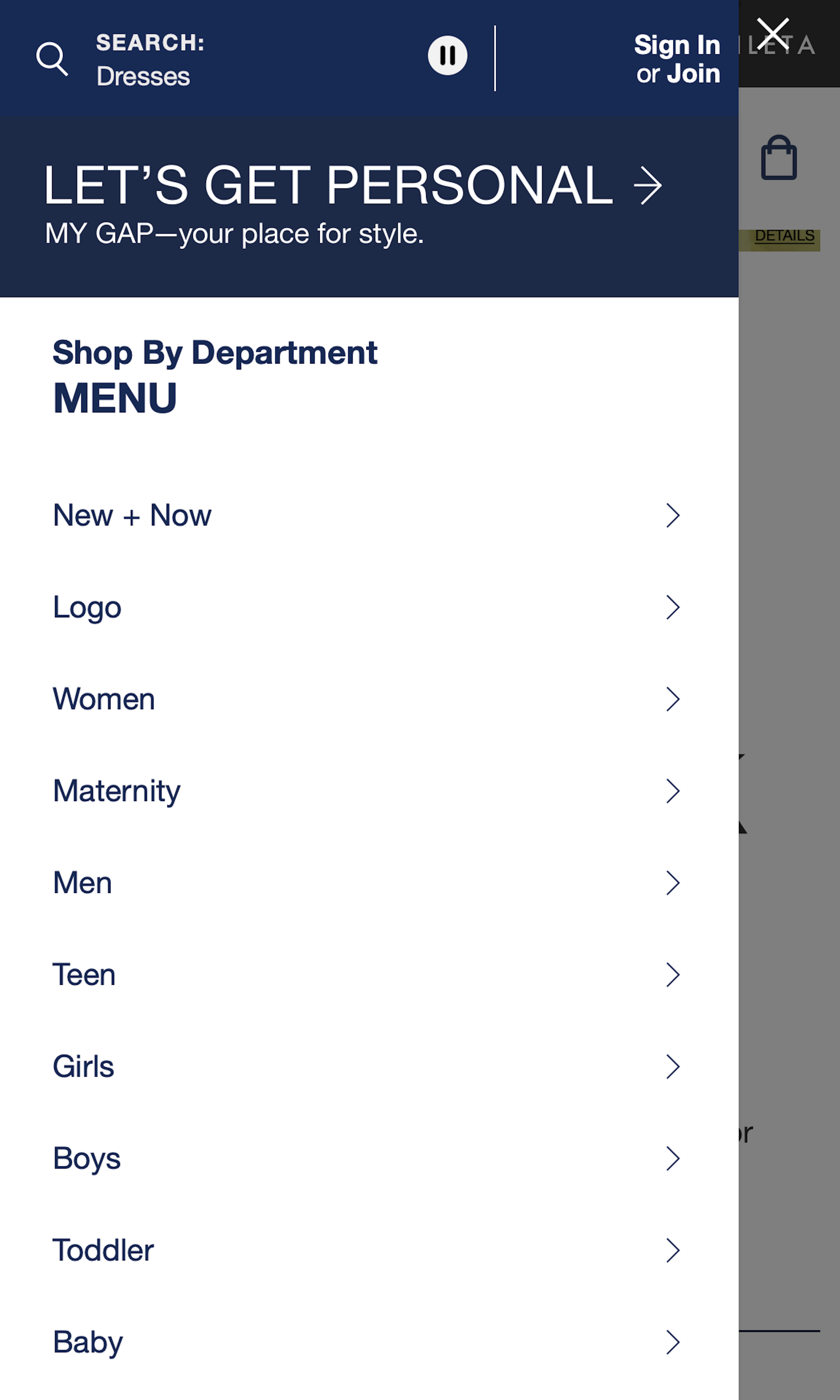
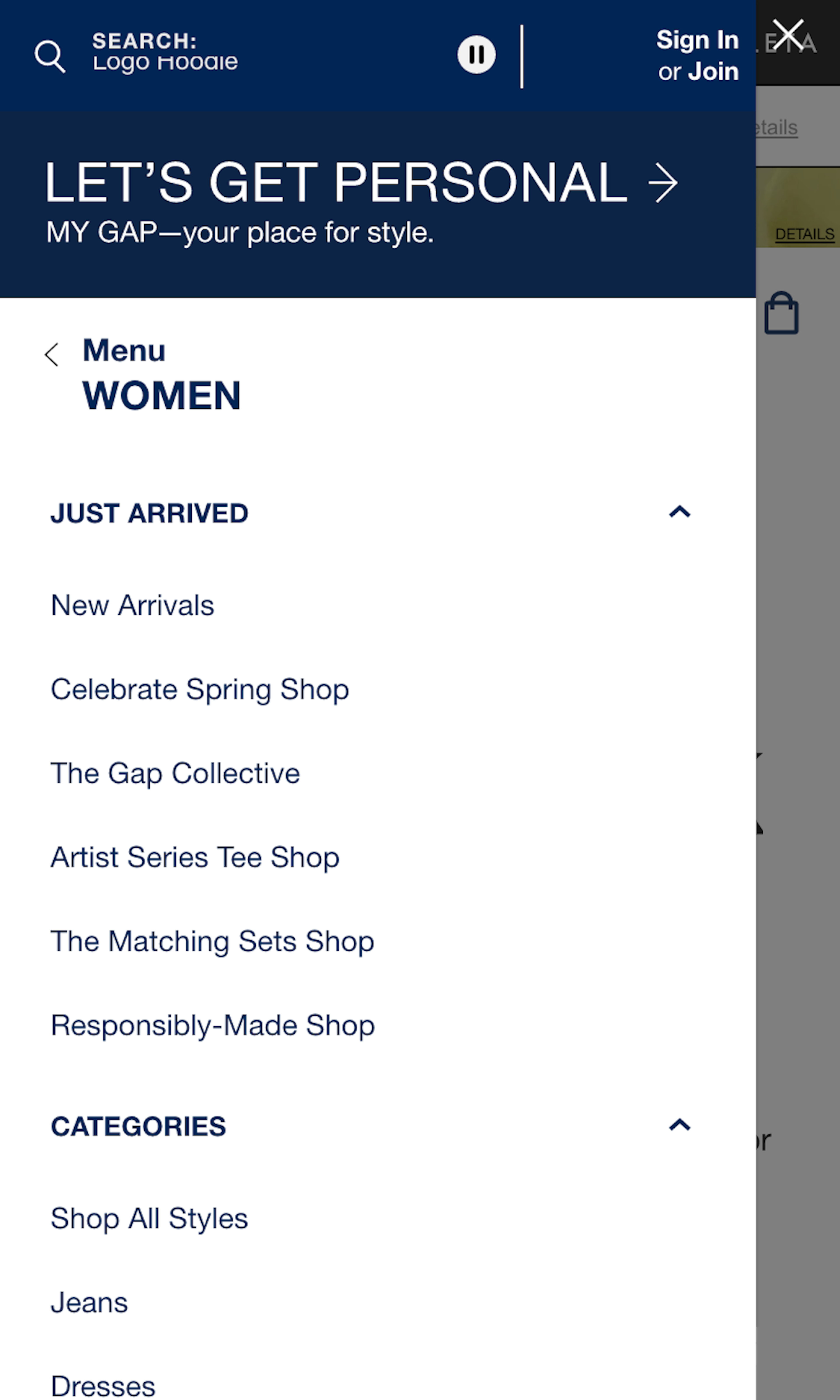
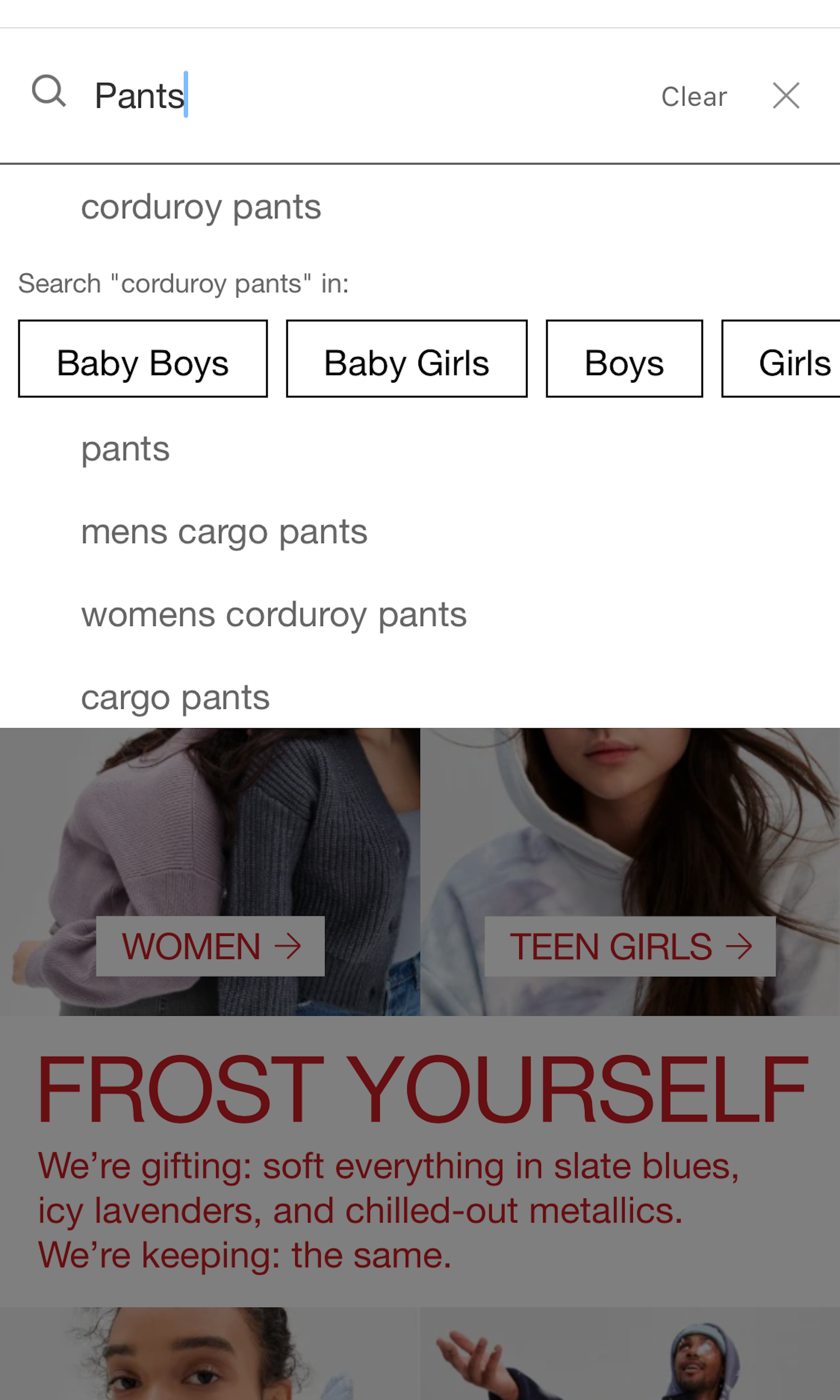
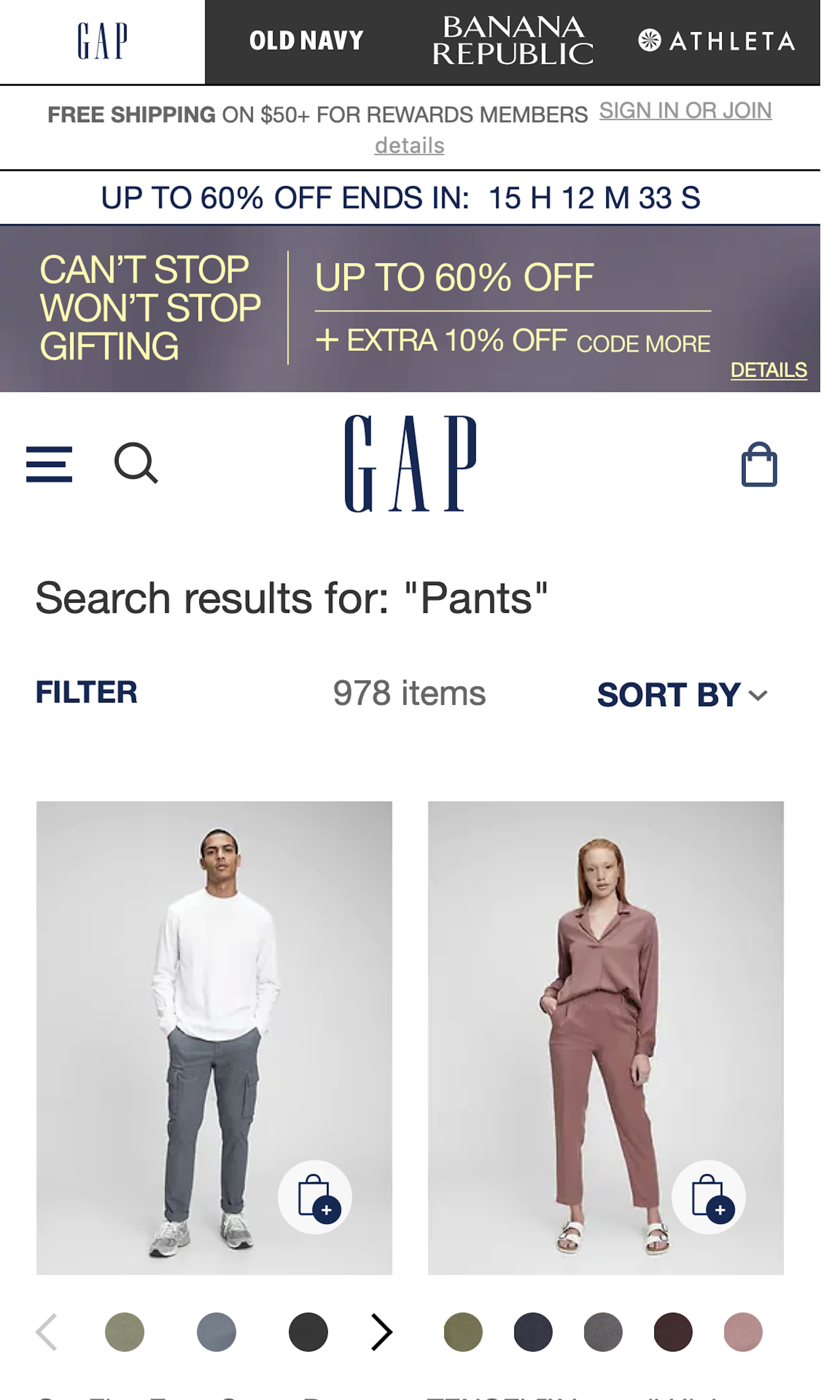
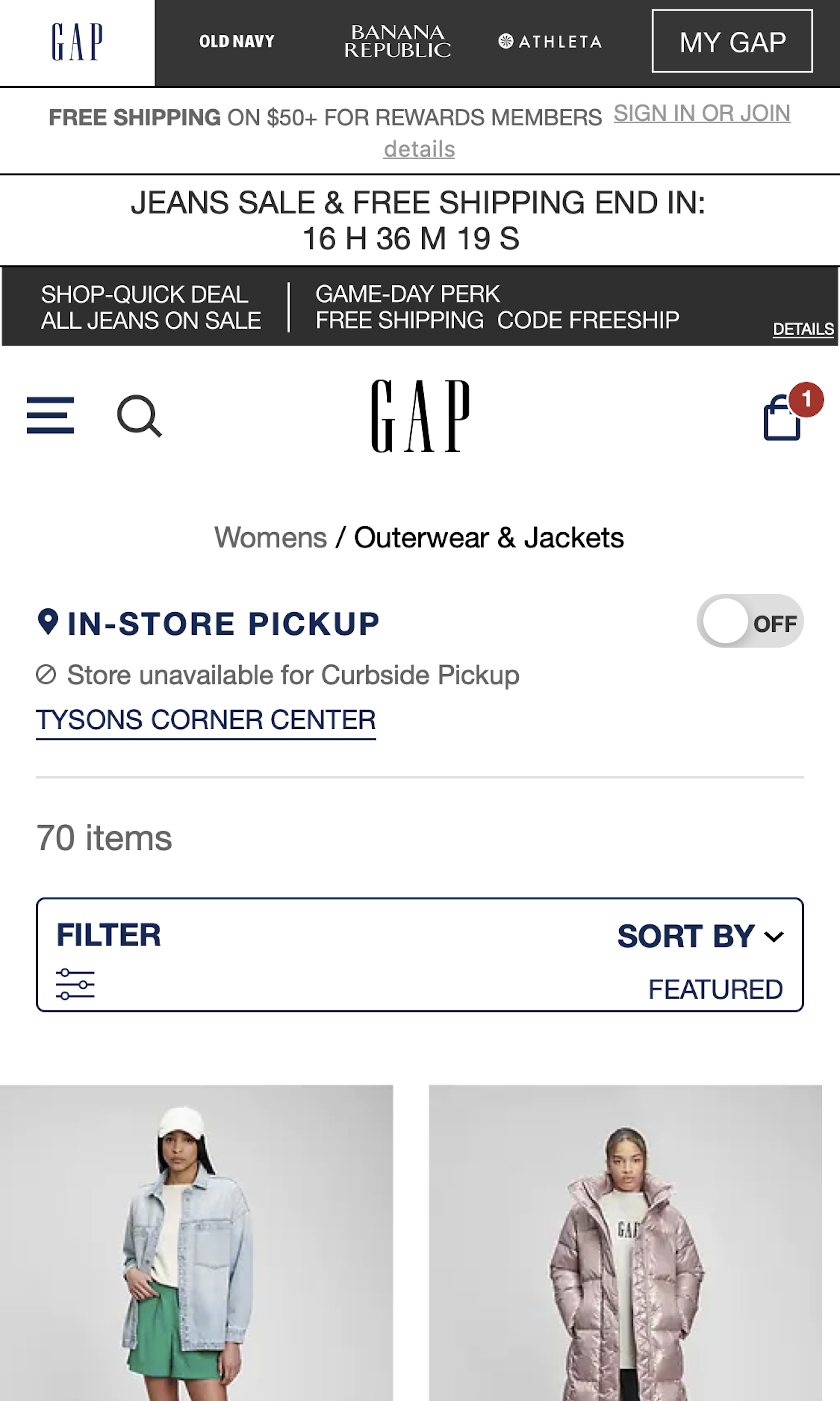
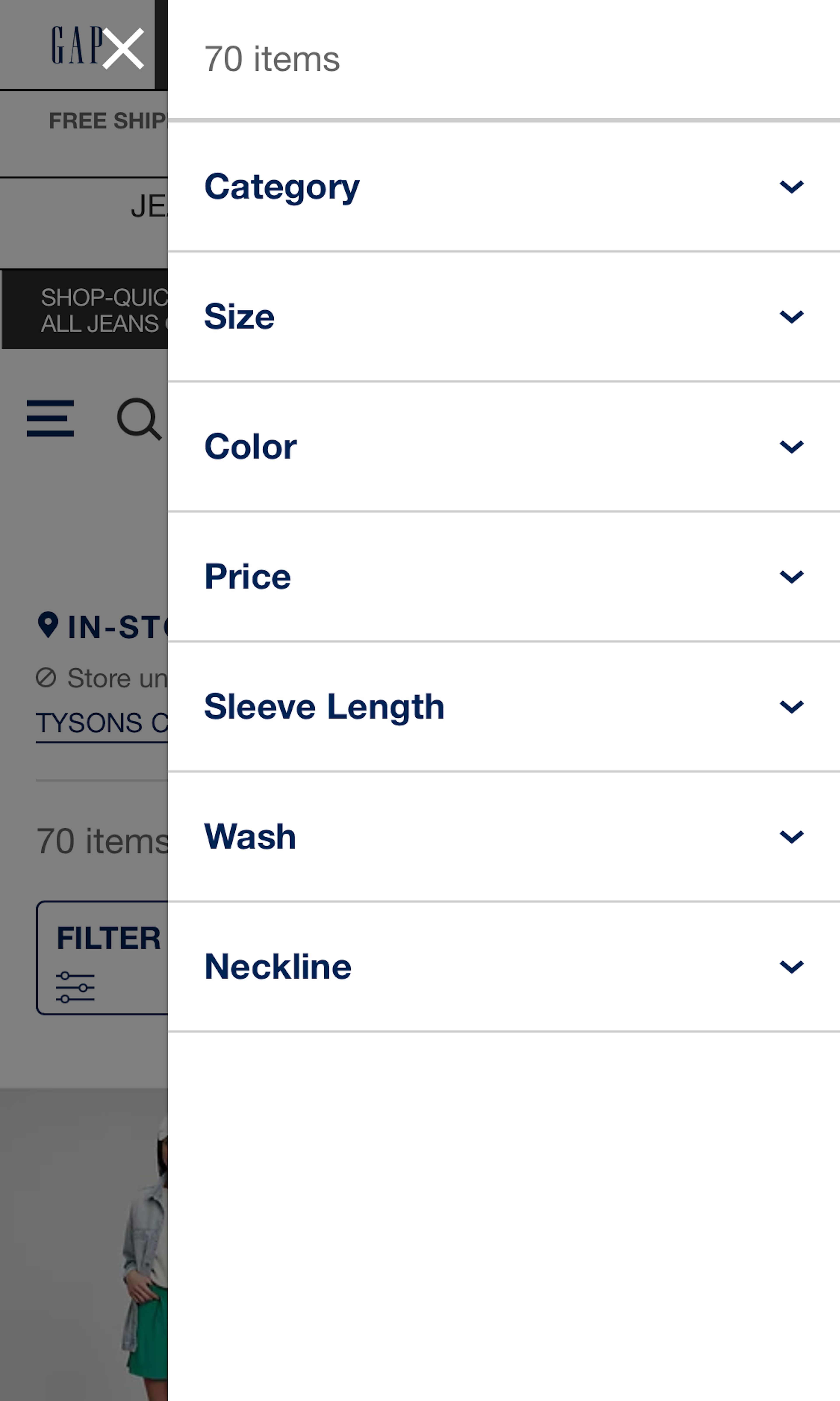
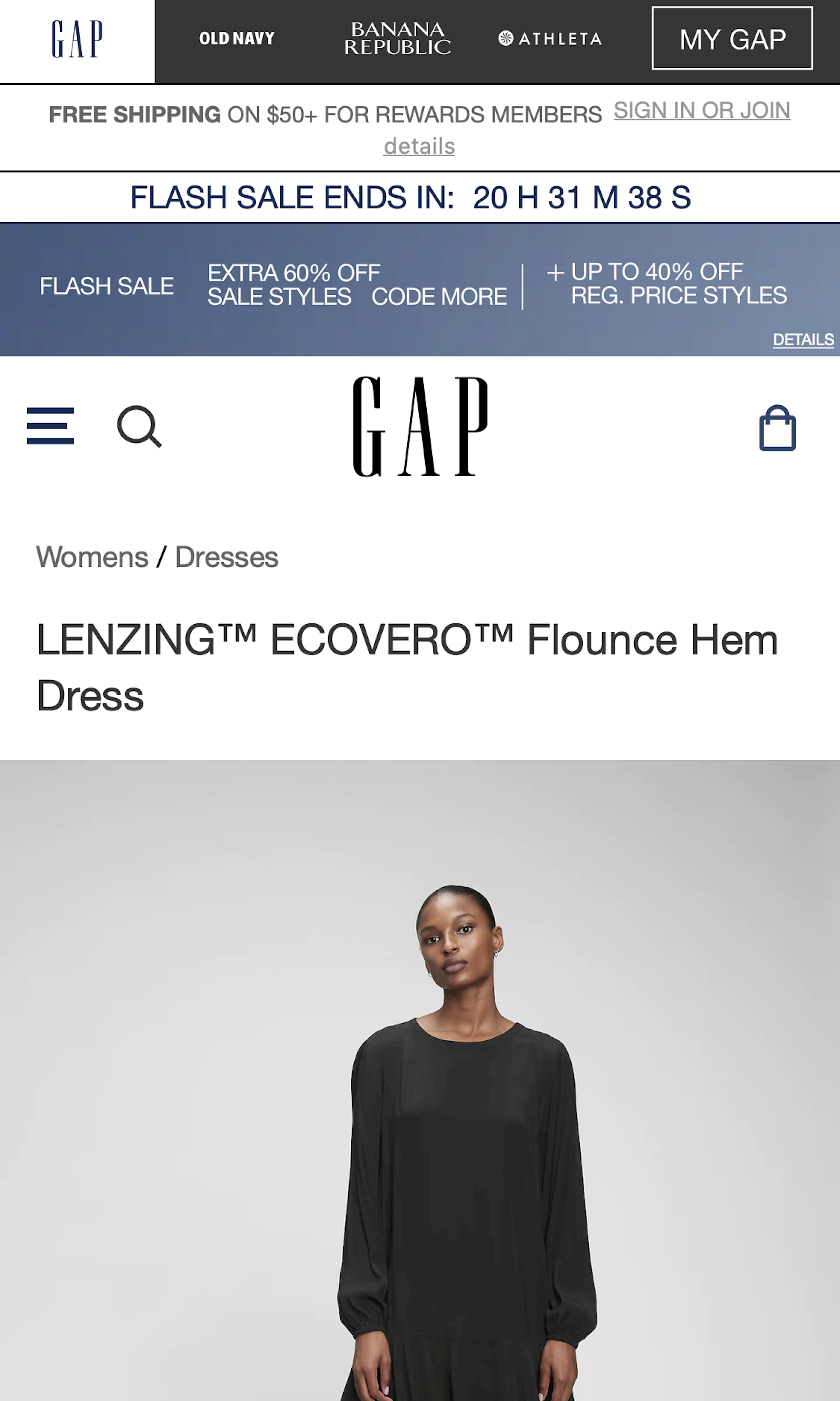
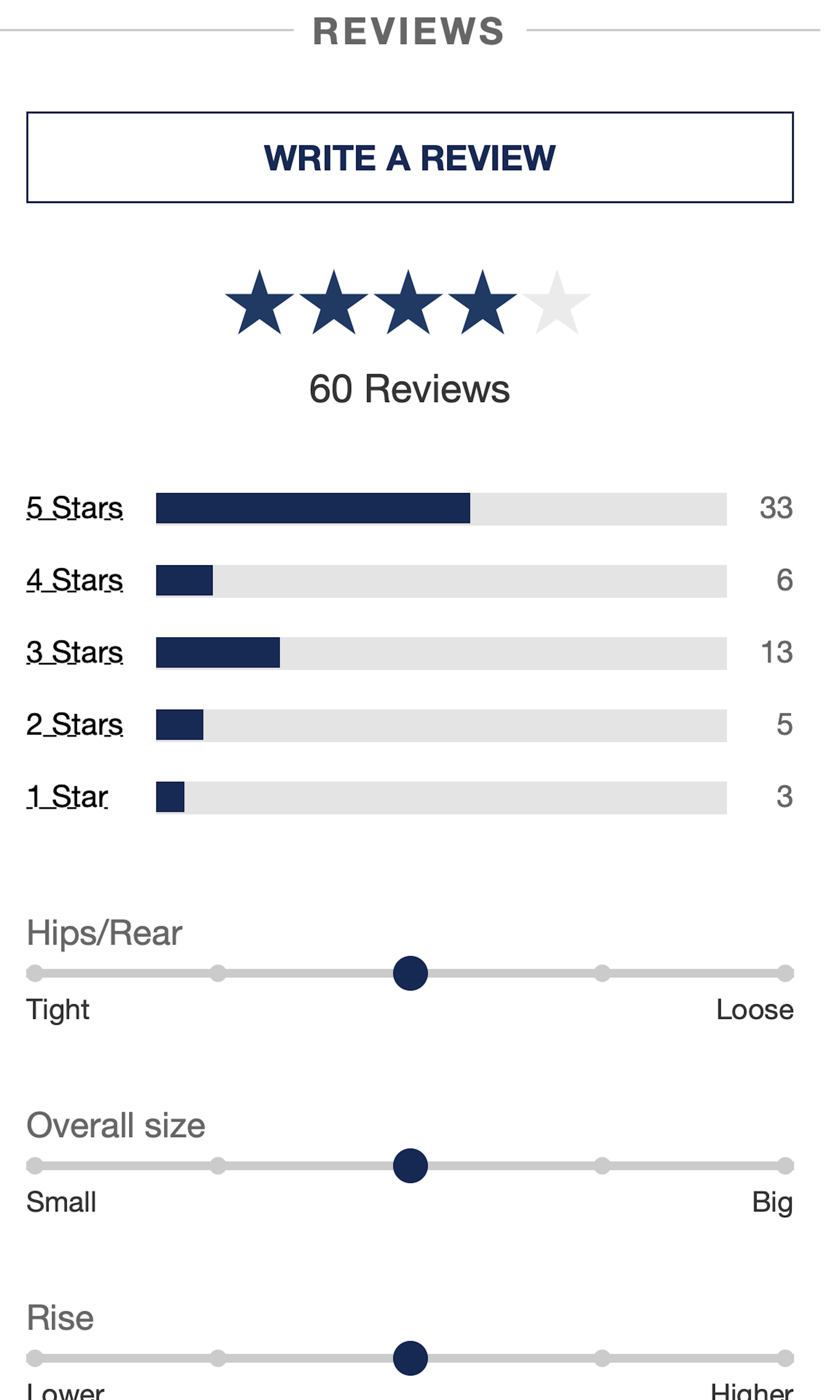
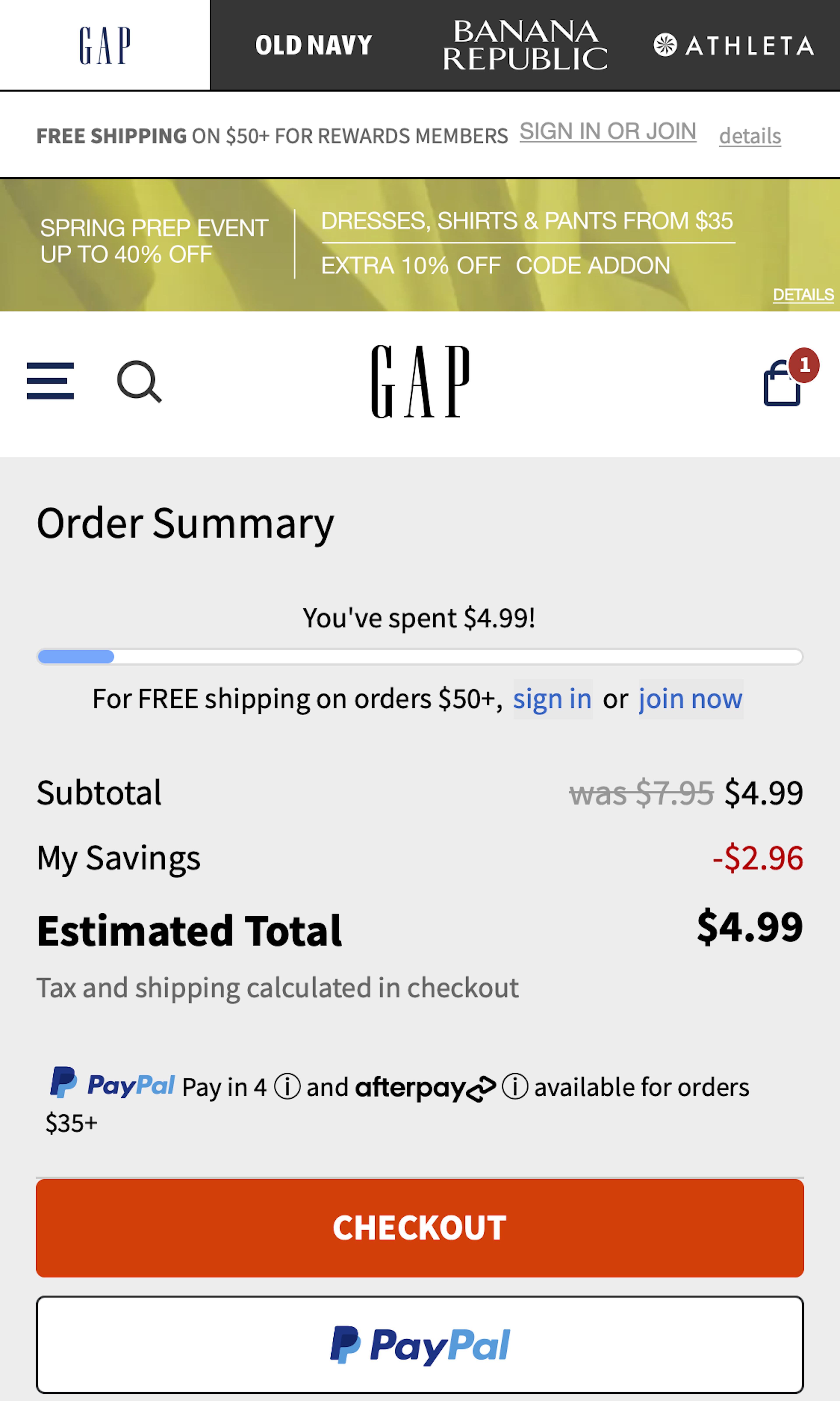
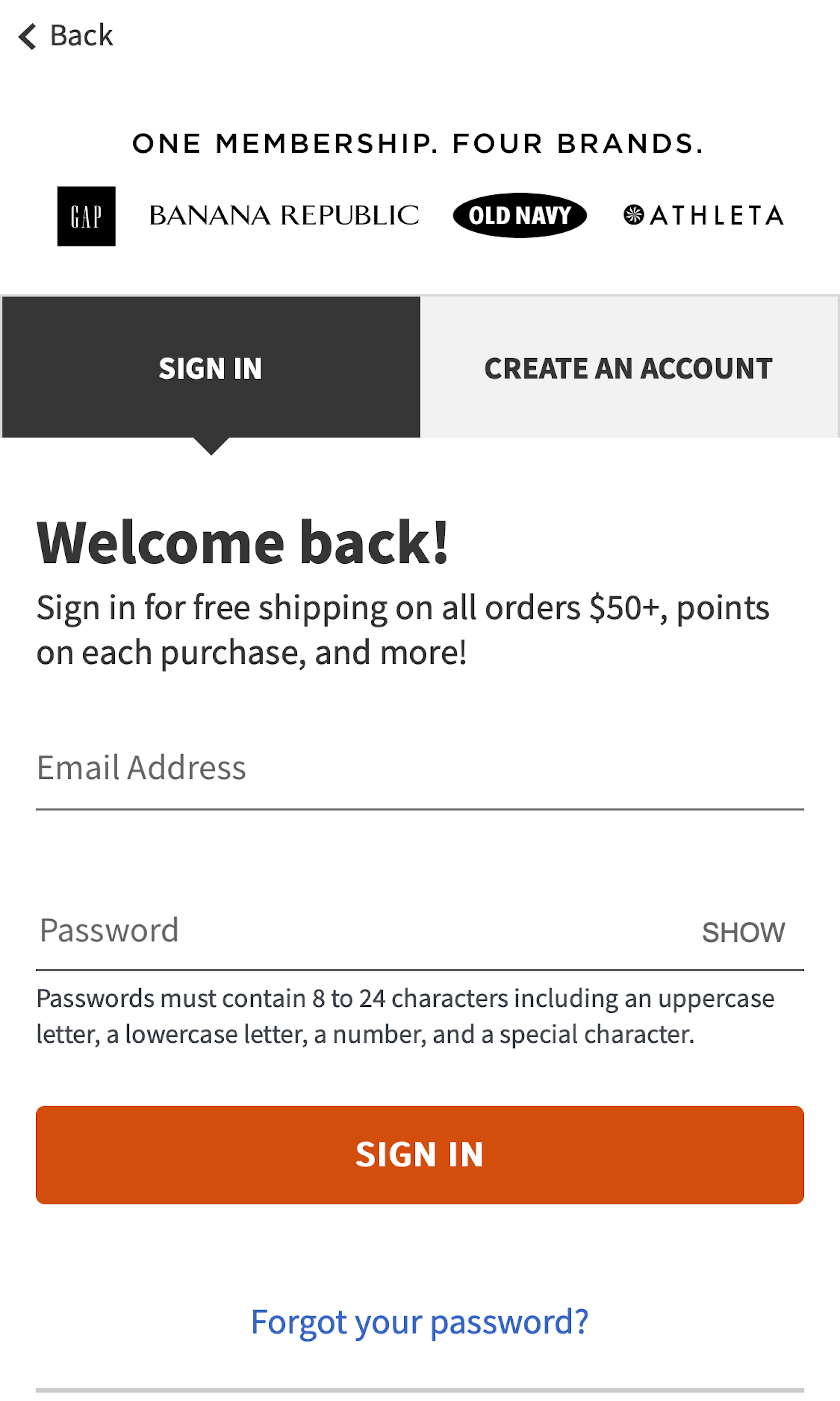
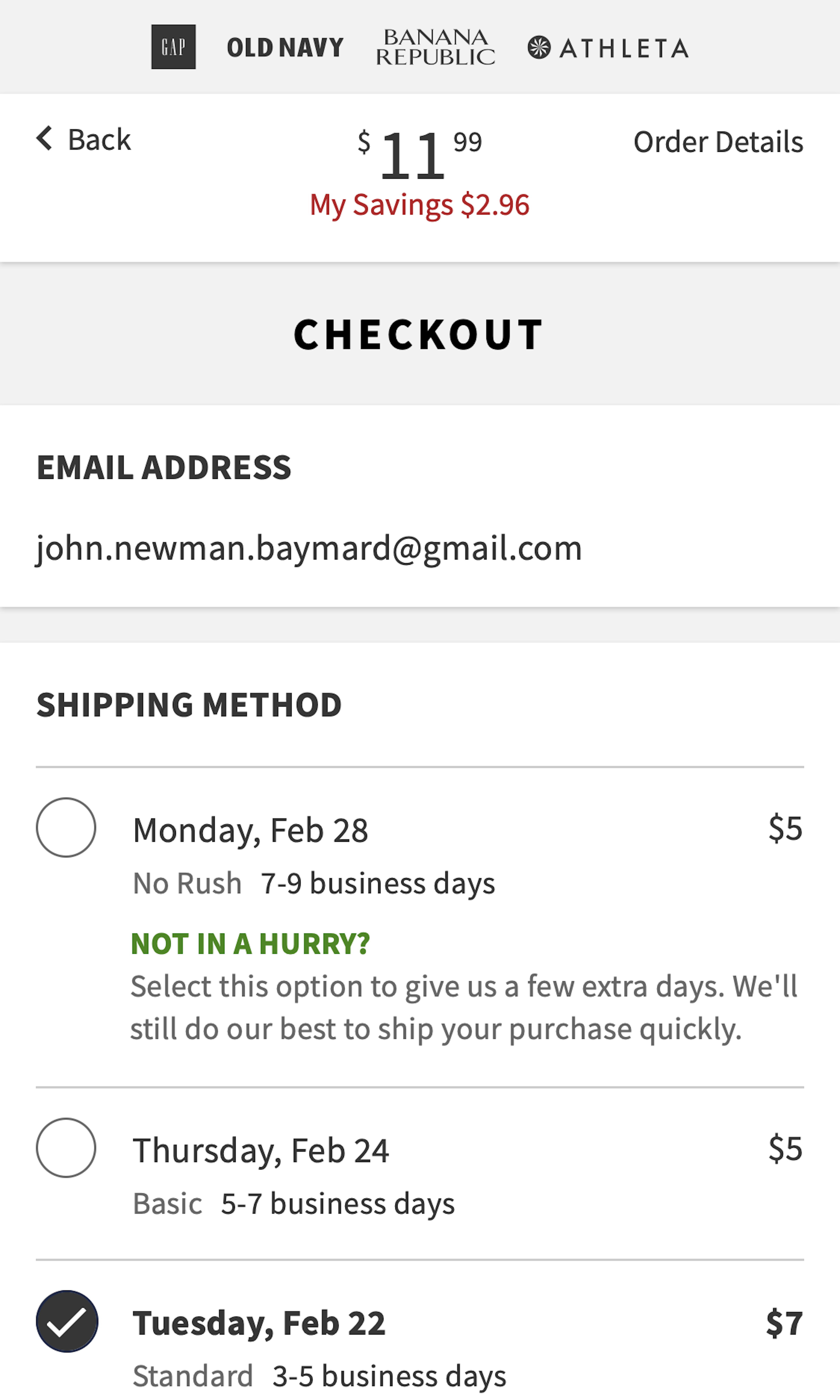
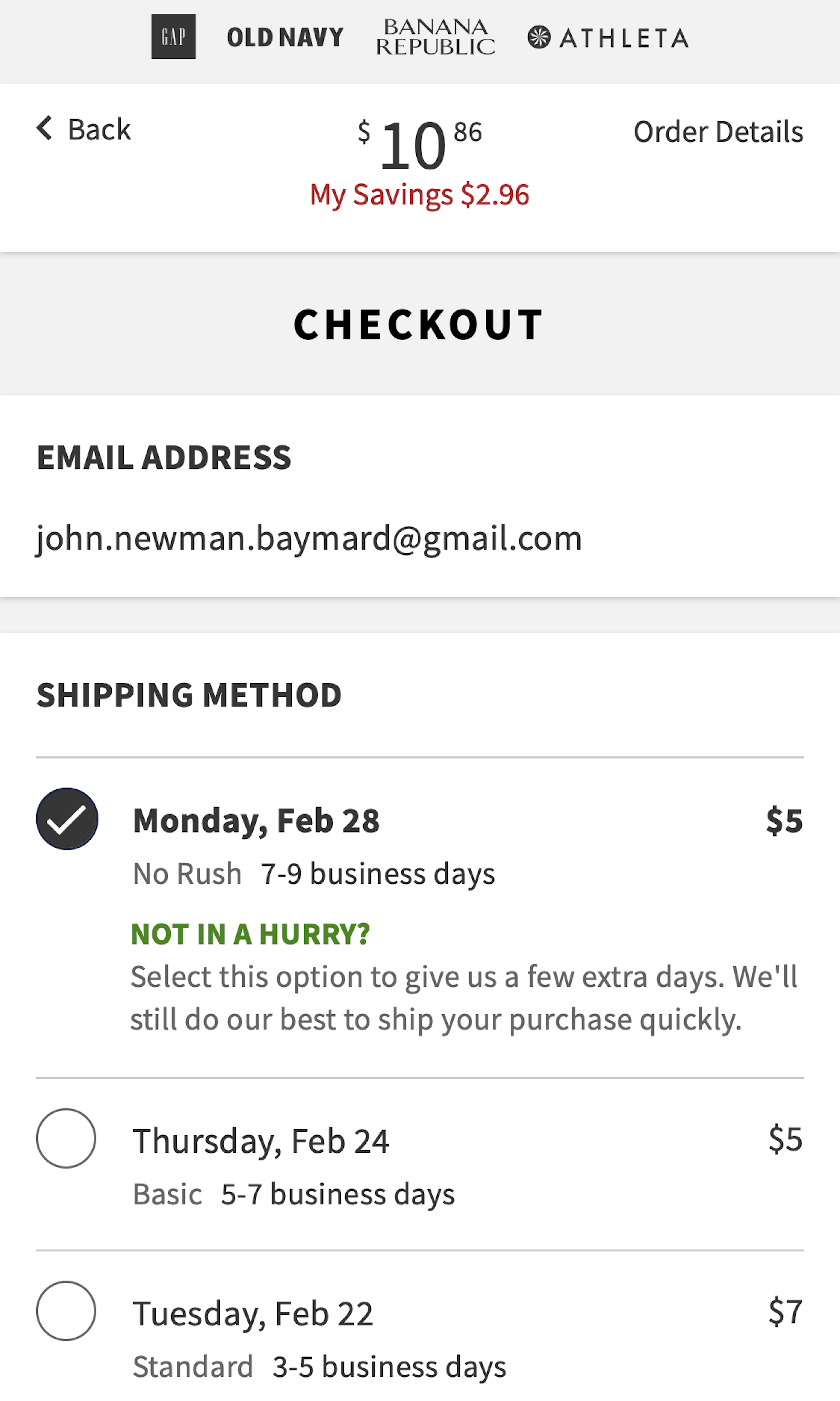
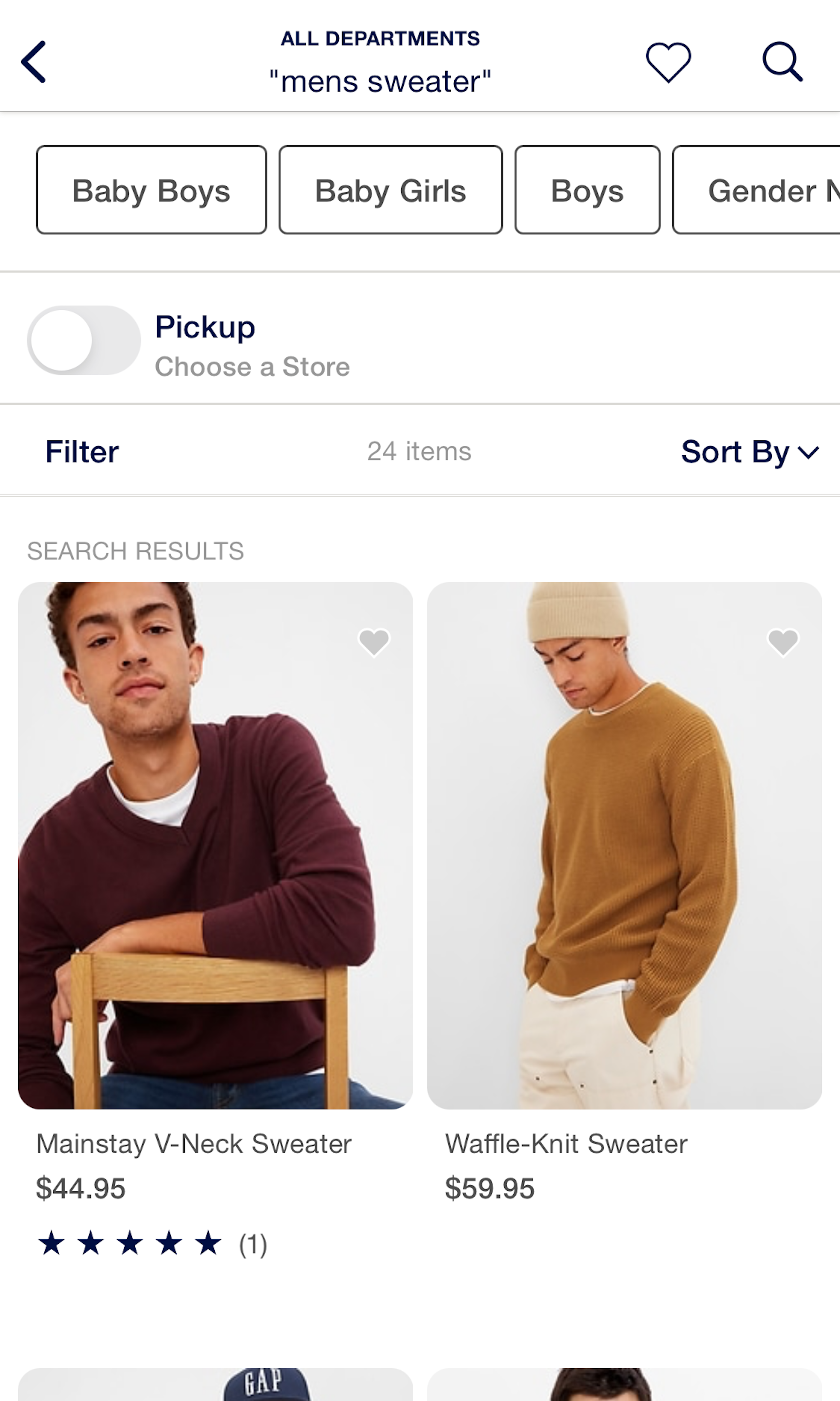
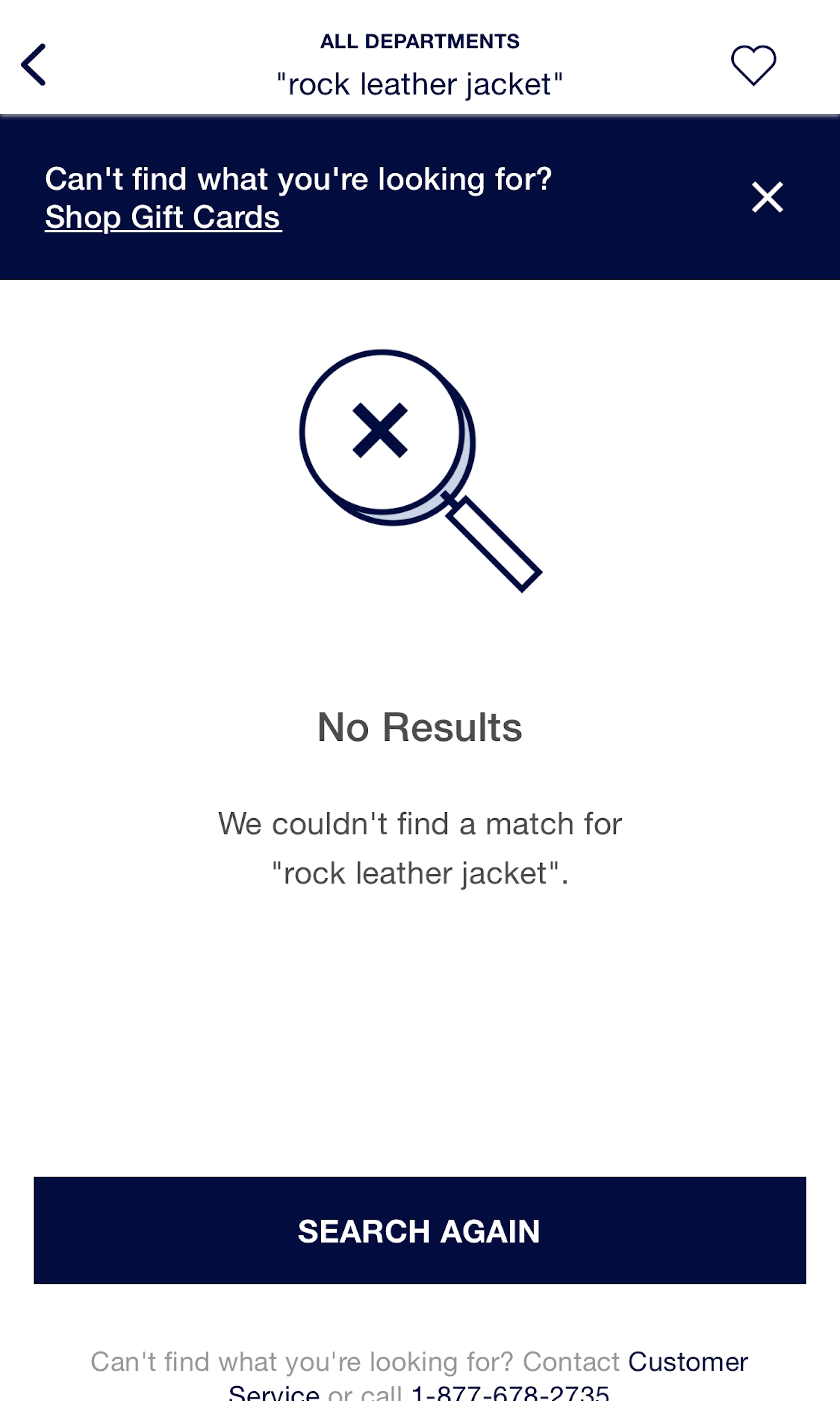
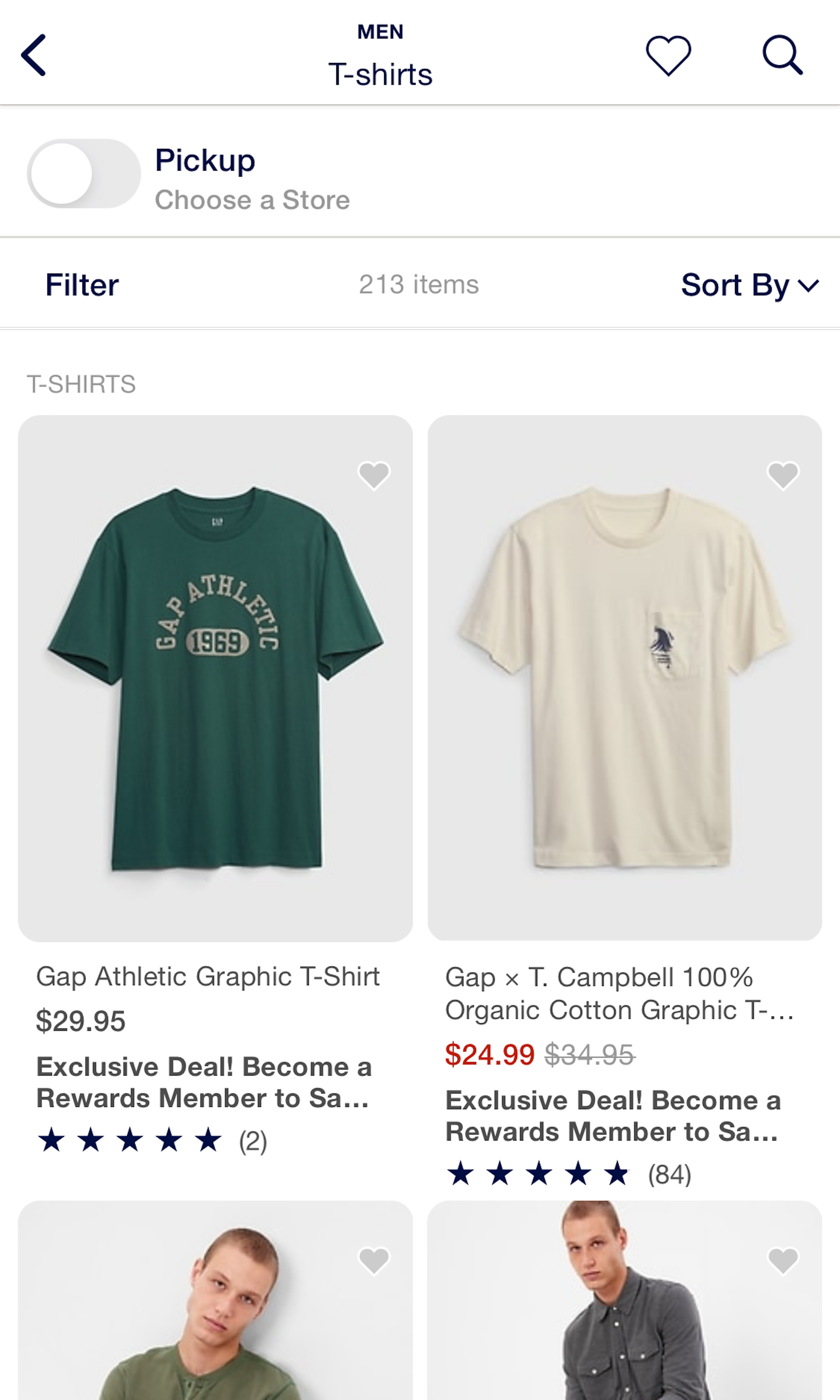
GAP’s Mobile Web E-Commerce Design
20 pages of GAP’s e-commerce site, marked up with 268 best practice examples:

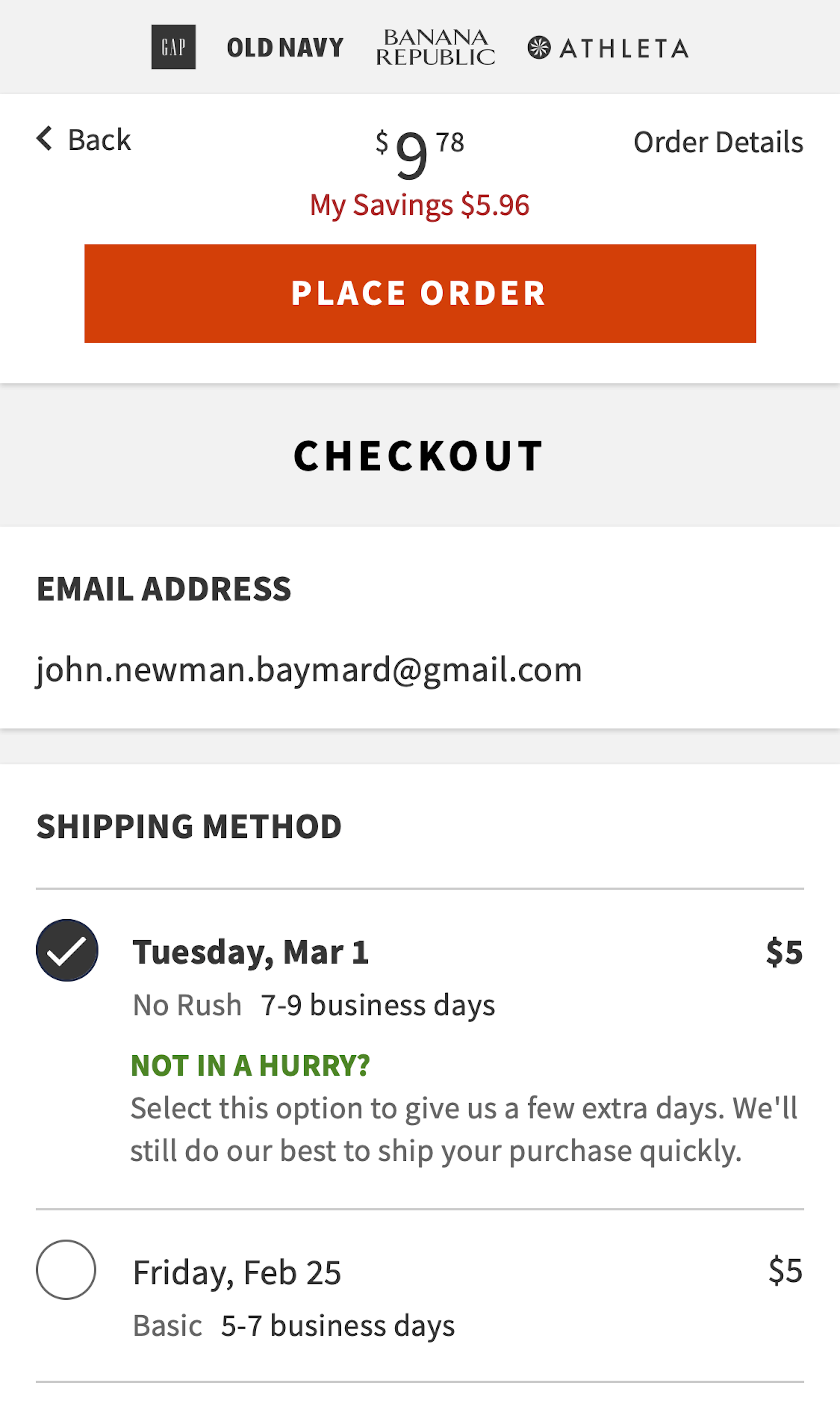
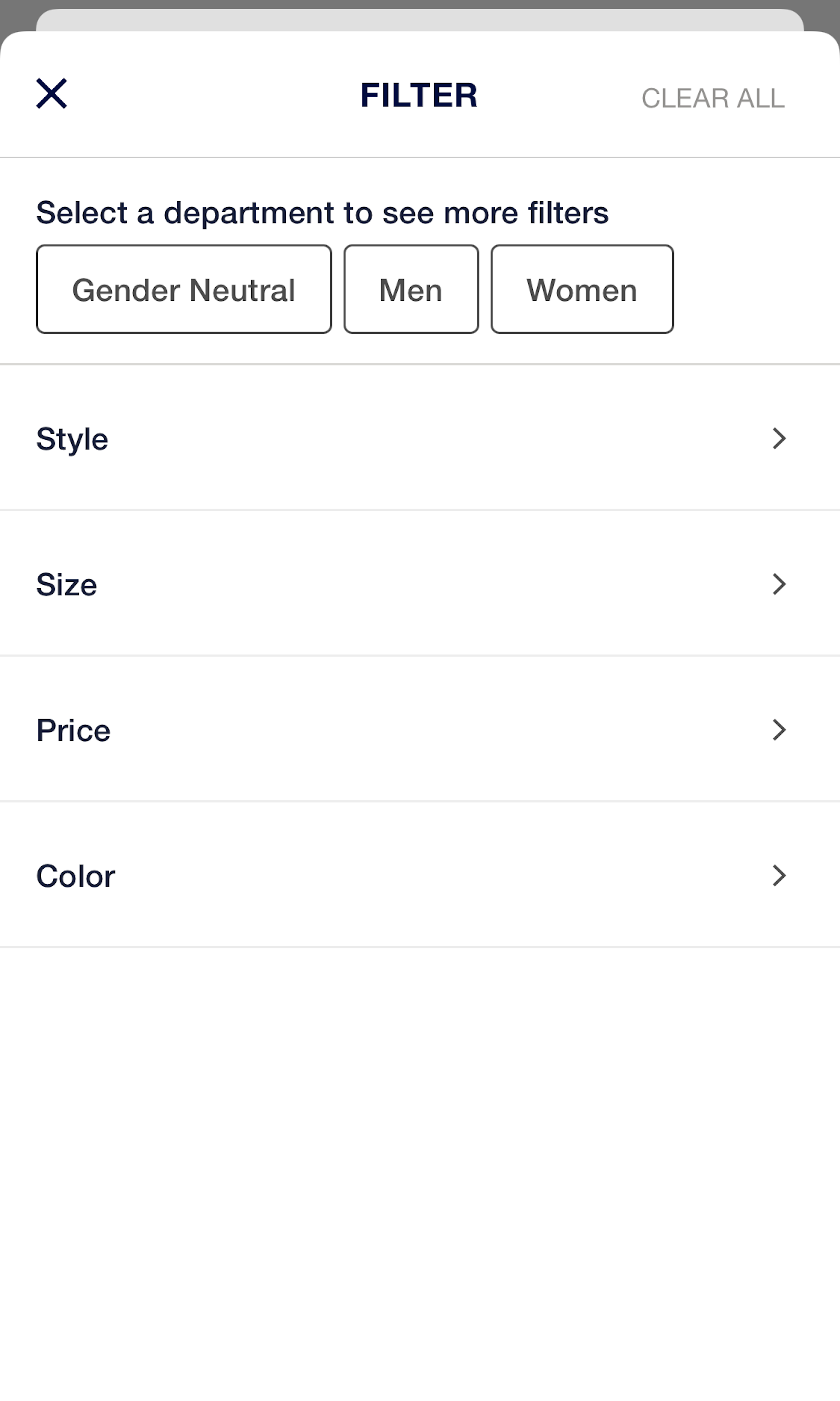
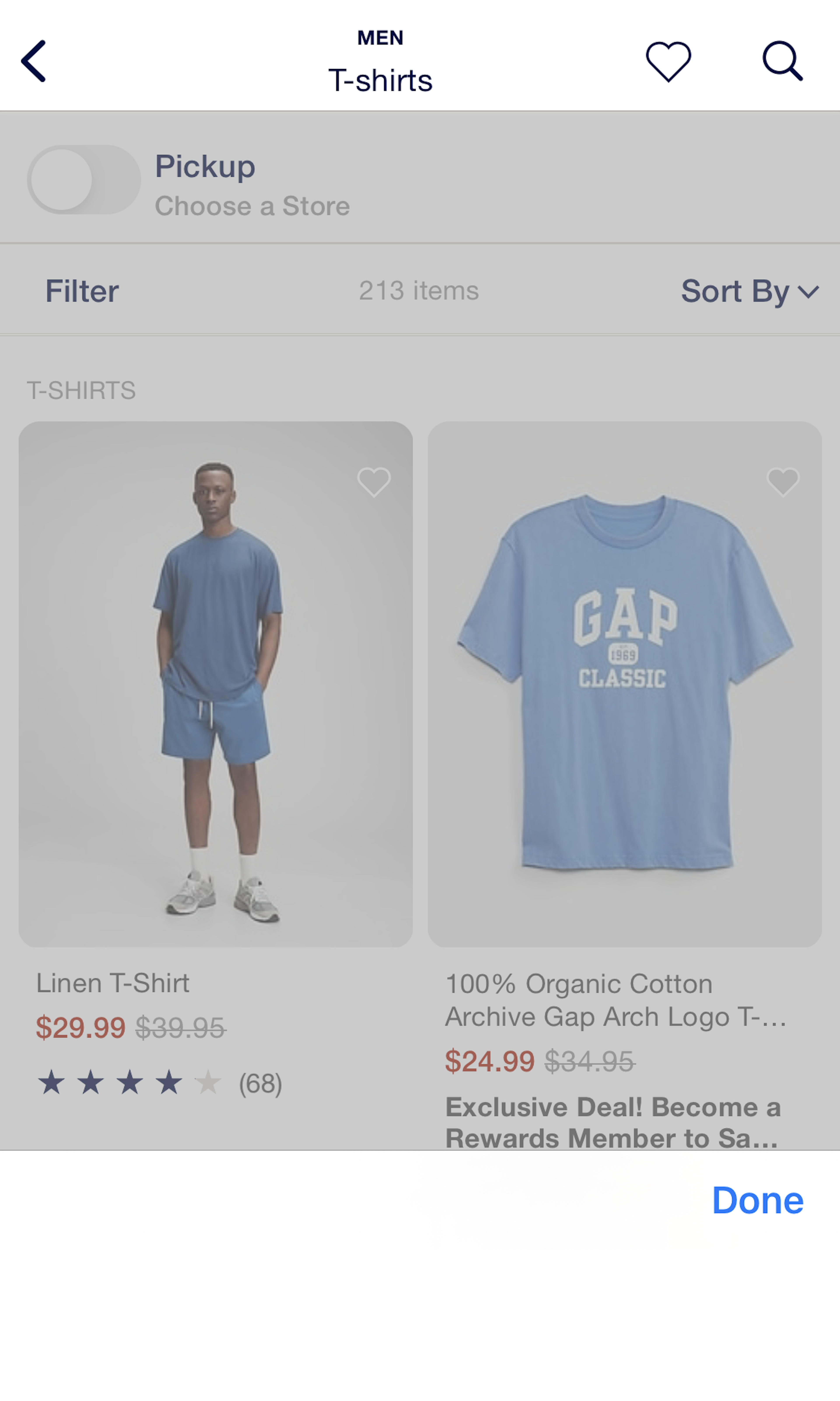
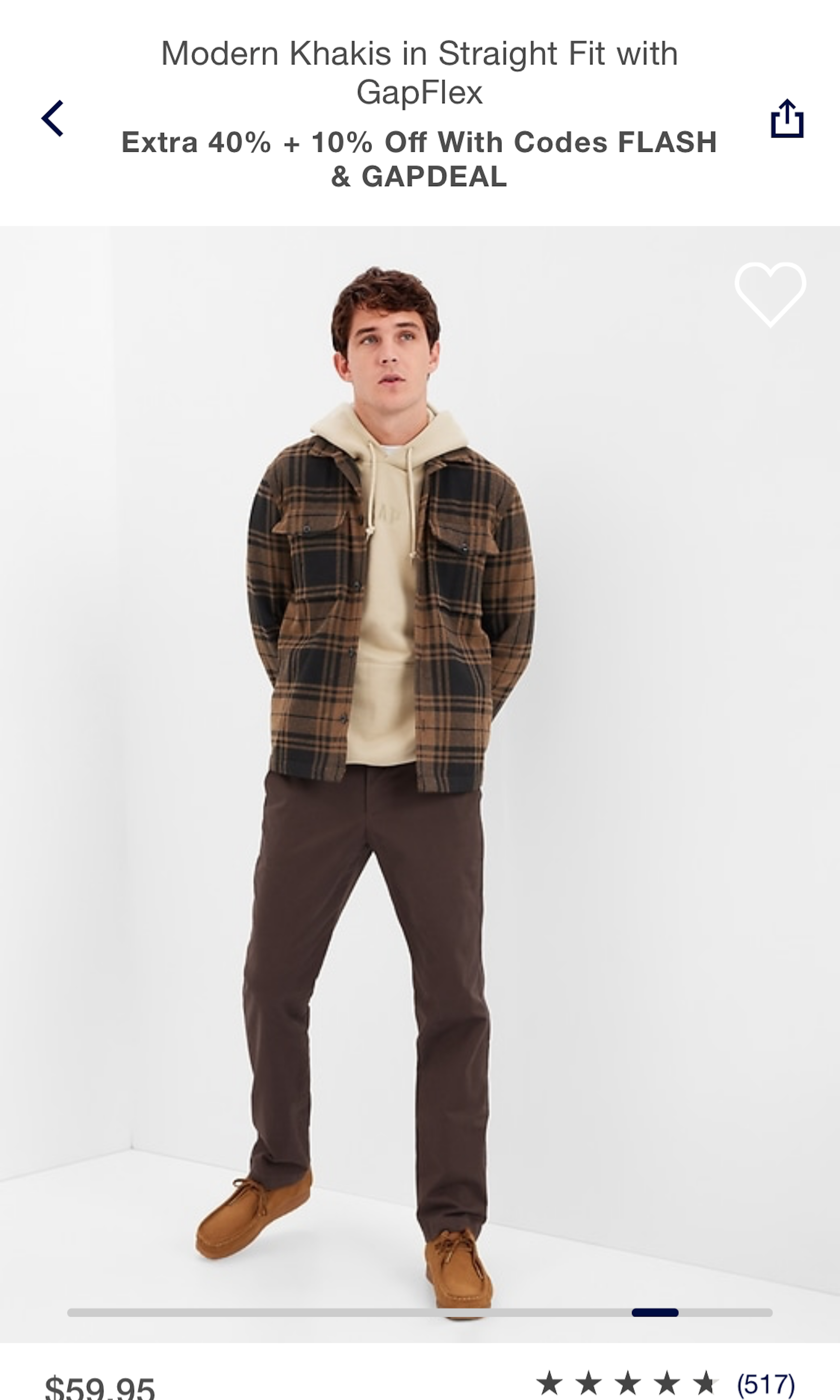
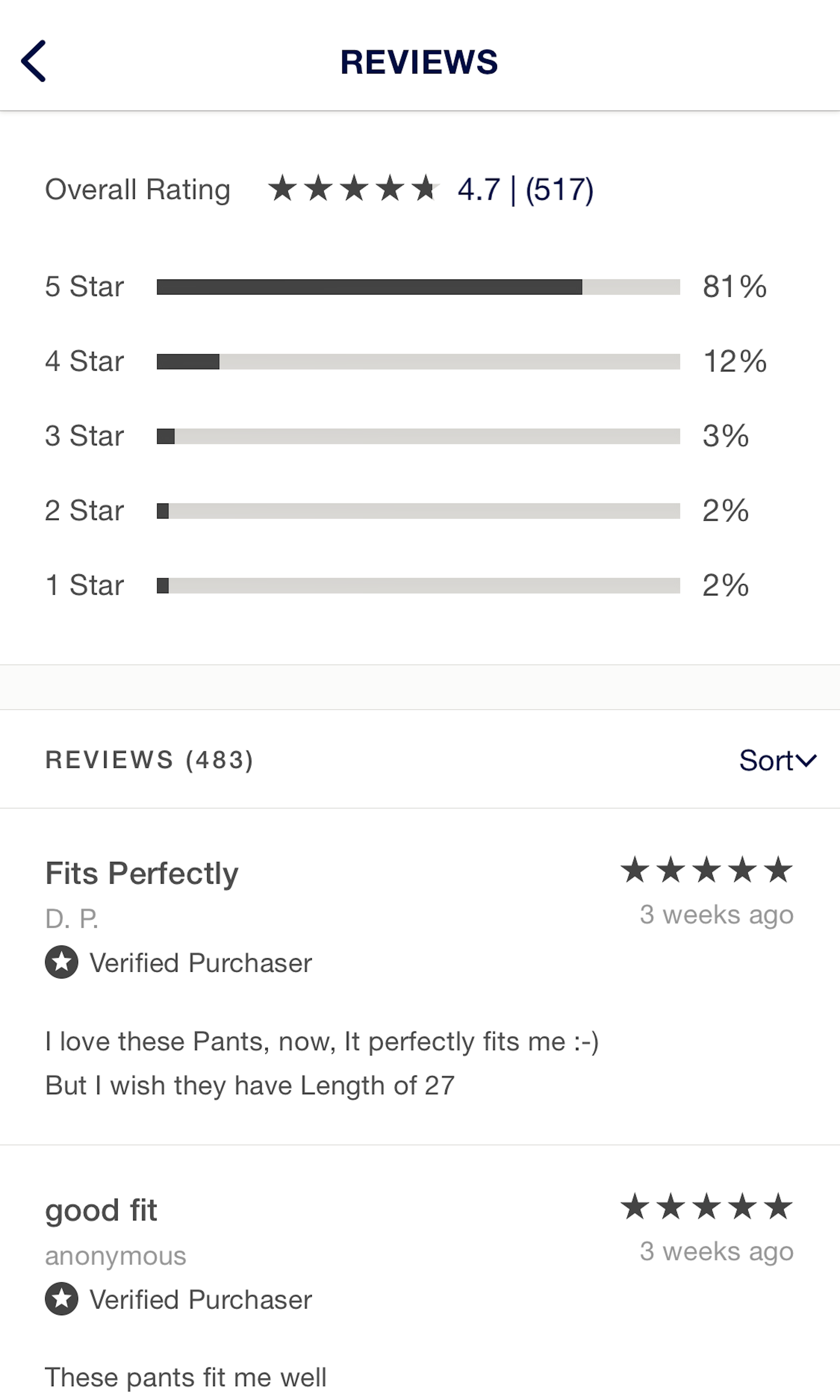
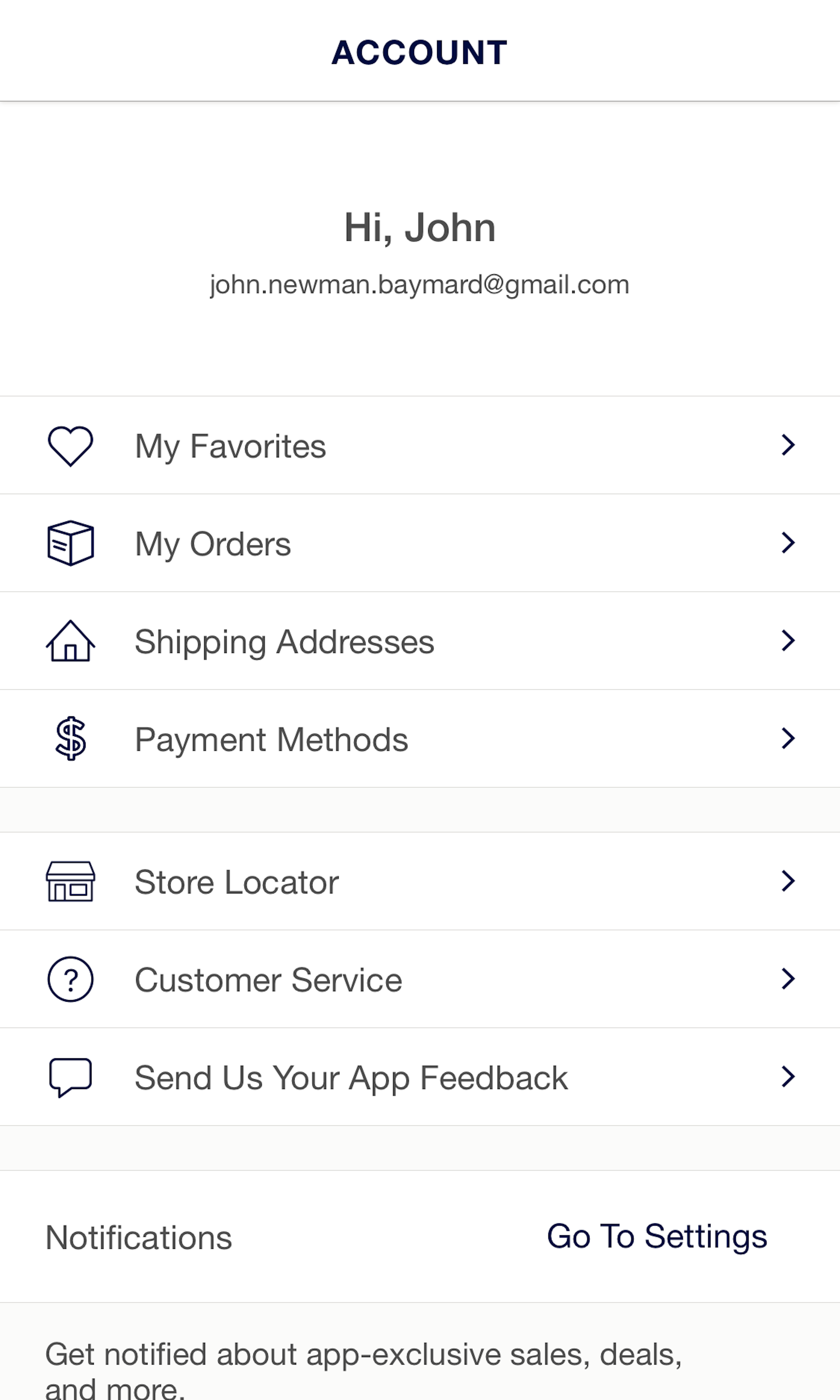
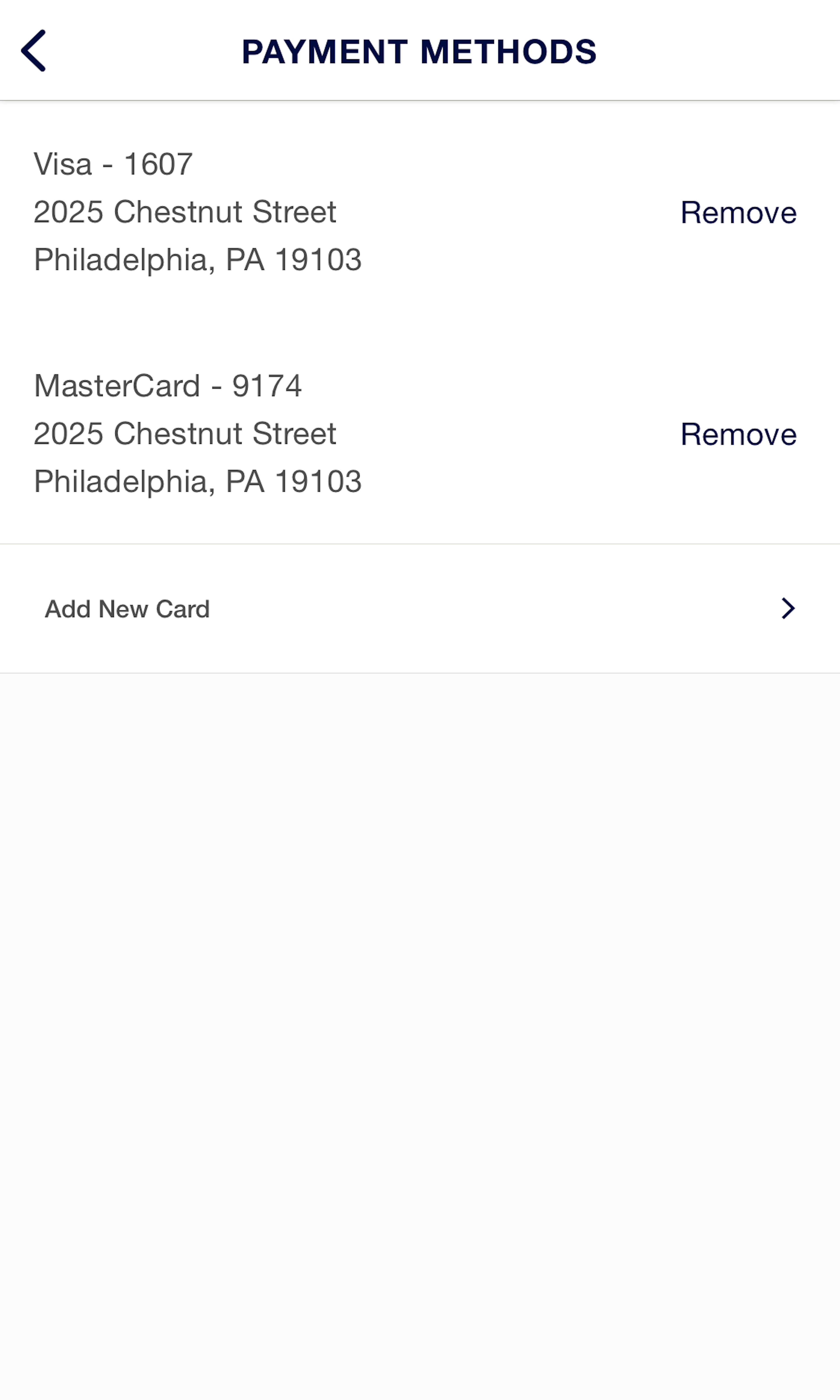
GAP’s Mobile App E-Commerce Design
15 pages of GAP’s e-commerce site, marked up with 151 best practice examples:


Explore Other Research Content
Every week, we publish a new article on how to build “state of the art” e-commerce experiences — here’s 5 popular ones:
Drop-Down Usability: When You Should (and Shouldn’t) Use Them
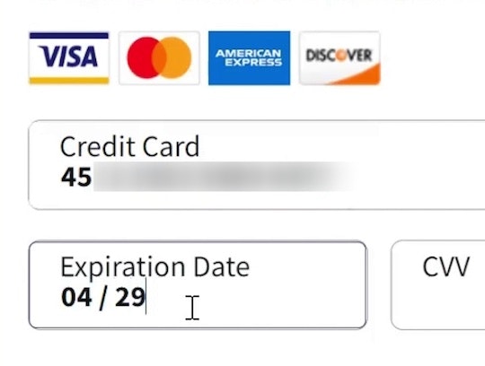
Format the “Expiration Date” Fields Exactly the Same as the Physical Credit Card (72% Don’t)
PDP UX: Core Product Content Is Overlooked in ‘Horizontal Tabs’ Layouts (Yet 28% of Sites Have This Layout)
Form Field Usability: Avoid Extensive Multicolumn Layouts (16% Make This Form Usability Mistake)
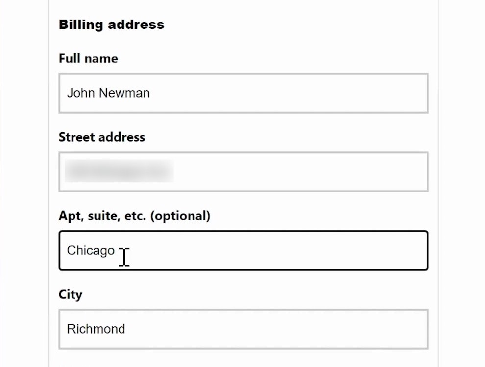
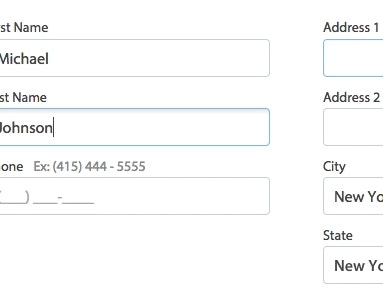
Form Usability: Getting ‘Address Line 2’ Right
See all 380 articles in the full public archive.