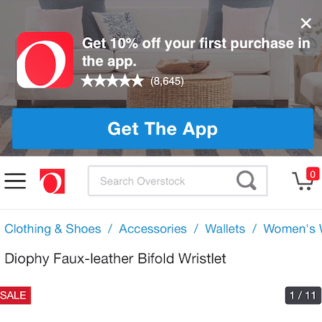
“Oh, god, I hate these, go away. NOO! Go. Away. If I wanted chat I would ask for it.”
It is not uncommon for users on e-commerce to encounter difficulties at some point during their product finding journey. A little help can go a long way and being proactive when it comes to offering that help, through a feature like live chat, makes sense. At least, in theory.
In practice, however, all of our large-scale usability testing of e-commerce has shown that live chat is a feature that isn’t relied upon that heavily, especially considering the prominent placement it often has. Instead of being perceived as a helpful feature, most users generally perceive live chat as just another annoying, site-initiated distraction when it appears.
Three live chat approaches that we’ve observed during testing — overlay dialogs, dialog pop-ups, and sticky/floating chat elements — all carry UX problems that should be taken into consideration during implementation. What at first may seem like a help can quickly become a hindrance for users.
That said, the general principle of offering live chat isn’t bad in itself; it’s mainly how and when it’s initiated that causes issues for users — and during testing we have also observed one pattern that generally performs well with users, which we’ll cover at the end of this article.
This article will cover some of the common pitfalls we’ve observed during our large-scale usability testing when it comes to Live Chat on both mobile and desktop — issues that many e-commerce sites suffer from in their live chat implementation. We’ll discuss the effects of some of these implementations and how they can be avoided, including:
- Three popular live chat approaches and the UX issues they cause
- Sticky live chat elements are especially problematic for mobile users
- How and when live chat is observed to perform well
Three Popular Live Chat Approaches and the Live Chat UX Issues They Cause
Many users enter an e-commerce site with a clear intent or purpose — to look for products. When they are unduly interrupted or disrupted in this journey, they are taken a little further away from being able to complete their task. If this happens too often or too severely, it could result in abandonment entirely.
During our large-scale usability testing, we experienced 3 popular approaches to live chat that can each cause issues for the user, depending on functionality, response, and placement.
1) Overlay Dialogs
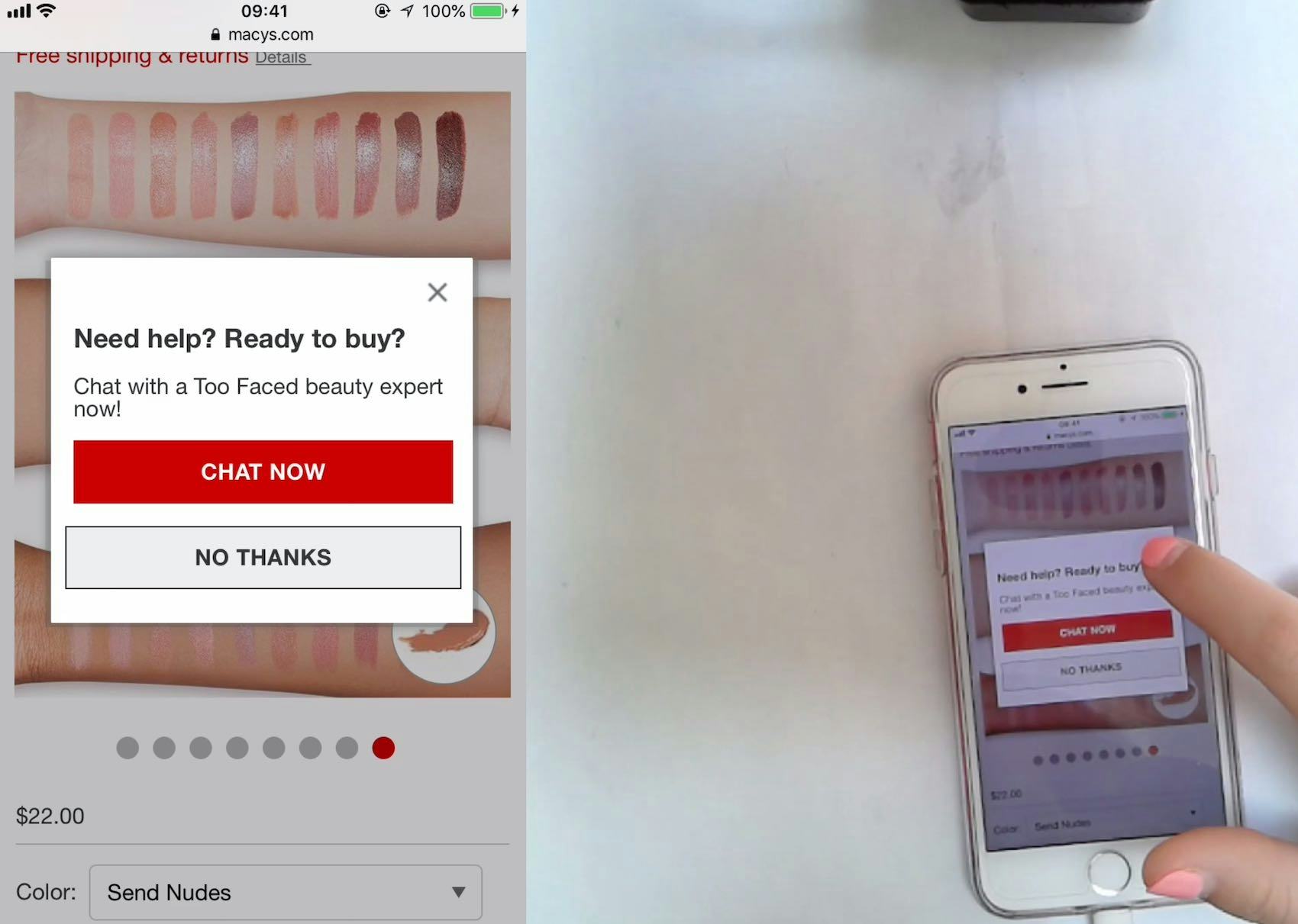
A user at Macy’s dismisses live chat for the third time while browsing products on the site. Constantly interrupting users to ask if they would like to chat is obviously disruptive and should be avoided. Furthermore, chat overlay dialogs can appear overly pushy; as another user at Macy’s said, “Don’t like that, when they ask to chat…It’s like they’re pushing you when you could just be browsing…Feel like they’re forcing you…It’s like they don’t want you just looking, they want the sale”.
Overlay dialogs – that appear on top of other content on the page – may seem like a useful way to make the user aware that live chat is available and ready to help. For the sub-group of users that would actually benefit from assistance this could be seen as a positive, but in that very same moment this interruption may be warranted. In practice the live chat dialog never only appears for those users who could use help, and never exactly when they need it. Live chat overlay dialogs come at the cost of disturbing the vast majority of the users who just want to continue with their product exploration without being disturbed.
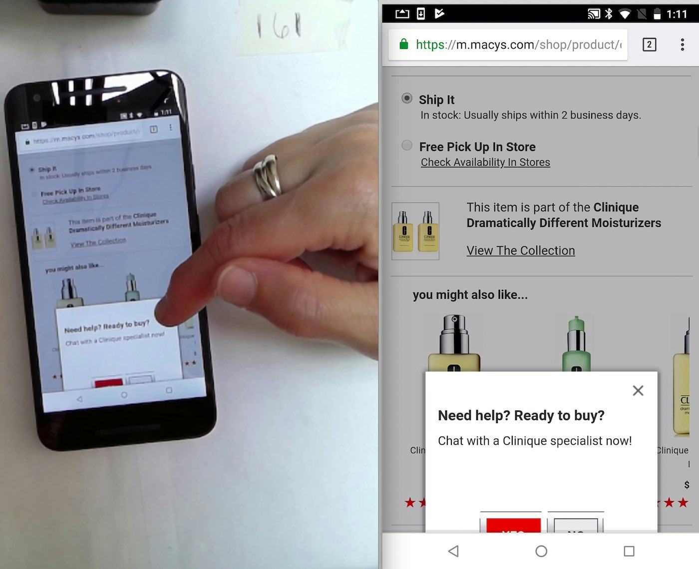
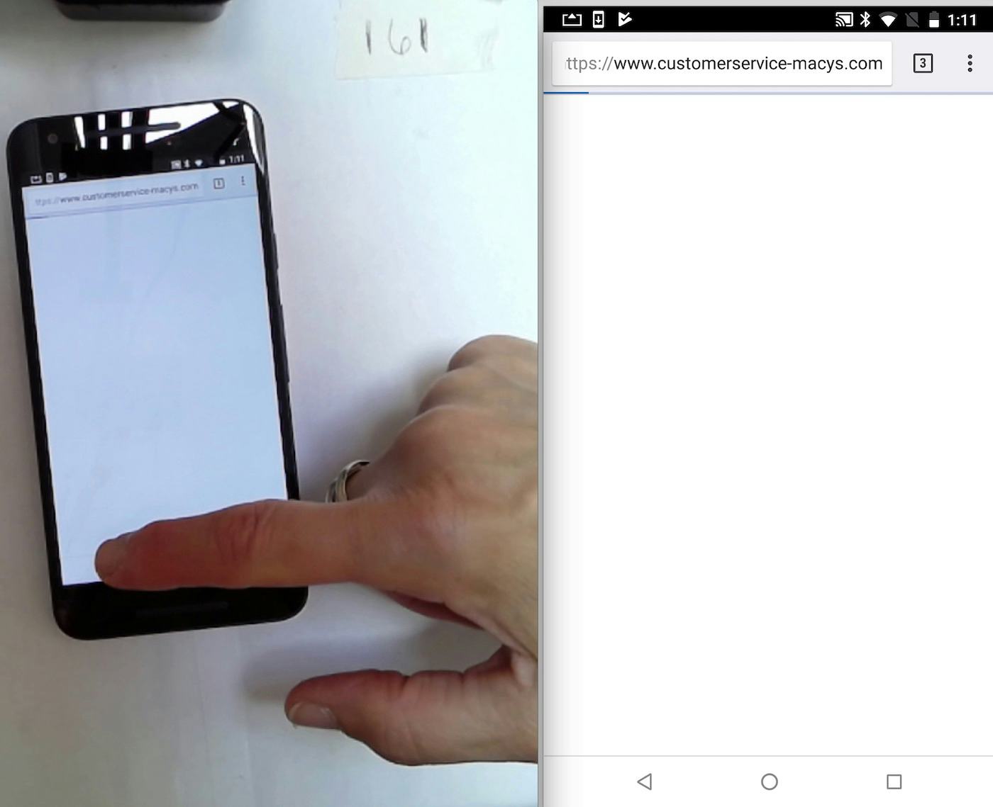
Here another user on Macy’s was taken to a blank page (second image) after she attempted to close a live chat overlay dialog (first image). She went back to the previous page using the browser “Back” button, and tried again to close the chat pop-up. What started as a site-interruption, became a larger detour, all caused entirely by the site.
During testing, live chat dialogs are experienced by users in much the same way as overlays that appear on page load: annoying interruptions that disrupt them from their current task. For the vast majority of users, a live chat overlay dialog is simply a minor annoyance, which they must dismiss in order to continue on with their product browsing. For others, like in the Macy’s example above, live chat can contribute to the general “buggy” feeling of a site, especially if the site has other technical issues.
2) Dialog Pop-Ups
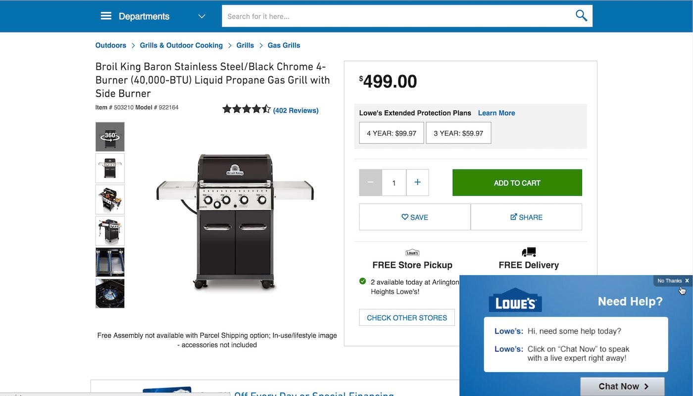
“Oh, god, I hate these, go away. NOO! Go. Away. If I wanted chat I would ask for it.” This user at Lowe’s, annoyed at having live chat pop up, became even further aggravated when she had trouble dismissing the chat pop-up due to the small “No, Thanks” hit area. Site-initiated live chat is experienced by most users as an annoying interruption.
Another live chat implementation is dialog popups. These differ from overlay dialogs as they do not usually take up the entire screen and in many instances the user is still able to continue with their actions on the page without having to close the popup first. However they typically still require some interaction in order to close or minimize them if they start getting in the way.
Again, it may seem like a good way of letting the user know that the feature is there. However, non-user-initiated live chats are experienced by a minority of users as “pushy salespeople”, the equivalent of overly aggressive store employees asking if you want help while at a brick-and-mortar store. For these users, being asked if they “Need help today? Chat with an expert.” reflects poorly on the site and brand. This is especially the case when chat dialogs appear multiple times while on the site, or when it’s difficult to close due to a small hit area.
We also observe that a smaller subset of users, typically more insecure web users, will never close these dialog pop-ups, and just continue to browse the website with a reduced effective viewable area.
3) Sticky Chat Elements
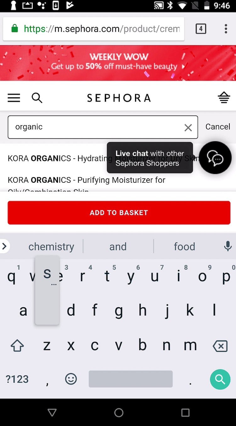
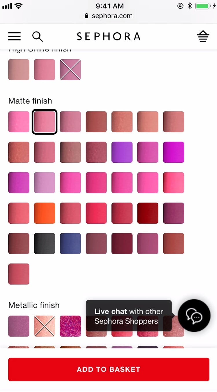
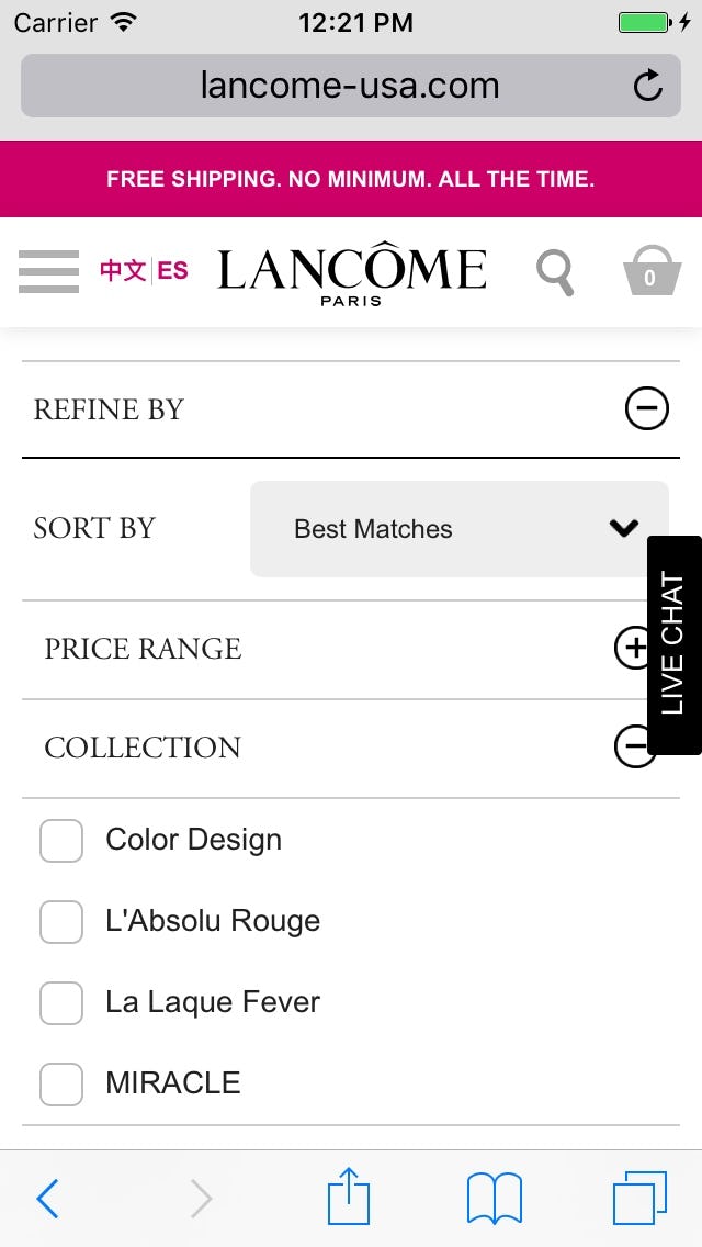
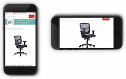
The use of sticky elements for live chat on mobile can often result in key page content being blocked, as seen here on Sephora and Lancome. Because the sticky element cannot be dismissed and because it’s typically displayed most of the time, even relatively small sticky elements can often end up being highly disruptive to users.
The third popular approach for live chat that we observe to often cause UX issues is having it as a sticky or ‘floating’ element throughout all or most of the sites, e.g. a chat “bubble” that’s constantly in the user’s viewport or a button on the edge of the page. While these may or may not actively interrupt the user during their journey by trying to initiate a conversation, their presence can still be disruptive to the user. Their constant appearance or ‘stickiness’ on the page means that there is a high likelihood that the live chat element will obscure or obstruct another feature at some point.
Sticky Live Chat is Especially Problematic for Mobile Users
Desktop sites have the luxury of screen real estate that mobile sites simply can’t afford, so the mobile screen real estate is precious as it is so limited. While the implementation of a sticky live chat means that users are never far away from accessing help, our testing reveals that on mobile websites these sticky chat elements often block key page content in much more obtrusive ways than the same sticky element will do on a desktop site. When sticky live chat appears nearly universally on the site (e.g., in search results, on product pages, in the cart, etc.), it’s difficult if not impossible for site managers to foresee all the different instances where key content or features may be blocked by the sticky chat element (e.g., autocomplete results, buttons, filters, text, etc.).
Sticky elements for live chat often block key page content on mobile sites in unforeseen ways. Here blocking autocomplete suggestions (first image), color swatches (second image), and the trigger for expandable filters (third image). Given the already-small interface on mobile, sticky live chat elements are often much more disruptive on mobile than on desktop.
Live chats that are implemented as sticky elements (typically) also can’t be dismissed the way overlays can. As one user said while trying to read a product description that was partially blocked by a live chat feature, “I can’t read it. Can I move that? No.” Even when the sticky live chat feature is designed to be as small or inconspicuous as possible, it can still cause issues for users, as on mobile nearly all of the interface is valuable (and already taken by other content or features).
Finally, on mobile, typing is quite difficult compared to desktop due to the intrinsic issues with the small touch keyboards and available space, and thus users may generally be more hesitant to even use live chat while on the mobile site.
On desktop, it’s less likely that sticky chat elements will overlay key content, given that the live chat sticky element will be relatively smaller compared to the rest of the viewable page area, and we observe that users generally have less trouble dismissing chat overlay dialogs or sticky elements. Hence, chat dialogs (if intelligent) and especially sticky chat elements are generally more warranted to have as desktop-only features. Nevertheless, it does not change the fact that site-initiated live chat still represents an unasked-for annoyance that can interrupt desktop users at critical moments in the product-exploration process.
How and When Live Chat is Observed to Perform Well
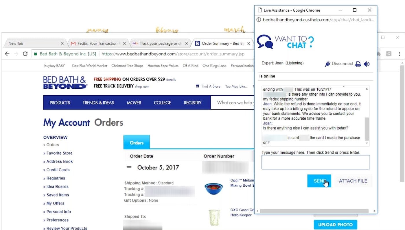
“I like to use these chat functions whenever I can because sometimes you can get a really fast answer or they can take care of a problem right there…Chatting is very easy for me; it’s quicker than sending an email, it’s easier than talking on the phone…but sometimes I ask something too complicated and they’ve told me to call in.” A user at Bed, Bath & Beyond successfully used live chat to answer a question she had regarding a refund for a product she returned.
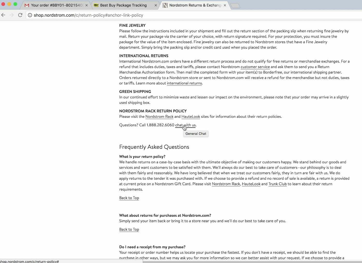
A user at Nordstrom had a question regarding refunding shipping costs for returned items. She was able to get this question answered quickly via chat, which was linked to from within the return policy, which is where she went first. Including a direct link to chat in the return policy and other help sections aids users who are actively seeking help.
Live chat can be extremely helpful, however, when users decide they need it. For instance, during our Accounts & Self-Service testing many users actively sought out live chat when they had questions about return policies, refunds, or shipping. However, the key difference in these instances was that the users themselves sought out live chat — live chat didn’t interrupt the task they were currently involved in.
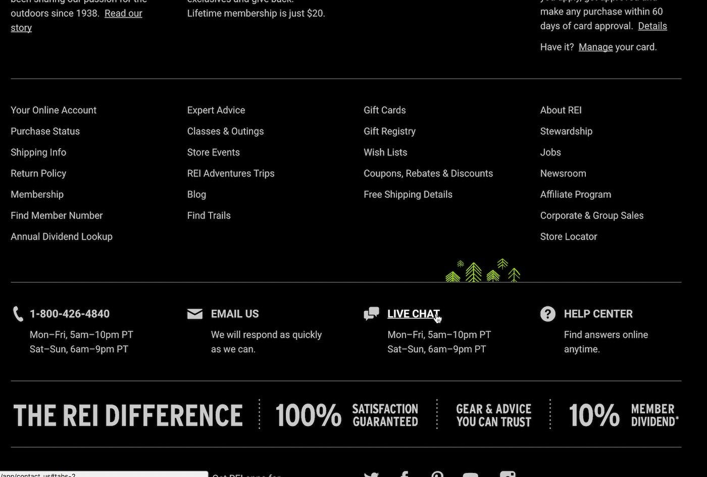
Including live chat in the footer helps users quickly access it, as many users expect to find it there.
Therefore, for live chat to be viewed by users as helpful rather than disruptive it must be user — not site — initiated. It should also be placed where users will expect to find it — particularly in the footer (see Have Direct Links to “Return Policy” and “Shipping Info” in the Footer), header, and as direct links within the help section of a site, as our testing have shown those are the areas where most users tend to look.
If the live chat feature must be site initiated, then take active steps to mitigate the disruption it otherwise causes for all users. These can include making some pages off-limits for live chat (e.g., when users are in a filtering interface or are in the checkout flow), being conservative when deciding how often to show live chat to users (often once is enough, so they are aware the feature exists), and having a time delay before showing live chat, which at least takes into account whether a user has had a chance to browse the page content before they’re interrupted.
Implementing the Best UX For Live Chat
When live chat is implemented appropriately, the help and reassurance that it can offer the user cannot be underestimated. What’s important, however, is not to force the feature down the user’s throats. As with many site-wide features, this will be a fine balance between design and implementation to provide help without hindrance to the various users that visit your site. What’s important to remember is:
- Avoid disrupting the user’s flow with non-user-initiated live chat overlays or dialogs. Let the user, not the site, initiate the live chat conversation.
- Be especially mindful of any inclusion and placement of sticky live chat on mobile sites, where they are more harmful than on desktop sites.
- Make the live chat feature accessible to those that need it (like placing it in the footer), without being obstructive to those that don’t.
This article presents the research findings from just 1 of the 650+ UX guidelines in Baymard Premium – get full access to learn how to create a “State of the Art” e-commerce user experience.